
How Porter Airlines Bucks the Trend With an Animated Mascot

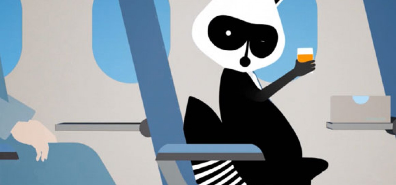
Porter, a regional Canadian airline, has quietly built a unique brand through print and animated ads featuring a jet-setting raccoon named Mr. Porter. I recently flew with Porter for the first time and was blown away by the entire experience; not only are their lounge areas filled with WiFi, free espresso and shortbread cookies, but TV screens display animated clips of Mr. Porter, flying from city-to-city, occasionally stopping to give the weather forecast before picking up his suitcase and heading to another destination.
Mr. Porter debuted in 2006, the work of London-based branding and design agency Winkreative. The graphic, black and white raccoon was just one part of a larger branding identity created to evoke the carefree feeling of retro air travel. Now, Mr. Porter is inseparable from the brand, showing up on the company’s brochures, water bottle labels and in-flight meal boxes. “Raccoons are intelligent, adaptable creatures that succeed in a variety of environments and unfavorable conditions, so our mascot choice was no accident,” said Porter founder and CEO Robert Deluce.
Porter is going against a trend afflicting many major brands; logos and mascots are becoming more and more reductive and impersonal. American Airlines, for example, has slowly transformed its eagle from a stylized illustration to an implied, decorative swoop. Similarly, the Quantas Kangaroo has become almost unrecognizable.
Mascots, whether realistic or graphic in style, definitely matter. When American Airlines recently retired its famous logo that was designed by Massimo Vignelli in 1967, Vignelli revealed that the company wanted a stylized eagle, something he was against—he believed that the eagle should be detailed down to the last feather. “I refused to do it. We started without it, and the pilots threatened to go on strike because they wanted the eagle on American Airlines,” Vignelli told Businessweek.
So why are so many companies shying away from punchy mascots that make a statement? Perhaps they’re afraid that a personality-driven character makes it more difficult to control a company’s message. Yet in embracing Mr. Porter, Deluce has created a stronger sense of the company’s goals, even among employees, saying, “Everyone at Porter has a clear understanding of the brand.” Mr. Porter is intriguing, mysterious and charming, three very dynamic adjectives that could never be applied to the American Airlines eagle-turned-swoop.