Dreamworks Animation CEO Jeffrey Katzenberg Spent $353,000 On Dinner Yesterday
Dreamworks Animation CEO recently said his company is “in the toilet,” but he seems to be doing fine himself.

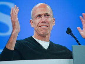
Dreamworks Animation CEO recently said his company is “in the toilet,” but he seems to be doing fine himself.
Tribeca Film Festival’s Storyscapes is a worthwhile look at where interactive storytelling is headed.
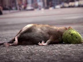
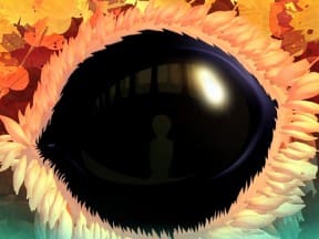
“Wrapped” delves into the clash between civilization and nature.
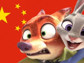
“Zootopia” is being denounced by China’s military as subversive American propaganda.
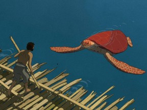
Ghibli’s first international co-production is directed by “Father and Daughter” director Michael Dudok de Wit.
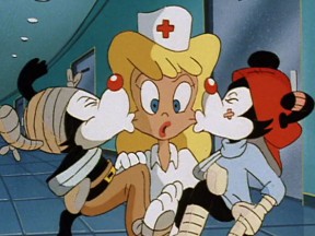
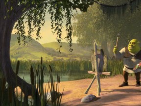
A naughty nurse in 2016 isn’t as funny as it was in 1993.

Paramount will release its ‘Ghost in the Shell’ live-action adaptation in 2017.
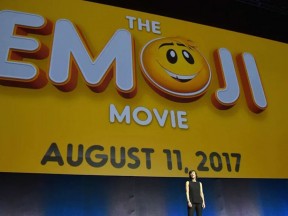
The emoji movie is turning into the app movie.

The Finnish game maker has invested over $100 million into making the “Angry Birds” movie.
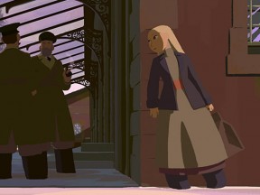
“Long Way North” will debut in the U.S. later this year.
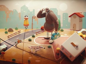
In a forgotten old penny arcade, a wooden doll is stuck in place and time
The girl-empowerment doc which premiered at Sundance could become a CGI animated film.
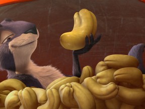
A release date has been set for a sequel to the Korean/Canadian CGI talking-animal comedy.

“They don’t make animation like this anymore,” says Warner Bros. exec Mary Ellen Thomas.

A look back at members of our community who died in 2016.
Guillaume Aretos, the new head of Art Center’s entertainment design program, worked for 20 years at Dreamworks Animation.

The Polygon Pictures series directed by Goro Miyazaki earns some international recognition.

A photo-based animation project that travels back in time with a little steampunk time machine.
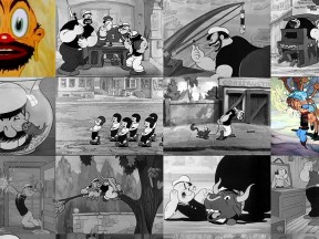
Over 100 classic Popeye cartoons on one poster.
An amazing look at Pixar before they made “Toy Story.”