What Is A Technical Director? The NFB’s Eloi Champagne Explains
A good technical director, according to Champagne, finds creative solutions to technical problems, and technical solutions to creative problems.

A good technical director, according to Champagne, finds creative solutions to technical problems, and technical solutions to creative problems.
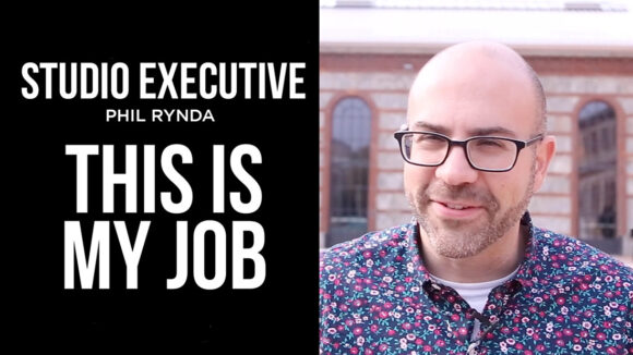

Phil Rynda had a successful career as an artist before switching to the executive side. We spoke with him about how and why he did it.
How can young directors work most effectively with studio executives?
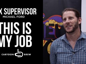
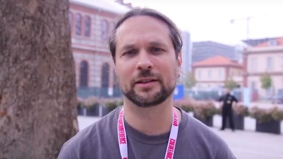
What does a vfx supervisor actually do during a film’s production? The answer might surprise you.
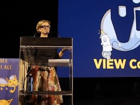
In this new episode of our series “This is My Job,” the Oscar-nominated director talks about what she’s learned about running an animation studio.
“It’s never the technology and it’s never even a story,” says Vincent Morisset. “It starts as a feeling that I want people to have.”
What is the role of a production designer in an animated feature? Ron Kurniawan, production designer of “Smallfoot,” explains.

The directors of the Annie Award-nominated feature film “This Magnificent Cake!” spoke with Cartoon Brew about their one-of-a-kind stop-motion project.

More perspectives on the global animation production boom from countries in Latin America, Europe, Asia, and the Middle East.
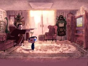
The Annie Award-nominated director sits down with Cartoon Brew to discuss the making of “Weekends,” and how he balanced the production while working full-time at Pixar.

Cartoon Brew’s whirlwind tour around the animation globe continues this week with insights from industry players in Chile, Norway, and Philippines.

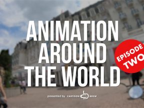
Watch the third episode of our new limited series about animation production around the world.
A look at what’s happening animation-wise in various countries around the world.

In our first episode of this tour around the animation world, we profile Mexico, South Korea, and Greece.
Former Pixar art director Robert Kondo and Dice Tsutsumi talk about the challenges of directing their first independent film “The Dam Keeper.”

What if everybody could read your thoughts and knew all your most inner wishes and desires?
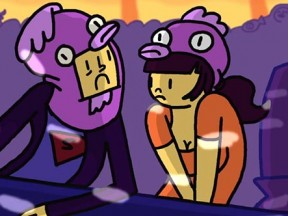
Two best friends wake up and start the day.
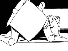
Surrounded by nothingness, a knight lives with his wife in a small house. Every day he must defend their home against attacks of other knights. What he gets as reward is love and a satisfying meal.
After a harsh breakup, our hero, Guy, decides to leave it all and fly to New Zealand hoping to find true love. However, he must first defeat his inner demons before he can put the past behind him.
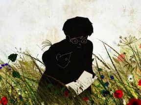
A girl has to conquer her fear for her grandma who is deathly ill.