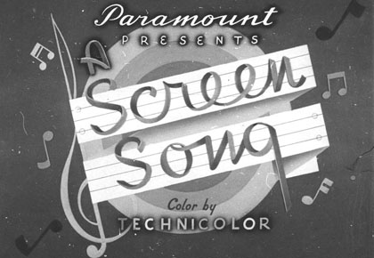

Fleischer/Famous lettering

One of my guilty pleasures, when watching Paramount cartoons from the mid-1930s through the late 1940s, is admiring the incredible “Fleischer lettering” in the main titles (and occasionally in the body of the cartoon itself). I’ve never been able to identify the mystery studio calligrapher, but this person’s unique work is as much a part of the studio’s style as the animation, voices and music. This lettering style first shows up right before the Fleischer studio moves to Miami and is prevalent throughout the 1940s Famous Studios period (you can view some of this work on my Paramount Original Titles page). This individual also did the Famous Studios logo, Fleischer/Famous letterheads and in-house publications.
Graphic designer Mark Simonson has just created two new fonts based on “Fleischer lettering” and they look terrific. Coincidentally, Mark has also been working on a font resembling to my second favorite classic movie lettering: Columbia Pictures titles (most recognizable from Three Stooges shorts, Sam Katzman serials and just about everything Columbia released from the late thirties through the mid 1950s). But I digress. I’ll be ordering his Fleischer styled Snicker and Kinescope later this week.
