Disney Vet Aaron Blaise Answers The Question: “Is AI Animation Going To Put Me Out Of A Job?”
The ‘Brother Bear’ director reacts to a recent viral video that claims to be animated using AI.

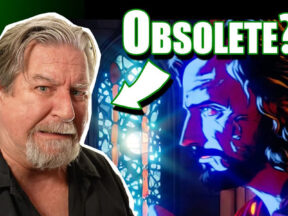
The ‘Brother Bear’ director reacts to a recent viral video that claims to be animated using AI.
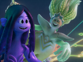
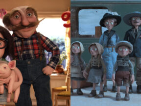
Director Kirk DeMicco and producer Kelly Cooney Cilella gave us the scoop on the studio’s next theatrical feature.
Praxinos manager and co-founder Elodie Moog joined us for a brief Q&A about the software.
Crump’s classic theme park designs can still be found at Disney parks, including the iconic It’s a Small World glockenspiel.
The festival will unveil other competition sections later this month, before kicking of in June.
Every day that we have the privilege of writing about this glorious art form is a gift. Thank you!

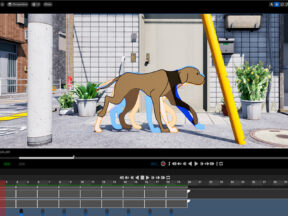
After being announced last year, Moonray was made available to the public today as open source for general access.

The museum reinforces Los Angeles’ status as a major center for the physical record of contemporary art and pop culture.
Directed by Kirk DeMicco, the film pits sea krakens against mermaids.
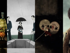
There are plenty of familiar titles heading to Zagreb this year, including a pair of Oscar nominees.
Four short films won prizes as well: ‘The Borderline,’ ‘The Queen of the Foxes,’ ‘Swing to the Moon,’ and ‘Intestine Road, Fish Island.’

Roy is a former executive producer of the French Animation Studio at the National Film Board of Canada.
The company’s money is safe now though after the government said it would insure all SVB deposits.

The network has ordered a pilot presentation for the series, which it is producing with Warner Bros. Animation.
This year’s Quirino Awards will take place on May 13 in the Canary Island city of La Laguna, Tenerife.
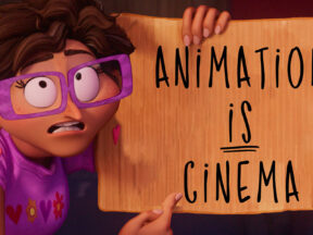
“Animation is the very definition of film,” actor Dwayne Johnson told the audience.
It’s Oscar day, the one day of year where Hollywood has to collectively grit its teeth and spend a few moments acting like they respect and appreciate animation.
The European pitching and co-production event has honored the year’s standout animation director, producer, and distributor.
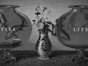
Filmmaker Conner Griffith used 1,400 images taken from 19th-century engravings to construct his latest short.
“Anybody who works in filmmaking, I feel they’re my peers. I don’t think they look at me the same way,” said director Sergio Pablos.
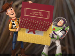
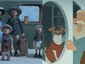
Mickey, Donald, Buzz, Woody, and even Snow White have announced Oscar winners over the years.