September 04, 2004
POPEYE POSTERS
Gordan Calma has updated his POPEYE website with a work-in-progress gallery of vintage Fleischer POPEYE cartoon posters. Go here and enjoy!
September 03, 2004
GOLDEN APPLE
I'm away this weekend attending the marathon screenings at the Egyptian Theatre (aka Cinecon), so I'll have little time to blog the next few days.
I wanted to quickly plug my local comics shop, GOLDEN APPLE, because they've got a few upcoming events I want you to know about. First off, on Saturday 9/11 at 3PM they are hosting a "Petition signing Party" for John K. and the Spumco Crew. Come down and add your voice to the plea to get Ren & Stimpy back on the air with new shows. Then on Saturday November 20th at 3pm, the IRON GIANT DVD SPECIAL EDITION release celebration and animation crew reunion:
A chance to meet and interact with over a dozen members of the creative team responsible for this milestone animated project. A reunion of the animators (and special guests) who conceived and created this much-loved movie. Autographs, lively Q&A and presentations, pre-production and test drawings, stories, surprises and lots more. Discussions will be moderated by Ramin Zahed, Editor of Animation Magazine who is co-sponsoring the Event. Admission to the Event is FREE with the purchase of the Special Edition DVD at any Golden Apple location. Pre orders will be available Oct. 1, 2004. Contact: Bill Liebowitz at Golden Apple (323) 658-6047 or billL@goldenapplecomics.com
Mark your calenders now.
Top of the World
Wednesday, July 14, 2004
_________________________
Holy Christ! Im in Iceland!
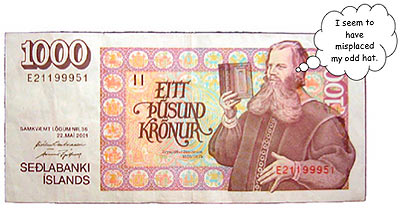
The sun shines all the time here, and the hot water from the tap smells like a fart from a sourstomached old man who's eaten too many pickled eggs. The signage is incomprehensible, people's names are unpronounceable, and the money looks like panels from a comic book regaling tales of stern, bearded men wearing odd hats and holding ponderous tomes.
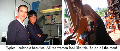
That being said, the weather is fabulous (that'll change), the food is delicious (I'm gonna get fat), and the women are giant blond goddesses (I can't touch 'em).
How did I get to this strange place? What happened? Oh, yeah... the story's starting to emerge from my sleep deprived brain.
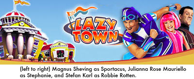
A week ago I got a call from my pal, Mark Zaslove, who's the Story Consultant for a series called LAZYTOWN. The show is being produced for Nick Jr., and can be seen on Nickelodeon weekdays at 10:30 and 11:00 AM. LAZYTOWN is described as "a fresh new television series designed to engage and motivate kids to make healthier choices in their everyday lives. The show is action-adventure on a small scale, encompassing movement, music, and comedy in an entertaining story." A writing spot had just opened and Mark had thrown my name into the hat as a potential scribbler. He described the show to me and it sounded like a hoot. I told him I was interested.
After discussing the offer with my lovely wife Susan, we decided that it was worth biting the bullet and dealing with an extended separation. After all, how often do you get a chance to travel to Iceland? Resumes got sent, agents got called, and a week later my plane was setting down on a volcanic island on the top of the world!
This day isn't over yet! To be continued...
September 02, 2004
Introducing Ken Pontac
We're excited to announce the return of guest blogging here at Cartoon Brew. It's a fairly straightforward concept. Jerry and I don't want this site to become purely an outlet for our own thoughts and opinions, so we're asking friends from around the animation biz to join us on the Brew and share their unique perspectives on cartoons and the industry. There's some terrific folks who've agreed to contribute over the course of the next few months, including artists, historians and critics. Our first contributor this month is animation director Ken Pontac. Ken is the co-creator of the highly inventive and entertaining stop motion TV series BUMP IN THE NIGHT, among numerous other achievements. He will be treating us to a journal he kept from a couple months ago while working on a show in that hub of animation production known as Reykjavik, Iceland. Here's a bit more about him:
 |
September 01, 2004
TOONFEST IN MARCELINE
If you happen to be wandering near Walt Disney's hometown - Marceline, Missouri - on Saturday September 18th, you might stop in on the annual TOONFEST. Pixar's Pete Docter (Monsters Inc.) will be there, as well as Michael Broggie, the Walt Disney railroad historian and family friend. Also appearing will be newspaper cartoonists Tom Wilson (Ziggy), Mike Peters (Mother Goose & Grimm), Greg Evans (Luann) and Brad Anderson (Marmaduke). It all starts 12:30pm at the Uptown Theatre, 104 N. Main St. USA, on the 18th. More information is posted here.
FUTURAMA CLASSIC CARTOON CLIPS
Oh boy, this is neat! A complete guide (with frame grabs) to all the classic cartoon clips used on the openings on FUTURAMA. Click on over to What Else? Futurama and enjoy!
THE MOST VIOLENT CARTOON EVER!
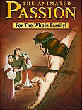 |
Richard Rich (The Swan Princess) is at it again. Hoping to cash in on the release of THE PASSION OF THE CHRIST on dvd this week, Anchor Bay Video has produced this ANIMATED PASSION ("for the whole family")! This could be the worst animated video since the child-friendly TITANIC animated musical I wrote about a few years ago. If watching the crucifixion in "bright colors and kid-friendly language" isn't enough for you, the bonus materials include "sing-along activities".
At least the lead characters aren't mice this time around.
August 31, 2004
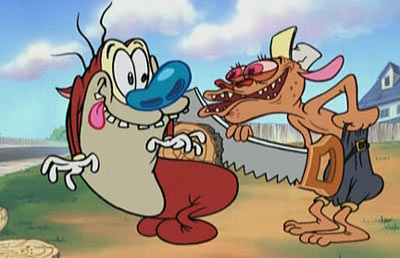
The John Kricfalusi Interview, Part 2
And now, the conclusion of our exclusive John Kricfalusi interview. The first part was posted HERE last week. Before we begin, be sure to SIGN THIS PETITION which will be sent to Spike TV asking them to put these episodes on the air sooner than later. LA residents, don't forget the two-evening John K. tribute at the Egytpian Theatre on Sept. 7 and 8. And for images, clips and info about these new episodes, check out THIS PAGE.

Cartoon Brew: You were saying that these new cartoons are of a much higher artistic quality than the original REN & STIMPY episodes. Would it be safe to say that a big reason for this is because you're a much better artist today than you were ten years ago and your improvement affects everybody else working on the show?
John Kricfalusi: That's a definite. I worked with a lot of newer artists on the show. There were some of the artists from the classic period - Eddie Fitzgerald, Jim Smith and Vincent Waller - and they're always great, but we started a lot of new kids. I mean, all artists get better with age. The more you draw, the better you're going to get. I'm not bragging, but I've been studying and drawing a lot since then. So that raises the standards of the whole studio. In the same sense, in the early-1930s, the standards were rubber hose. By the late 1930s, the standards were much more realistic drawings and by the '40s, there were even more difficult drawings. So as the standards were raised, not only did the veterans get better, but new people coming into the business had more of a challenge than they did ten years earlier because they had to achieve a higher level of drawing.
One problem I face now is a lot of people who come into the studio have only one influence and that's Spumco. That's a bad thing. I have to untrain them from what they think is the Spumco style. I have to explain to them that the Spumco style is a combination of me and Jim Smith, Bob Camp, Lynne Naylor and Vincent Waller and all of us have a wide variety of influences. So I say to people, "Go back and look at our influences," which Luke [Cormican], Katie [Rice], Nick [Cross] and all these people do. They go to Shane Glines' site and they see what people can really draw. They see all these great artists on Shane's site. Now their standards are higher and they no longer draw just like Spumco or what they think is Spumco.
In general though, it seems a lot of younger artists today aren't as well versed in the fundmentals of drawing as in the Golden Age of animation.
You meet young artists now and try to teach them something and they say, "I could do it that way if I wanted to, but this is my style. I draw club feet because it's my style." Unfortunately, schools are really bad now. Schools are not only bad in reading, writing and arithmetic, they're worse in cultural aspects, like in music and art. They don't teach you anything anymore. I know this from twenty years of experience hiring artists out of the schools. They get worse every year. They're absolutely ridiculously retarded now. They don't teach you anything and the few things that they try to teach you are completely wrong. They don't teach you construction, line of action, nothing.
Illustration from the late-1900s up through the middle of the 20th century was absolutely amazing. In general, American culture was at its highest skill wise in every aspect of human life in the 1940s. It's all been downhill since then. You just open an old magazine from the 1930s and '40s and look at the illustrations in it. There's nobody alive that could touch the way they could draw back then. In old movies, the cinematography is a thousand times better than anything today. Writing, a thousand times better. The standards in the 1940s were extremely high in all aspects of American culture. And they had schools that were like boot camp. They made you learn things. You couldn't walk into a school and say, "Well, it's my style to draw badly." You wouldn't get into the school. You'd have to be pretty damn good before you came to the school and then once you get there, they were extremely strict about your learning every technical aspect of art. Not only the obvious things like life drawing, anatomy, perspective, but elusive hard to teach concepts like composition and color theory. You buy any book on color theory today and it's just complete poppy cock. Everybody comes out of school painting pink, purple and green. The whole damn cartoon industry has pink purple and green on their mind.
Those are the colors of INVADER ZIM
Most cartoons are those colors. They have been for 35 years. Until REN AND STIMPY made that change. REN AND STIMPY changed it, Genndy Tartakovsky perfected it. And then there's been some shows that have followed Genndy's lead, like TIME SQUAD, which have absolutely beautiful color. But here's an interesting theory. The main difference between cartoonists and illustrators, and this isn't going to apply in every case, but in general cartoonists are untrained artists, while illustrators are more trained. But because the standards were so high in illustration and fine art in the early to mid-20th century, that even the cartoonists and animators who were mostly self-taught, looked up much higher than you have to look today. If you're a kid wanting to be a cartoonist today, and you're looking at FAMILY GUY, you don't have to aim very high. You can draw FAMILY GUY when you're ten years old. You don't have to get any better than that to become a professional cartoonist. The standards are extremely low. Same as in illustration. Not very many people can draw who are illustrators today, compared to the early-20th century.
So would you say that training the artists on this show was easier or harder than the first time around?
It was harder this time. I'm trying to figure out why it was harder. I think maybe because when we first formed Spumco, there was a fairly large group of us that had worked together before. One of the big problems this time is that we were doing it in two countries. Even though I'd worked very closely with Jim, Eddie and Vincent before, they were in LA while I was in Canada. We didn't really work that closely together. And I had to jump back and forth between LA and Canada training two crews of young people. So I don't know if I can really answer that question because there were other factors involved in that. I think that we probably have some stars that came along this time like Katie, Luke, Kristy Gordon and Helder Mendonca. They're just naturals and I don't think we had as many of those in the younger group at the original Spumco.
Does Nick Cross fall into that group as well?
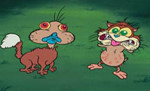
Nick was the fastest learner I've ever met in my life. He was unbelievable. I hope he doesn't get mad at me, but when he came to the studio he had a very generic style. It was the generic Canadian style which is different from the generic American style. Nick was drawing wonky backgrounds and really generic characters. Kristy Gordon, who did background design on RIPPING FRIENDS, was always plugging Nick and I was like, "Yeah, yeah, you've got to say that about your boyfriend."
So anyway, we were starting the show and I needed somebody up here to do storyboards. I hadn't worked with any board artists in Ottawa so I had to try somebody. I said, "Alright, I'll give Nick a week and see how he does." I acted out a scene from "Life Sucks" [an unproduced episode] and he went off and storyboarded it. He brought it back the next day and it was super-generic. Everything was symmetrical and all the shapes were even. Stimpy was completely created out of ovals. Two oval eyes, oval pupils that were the exact same shape as the eyes, each eye is the exact same shape and size, standing next to each other on the same angle, the nose is the same shape as the eye, the body is the same shape as the eye.
So I sat down with great patience and explained assymetry and design to him. He may have already known this stuff that I told him, but I explained to him that to make something look real and alive, nothing can be symmetrical because nothing in real life is symmetrical. You have to make it look organic and give it appeal and design. Those are all difficult concepts and even if you start to grasp them intellectually, that doesn't mean you can put them into practice right away. You have to train your hand and mind to follow this stuff and that usually takes a long long time. I've worked with artists who've never been able to grasp assymetrical drawing and design at all. I explained all this to Nick not expecting that it was going to sink in, and even if it did, it would probably be a few years. He came back wih the same storyboard, redid it like in two days or something, and it was beautiful! He applied every single concept I gave him; I couldn't believe it. It was the first time I've ever seen that happen. I've never seen any human absorb information and concepts so fast and instantly put them into practice.
Let's talk a bit more about the visual aspects of the show. How would you say that the show has evolved stylistically since the original episodes?
The 'look' of the show is the sum total of the artists' styles and my stage in development. Technically, the drawings in the new episodes are much more advanced over the old series. The acting is better than it ever was. All artists have their own styles and my studio is one of the very few that allow the artists to use elements of their styles in the cartoons. We don't trace model sheets here, so whoever is working on the shows is going to influence the 'look'. If you notice, the 'look' changes from episode to episode and sequence to sequence as it always did. The BG styling is not as abstract in the Spike episodes as the Nickelodeon episodes.
In the original series, I influenced the BG style by not being able to draw perspective. Bill Wray and the BG artists developed cool graphic painting styles to make my bad backgrounds look like they were that way on purpose. When Bill painted Jim Smith's excellent background drawings, then the result was solid, stylish and strong as in "Robin Hoek." That look was partially inspired by N.C. Wyeth and didn't have that 'retro' look people associate with REN AND STIMPY. In the new series, Nick Cross and Helder Mendonca drew very stylish (but not too stylized) backgrounds, and Kristy Gordon painted many of the backgrounds. Her style is softer and more lush than the graphic styles of the first season episodes and the combination of her style and Nick's and Helder's styles created some new 'looks' for REN & STIMPY. Jay Li painted some cartoons and scenes in his style also. He painted a magnificent bare girls ass in "Naked Beach Frenzy." Its so convincing in every detail. You can tell this fine artist researched his subject very carefully. Next season we all want to try some new 'graphic' looks again.

Assuming you get another season, in addition to greater stylization, what else would you do differently from these recent episodes?
I think I want to go and do some simpler, lighter, shorter and more cartoony stories next time. No more poo jokes! I'm actually thinking of making a cartoon specifically for Mike Barrier and then one for my Dad according to their specific tastes and phobias, rather than mine. I definitely want to bring back the bumpers and short bits like the original series. We wrote a bunch for the first season, like "My Little Ass," "Powdered Toast Rolling Tobacco," and "Log For Moms," but didn't have time to make them. I love to experiment and dont like to stay in one mode for too long. Oh yeah, I want to do some musical stuff!
I'm curious to find out a bit more about your character creation process. I'm going to throw out the names of some of the more memorable characters from these new episodes and maybe you could talk about how they came to be.
Sure. Though I find it very hard to just sit down and create an idea or especially a new character on command. Usually my characters evolve by accident out of some story context, to fill a need in the story. The only character I ever remember actually creating in a flash of inspiration was George Liquor. God planted that in my head in an instant; I knew everything about the character - his look, his personality, his stories, everything. That was spooky now that I think about it. He's really the richest character I have too. I'm amazed there aren't 365 episodes about him on TV already.
 |
They came about through sheer inevitable logical syllogistic progression. In "Altruists" Stimpy needed to wear a sexy duck costume to lure an angry duck away from protecting a house.
Therefore Stimpy had to have a duckbill taped to his nose.
Therefore the duck had to try to kiss the duckbill.
Therefore by sheer necessity I knew I had to make the duckbill speak, in a sexy voice.
Therefore the duck had no choice but to make out with the Stimpy/sexy duck.
When you make out it leads to an inevitable result - offspring. Ducks lay eggs, therefore a cat in a duck suit must also lay eggs. Eggs hatch. When a duck and a cat have a baby, the baby must be half cat (on top) and half duck (on bottom). The second baby must be the reverse, of course: duck on top, cat on bottom. They naturally have to think each other is weird looking.
And by the comedy law of 3s there must be a 3rd topper. Where do you go now that we have used both possibilities? Left side-cat, right side-duck. Obviously. For easy comparison and contemplation we need to line all three up next to each other. They need a Terrytoons title card to show off their shiniest assets. Terrytoons once tried a short series of cartoons that starred three very weird-looking indefinable animal characters. They had a beautiful shiny title card advertising their entertainment attributes. I christened them "The Three Things" because I didn't know what they were. Therefore a cat in a sexy duck costume leads logically, inevitably, step-by-step, to a spin-off series from REN & STIMPY called "The Three Things"...and a very shiny title card.
 |
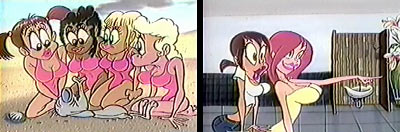
Hmmm more sort of logical progression from a story need. Ren and Stimpy are bathroom attendants in the girls' shower room at the beach. The first dirty gag has Ren lathering up soap on a girl's breasts. He thinks he has the best job in the world and is quite professional about it, so now it's Stimpy's turn to top him. We originally had him shampooing the other girl's hair, but I thought, well that's not as good a job or as entertaining as washing a girl's breasts, is it? Steve Stefanelli was storyboarding this sequence and he brought me this problem. It seemed anti-climactic. What to do? Then came inspiration: SHAMPOO MASTER!!!, I blurted. He said What? thinking I had lost my mind. And I did for that ecstatic moment. I explained that Stimpy had to be better than a bathroom attendant to top Ren, so he had to be a super-hero that could dispense shampoo from his utility nozzle. Steve then drew the nozzle and added this strange ball in the middle of the tube, which when you twist it, the nozzle squirts the goo all over the girl's head. There you have it. Of course now we have to do a whole cartoon about Shampoo Master.
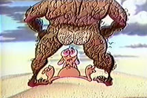 |
Once we decided to do a beach picture I knew I had to use a bunch of old beach gags we had storyboarded for the TNN bumpers promoting BAYWATCH. The bumpers starred a cat and a duck who spy on sexy girls at the beach, while this huge hairy David Hasselhoff-like lifeguard keeps beating on them to protect the sanctity of all the unspoiled maidens. I loved this character so much; I kept trying to find places to use him. "Naked Beach Frenzy" afforded me the opportunity to debut this bright new Hollywood cartoon star.
August 30, 2004
BISPOP GALLERY
 |
The BISPOP GALLERY is located inside Johnson Motors Inc. at 36 West Colorado Blvd., #7 Mills Place Alley in Pasadena. For more information check Tim's website or Flopdoodle.com
August 29, 2004
VARIETY REVIEWS "PRIDE"
DAILY VARIETY posted its mixed review of Dreamworks' FATHER OF THE PRIDE today. Quote:
The show remains a serious gamble with doubtful prospects, as its sporadically tawdry tone clearly isn't meant for kids, and questions linger about how many adults will be motivated to tune in a CGI series on their own, the popularity of "Shrek" and its sequel notwithstanding.You can read the whole review here.