‘Spider-Man: Into The Spider-Verse’: Production Design Is About Character, Not Style
“I don’t approach production design from the standpoint of style; I approach it from the standpoint of character,” Justin K. Thompson told Cartoon Brew about his work on Sony’s critical hit and box-office smash Spider-Man: Into the Spider-Verse, which marks his third outing in the role of production designer in a feature film following the two Cloudy with a Chance of Meatballs movies.
This is part III in our in-depth series on the making of the film. For more, read our piece about the film’s technological innovations at Sony Pictures Imageworks and our interview with co-director Bob Persichetti.
Note: This article may contain spoilers. If you haven’t seen the film yet, proceed with caution.
The familiar and the supernatural

For Thompson, the conversations he has with the filmmakers early on allow him to get into their heads and learn about the characters’ thematic elements: all the psychological and emotional qualities that make the character who he or she is. In this case he thought about the best way to tell Miles Morales’ story. He wasn’t worried about style, but rather about making this character feel real on screen.
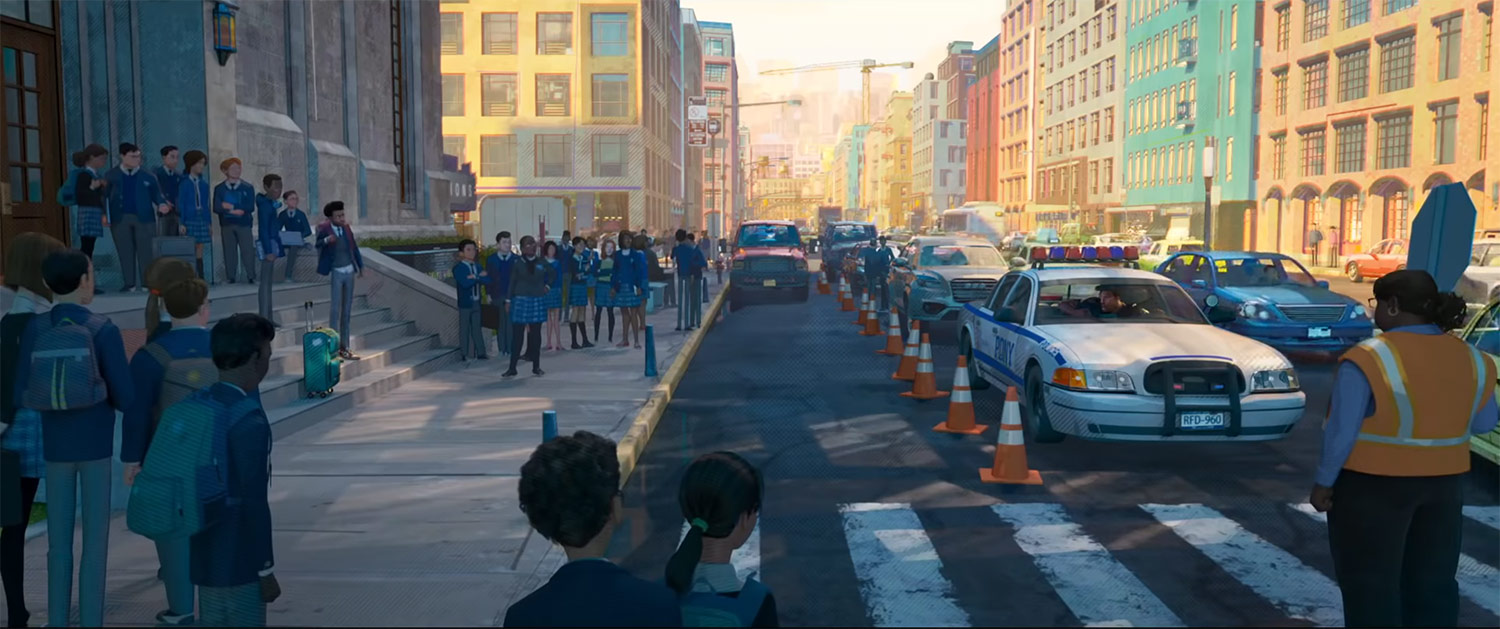
Taking into account Miles is a thirteen-year-old boy living in Brooklyn whose father is African American and mother Puerto Rican, Thompson designed the home where we first meet them to reflect the melting pot that is his family. Vibrant and eclectic colors are present on every piece of furniture and the walls. His neighborhood is also energetic, and reinforces the cultural diversity expressed visually at home.
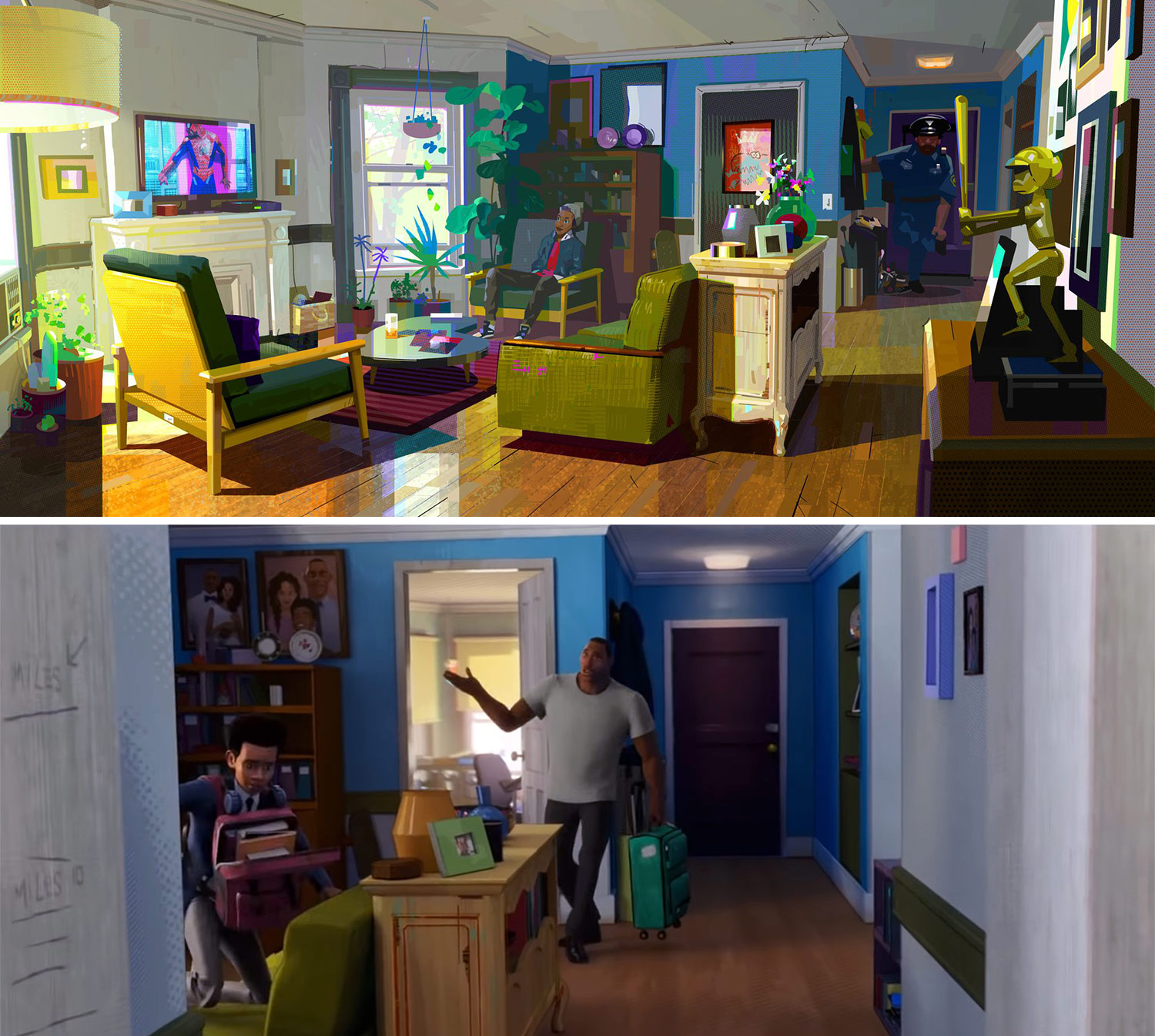
“He comes from a very inclusive, dynamic, and warm universe, and it’s at a scale that we can recognize ourselves in it and feels familiar to us,” said Thompson. Every decision was driven by his commitment to making sure audiences understood Miles’ situation as somebody who is “looking for a role model,” as Thompson puts it. He credits Patrick O’Keefe, art director of environments, and Dean Gordon, art director of lighting and color, for following through on these ideas and ensuring visual consistency throughout the production.
The naturalism reflected in the lighting choices and color scheme change drastically once the story goes into the Spider-Verse and characters like Green Goblin and Peter Parker join the action. At that point, Thompson introduced what he calls the “supernatural element” as part of the movie’s aesthetic. In this supernatural realm, color becomes brighter and more saturated, and the contrast and the scale increase. “From the very minute he meets Peter Parker, the scale of everything gets bigger,” explained Thompson.
Fans will notice that some of the iconic characters have been modified for Into the Spider-Verse. According to Thompson, what motivated him to make them different than in other iterations was not only the desire to render them unique for this particular story, but also to look at the world from the point of view of a 13-year-old. Miles is the main hero in this universe, so his perspective is what reigned. “The Green Goblin and the magical portals to other dimensions would all seem like things that were larger than life. We made the scale of those things huge, the way they would appear to a teen that is overwhelmed by them. Part of what makes the journey that you go on with Miles feel so believable and so fun to go along with him, is that see the movie through his eyes, and you experience it the way he does.”
Grounding the emotion in a ‘comic book style’
The production designer grew up loving superhero adventures. At age 14 Thompson got a job at a comic book store where he became a devoted reader. In devising the correct approach, Thompson thought of his younger self who spent hours staring at comic book pages, obsessing over all the line work and the Ben-Day dots, and noticing the misaligned plates of the four-color printing process.
“Those are things that I saw that I saw that made comics feel tactile,” he noted. “The color palette as very bold and expressive from panel to panel, you might have had one panel that was blue and one panel that was red. There were very high contrast images with saturated colors. You have black being used on comic books, in the shadows, very high contrast images with the saturated colors.”
In comic books, said Thompson, frames change color when someone’s emotions change or when there is a particularly expressive moment, and that was another touch he felt could help viewers feel like they were in a comic book with Miles. “Since this is an alternate universe, let’s just treat it like a film that’s told from the point of view of somebody in one of those comics,” said Thompson about the reasoning behind these flourishes taken from the source medium.
He tried to imagine what it would be like to experience the world as Miles, and how all those printing imperfections and intricacies would naturally be part of his world. “If I looked up from Miles’ point of view, if I looked up through his eyes, all those things would be in the world around me: the Ben-Day dots, the offsets, the line work on people’s faces, all of those things would actually exist.”
The risk for Thompson and his team was making something that wasn’t overly indulgent or that overwhelmed the storytelling. His primary goal was to include all these comic book elements, while still having moments that felt naturalistic, human, and believable. The over-the-top moments of supernatural fun had to exist without overshadowing the significance of the character’s journey. “My goal was to make sure that people fall in love with Miles Morales, not to make sure that they fall in love with the look of the movie,” he said.
Re-thinking the bad guys
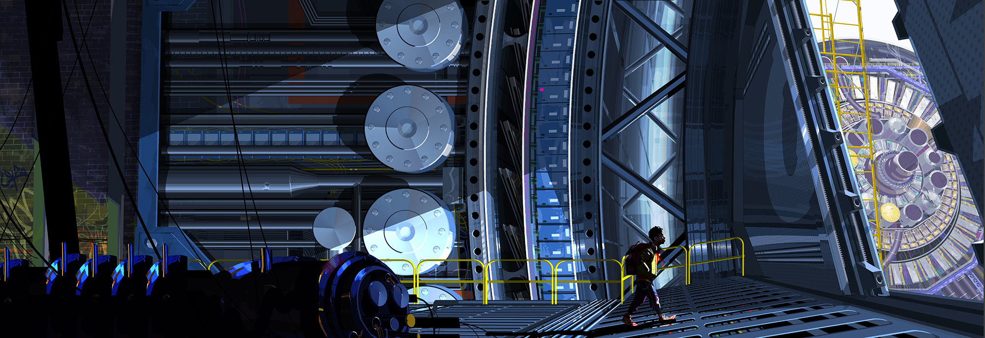
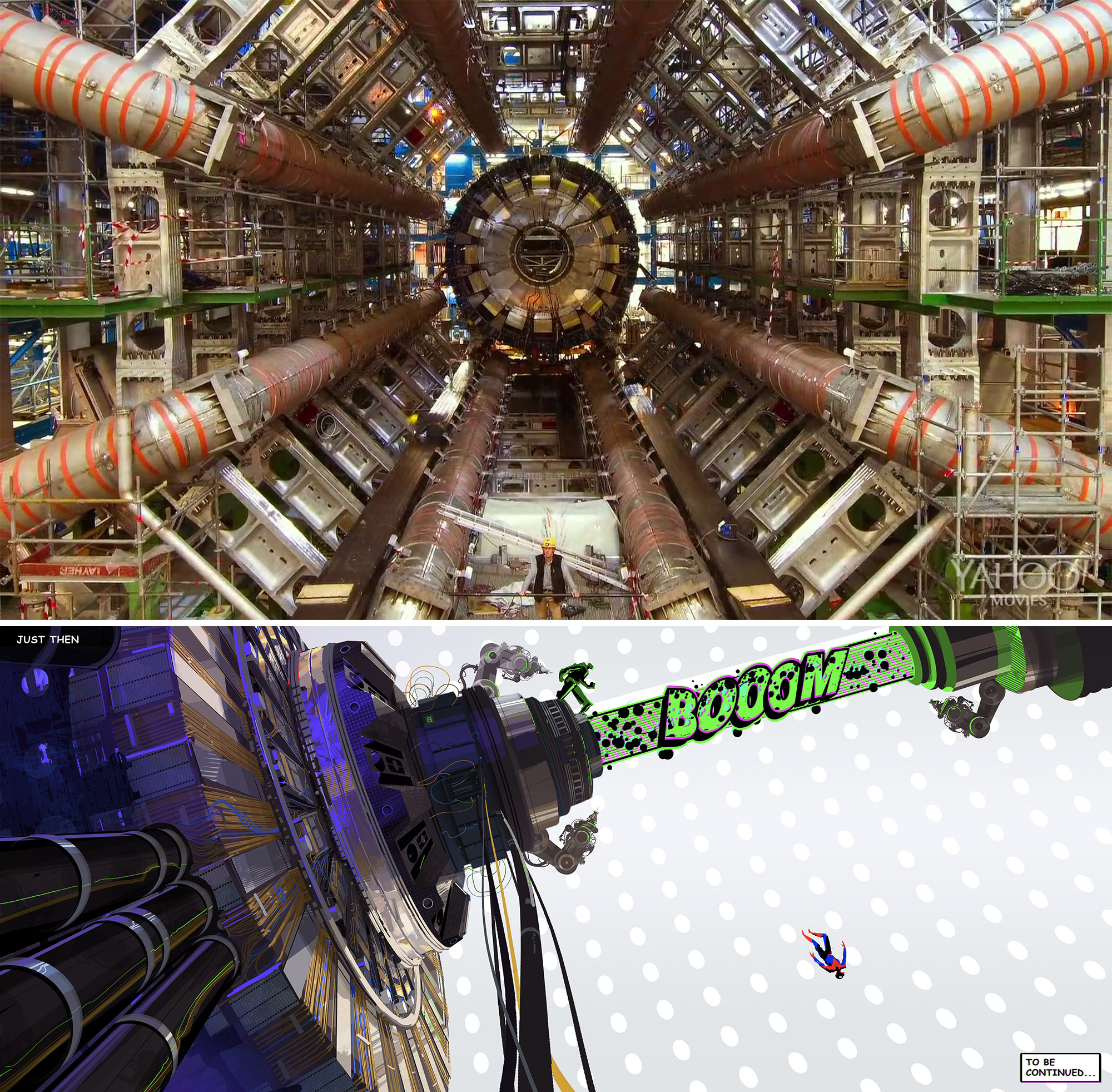
Creative liberties were taken with two of the key antagonists. Doc Ock represented a great opportunity for Thompson to revamp a popular figure. Aside from making the villain a woman, he sought to deliver a new take on the character. Movies like Particle Fever, documentaries about real scientists, and information on quantum scientists researching wormholes and colliders, specifically those who were women, served as inspiration. “I looked at all the female scientists who were designing colliders, these amazing women around the world who are some of the most brilliant minds on our planet,” he said.
Doc Ock in Into the Spider-Verse is voiced by Kathryn Hahn and exhibits a unique flair and style. So when it came to designing her costume, Thompson didn’t want to use the typical metal arms we’ve all seen before. Instead, he looked at soft robotics to give her weapons that truly resembled an octopus’ tentacles. Thompson crafted the suit and tried different textures to make it seem like she was wearing a prototype she had designed herself. Her robotic extremities also needed to stretch and squeeze like a boa constrictor, which required a painstaking rigging job.
“This is probably the character that I’m the proudest about. We did something different and memorable that stands out from a production design standpoint,” said Thompson.
Regarding The Prowler, Thompson’s mission was to bring this secondary character to the forefront. “He wasn’t ever somebody featured very heavily; he was always somebody who was kind of in the background, and kind of a joke villain,” Thompson said. Through Miles Morales’ story, the character came out of obscurity and turned him into an emotionally-charged familial figure. The aim was to reinvent The Prowler and turn the once corny villain into a scarier, and more meaningful, adversary for the hero.
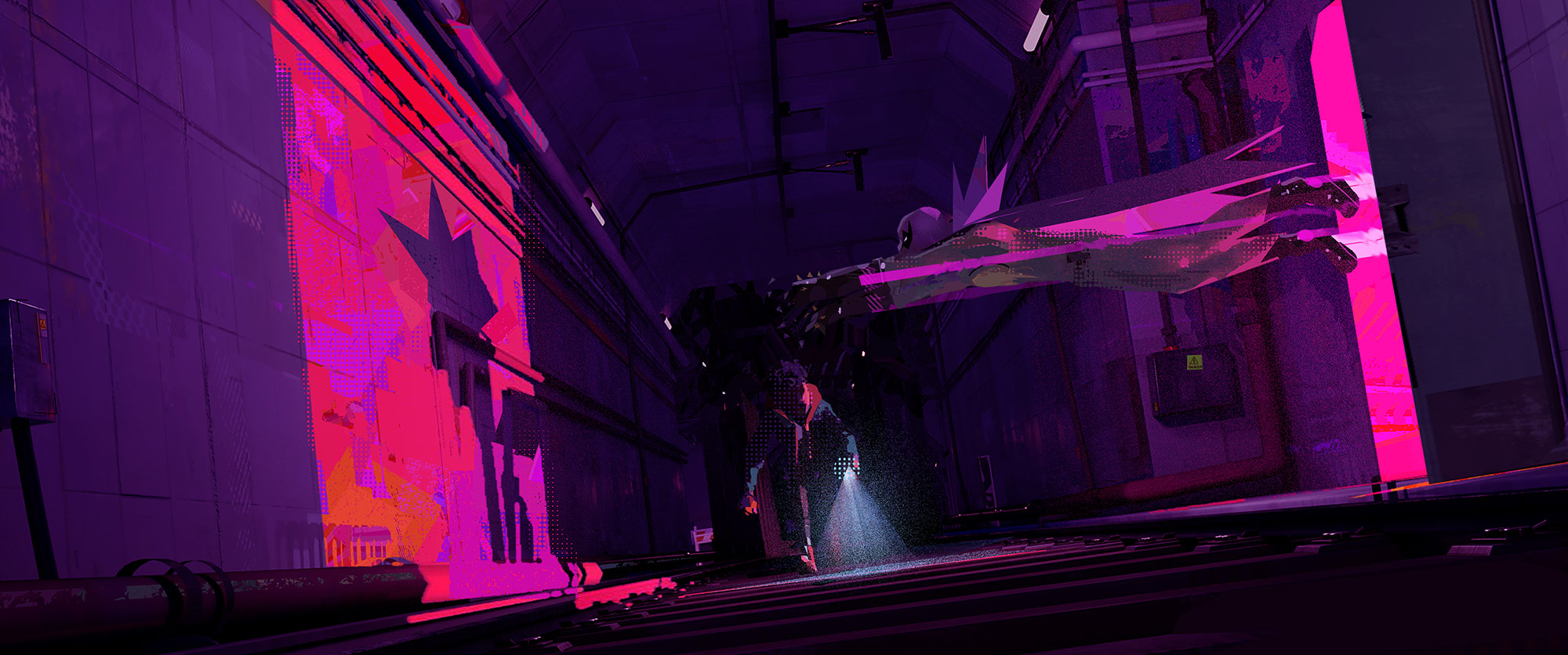
The Prowler became a dark wraith that seemed relatively omnipresent. Visually, every time he appears there are flashes of energy that startle the viewer. It’s always unclear whether he is a mechanical being, because the intention behind his movements feels very handmade and raw. The desired effect was to have him resemble a creature assembled from pieces of metal bent together into rough shapes, something that’s “almost primal and sort of jagged in its edges,” as Thompson described him.
“The way he’s become a master criminal is through his brain, finding ways to re-engineer things, almost like a low-fi Batman, using these low-fi technologies to create this super powered suit,” he added. They kept his signature dark purple color intact, as well as the emblem on his chest, just as the original character from the late 1960s wore then.
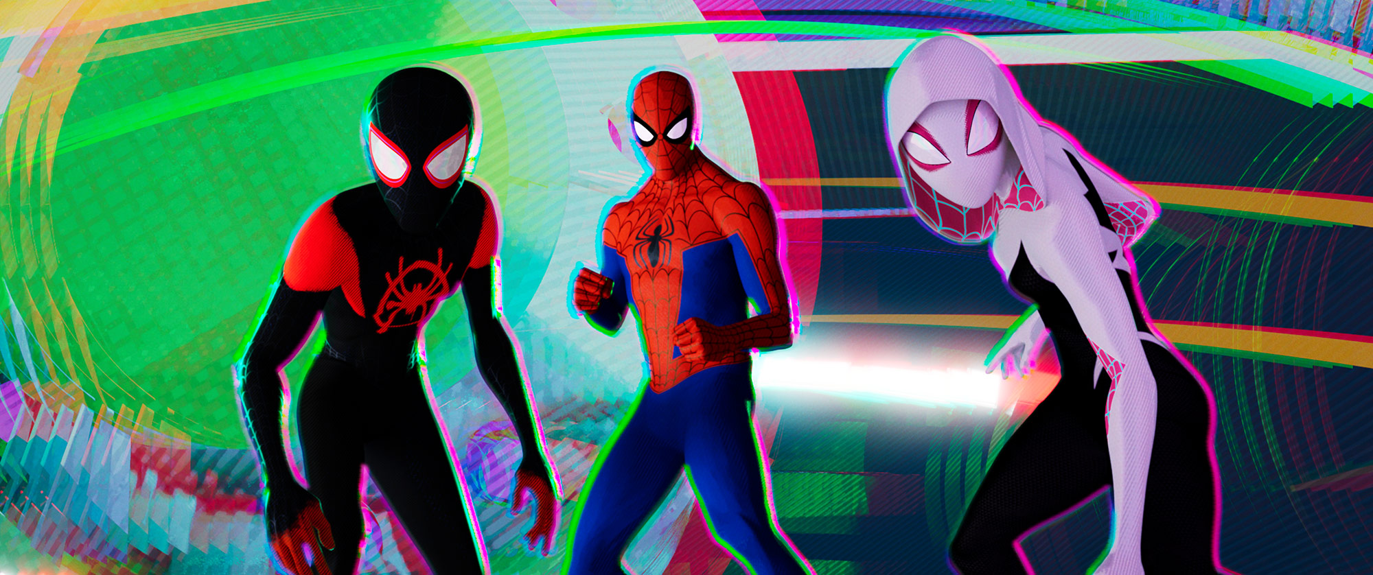
A Spider-person for every season
When dealing with the team of Spider people from other alternative universes, Thompson had to be cautious because they had very limited screen time. “I had to somehow explain to the audience and to Miles that these characters came from other universes that are very different,” he explained. On one hand, he had to make sure each of those universes felt distinctly designed and different from each other. At the same time, he had to ensure none of them became more enticing than Miles’ world. “I didn’t want them to become something that you felt like you didn’t get to see enough of and that you wished could’ve stayed in the whole movie.”
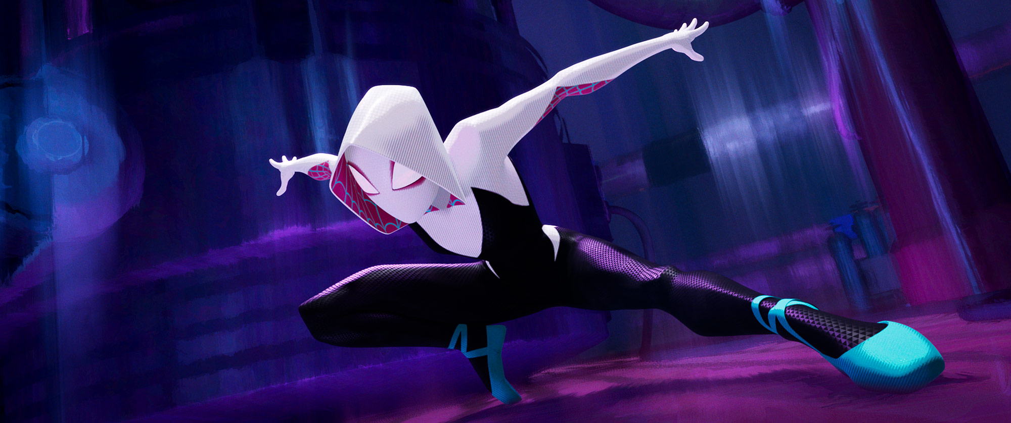
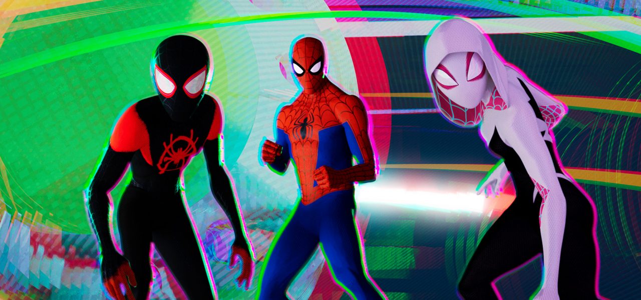
Aside from Peter Parker, Gwen Stacy (Spider-Woman) was the most straightforward one of the supporting heroes in terms of design. Thompson is deeply fond of Jason Latour and Robbi Rodriguez’s comic book series Spider-Gwen, which is focused on the character. “I loved how the covers of those comics have this beautiful dry brush streaky quality to them that I thought would be really cool since she’s telling her story in flashback.” The palette in those works consists of pink, mint green, and purple, which Thompson was really attracted to. He replicated that color palette and met Latour in person to show him what they we were doing.
For Spider-Noir, Thompson thought about Will Eisner’s comic work, and others dating back to the late-1930s when pulp detective comics were popular. For him, Noir represents those heroic noir figures before superheroes like Batman and Superman became all the rage. “Back then, a lot of them were printed in black and white, [and] they didn’t have the fidelity of printing in those days, so all of the Ben-Day dots were much bigger, the line work was much rougher, the characters didn’t have the same level of mid-tones that you get in comics now.” Thompson aimed to create a character that felt like he just stepped out of those comics and who couldn’t even understand the concept of color.
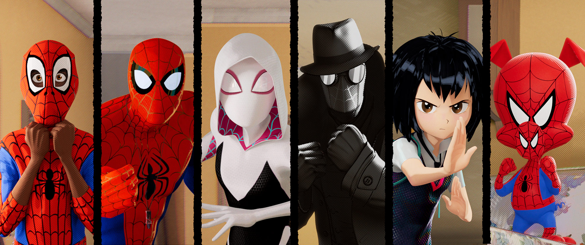
Then there was Spider-Ham, who reminded Thompson of Mad Magazine and the works of Sergio Aragonés and Harvey Kurtzman. Channeling those humorous cartoonists felt appropriate for Thompson given that he saw this project as a way to showcase the comic books as an eclectic art form. “There’s always been this idea in the public’s mind that comic books are one thing, and they actually aren’t; there’s every kind of comic you can imagine, and I wanted to honor that tradition,” he said. Manga was another big source of inspiration for capturing a sense of 2d drama for Peni Parker’s sequences, which can be best appreciated during a fight scene near the end of the film with the villain known as Scorpion.
“It’s really a celebration of all the different types of comic books, and how they all inform this Spider-Verse that Miles is a part of. They’re all unique in their own way, and I wanted to bring all these styles together,” concluded Thompson.