Interview: ‘Pachamama’ Director Juan Antín On How Stop-Motion Gave His CG Feature Its Unique Look
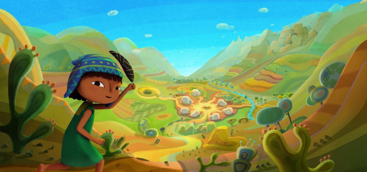
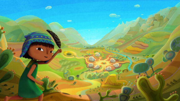
Set in 16th century South America, more specifically the Andes Mountains, Pachamama is a colorful cg animated feature by Argentine director Juan Antín and produced by Didier Brunner (The Secret of Kells, Ernest and Celestine) through his Paris-based studio, Folivari. Determined to tell a story from an indigenous perspective, Antín harnessed pre-Columbian iconography, including repetitive geometrical patterns particular to the region’s clothing and art, as the basis for the film’s character and production design.
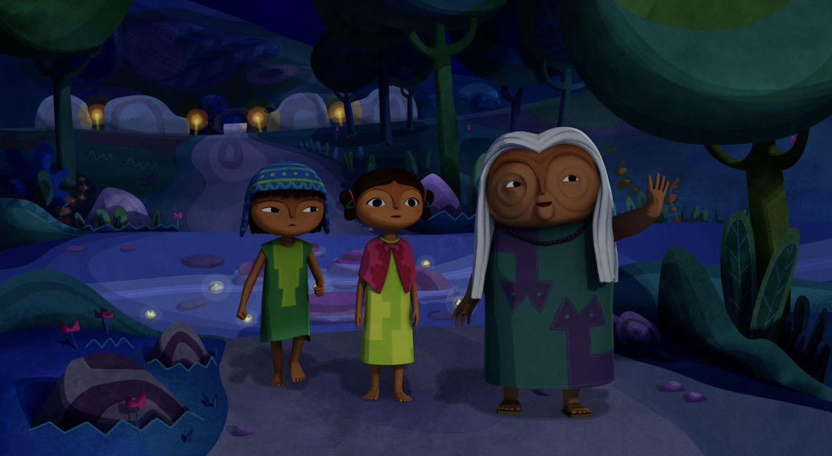
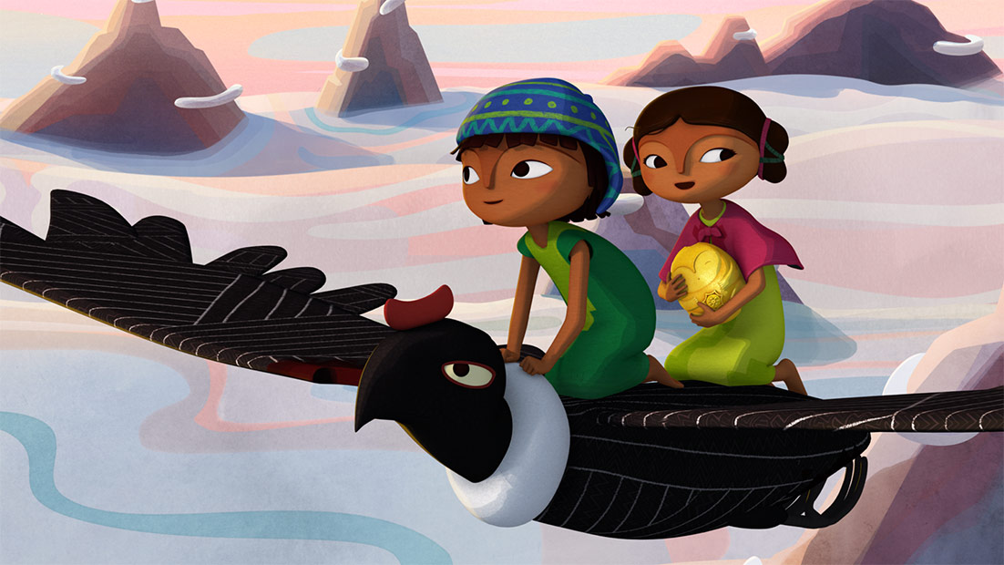
Pachamama places at the center of its narrative 10-year-old Tepulpaï, a vivacious kid with aspirations of becoming a respected shaman. But as his community engages in a ceremonial offering to the great spirit of Pachamama, an Incan overloads disrupts their sacred time and confiscates the town’s highly symbolic golden statue, which connects them to the Earth. Using this as an opportunity to prove himself, Tepulpaï embarks on a journey to recover the invaluable icon alongside his friend Naira and her pet llama.
The film had its world premiere last November in Hollywood at the Animation is Film Festival and was nominated at the Cesar Awards, France’s highest film honors. Netflix released Pachamama online on June 7, and the film also had a one-week, awards-qualifying theatrical run in Los Angeles.
Cartoon Brew recently spoke with Antín about the movie’s unique stylistic references, the complications of international co-productions, and why he originally wanted to make Pachamama as a stop motion feature.
Cartoon Brew: Where did your interest to make an animated feature centered on indigenous iconography and beliefs come from?
Juan Antín: Everything emerged from having traveled throughout the north of Argentina, Peru, and Bolivia, and having discovered the culture of the Andes and the culture of the Pachamama. I started working on this film about 14 years ago. My wife is an anthropologist, so we would travel together and while she did field research, I would interview shamans and people from these communities because I wanted to make a movie from an indigenous perspective.
Movies made about colonization have mostly been told from the point of view of the conquistadors. In order to make a movie from an indigenous point of view, it needed to be based on their art, which is the medium they use to represent themselves. We wanted to honor indigenous cultures, specifically those in the Andes. On a personal note, since I’m Argentine but from European descent, I felt that creating the film as a tribute to the Pachamama deity, I could somewhat ask for forgiveness for what my European ancestors did to these indigenous communities during the Spanish conquest of the Americas.
How did the information gathered in your research trips, including the first-hand accounts from indigenous people on how their worldview influences their art, translate into the visual language and the overall aesthetic we see in the final film?
Juan Antín: From our research trips we gathered a lot of material, including many photos from Peru, Bolivia, and Argentina. I did plenty of graphic research. The design process started once we were settled in the French studio, Folivari. This is a movie made primarily in France. I worked together with Maria Hellemeyer, who was the person in charge of the production design. Our character designs were mostly based on pottery, specifically on pre-Columbian Andean vases that we thought were shaped like round, funny faces. That was the inspiration for Tepulpaï and his community.
We also had to differentiate between the Incan world and the Pre-Incan world, so that the audience could more easily follow the story. Our solution was to make the Incas have square-shaped heads, because they represent an empire invested in architecture. For those characters we used their own constructions as reference, more than their art. We wanted their heads to look like if they were temples, also to have fun with the more strict aspects of the empire. The film’s design was also partially based on Spanish Renaissance art for the conquistadors. Those characters look more realistic in terms of their features. The indigenous characters have a more synthetic rendering, like indigenous art, which was simpler in terms of shapes and details.
The color palette in Pachamama is highly saturated and stands out as one of the project’s most striking features. What was the intent behind using vivid colors? Was this directly inspired by what you observed in the Andes?
Juan Antín: The color was born out of something that happens in the Andes. I’m not sure if it’s because the atmosphere is very thin since we are 4,000 meters (13,000 feet) above sea level, but colors always look really vibrant. The sky is turquoise. You also see this reflected in the indigenous people’s clothing. Their attires are rich in color. When you are in Bolivia or in Peru, what you witness is an explosion of color everywhere. The color palette there is made of saturated hues that are also very harmoniously combined. That was our inspiration. We wanted to reproduce those colors. At first it was difficult to impose those colors on the team because in Europe there’s a tendency to always bring down the colors or tone them down. There were many times that people in the team thought the colors were too strong and tried to make them more subtle, but I had to fight to keep them saturated. In the end we managed to impose that palette, and it’s one of things that audiences notice the most about the film. Those colors are really the Latino touch. Color is part of our culture.
Was your artistic intent always to make it as a cg project, or did you consider making it as a traditional 2d animated feature? As it stands, the movie seems to exist somewhere between hand-drawn animation and stop motion.
Juan Antín: I first wanted to make the film in stop motion. We even made a stop-motion trailer for it. The characters were essentially animated vases, heads made of clay, and it turned out really nice, but the faces were lacking expressiveness. Ultimately, all those designs we made in clay were useful later to design the characters for the cg version. I initially wanted to work in sop motion because its physicality relates to the earthiness of the story. I also thought about the clay, the gold of the Incas, and the metal of the conquistadors, which are tangible materials. I felt the movie needed to have those materials.
I’m a big fan of stop motion, so we tried it, but as time went by I realized that stop motion is much more difficult, much more expensive for our budget, and the tests we did in cg were good. We realized that even if it was going to be cg, we could add textures so that it didn’t have a cg look that makes you aware it’s from a computer, but more closely related to the materials in the story. We scanned watercolors and we applied them as textures on the characters’ faces, as well as on the backgrounds. All of the development we did with stop motion in mind gave Pachamama a unique look, which is not entirely cg. One of my major notes to the animators was not to make the animation totally fluid; I wanted it to resemble stop motion.
How many studios were involved in the making of Pachamama and what’s your takeaway from the experience of working with multiple companies on a project?
Juan Antín: There were three studios involved. It was a co-production between France, Luxembourg, and Canada. The main studio was Didier Brunner’s Folivari, who’s the famous producer of Kirikou and the Sorceress and The Triplets of Belleville. We developed the film at Folivari, which was our headquarters from where we coordinated all the aspects of the co-production. However, all of the actual animation was done in Montreal, Canada at Kaibou Productions, and the backgrounds were done in Luxembourg at Doghouse Films. In Paris, we were a small team and we coordinated everything via Skype and using applications that allow resource sharing we managed the production pipeline. It was complicated because we were dealing with several studios around the world in different time zones. Working on a co-production like this is rather complex. Once production started it took us two years to complete the film, from when we started creating the backgrounds and modeling the characters.