
This Video Traces The Visual Evolution Of ‘The Simpsons’ Over The Years
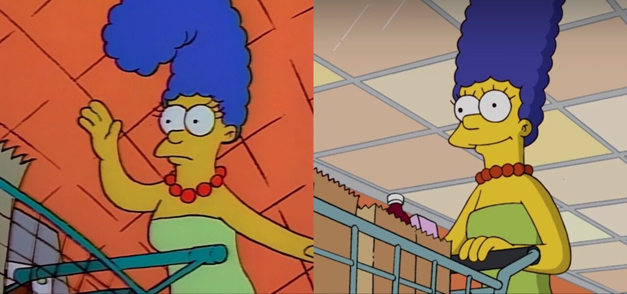
Does Marge’s hair look better when it swings round, rubber band-style, or when it turns crisply? How much background detail is too much? Arguments about evolutions in the visual style of The Simpsons continue to rage among fans, as a kind of proxy for the broader debate about how well the show has aged.
Insider has intervened in the discourse with a neat video overview of the Fox series’s visual changes over 30-plus years, from the rough-and-ready cel animation of the earliest episodes to HD slickness of recent seasons. Two Simpsons veterans, showrunner Al Jean and animator-director David Silverman, contribute insights and reminiscences. Watch the video below:
The video is especially good at showing how technological progress can spur subtle changes in directing and even storytelling. The move from cel to digital, for example, facilitated more complex compositing, laying the groundwork for, say, a storyline in which Homer clones himself many times. The later shift to a wider 16:9 aspect ratio meant that more action could be staged within a shot, enabling longer shots in turn.
The interviewees are also candid about the drawbacks of this progress. Jean notes that when the crew moved to HD, they effectively lost access to their library of backgrounds and other assets from previous seasons. He adds wryly that they were given no extra time or money to update the title sequence to HD.
The video may not change minds about which incarnation of The Simpsons looks best. At the very least, it’s an accessible lesson in how constraints of time, money, and technology can shape the stories told and art created in animation.