‘The Summit Of The Gods’: How The Manga Was Adapted For The Screen
In The Summit of the Gods, which is released on Netflix tomorrow, famed Japanese mountain climber Joji Habu sets out to climb Everest in very difficult conditions, accompanied by photographer Makoto Fukamachi.
The filmmakers faced a task of similar proportions: the European feature adapts the epic manga of the same name, which runs to around 1,500 pages of knotty intrigue and psychological complexity. Based in turn on a novel by Baku Yumemakura, the manga is illustrated by the late Jiro Taniguchi, who was known for his detailed, naturalistic draftsmanship.

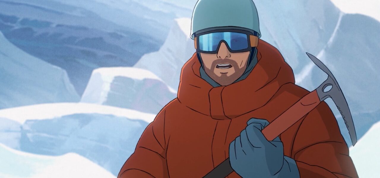
The Summit of the Gods does a fine job of translating the manga to the screen, simplifying plot and graphic style where necessary, while deploying those features unique to cinema — color, music, time — with flair. To learn more about the changes made along the way, we spoke to director Patrick Imbert about a single scene in which Fukamachi leaps across a crevasse during the ascent. We’ve reproduced the relevant section from the manga below, alongside the animatic and final scene from the film. Read on to find out how Imbert and his colleagues tackled the sequence:
Patrick Imbert: The film is always different from the manga — sometimes completely different — simply because it’s a different medium, a different sense of time, a different frame. For example, we wouldn’t be able to copy the comic’s panels [for the storyboard]. It wouldn’t work.
In the manga, the scene where he jumps is quite short; it’s just one moment in the ascent among many. In the film, I wanted to turn it into a key moment — one of the three big stages that pace the first day, alongside the vertical face and the avalanche (a bit like levels in a video game).
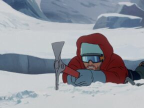
Below: the jump scene in the original manga (French translation). © PAPIER/Jirô TANIGUCHI 2000-2003 © Baku YUMEMAKURA 1994-1997


So the directions for storyboard artist Etienne Mattera, as for the animatic, were not to rush it, to develop it, to really show the difficulty, to be as close as possible to Fukamachi and to convey what he’s going through to the viewer. We first worked with the awe-inspiring aspect of the crevasse, then with Fukamachi’s preparation, so as to build suspense and better accentuate the moment of the jump itself. The music plays a big role in the scene, which of course isn’t possible with pen and paper.
For the reasons above, the storyboard was never close to the manga: the action is the same, but not the way it’s depicted. Etienne understood what I wanted and got it right straight away with the first version, which is more or less what we see in the film. We cut a few shots at the animatic, which happens all the time, then when it came to background layout we sought to reinforce how awe-inspiring the crevasse is through wide shots.
Overall, this scene required relatively little work. Others were far harder, and went through many versions and changes.
I never tried to be faithful to Taniguchi’s aesthetic, neither for the characters nor for the backgrounds. What I find interesting about this artist is not his drawings but his talent as a narrator, his point of view on things, the depth and psychological complexity of his characters.
I’m exaggerating: I find his compositions superb, especially in the mountain scenes. In some cases, their evocative power gave me inspiration for images in the film, even though, of course, you can never reproduce a frame in a comic as it is, because the format of a film is different.
Mangas are in black and white for economic reasons, but not films. I wouldn’t say that [the addition of color] allows more freedom [in terms of composition], but it creates more possibilities. Let’s say it’s a larger toolbox. In this film, the choices of colors are very important for the atmosphere, and they contribute hugely to the film’s identity. We didn’t want classic animation palettes: our influences were more from live action or photography.
That said, thinking in black and white is very important: it’s what lets you play with light and obtain beautiful contrasts. Artists working in animation often think in terms of color and not enough in terms of light. I realized this (fairly late on) when I discovered printmaking, where there’s no color, no Photoshop, and if you want it to work you have to think in black and white.
Imbert’s comments were sent by email. They have been translated from French and edited for brevity.
Images from the film © Le Sommet des Dieux – 2021 / Julianne Films / Folivari / Mélusine Productions / France 3 Cinéma / AuRA Cinéma