
What Every Animation Student Should Know About Title Sequence Design
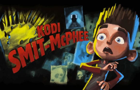
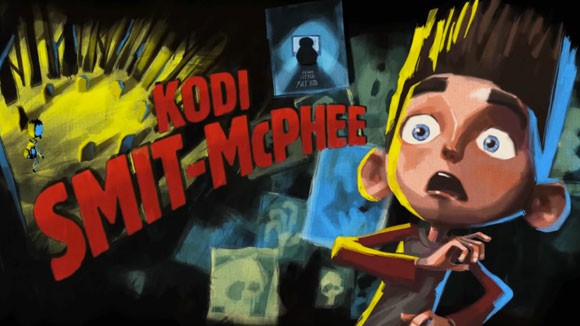
 Art of the Title, an addicting resource with dozens of high-def clips, recently posted their Title Design Finalists for the SXSW 2013 Film Awards. Of the animated title sequences, The Man Who Shook the Hand of Vicente Fernandez and ParaNorman are standouts: the first for its use of vintage woodblock typeface and spaghetti western aesthetic, and the latter for its 1950s horror-inspired design. Both sequences are richly nuanced, and imply an understanding of the history of typography and graphic poster design. This applied visual knowledge is the direct result of the collaboration between animators and designers.
Title sequence design has evolved since the days of Saul Bass, Maurice Binder and Pablo Ferro, some of the most recognized godfathers of the artform. More and more animators and graphic designers are building entire studio practices devoted to title sequence design. The first (or last) fifteen minutes of any film is increasingly crucial to the overall art direction, and often seen as an opportunity for experimentation.
I’ve spoken with several young animators who still treat title sequences as an after thought. Or, even worse, they just slap on the default fonts provided by Flash or After Effects. I’ve never understood this attitude. Think of it this way: you wouldn’t spend several months working on a cake recipe, bake it to perfection, just to cover it in store-bought icing. But for animation students just starting out, executing a thoughtful title sequence in addition to animating a film can be overwhelming. Fortunately, help is usually nearby in the graphic design department, where students will leap at the chance to assist in creating a title sequence.
One of the (many) ironies of higher education is that colleges attract hordes of bright, eager students, then isolate them into separate buildings, sometimes several city blocks or miles from each another. When I was a design student at the University of Texas, the animation students didn’t even realize my department existed—and vice versa. Unfortunately, animation and graphic design departments are rarely adjacent, and it’s up to students—not their teachers—to make these connections.
So if you’re an animation student, do yourself a favor: open up your university map, locate the graphic design school, then drop by and make introductions. Not every animated film, short or feature-length, needs a complex, typeset title sequence with bells and whistles. But building relationships with graphic designers, especially now that motion graphics is a required area of study in many design schools, could yield infinite possibilities with mutual benefits.