
2027 Oscars Short Film Contenders: ‘Apart’ Director Pola Maneli
Stay informed with free updates
Sign up to get our news digest — delivered directly to your inbox twice a week.
Welcome to Cartoon Brew’s series of spotlights focusing on the animated shorts that have qualified for the 2027 Oscars. The films in this series have qualified through one of multiple routes: by winning an Oscar-qualifying award at a film festival, by exhibiting theatrically, or by winning a Student Academy Award.
Today’s short is Pola Maneli’s Apart, written by Spike Lee, Tim Jones, Jeff Leisawitz, and Lubabalo Mtati. Made in association with Taking Over NY and 40 Acres and a Mule Filmworks, the film features music supervision by Black Coffee and wardrobe design by Laduma Ngxokolo. It qualified for Oscar consideration by winning Best in Show at SIGGRAPH 2026.
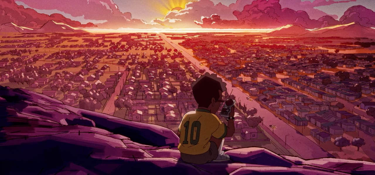
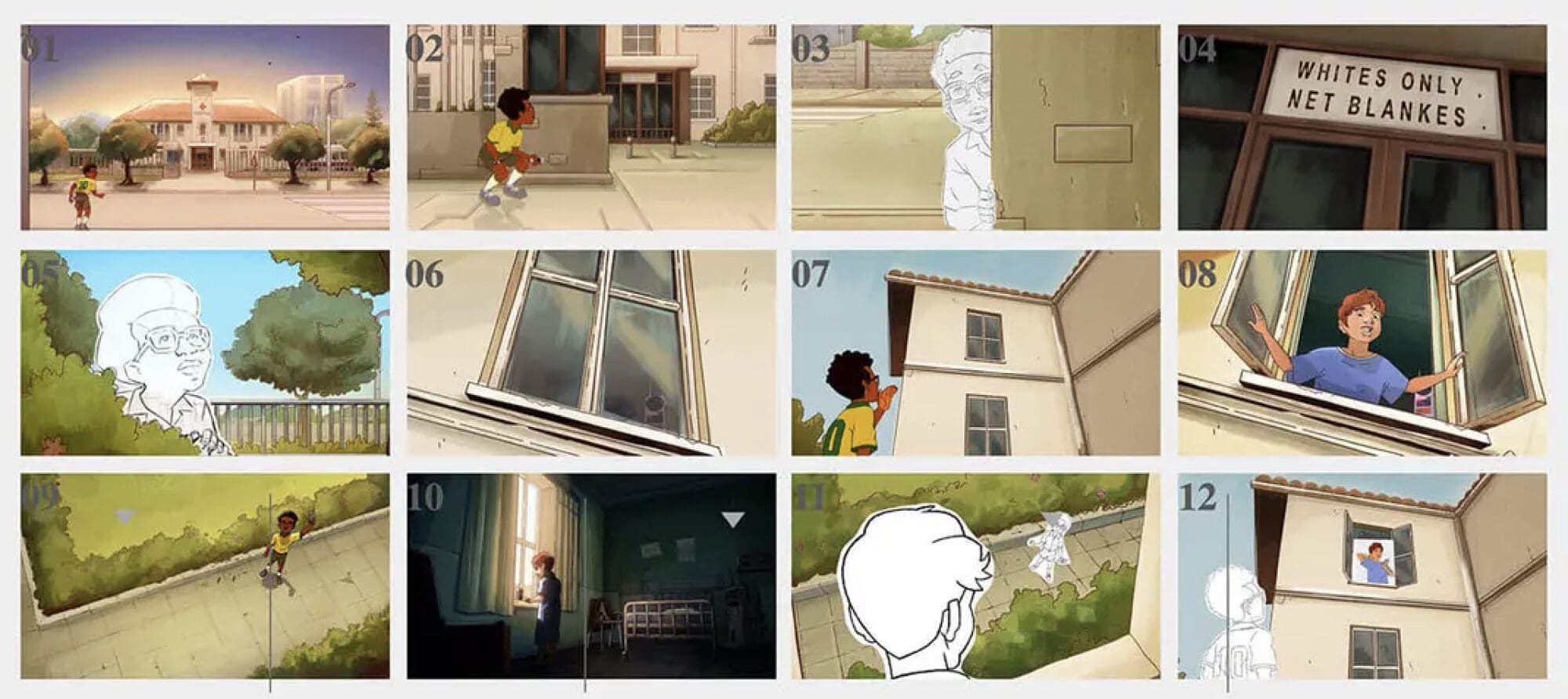
Set in apartheid South Africa, Apart follows a forbidden friendship between two boys, tested by a life-saving act that forces them to confront the hatred dividing their world. Maneli draws on the visual language of anti-apartheid woodcut prints, combining rough lines and angular forms with harsh sunlight and shadows that evoke Nguni geometric patterns. Seen through a child’s eyes, the story connects an intimate relationship with the political system shaping it.
Cartoon Brew: What was it about this story or concept that connected with you and compelled you to direct the film?
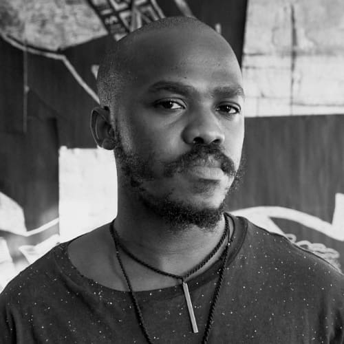
Pola Maneli: I loved that the script had the potential to hold space for deep emotional exploration of these characters as well as an acknowledgment of the political and sociocultural environment they existed in. I believe that the internal and external are inextricably linked, and exploring the reality of one can only deepen the understanding of the other.
I knew that I wanted to bring this supposed juxtaposition into sharp relief by telling the story through the eyes of our child protagonist.
What did you learn through the experience of making this film, either production-wise, filmmaking-wise, creatively, or about the subject matter?
I did a lot of deep historical research prior to production, and despite being born and raised in South Africa, I was heartbroken by how comprehensive apartheid was in its brutality. The extent of the cruelty of those policies still isn’t adequately understood by the public. I also came across a handful of anecdotal testimonials from Black children during the period, and those affected me quite a bit as well.
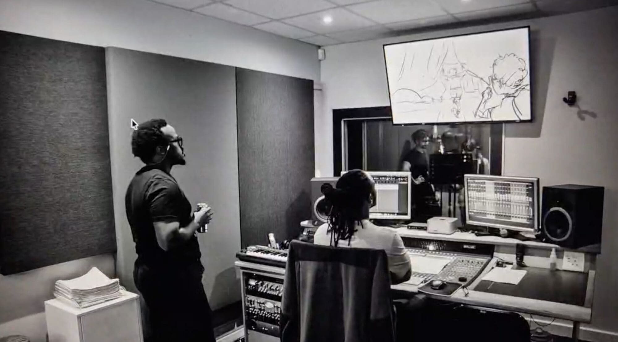
As far as the process of filmmaking goes, being a first-time director meant that almost everything was a new lesson for me, and that meant having to absorb and process a lot of things on the fly. However, I was incredibly fortunate to have great support in the form of our animation production company, Colossal.
For example, as someone with a background in illustration, I pride myself on my drawing ability and stamina, so I think I initially tried to overcompensate for my lack of experience as a director by taking on a lot more technical tasks than I needed to. Thankfully, it didn’t take long for me to realize that this wasn’t the most efficient use of my time. Learning to loosen my grip and trust in my ability to express ideas to my collaborators through communication rather than execution was a big turning point early on.
There were quite a few learning moments like that.
Can you describe how you developed your visual approach to the film? Why did you settle on this style and technique?
I started out by looking at examples of live-action movies that were shot in high-humidity conditions that mimicked the feeling of a hot South African summer. From that, I knew that I wanted to have hard lighting with sharp shadows that would convey the feeling of an afternoon sun beating down directly on you.
From there, I felt there could be an opportunity to abstract those sharp shadows into geometric shapes that could be evocative of Nguni geometric patterns. I really liked the idea of using the light to allude to something geographic as well.
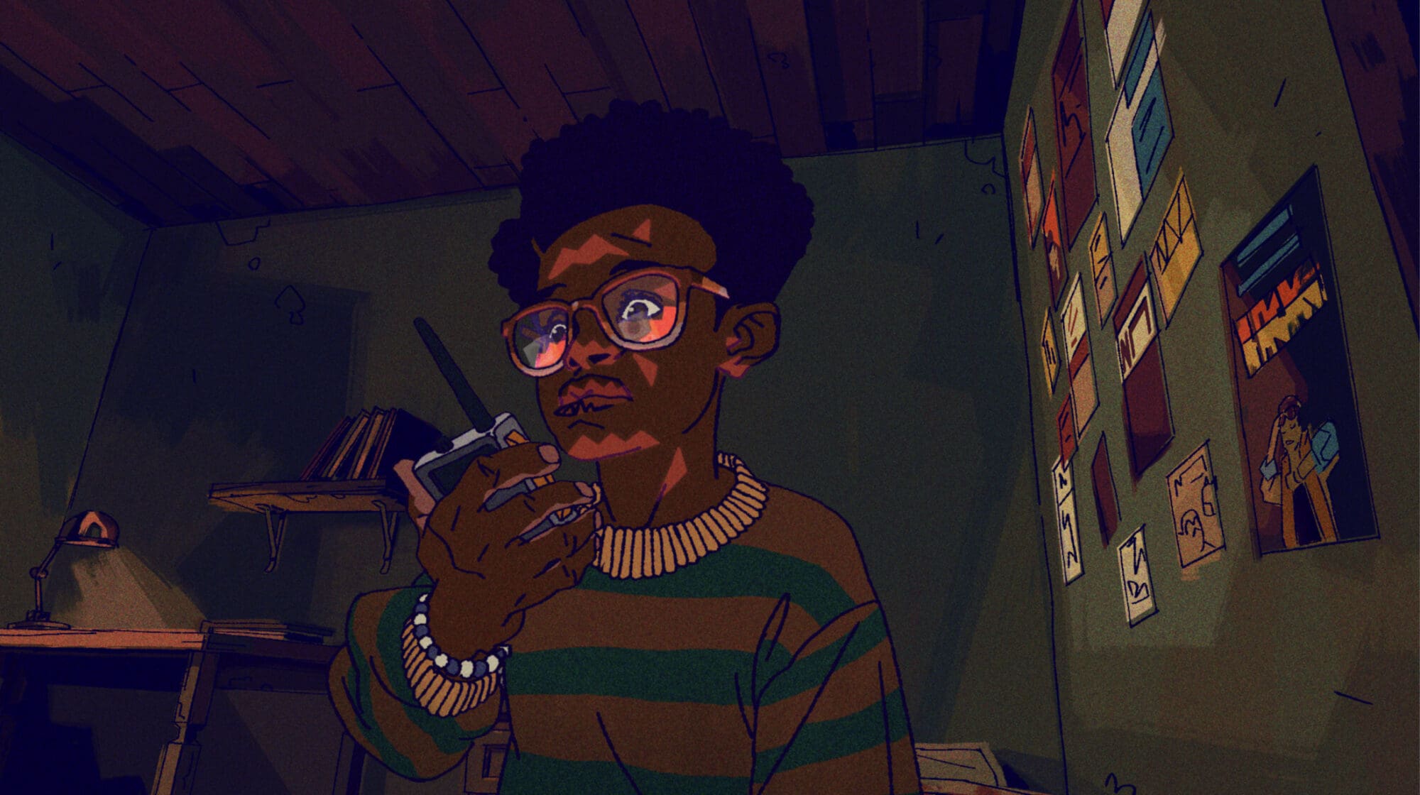
I knew that taking that approach to the lighting meant that the figures themselves would have to be fairly simple. We had a little bit of angularity in the figures, but not so much as to bring too much attention to itself and end up overwhelming the audience with “a hat on top of a hat,” so to speak.
The film draws on the visual language of woodcut prints used in anti-apartheid resistance. How did that historical connection influence your approach to the animation?
Visually, it meant that there was a certain degree of smoothness to the animation that I wanted to avoid. We achieved that by using hard, angular brushes in the background paintings wherever possible, as well as mostly animating on twos. We also tried to preserve a bit of roughness in the character linework to simulate the limitations of the medium when it came to depicting curved forms.
But at a storytelling level, those protest posters, for me, clearly showed that it was more than possible to reflect real-life circumstances without ever having to compromise on beauty—and that, in fact, beauty is an essential tool in giving your message the best possible chance of being spread as widely as possible.