Crafting A Viral Sensation: ‘Lackadaisy’ Director Fable Siegel Shares Behind-The-Scenes Stories And Artwork
Since releasing on March 29, Fable Siegel’s animated adaptation of Tracy Butler’s Eisner Award-nominated webcomic Lackadaisy has become a viral sensation, racking up more than 6.3 million views on Youtube and more than half-a-million subscribers.
Created as a short and/or pilot for something larger, Lackadaisy was directed by Siegel, produced by Iron Circus Animation, and made by a crew of more than 160 artists from around the world. It’s the first multimedia endeavor from Iron Circus Comics’ new animation branch, which was able to crowdfund a budget of more than $330,000 from 6,000 backers on Kickstarter and Patreon.
We asked Siegel about the work required to adapt the original comic, aesthetic choices made during development and produciton, and the balancing act required when animating anthropomorphic felines.
Cartoon Brew: There are several artifacts left from the animation process that are very charming. Was that a stylistic choice, or one of practicality?
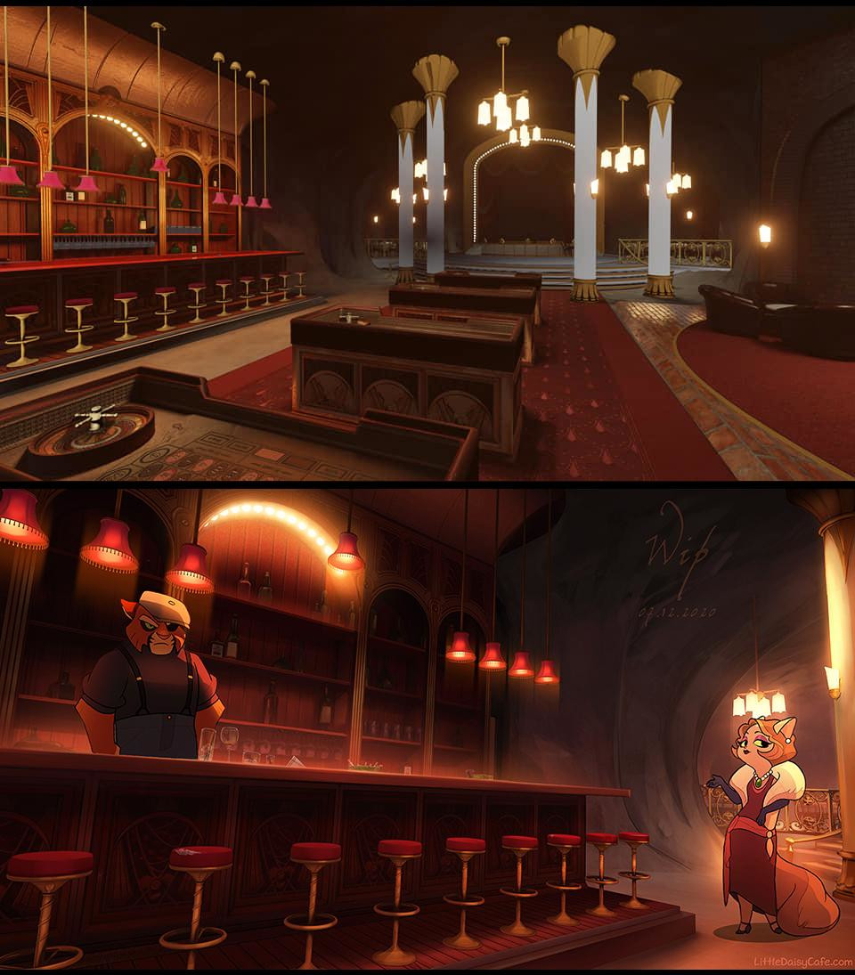
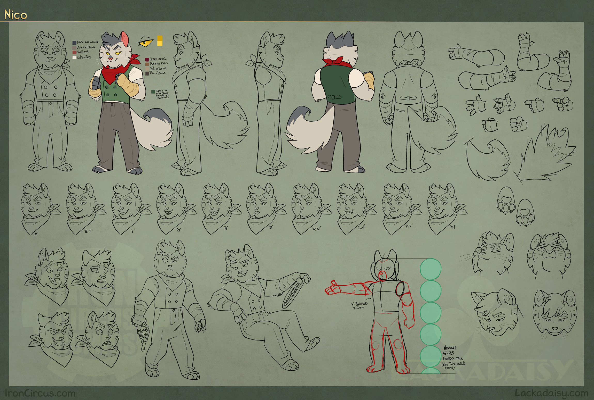
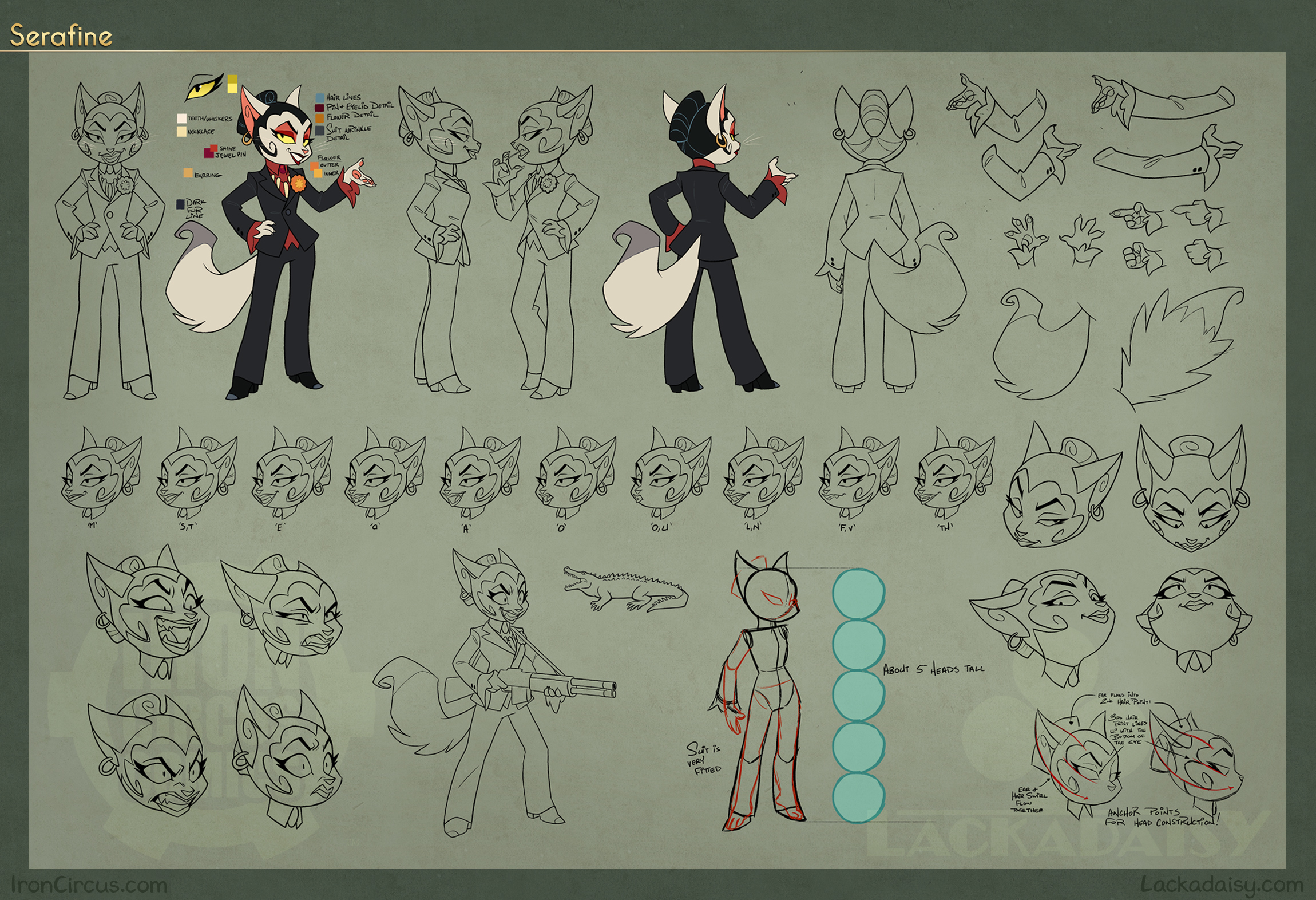
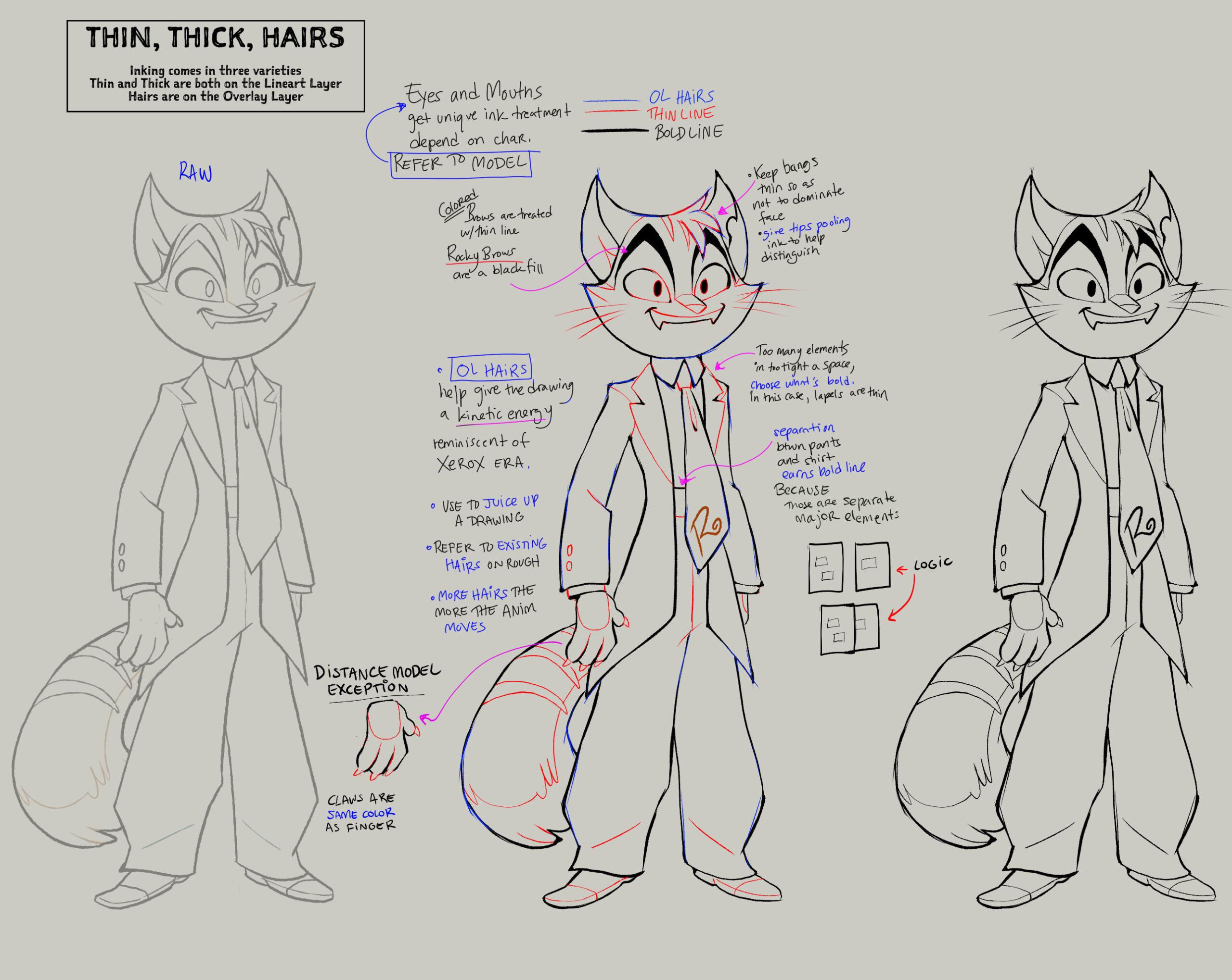
Fable Siegel: Stylistic, but also practical. Draftsmanship is a core component of hand-drawn animation, but it’s impossible (and sometimes unwarranted) to excise the “flaws” that make that hand obvious. Rather than hiding it, I embraced it. Where we can show off something of the animator’s and cleanup artist’s work, in a way that doesn’t draw the eye away from the shot’s focus, then I leave it in. That’s the distinction between hand-drawn and any other animated medium, cousin to the approach in stop motion where thumbprints and fabric ripples are retained.
I have faith that the audience will know these are drawings and still get sucked in. Like a good puppet show, the reality of the performance is part of the performance. The mastery is part of the intrigue.
It also has a pretty nice knock-on effect of allowing me to loosen up a little when giving notes for an already demanding exercise. Perfection is a poor goal when making art.
Ironically, adding in the construction lines was more work than leaving them out. It’s actually entirely the hand of the cleanup artist…to mess it up! And often it’s a reflection of the character’s internal state, ala Wolfwalkers. I’m hoping that as Lackadaisy moves forward, we can keep exploring texture as a component of the story. I’m a big fan of dirt. There’s even a fake “paint boil” if you notice, to simulate vinyl paint on cels!
It’s obvious in looking at the comic and the animated short side-by-side that they’re the same property, but there are some significant aesthetic differences too. Can you talk about adapting the illustrations into moving images and what changes you made to facilitate the process?
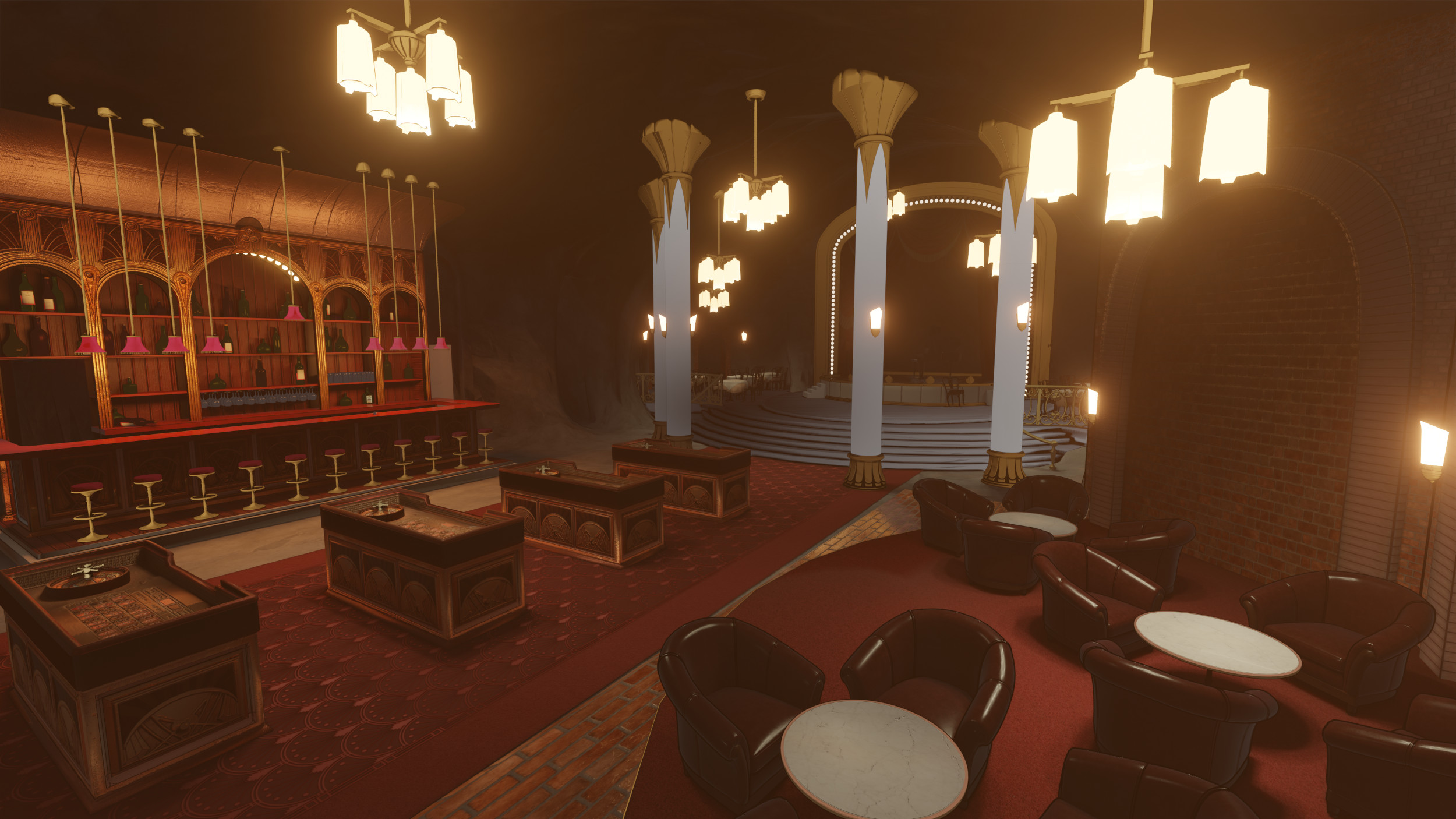
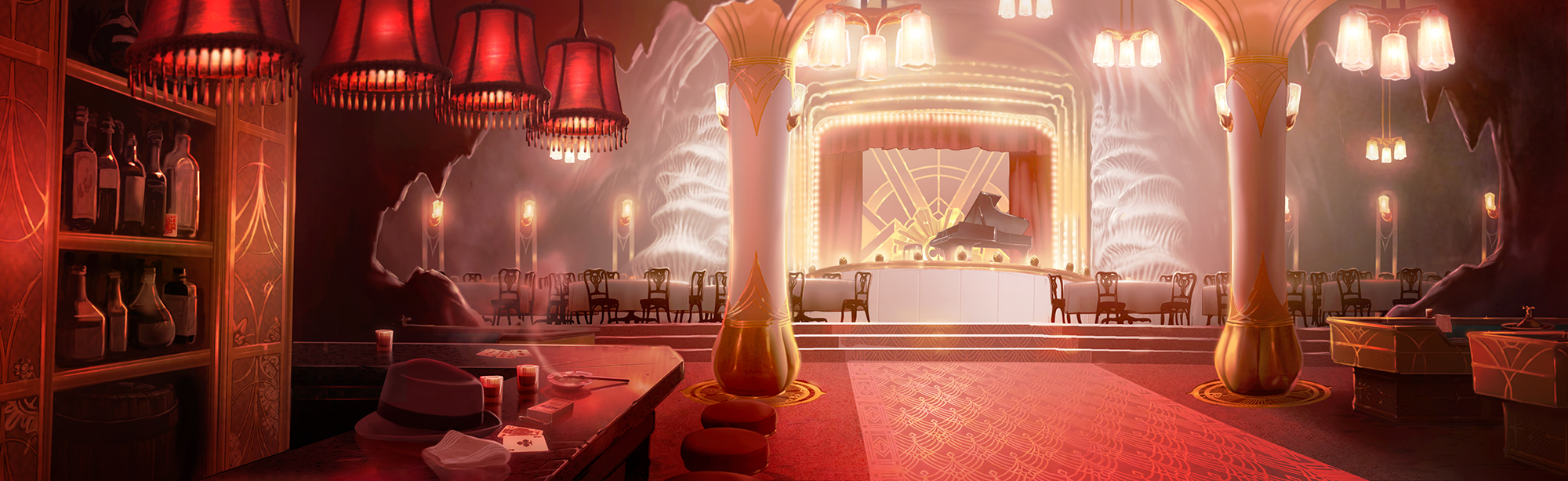
Siegel: There’s no realistic way to adapt Tracy Butler’s magnificent illustrations into hand-drawn animation, at least not without the budget, manpower, and software of Klaus. And no shade on Klaus, but there wasn’t a desire to achieve that degree of render mastery. Tracy, like myself, loves hand-drawn animation that shows off the raw work of the original animator as much as possible. It evokes the films that inspired us as children of the 1980s and 1990s, which goes hand in hand with Lackadaisy’s examination of nostalgia. Despite its beauty, pining for an idealized version of the past can be an extremely destructive force. And choosing the aesthetic of animation’s Xerox and Renaissance eras leans into an emotional subconscious in the audience that would be missed if taken in another direction.
Admittedly a “rubber hose” look would’ve been more appropriate to the time period depicted, but it would’ve lacked the visual oomph we pictured. Besides, what is the look of the darker and more mature animations we could recollect? It was the Xerox era, when grit and experimentation were all the rage; when “adult animation” scurried out from Disney’s long shadow in the United States. And Bluth’s weirder, more mystical and darker explorations, rose up.
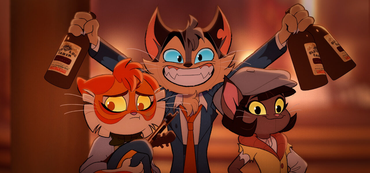
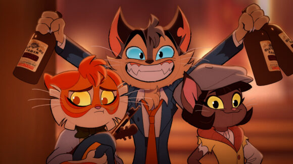
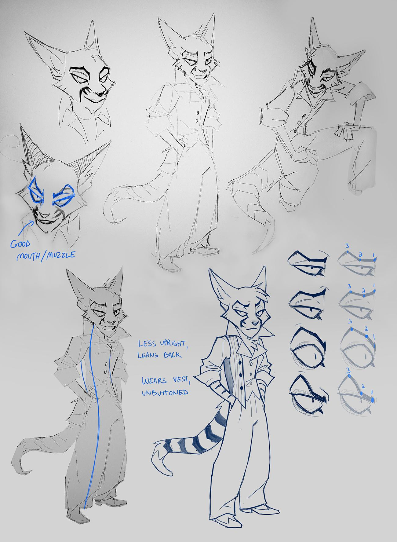
It’s one thing to draw anthropomorphic cats for a comic and another thing entirely to make them move on the screen. How much did feline movements influence the movement of the characters in the pilot? And how did you strike the balance between human characteristics and those of cats?
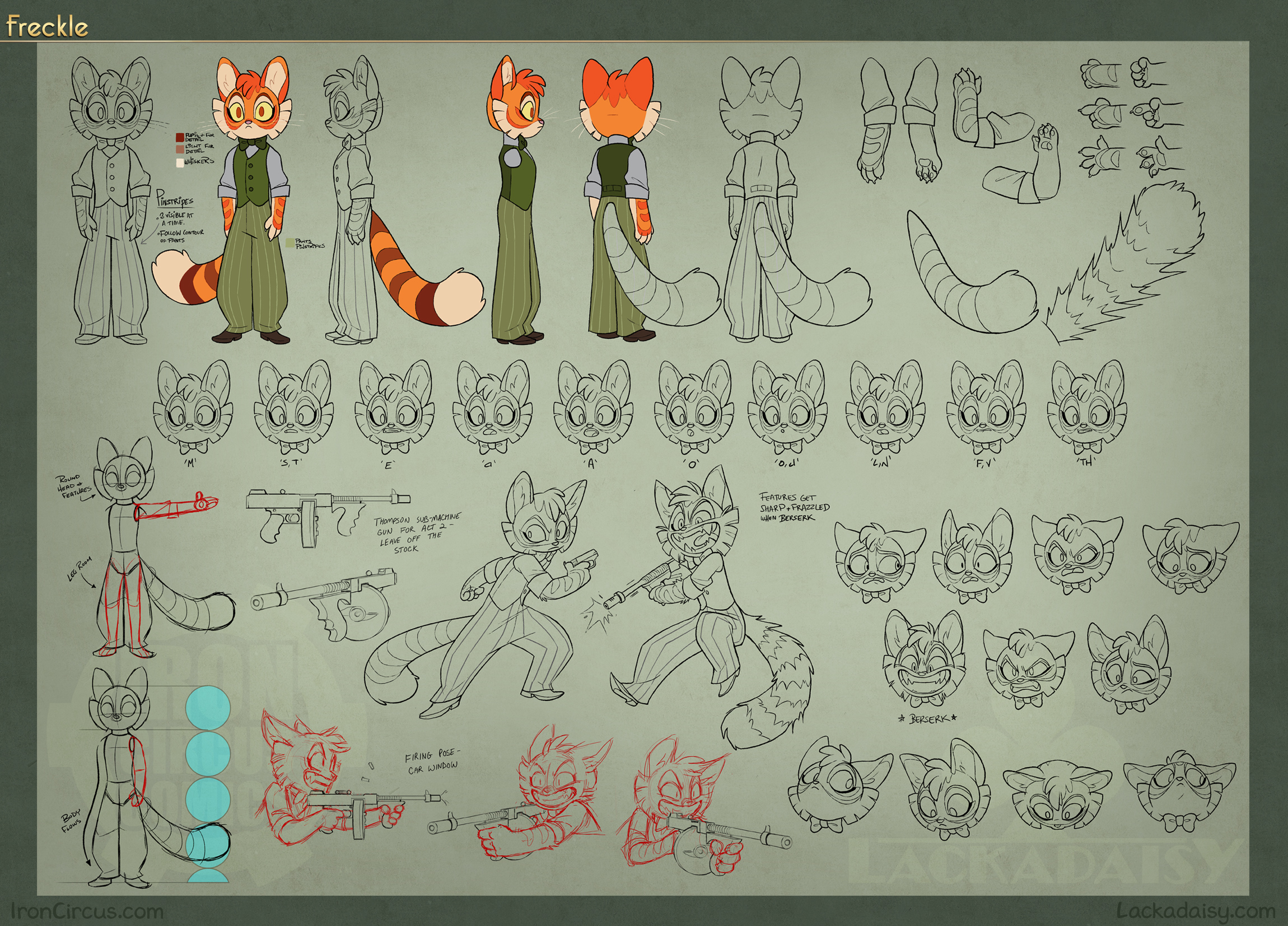
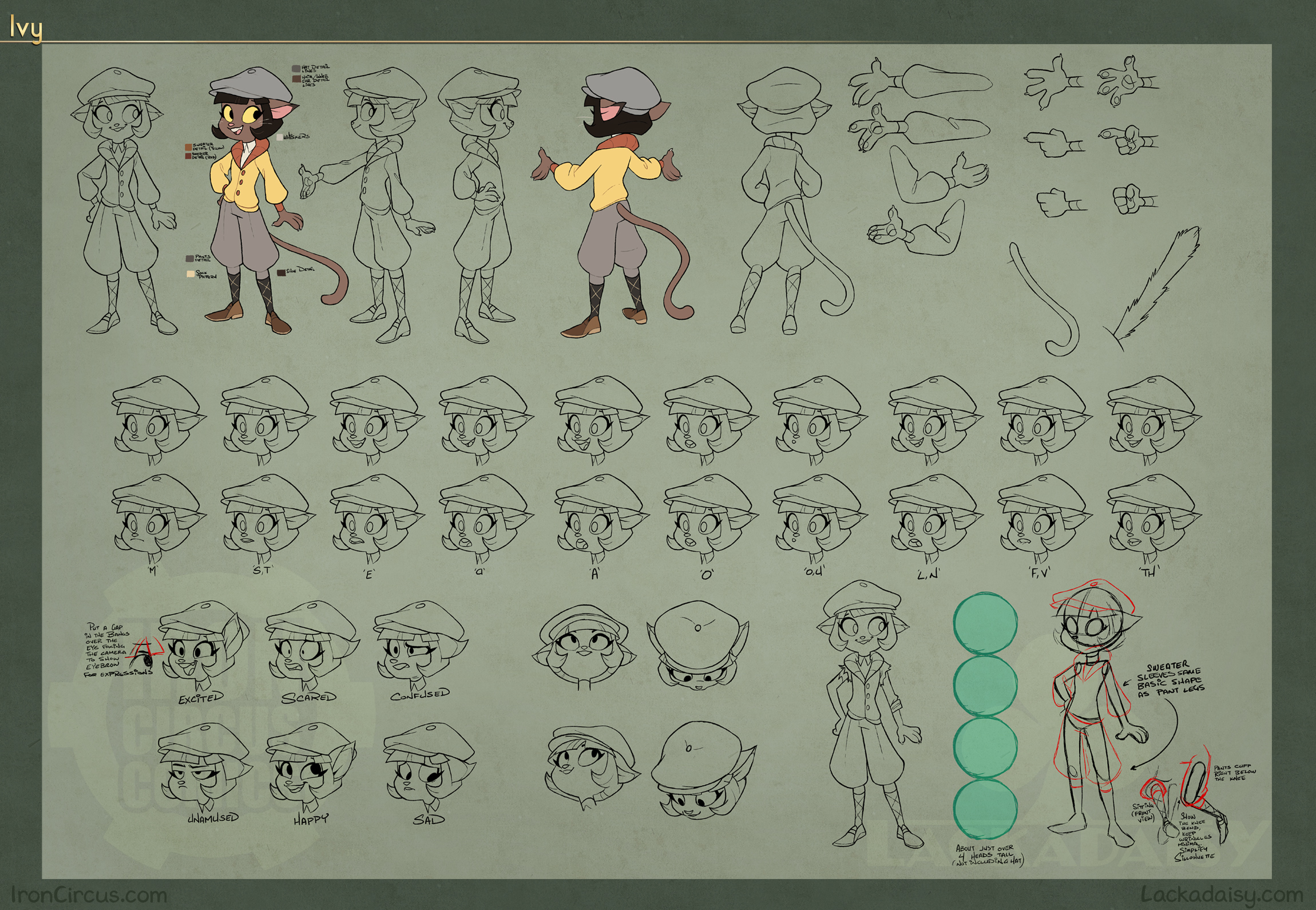
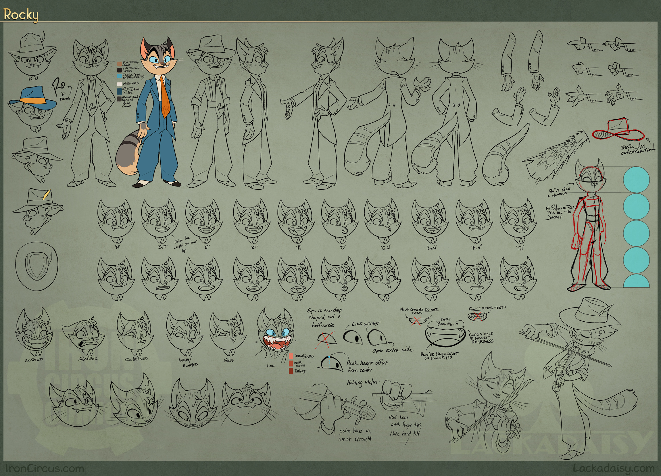
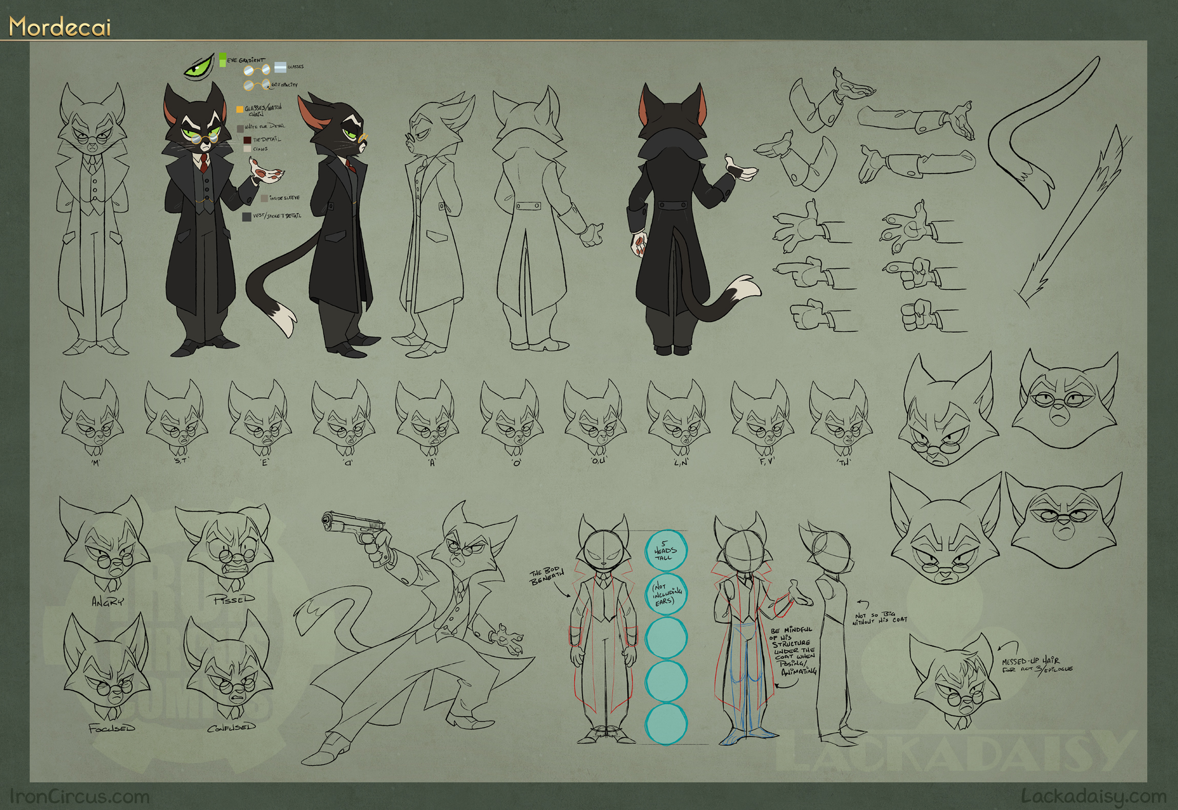
Siegel: Well for the most part if it was an emotion or action that could be emphasized via animal features, we’d opt for it. The animal parts act as a kind of “thought bubble,” revealing the character’s personal quirks and anxieties. Rocky’s feral mania wouldn’t come across quite the same way without his signature grin. Mordecai’s emotional state would be unreadable if he lacked ears and a tail. And all with no pause in the flow of conversation or action. All you have to know is the basic body language of man’s other best friend. And if nothing else, it’s really funny.
The balancing act was in choosing how much to emphasize. If their emotions are always readable via body language, then it becomes so much a part of the character that you forget they even are cats. Up until they hiss or get the zoomies. But the rare instances we draw attention to the visual pun have earned the laugh by catching you off guard. You forgot they were animals at all. And thus, it adds to the humor way more than if they spouted lines like “NYAH see?” and were running milk and catnip instead of alcohol.
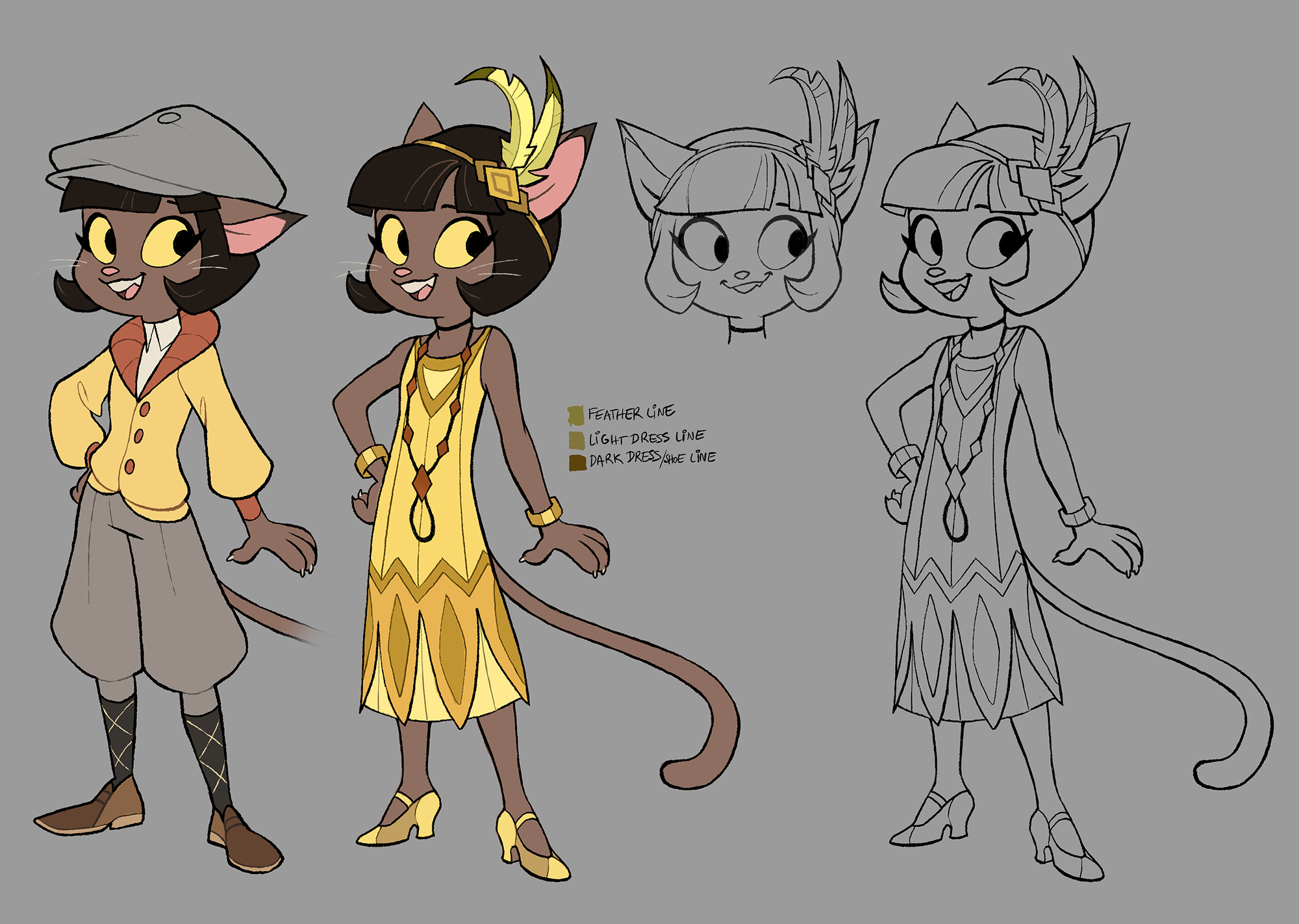
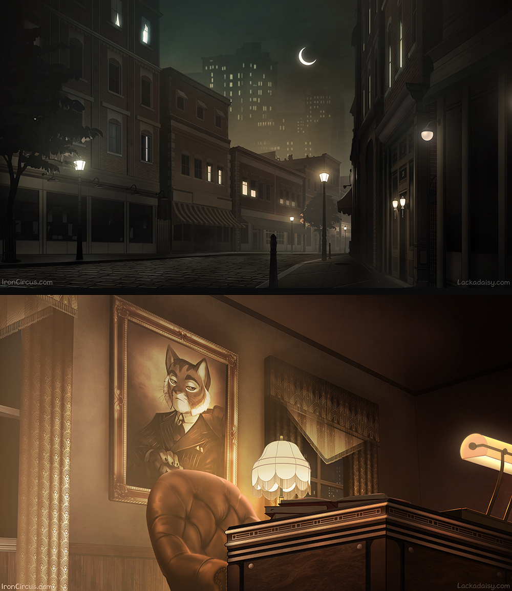
The outfits, vehicles, and scenery all provide a very clear picture of where and when this story takes place. What sorts of visual influences did you lean on in building the animated world of Lackadaisy, aside from the original comic?
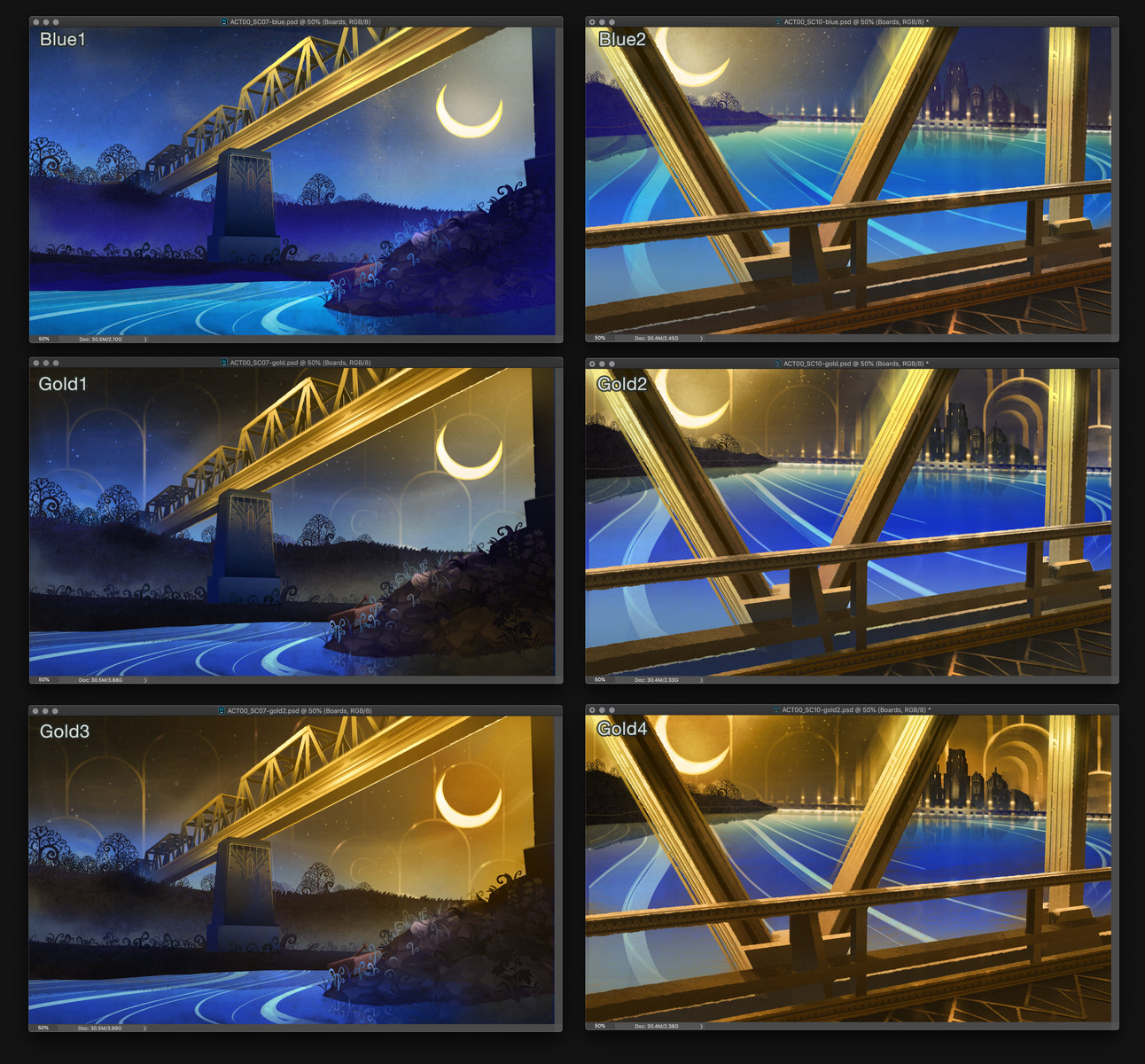
Siegel: For the “real” world, it’s mostly a limited palette that leans into the desaturated and monochrome to maintain “realism” as much as possible and lend weight to the world around the characters.
But the dream space…
Totally awash in saturation and contrast. Realism is done away with, replaced with scenes unconcerned with continuity or consistency. They’re individually and together responsive to the emotional state of whatever character they’re reflecting (either Rocky or Mitzi, in the pilot’s case) because the imagination is unbound by the physical world.
Rocky’s opening poem surrounds him with the signature Art Deco of the 1920s; the exultation of industrialization’s excess. Construction and machinery are integrated into the design and amplified. And that romanticization pairs nicely with Rocky’s nostalgic prose. A little touch of Deco’s predecessor, Art Nouveau, in the natural elements compliments the angular structures well. So we’re instantly drawn into a world that screams “1920s” without relying on the sepia wash that so dominates the era’s usual depictions.
Mitzi’s reverie is far more impressionist inspired. Her recollection of Lackadaisy’s past is literally “rose-tinted”, softer and more glamorous than the reality we just witnessed. The indistinct crowd of partygoers obscured by glitz and glitter are mere smears of paint shimmying to the tune. And even the band, the original family she entered Lackadaisy with (as a former singer and musician herself) blends into the backdrop to be covered by the descending logo and closing doors. It’s beautiful, but in a way that implies a danger we’re eager to explore further.