
This Year’s Oscar Shortlisted Filmmakers Discuss Their Visual Approach To Storytelling
Oscar nomination voting is underway and wraps up on January 16. To provide more context to this year’s animated short race, we spoke to the filmmakers behind the shortlisted films about
For this piece, we asked the directors to describe how they developed the visual approach to the film and adjusted the style or techniques they’d used for their previous work.
Here are their replies in reverse alphabetical order.
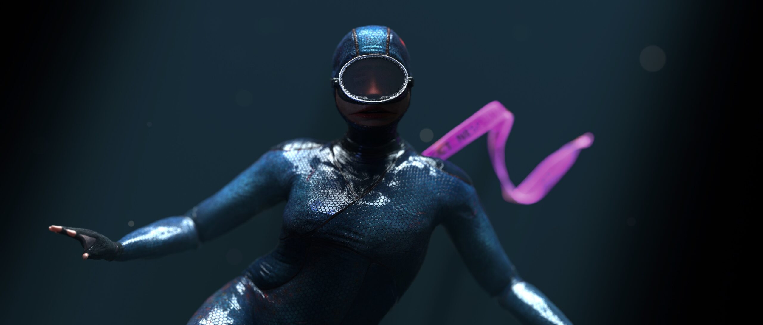
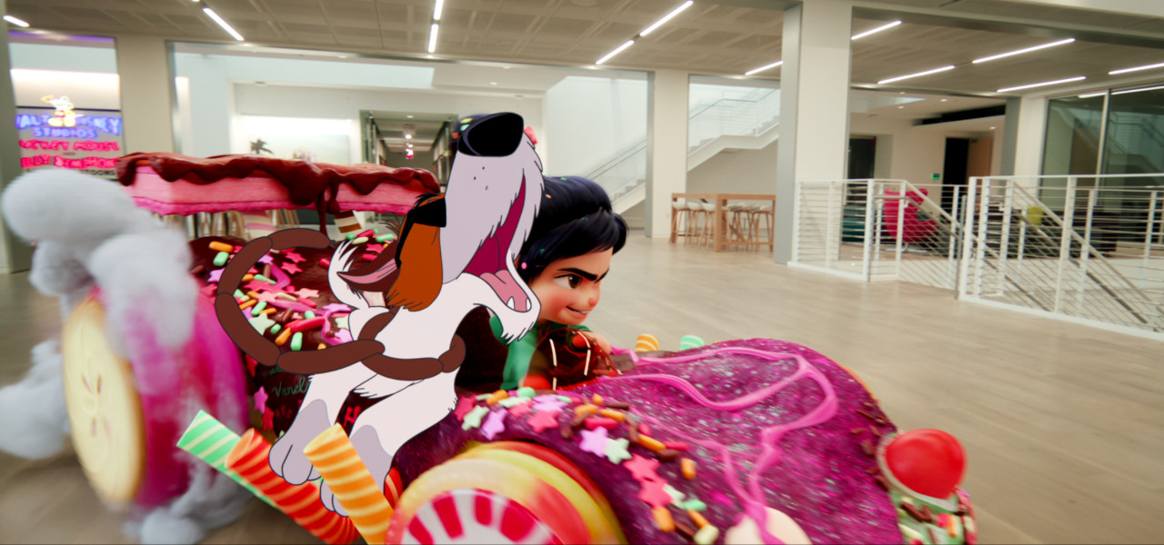
Wild Summon
Directors: Karni Arieli, Saul Freed
When mixing animation and live action, we do so in a style that we call “casual fantasy.” It is a photographic, cinematic imagery that includes fantastical elements in a straightforward, casual manner, usually with some wildlife or natural elements in the mix. Wild Summon, being a faux natural history documentary, gave us a solid starting point when developing the look of the short. Realistic, live-action backgrounds were essential to remind our viewers that this is not a fantasy world.
Our main look dev was focused on the female character design and animation style. The salmon/women characters needed three different stages (baby/teen/adult), and as fish change their color and texture as they grow, this needed to be reflected in the design. We stepped towards fantasy to create this hybrid creature with her wide fishlike mouth, waxy glass for masks, and webbed fingers. We also looked at the deterioration and color/shape changes the fish undergo on their epic journey of survival. Their wet suit becomes rusty red as they grow, and severe aging and damage occur.
There is a moment at the film’s climax where the fish are fighting for survival in a crowded space. We tried to make this scene more dramatic and inspiring by using breathing stills. It’s one of our favorite moments, something quite different in animation.
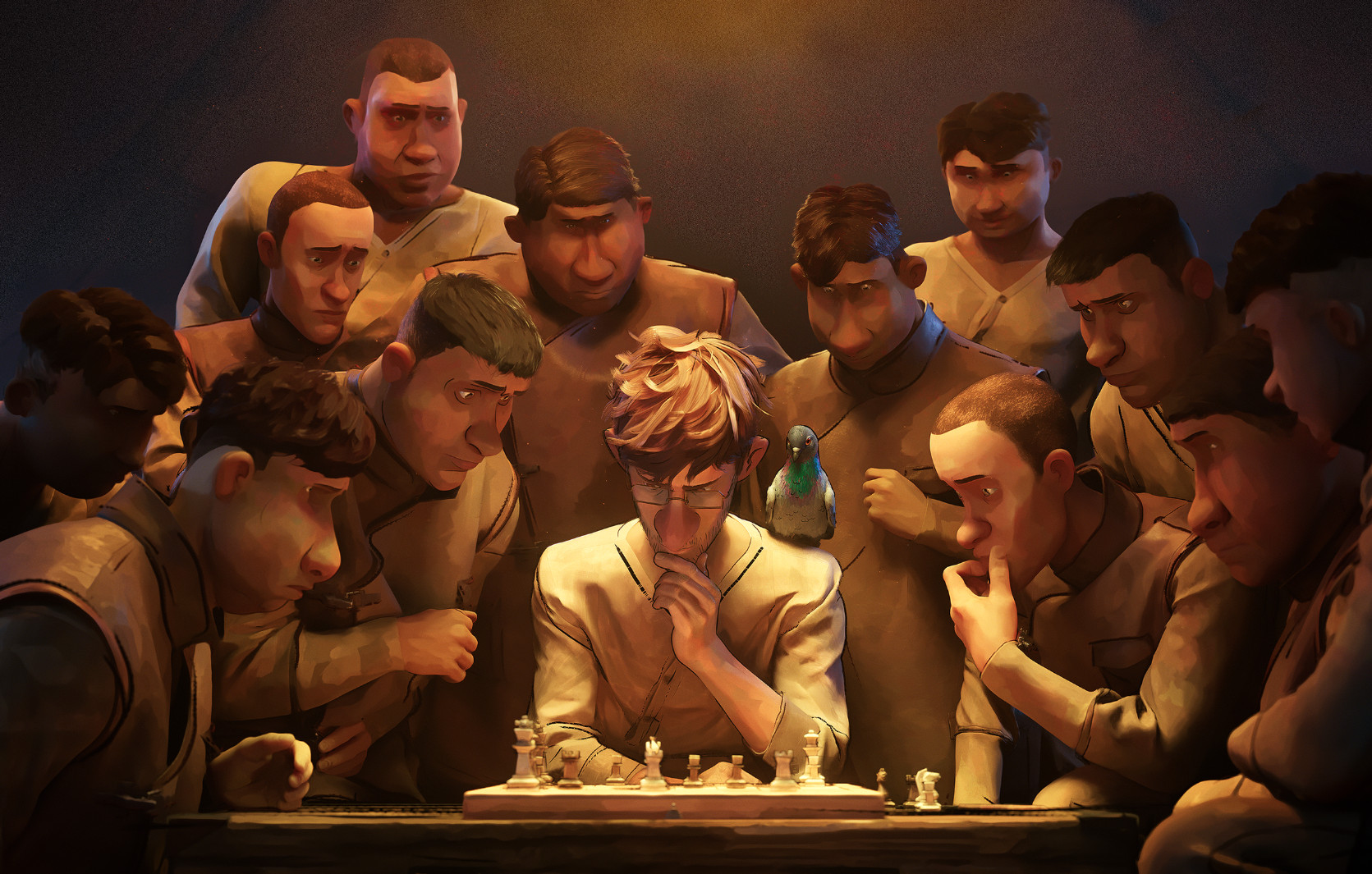
War is Over! Inspired by the Music of John & Yoko
Director: Dave Mullins
My previous film, Lou, lived inside the lines of Pixar’s style of production design, but for War is Over!, I wanted a distinctive handcrafted style more akin to the war posters of WWI and WWII.
The outline shader and quills (lines drawn on every asset in the film) are a love letter to traditional animation, while the hand-painted style comes from my love for painting and beautifully executed concept work. The line work over painting was probably the trickiest stylistic technique to get right because it can look radically different depending on the angle of view, and the artist at Wētā FX did an incredible job of making this style sing on screen.
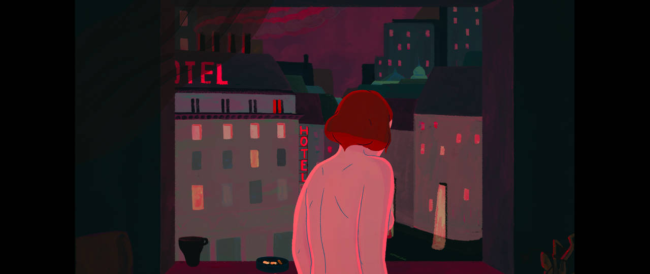
27
Director: Flóra Anna Buda
This film was more personal, sensual, and linear than my previous short, Entropia. In a way, I wanted to choose a more poetic visual style and color combinations. It was essential to show different moods with the lighting and the colors, so I kept the color script closer to reality.
In terms of compositions, I chose a 3:4 aspect ratio to be able to put the focus on the acting, which was very important in the film, and this ratio works very well with portraits, too. At the same time, it creates a narrow, claustrophobic sensation that was also part of my goal since the film’s topic is strongly connected to the feeling of being locked up in your own body, room, and life.
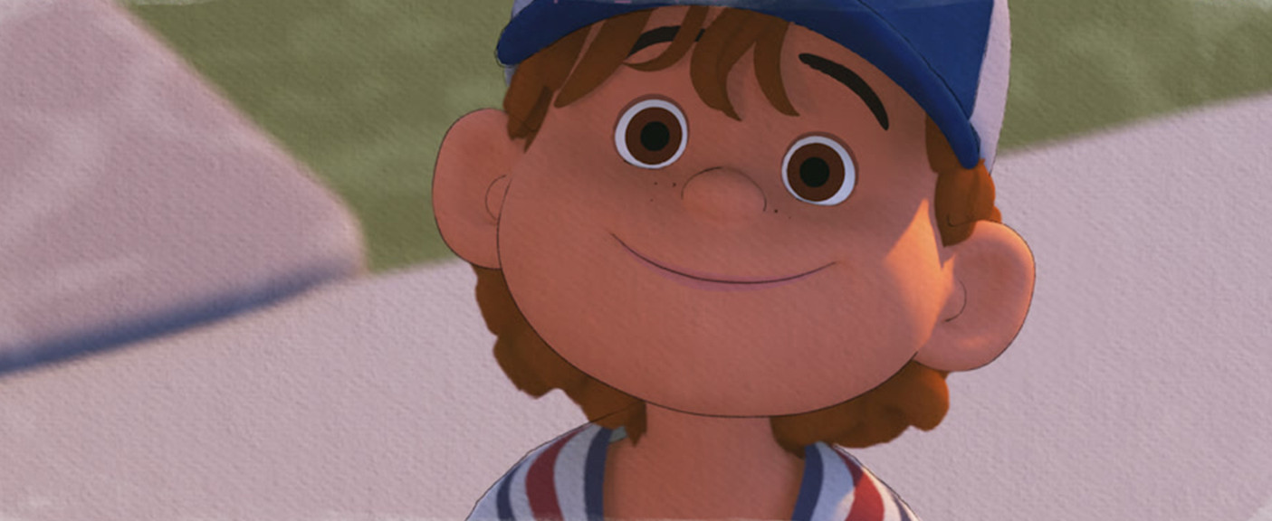
Pete
Director: Bret Parker
I knew from the start that I wanted the film to have an ink and watercolor look inspired by early Winnie the Pooh illustrations, but developing the look of the film was one of our biggest challenges. The film was made through the Pixar Cooperative, and ink and watercolor are not part of the Pixar wheelhouse, so we had to be scrappy and dive outside any traditional animation pipeline to create our final look.
To begin, my VFX supe Brett Levin and I studied watercolor techniques with Tia Katter (production designer) to understand how watercolor works – how the water affects the pigment and what techniques caused different results. Once we started getting a basic feel for it, Brett tried to replicate this digitally. At the same time, Haldean Brown (FX lead) started exploring how to get the ink outline working on the characters. This was a huge undertaking because we were animating in 3d, but we wanted to flatten the animation to have more of a 2d look and feel. We needed the outlines to follow the characters, but we also didn’t want them to be perfect, and I wanted to be able to art direct the lines so we could add and remove or re-draw as needed. It was an enormous amount of work, and nearly every frame was re-touched by hand somehow, but I also feel that without the outlines, the work would have felt incomplete.
The final component of the look of the film was the lighting, which was done by Danielle Feinberg. This was a totally new exploration to discover what “lighting” means in a 3d space, which needs to feel like watercolor. In the end, we were all painting digital watercolor washes, which Danielle brought in and lit to create the incredible skies and backdrops that complete the look of the film.
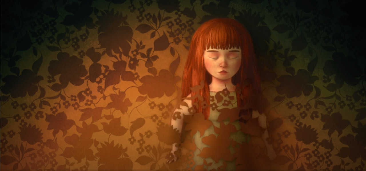
Pachyderme
Director: Stéphanie Clément
Although the film was made in cgi/3d, it had to retain the pictorial rendering and the liberties taken with the rules of perspective in my concept art. All the sets, broken down into different layers, were therefore painted entirely “by hand.” I wanted to achieve an organic look to recapture the warmth of traditional mediums.
I sought to create images that would inspire a mixed feeling of gentleness and unease in the viewer through the simple play of colors, framing, and composition. The colors had to evoke those of old photographs as if we were immersed in an album of family memories, as well as the summer landscapes of southern France: the yellow of the dry grass, the turquoise of the water, the dark green of the cypress trees. But colorful and bright at the start, the film ends on a pale, earthy note. This tonal shift is particularly pronounced in the reds. The framing and composition of the shots introduce a sense of disquiet. The sky, for example, is virtually non-existent. When the sky is present, it is obstructed by an element – the grandparents’ house, a tree, etc. – to evoke the character’s lack of escape. The little girl is a prisoner, trapped in a game of a frame within a frame, the outline of a door or a window. She is often fragmented in the shot, her upper body separated from her lower, as if dispossessed of herself. Sometimes, it’s her eyes that are cropped out, as the sign of a forbidden.
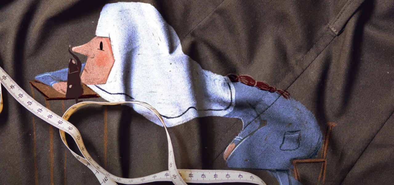
Our Uniform
Director: Yegane Moghaddam
In the beginning, I was determined to use the paint directly on fabric and do some real experiments. Soon, I realized it was nearly impossible to get the work done with that ambitious approach. So, I switched to something as convenient as a pencil.
I wanted the visual atmosphere of the film to be as minimal as possible, so I picked a monochrome palette and allowed the textures in the background to be part of the characters, too. This way, I didn’t have to draw parts of the characters because it was already in the background. Later, I decided that the black and white palette could give the film an outdated look. So, I switched to colored pencils, resulting in the most satisfying look and feel. The pencil strokes resembled embroidery on fabric, which also helped with the overall visuals and atmosphere of the film, which is about clothes, threads, textures, etc.
Once Upon a Studio
Directors: Dan Abraham, Trent Correy
In Once Upon A Studio it was very important to us that our characters look and feel exactly how you remember them from their original films, and yet they had to live within our studio walls on live action plates and interact with different mediums and styles throughout the past 100 years.
With our cg characters, there was a huge effort amongst our character teams to rebuild characters from the past and update characters to work with our new technology. With our hand-drawn characters, we wanted to embrace and celebrate their flatness, but bring them into our dimensional environment. This created a unique challenge with our hand-drawn characters and our team did their best to capture everything from the 2d animation design/style, the clean-up line (dependent on era, thick and thin lines, scritchy/scratchy with construction lines, black or colored lines etc.) and the ink and paint.
Our team worked closely with the Animation Research Library to retrieve old model sheets, original color palettes, size charts and line tests as reference. Integrating them into the live action plates and beside the cg characters meant that we had to light them believably to live cohesively with each other. We opted to add simple gradients and take advantage of reflections, shadows and bounce light as opposed to adding harsh rim lights or shadows on the characters to stay true to their original looks.
Some of these characters are only on screen for three seconds, so it was extremely important to us that you could instantly recognize them, celebrate them and hopefully get a warm sense of nostalgia…it should feel like seeing an old friend! That was our philosophy throughout and our driving factor behind our visual approach for our short, and it applied to every department to make each shot believable.
Ninety-Five Senses
Directors: Jared Hess, Jerusha Hess
We had a group of super-talented artists from around the world. Everyone had very different animation styles, and we wanted to take advantage of that when telling our story. The six animation teams were selected from among hundreds of applicants in the MAST “Voices Seen” Springboard contest, and they were chosen specifically because of their visual styles. The MAST non-profit is all about giving artists opportunities to contribute creatively and see their own ideas on the screen.
Our job as directors was a blast. The animators came to us with so many amazing ideas. We loved collaborating with them and helping them push their ideas so they served the story in the best way possible. We assigned each animation team different segments of the film that best suited their unique aesthetics. It was fun figuring out how to transition between each different style and keep everything cohesive as the narrative progresses.
The clothesline that everything hangs on is our central character, Coy. Daniel Bryson’s hand-painted watercolor design became the template for the other animators to work from. Everyone interpreted that model in their own cool way.
This is a different process than we’ve followed in the past, but the result is an apt visual representation of a broken life. The writers Chris Bowman and Hubbel Palmer wrote the script specifically to accommodate different visual styles. They provided a deeply moving voiceover without being prescriptive in action or setting, giving the artists even more latitude in how they chose to interpret the scenes. That shows in the result.
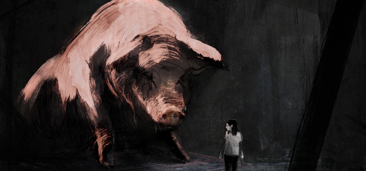
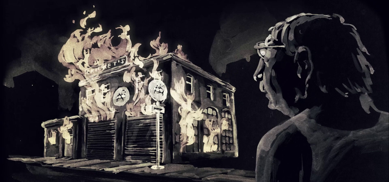
Letter to a Pig
Director: Tal Kantor
This is a mixed media technique I developed in my previous film, In Other Words, that combines hand-drawn animation with footage segments. In this film, I wanted to refine it further while adding another significant layer to the process, using traditional paint animation on paper. I wanted to add the materiality of paint on paper with its vibrations and the mistakes of the human hand, as it evokes a lot of expressions and emotions that were important for me to have in this film.
It was also important to perfect the footage parts, which would feel like an organic part of the animation and could be more dynamic, appearing and disappearing from view. The process blended directing and filming actors, manual frame-by-frame 2D animation on the computer, and acrylic paint on paper. It’s a long production process involving numerous steps and layers until it organically fuses all the visual elements together to reach this result.
This technique allows me to visually trace how human memory works – to show how and what we remember, how we focus on certain details that remain realistic and clear in our minds, while others become elusive and tend to change or disappear. The world and the characters in the film appear fragmented, fleeting, and incomplete. It also allows us to sense their inner world and subjective point of view through their visual appearance.
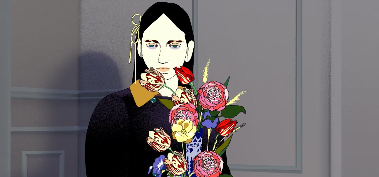
A Kind of Testament
Director: Stephen Vuillemin
I worked with designs that purposefully weren’t optimized for animation (very detailed and realistic models). I asked fashion designer Kerhao Yin to pick the characters’ outfits, and I drew them based on the runway pictures he sent me. This approach is close to my illustration style but not very fit for animation: it’s very detailed. I also decided to do some very long shots (the longest one in the film lasts 45 seconds), with no camera moves, animated all the way through. This is very, very fastidious to do, and you rarely see it in animated films because it is too costly. I could afford to do it because I was working on the film alone, in my spare time, without a budget or a deadline.
Since I spent so much time making the film, my style changed slightly while doing it. It got more and more detailed, and I introduced vanishing points and outlines while progressing.
The story is about someone who spends years making these animations, so I had a pretty “actor’s studio” approach to it. I actually spent five years making the animations myself. The animations had to be impressive from an animator’s point of view, too.
After five years of doing it alone, I met Remembers, an amazing animation studio based in Paris, and we finished the film together. I was delighted to find such a partner. They introduced me to some techniques I wasn’t familiar with, such as the use of 3d faces to be rotoscoped. This was a real time-saver. We did some of the camera moves in 3d too. I also got some world-class animators involved, and we finished the film in one year (so it was six years in total).
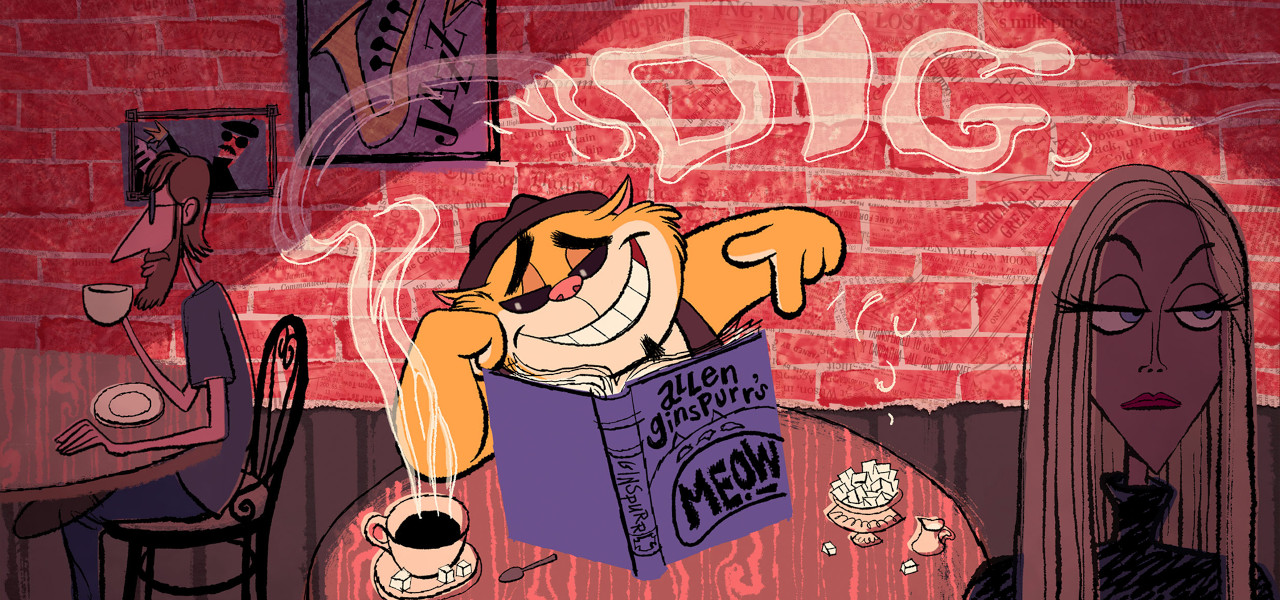
I’m Hip
Director: John Musker
Because I’m Hip is a valentine to both hand-drawn animation and jazz, I wanted the visual style to accommodate both worlds. For the characters, I wanted them to be clearly caricatured drawings (I am by nature a caricaturist) utilizing various 2d “cheats” for the sake of design but have enough volumetric integrity to work with the musical, squash and stretch cartoony animation I had envisioned. To get the full, fluid, bouncy animation I was after, I wanted it to be on ones, needed for maximum fluidity, and not to be “limited” animation. As cartoon studios’ budgets got smaller in the fifties and sixties, a more limited approach was often used. I wanted to celebrate animation at its “fullest.”
In terms of the art direction and the “world” of the short, I was strongly influenced by the great jazz album covers of the fifties and sixties. In particular, the work of illustrator David Stone Martin. His style was strongly graphic: beautiful ink drawings often using solid black shapes over limited palettes of watercolor washes that didn’t adhere to the outlines in the drawings. In my film, both characters and BG elements used this approach. It felt like a graphic realization of the improvisatory nature of jazz. Like jazz, I found it engaging and exhilarating. And just as jazz has “step out” solos, I felt this gave me license to take certain shots and give them some unique graphic approach that wasn’t present in every shot.
This “style” was different than the work that I had done in my previous work at Disney, where the hand-drawn feature films I co-directed eschewed line work in the backgrounds generally, and characters’ paint colors always remained within the bounds of their cleanup lines.
The Hip style was the outgrowth of fine visual development by John Ramirez, Claudio Acciari, and Ian Gooding. The layouts done by Jennifer Yuan and Ken Slevin embraced this “David Stone Martin” inspiration but filtered through their own graphic sensibilities and wit. The vivid color script by David Goetz, the terrific BGs by Ken Slevin, and the areas of textured washes Ken created for characters that were animated by compositor Talin Tanielian all contributed immensely to realizing this jazzy Hip world.
Humo
Director: Rita Basulto
Unlike my previous short films, where I was looking for a significant level of realism, for Humo, I used certain industrial materials such as high-end silicones that allowed me to give the puppets a more humanistic look.
On the other hand, this story demanded the use of more traditional materials and technical solutions; the use of paper and charcoal was fundamental in conceptual terms to convey the naive sensation of timeless three-dimensional drawings that wouldn’t lose visual validity over time. The choice of materials holds significant importance in this specific narrative, while the calorimetry limitations serve both a narrative and conceptual purpose. From an aesthetic standpoint, I delved into numerous options, seeking ways to depart from conventional norms and prevailing design trends.
Eeva
Directors: Lucija Mrzljak, Morten Tsinakov
We learned that when making our previous films, we were rather lazy, and with this project, we decided to put much more effort than our previous ones.
We went through some old illustrations that Lucija had made and thought that some of them suited the story very well. Lucija’s drawings are hand-drawn and very detailed. We were also quite influenced by some live-action films while choosing the color palette for the scenes. For example, the pastel colors in the films by Krzysztof Kieślowski and Wong Kar-wai.
Dog Apartment
Director: Priit Tender
My inspiration for the film came from soviet surrealism, a poem called “To Be A Dog-Apartment,” written by Andres Ehin. Many characters like the Rooster-Axe or Dog-Apartment itself are direct visual interpretations of those word combinations. I just translated the play of words into matter.
To stay loyal to the surrealist concept, I decided to combine the film visuals from both hyperrealistic and dreamlike elements. I’ve worked with 2d animation mostly; my last stop motion, Fox Woman, was made 20 years ago. I had the urge to do something with real materials, something I could touch and feel. It was great to try sculpting again.
I modeled the characters by myself. With puppets, it really feels that one should work and think through plasticine, unlike with drawing. The sensation of modeling stays in your hands, and you start to perceive the world more like a three-dimensional entity.

Boom
Directors: Gabriel Augerai, Romain Augier, Charles Di Cicco, Yannick Jacquin, Laurie Pereira de Figueiredo
For Boom, we knew from the beginning that we would go for a realistic 3d rendering style. The fact that there was a lot of vfx (smoke, fire, water, lava) forced us to work on realistic shaders for those to be believable and serve the storytelling – they represent the volcano, which is the antagonist and the danger.
The biggest technical challenge was probably the feathers. Romain developed a custom tool to create, groom, animate, and render feathers effectively, and Charles used it to create the featherings of the birds. There has been a lot of back and forth between them to improve the tool and get the look Charles wanted for the feathers.