Venturia Animation Studios Takes Us Behind The Scenes Of Bebe Rexha And Snoop Dogg’s New 420-Themed Music Video ‘Satellite’
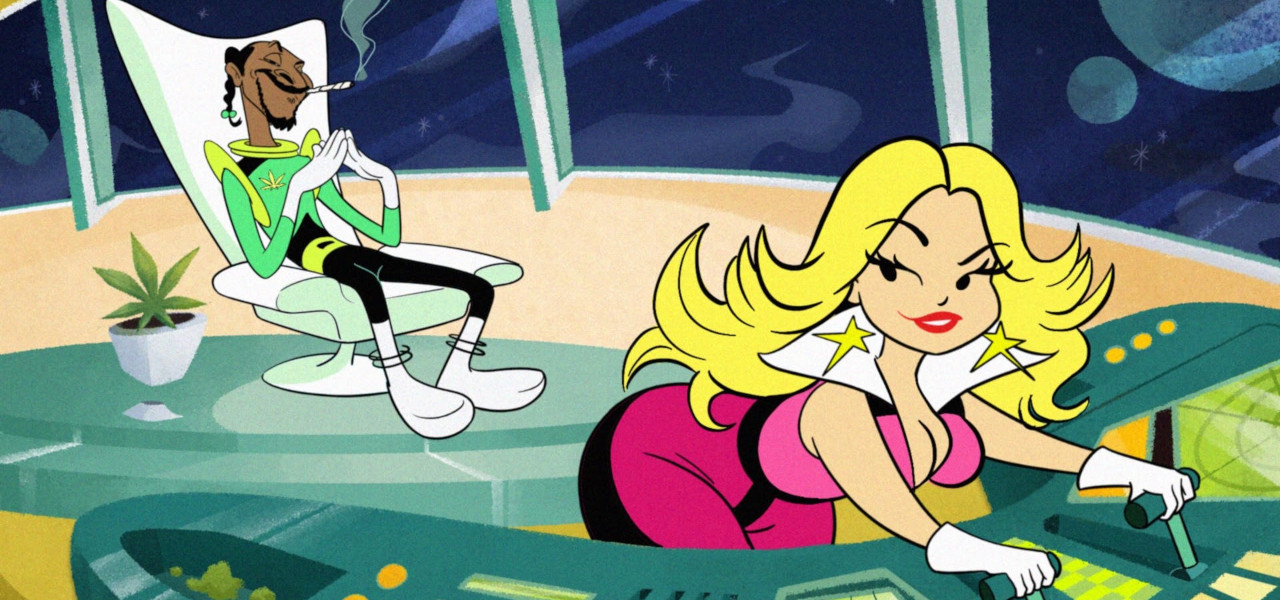
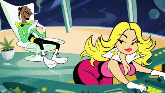
To celebrate 420, Bebe Rexha and Snoop Dog ’s new single Satellite got a Hanna-Barbera-inspired animated music video from Colombian studio Venturia Animation Studios.
The video, put together in just one month, was directed by studio founder Juan M. Urbina. It’s loaded with plenty of throwbacks to 1960s-1970s Hanna-Barbera cartoons, a bit of Star Trek, and a load of 420-themed imagery.
We caught up with Urbina to discuss the video’s visual influences, his take on Hanna-Barbera, and the tight timeline he and his team were working on. He also shared a ton of BTS artwork and guidelines that the studio’s artists followed while putting the video together.
How involved were the musicians/management in finalizing the character designs? Was there a back-and-forth on those designs?
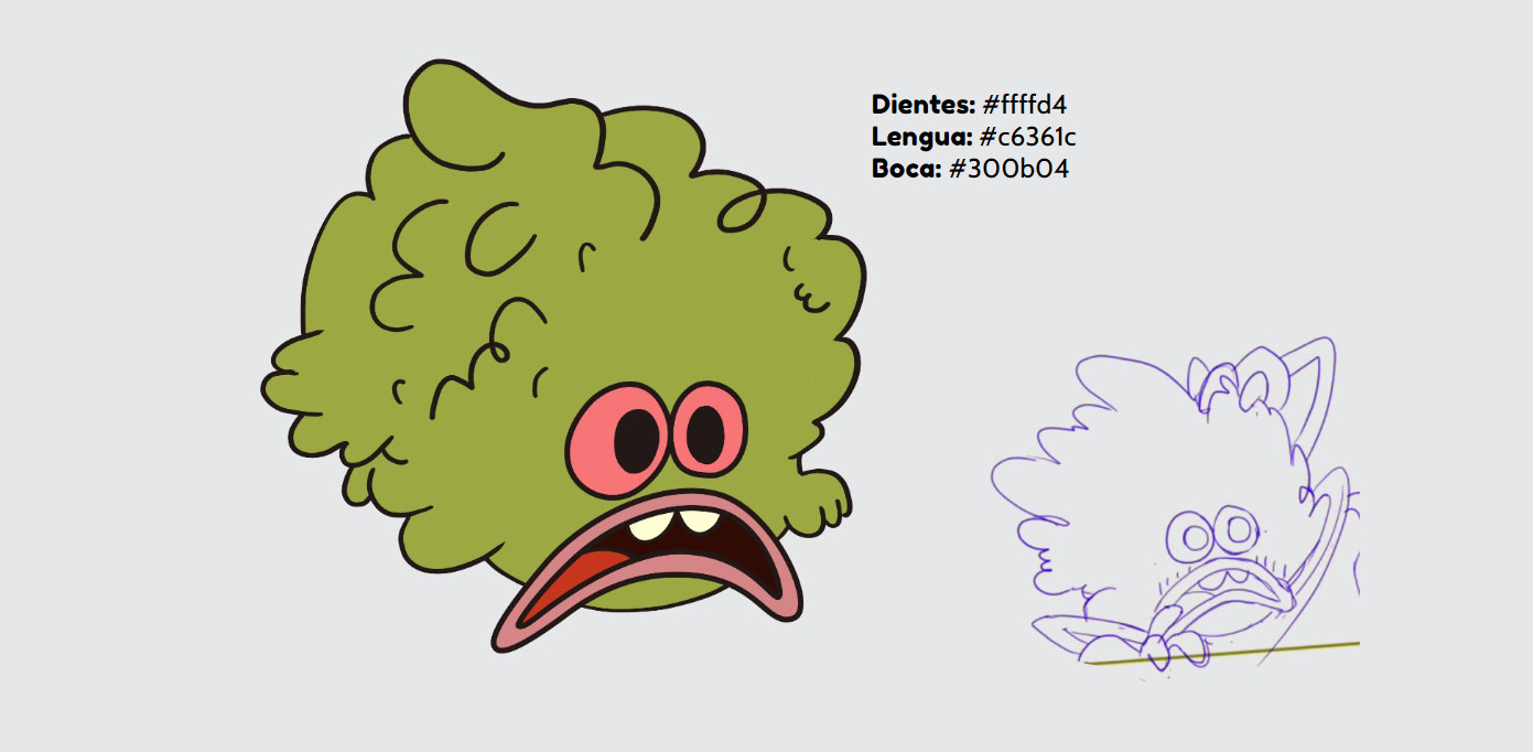
This project was truly a dream for us to work on, not just because it was the perfect opportunity to explore a different throwback animation style, (we had done a Rubber Hose short in the past and a Chuck Jones-inspired Christmas music video) but because the client (Warner Records) completely trusted our vision for the clip, and we never got pushback regarding how Bebe Rexha or Snoop Dogg should or shouldn’t look. Our character design team nailed them right from the start. In that key visual you see, which later turned into the base for the actual single’s cover art as well, the project got greenlit instantly. So, after the key visual was approved we went right into production. It was a very tight turnaround too. A truly heroic deed on our team’s end. So Venturia.
Were you hired because they were looking for this particular aesthetic, or did you pitch the aesthetic to get the job?
We have done many projects with them in the past, involving many different animation styles. So, they trust us. And I realize our studio has gained this reputation of executing vintage animation styles in a really accurate – I should say ultra-nerdy – way. Because Bebe’s new album has this 1970’s inspired aesthetic, we immediately went to the kings of that era in animation for inspiration: Hanna-Barbera, so it was almost impossible to avoid going a bit The Jetsons / Josie and the Pussycats with it.
Aside from Hanna-Barbera, which you’ve mentioned, what other sources inspired the look?
There’s influence from a lot of old shorts from Warner, obviously, like the Marvin The Martian shorts and Duck Dodgers in the 24½th Century – the 1953 short not the 2003 show. But from an art direction and production design standpoint, we also looked at a lot of live-action things, which is a good way to avoid simply ripping off or doing a straight parody of other animation. And the original Star Trek was a huge inspiration for some details in the outfits, how the ships connect to each other, and of course… the teleporting effect.
What do you think is the pinnacle of Hanna-Barbera’s design and what elements did you need to get right to nail this look?
Well, like any studio, I personally think they had their ups and downs, their hits and misses. One could almost attempt summing up the history of Hanna-Barbera by saying they definitely ruled the 1960s and 1970s with hits like The Flintstones, The Jetsons, and Scooby-Doo, and then in the 1980s it went downhill for them – with the exception of their only hit The Smurfs, and then they came back hard in the 1990s renaissance with them turning into Cartoon Network.
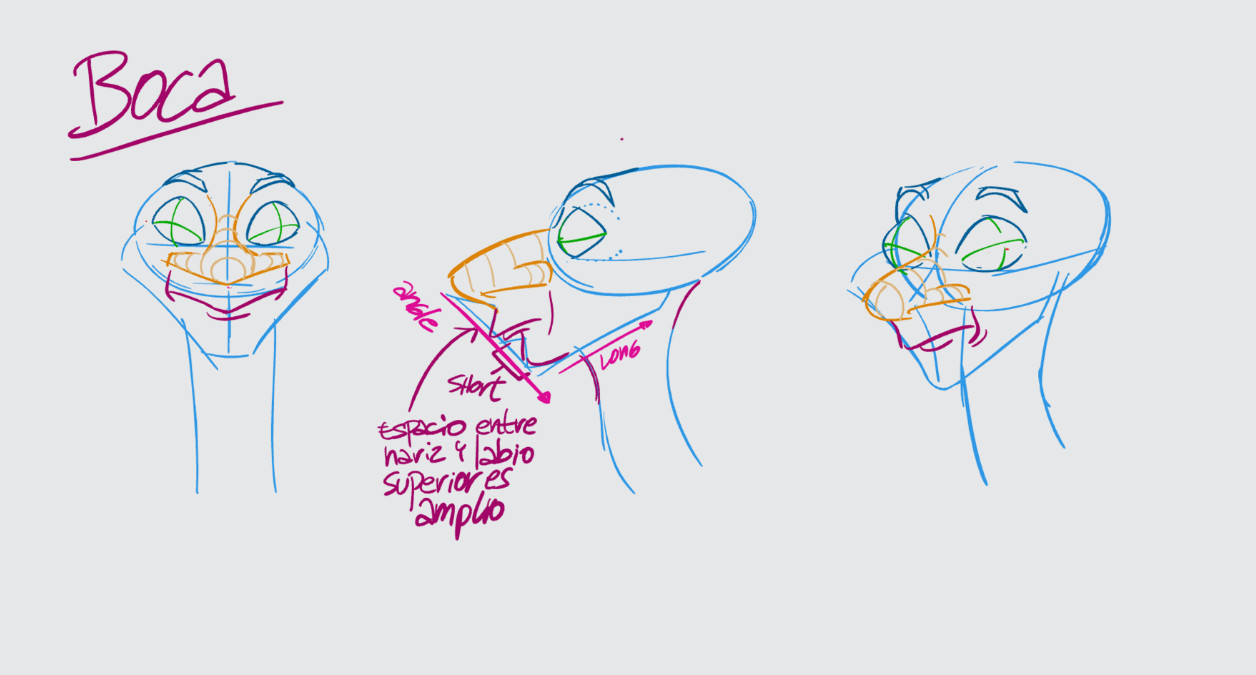
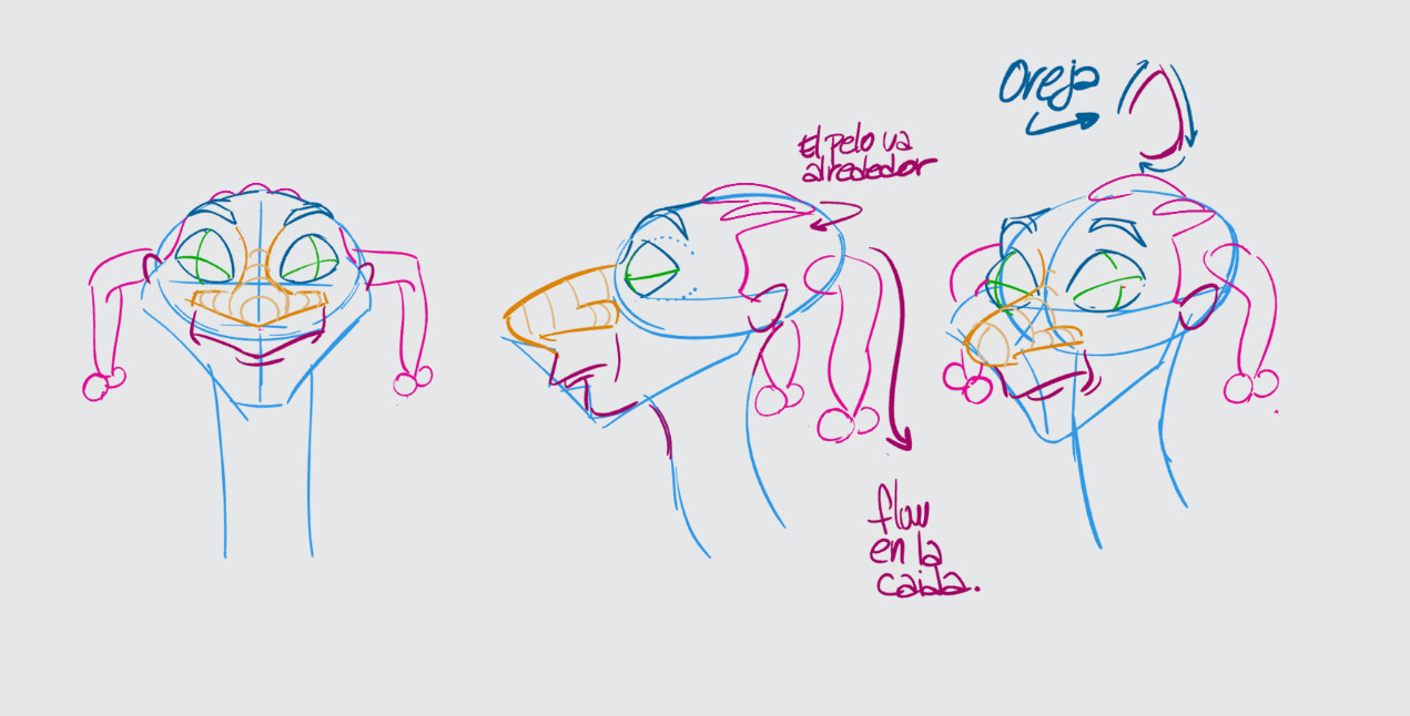
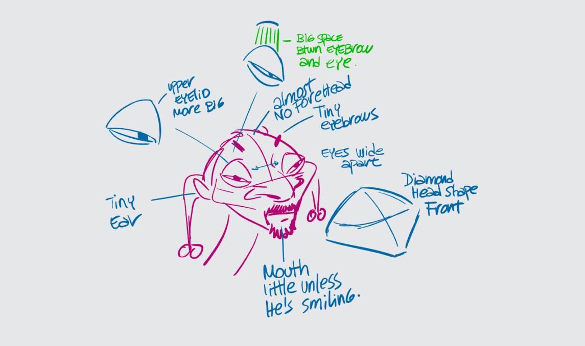
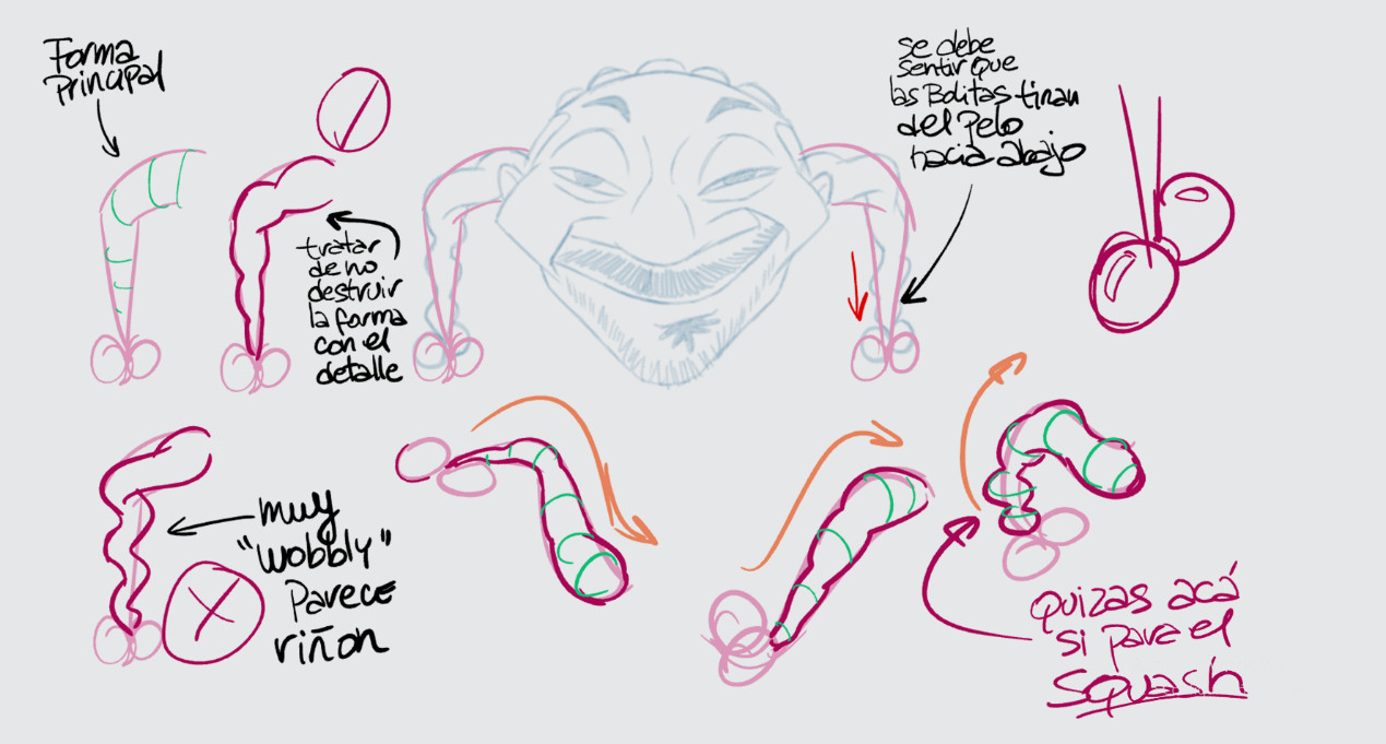
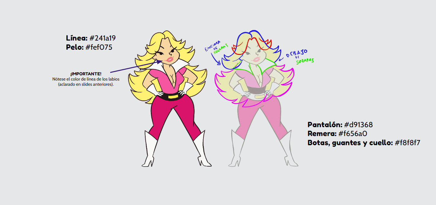
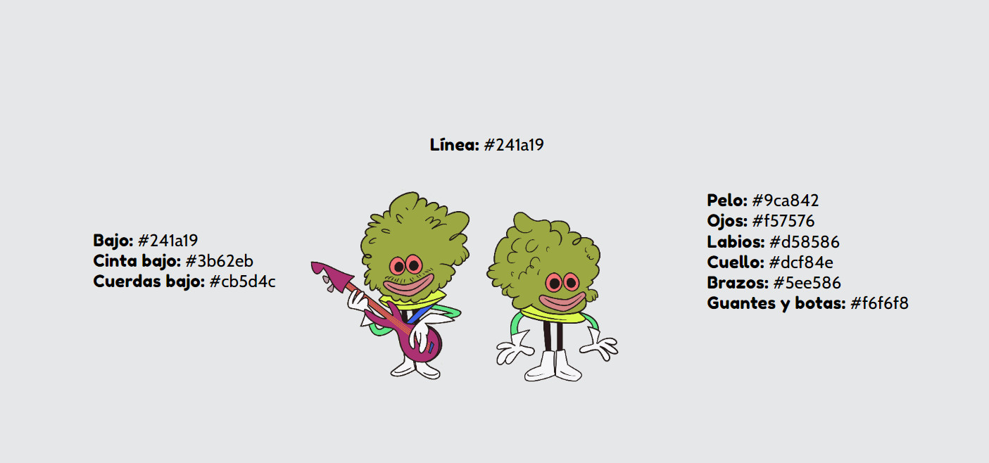
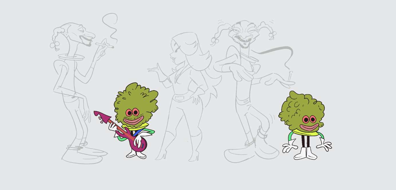
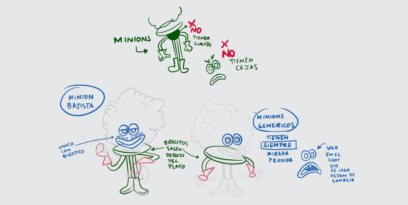
I’ve always been a sucker for all things H-B and I really like to draw in a graphic, straight line vs. curve line, way, a style made famous by the great Ed Benedict of course, so I always try to influence the crew in making these choices when they design not just the characters but also the layouts. I think the key to really nailing the look was to unlearn, to forget what you know from more modern, or should I say contemporary approaches. Since we know so much nowadays, the 2d animation craft is so refined, thanks in part to phenomena like the Disney Renaissance, for instance, they brought back a lot of those “how characters should look – how characters should move” rules. And these guys back in the 1960s weren’t trying to compete with Walt Disney Feature quality animation, they were trying to make ends meet and deliver weekly episodes for tv. An example of all this is a discussion I had with Paul, our lead character designer, in which he said: “Why don’t we give Bebe white in her eyes? She will look more ‘appealing.’” And he was right. But since this video was an homage to that era, I told him, “Not for this project.” Sometimes, they used pupils only to save time in Ink & Paint. And we did save time, too.
And let´s remember these old-timers didn’t have the amazing tools we have now, Ink & Paint was so laborious, and we can do that with a click now, also the montages on celluloid, that’s so easy to do for us now in software like After Effects. So, a lot of those “mistakes” you see in our animation we tried to put intentionally, in this case, the “off-model” on a character is not a sin it’s a virtue.
How long was production, and what tools did you use to put the video together?
This had a very tight schedule. A month really, from the moment we first heard of the project. We used all things from pen and paper sketches for the concept drawings and the animatic to Adobe Photoshop for the backgrounds, Toon Boom Harmony for the animation, and Adobe After Effects for compositing.
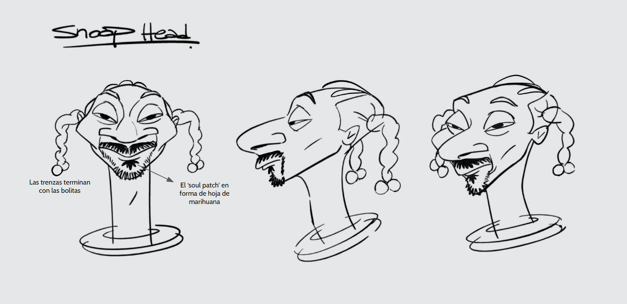
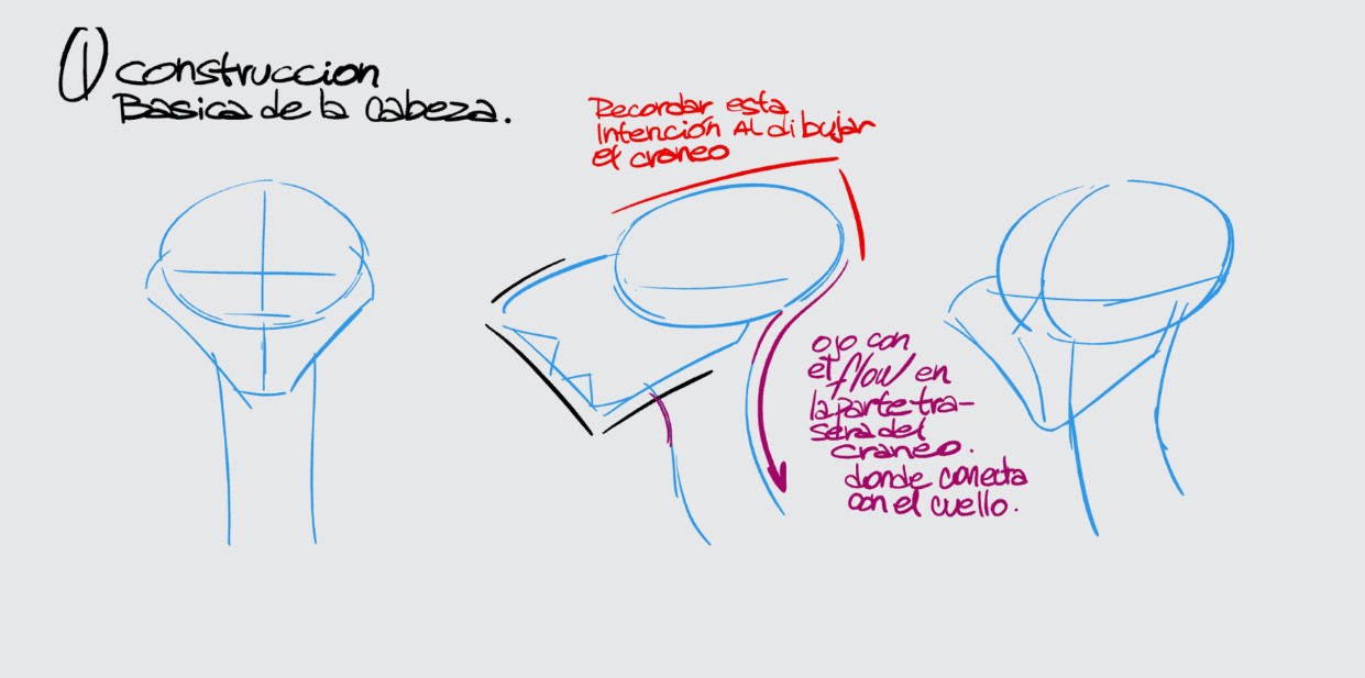
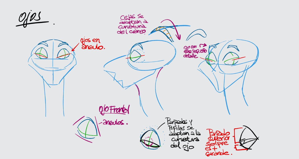
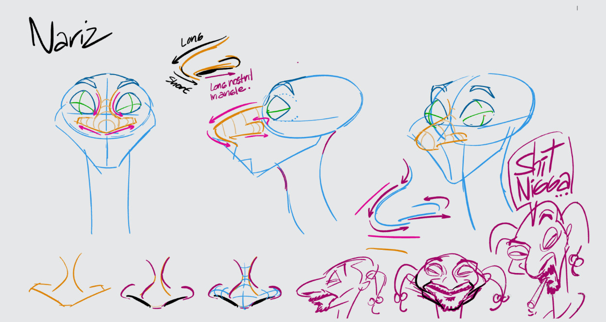
Snoop Dogg
Bebe Rexha
Crew
Credits:
Line Production – Carlos Ahmed Osorio
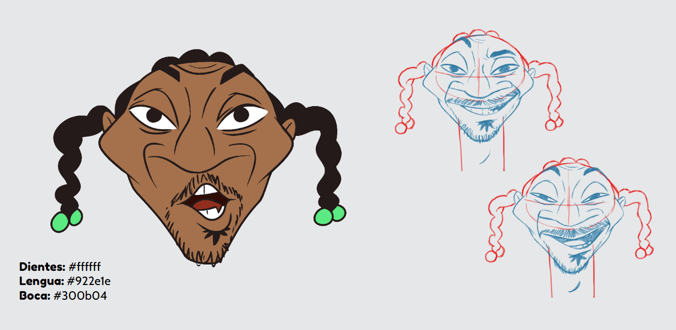
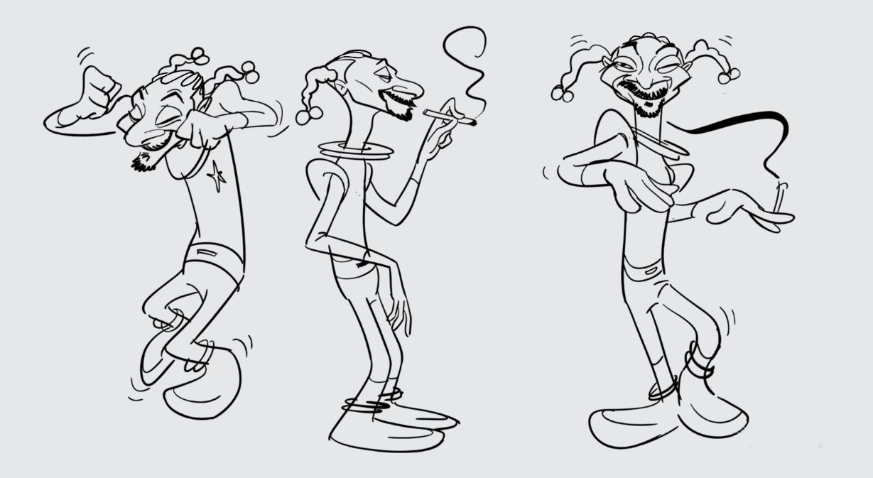
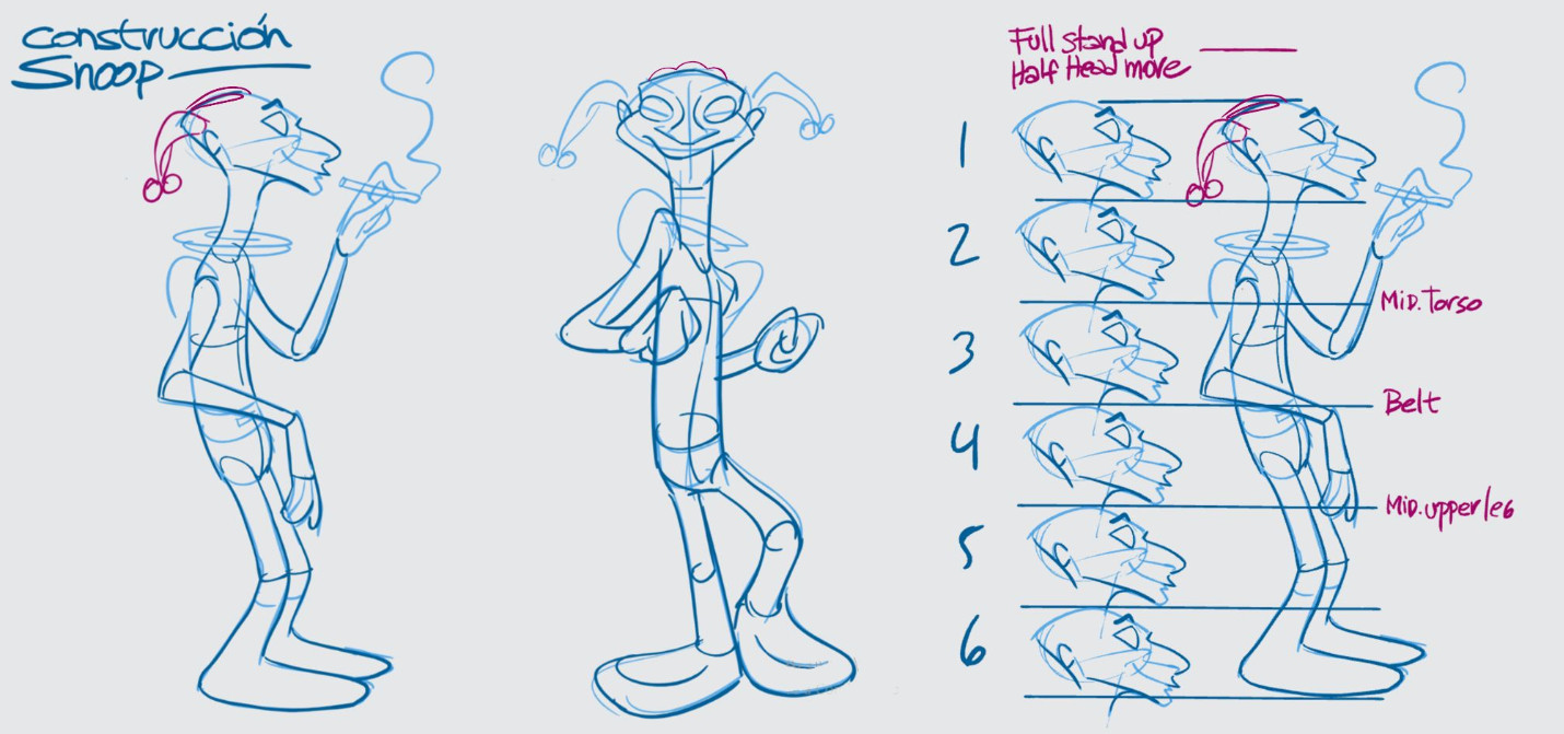
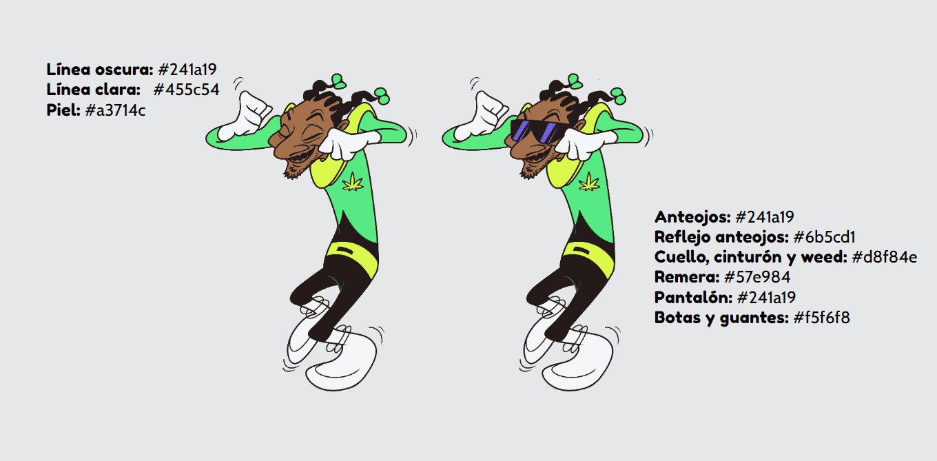
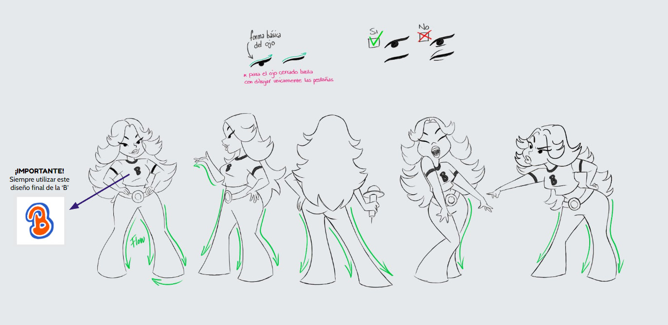
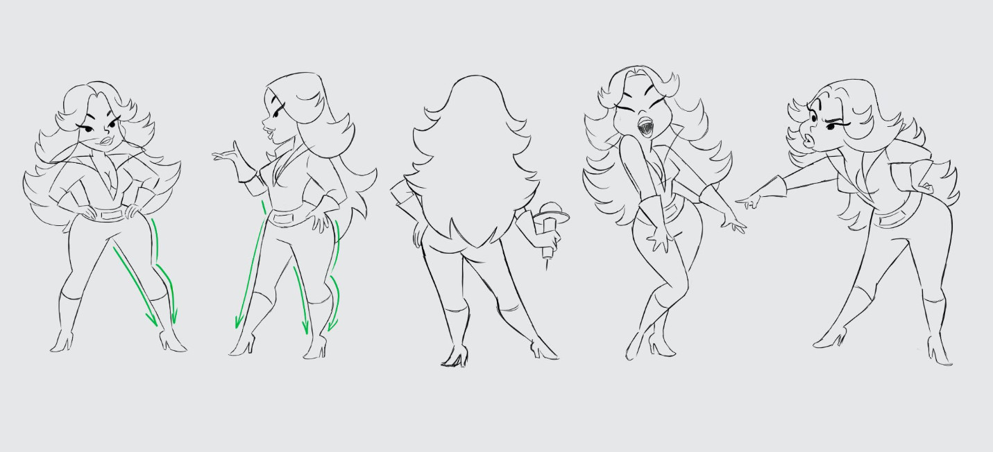
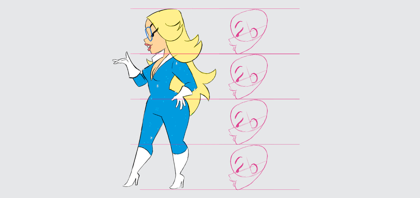
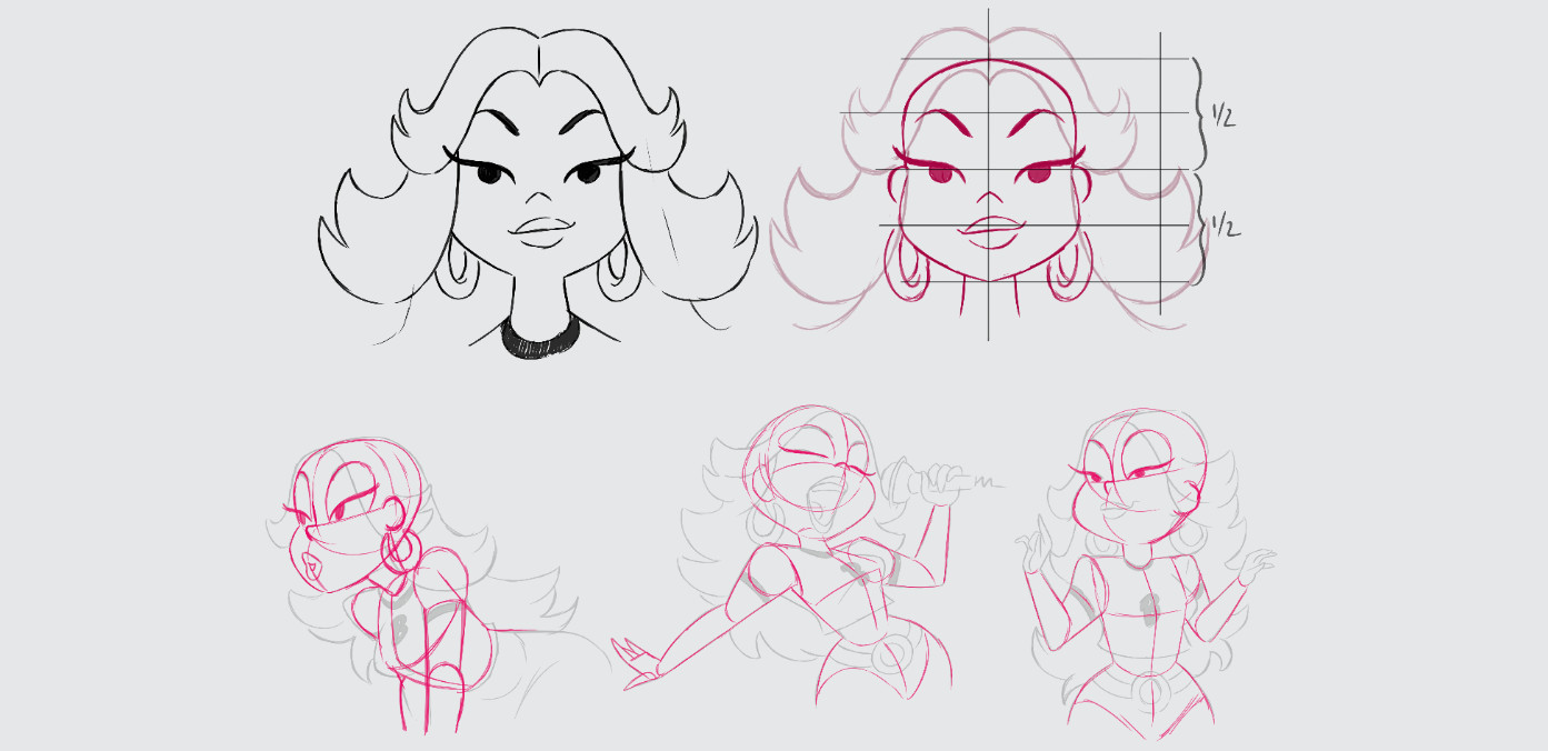
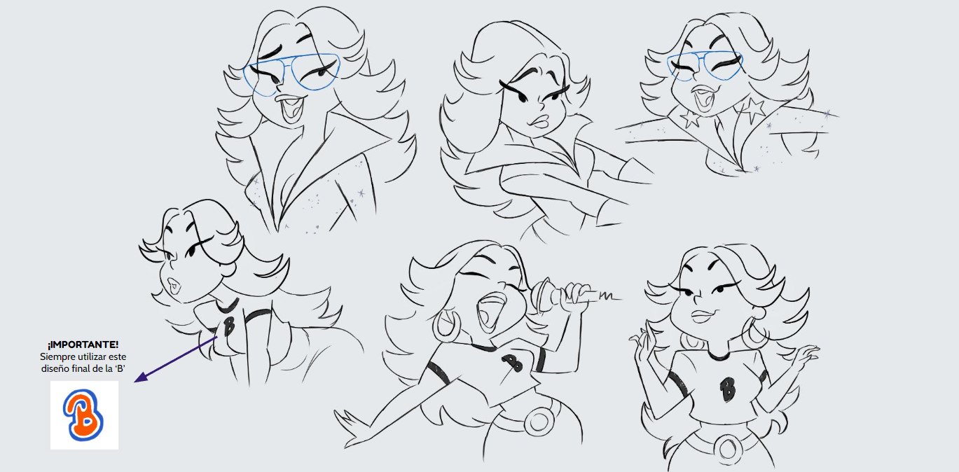
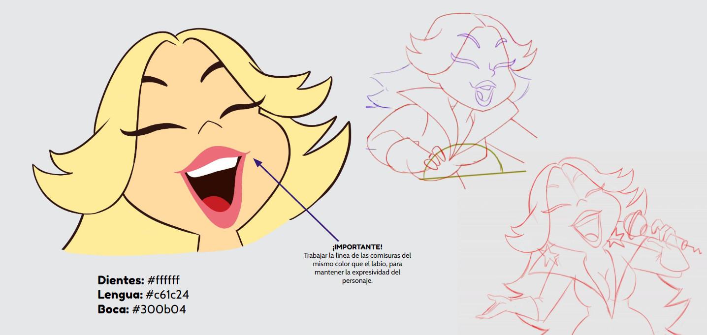
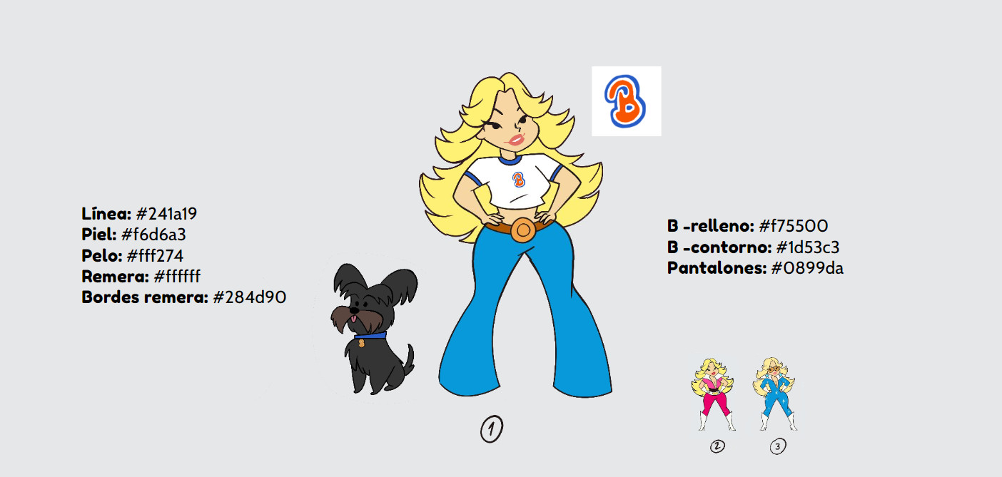
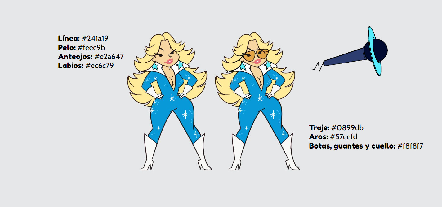
Character Design – Paul Badilla, Nelson Cabrera, Juan M. Urbina
Character Layout & Animation – Paul Badilla, Nelson Cabrera, Nicolás Beltrán, Paz Rodríguez, Álvaro Camacho, Mauricio Vargas,
Clean up & Inbetweening – Sara Aranzales, Ana María Martínez, Jesús Terraza, Manuela Fandiño, Jacobo Arcila, Felipe Rodríguez, Ricardo del Valle, Christian Sánchez, Federico López, Leonardo Niño, Juan Manjarrés, Ricardo del Valle, Christian Sánchez, Álvaro Acosta
Model Sheet – Rocío Caputo, Sabrina Franchi, Álvaro Camacho
Color Script – Camilo Sastre, Karlos Velásquez, Juan M. Urbina
Backgrounds – Camilo Sastre, Sabrina Franchi, Karlos Velásquez, Alejandra Pérez, María Camila García, Paula Barreto, Rocío Caputo, Camilo Vieco
Compositing – Karlos Velásquez, Ricardo García, Diego Beltrán
Editing – Karlos Velásquez, Camilo Vieco, Juan M. Urbina