CARS AND CARTOON BREW
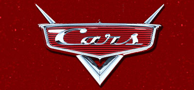
What does CARTOON BREW have in common with Disney/Pixar’s CARS?Give up?? The answer is the lettering in both of our logos was designed by Leslie Cabarga. Cabarga is an animation historian (The Fleischer Story) who is also well known as a lettering and font designer. In addition to designing the original Brew logo, Leslie created the font, Magneto, that Pixar used for, not only its CARS logo, but the titles, ancillary signage (that appear within the film’s backgrounds) and merchandising material. Says Leslie:
“Pixar dutifully purchased Magneto (font piracy is a constant concern for type foundries just as DVD piracy is for film studios), a streamlined script, reminiscent of 1930s to 1950s automobile logos, from me more than a year ago. I have been thrilled seeing Magneto all over the place in Cars. Font designers always notice when our typefaces are used well, by talented designers, or badly by other designers, and Pixar has done a beautiful job with the Cars logo and titles.”But – ironic for me to say – I think they’ve over used it. My latest book, Logo, Font & Lettering Bible makes the case that designers shouldn’t rely so heavily on ‘OPF’ (other people’s fonts) but can learn to draw their own custom lettering. Think about the great hand-lettered movie titles of the past, where every credit was specially designed to emphasize the interesting alphabetical anomalies in each word or name.”In other words, it’s funny that Pixar, the world’s leading innovator of quality animation; a company with probably the world’s greatest writers, directors, designers and animators has sort-of a blind spot when it comes to the art of lettering. They buy an off-the-shelf font, instead of hiring lettering talent to customize at least some of their titles and signage.”
And that would be you, eh Leslie? Regardless, I have a strong feeling that CARS, the film, will live up to its marvelous logo!