‘A Vivid Hell On Earth’: Director Kenichiro Akimoto On Color, Death, And Repetition In ‘All You Need Is Kill’
Stay informed with free updates
Sign up to get our news digest — delivered directly to your inbox twice a week.
It’s fitting that a story about living, dying, and then repeating the day would get another adaptation — but even then, take a look at any single image from Kenichiro Akimoto’s All You Need Is Kill and you can immediately see a different interpretation than those that came before.
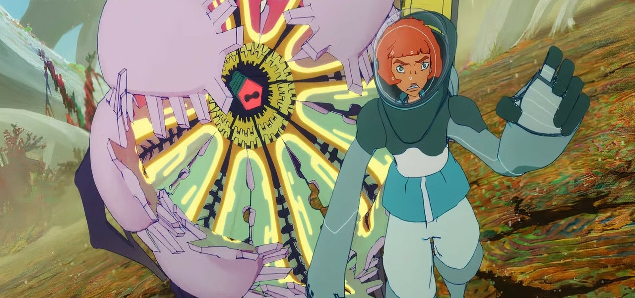
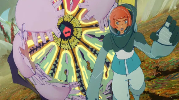
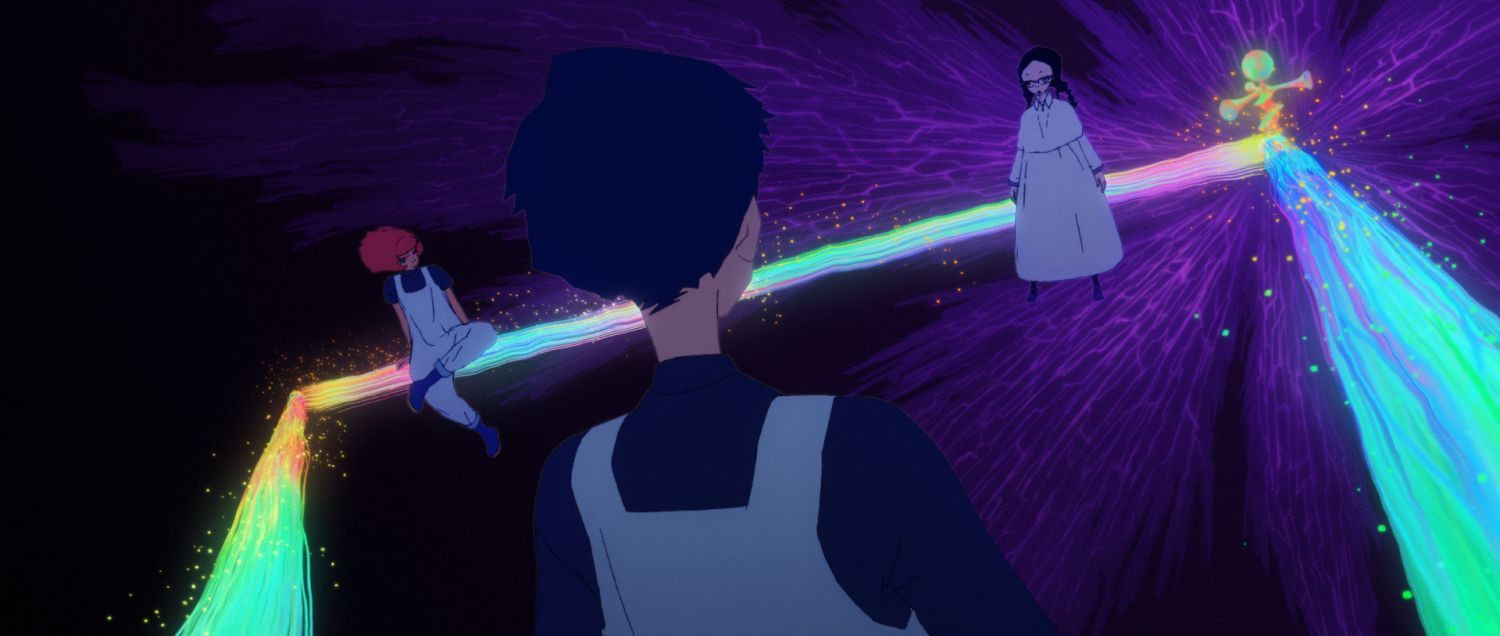
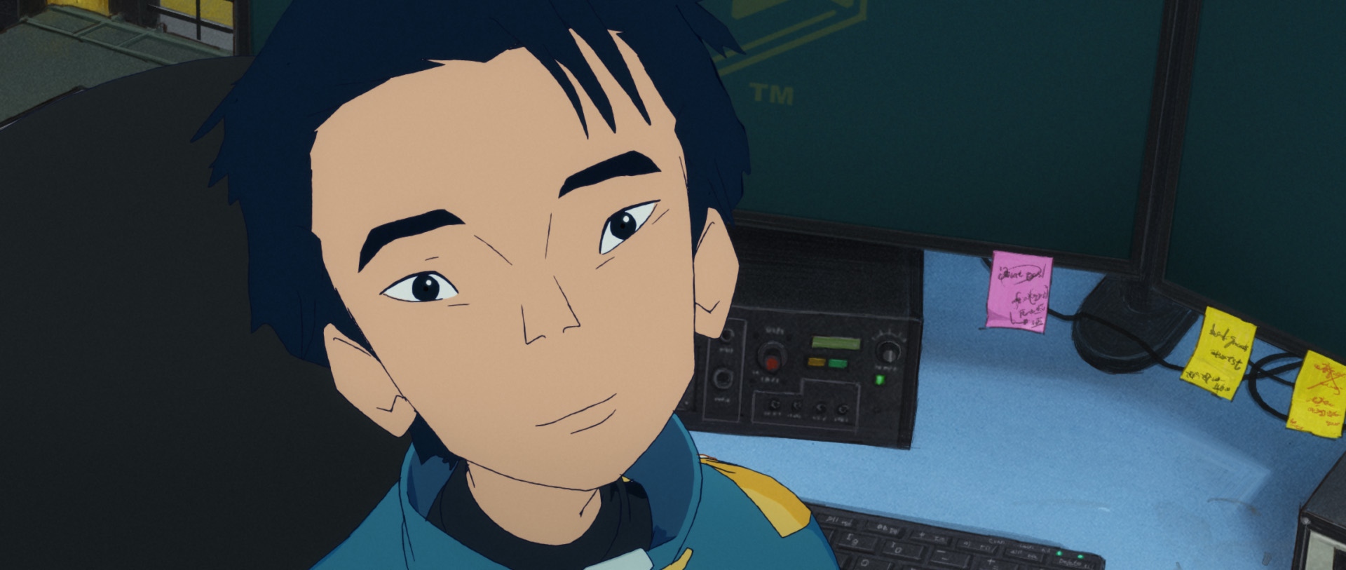
Based on the science fiction light novel by Hiroshi Sakurazaka, which was also adapted into 2014’s Edge of Tomorrow, the Tom Cruise– and Emily Blunt–starring film directed by Doug Liman, All You Need Is Kill is immediately set apart by the psychedelic colors that fill the frame. The designs also move away from both the hard-edged military aesthetic of the novel and Liman’s feature, and the story similarly aims for a slight subversion of the tale, looking at it from Rita’s perspective instead of Keiji (Cage in the Cruise movie).
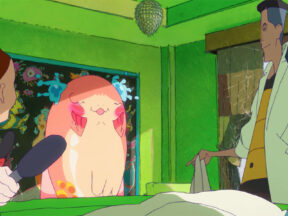
Produced by Studio 4°C, the idiosyncratic CG animation is reflective of Akimoto’s work on films such as Ayumu Watanabe’s Children of the Sea, which similarly utilized the medium in an illustrative style — one that Akimoto effectively leverages here for an intimate take on this time-tripping sci-fi actioner.
For the film’s North American release today, we spoke to Akimoto about its design and avoiding repetition in a film about repetition.
You’ve worked in production roles on other projects you’ve already mentioned, such as Fortune Favors Lady Nikuko and Children of the Sea, where you were CG director. What were you bringing from that experience into your role as director of All You Need Is Kill?
The biggest turning point for me professionally was when I was working on Children of the Sea. That film involved a lot of hand-drawn characters, while much of the background — including the fish and whales — was done using CG animation. It was a very well-drawn film, and I wanted to make sure that the CG didn’t bring down the beauty of the hand-drawn animation.
That experience really made me think about what makes good movement in CG animation, and what actually gets viewers emotionally involved and invested in a film. I also worked on Berserk in the past, and taking all of those experiences together, there were many things I wanted to do — and many things I wanted to change — about how I worked, all to ensure that the CG looked beautiful. That’s the experience I brought into All You Need Is Kill.
This is a very bright and colorful film for one with so much death in it. Did you have that visual contrast between the look of the film and the darkness of its story in mind from the beginning of the project?
As you know from the original novel and the live-action movie, they’re very militaristic and dark — very cool, visually speaking. But at the same time, I wanted to make All You Need Is Kill to showcase the best qualities of animation, in part by making it colorful. When Rita goes into the time loop and faces death over and over, she also has a very strong will to live, and I wanted to represent that by making the film as colorful and bright as possible. I wanted to create a vivid hell on Earth and really contrast it with Rita’s aggressiveness as she fights for her life in this very dark world.
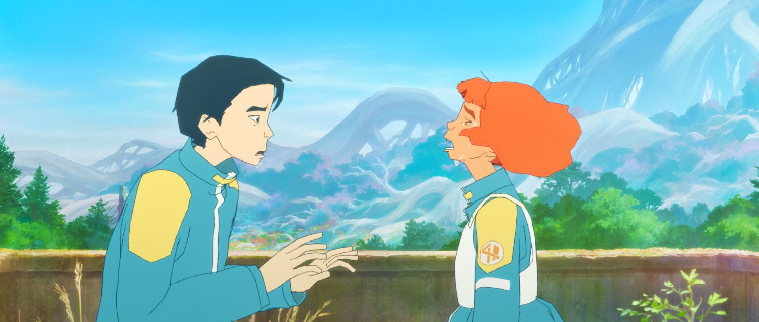
Along with the use of color, the character design also stands out from the norm. What conversations were you having as you shaped the look with character designer Izumi Murakami?
For the character design, one of our main goals was to create something very original. This was actually Murakami-san’s first time serving as a character designer.
I had worked with her in the past on Children of the Sea and Fortune Favors Lady Nikuko, but at that time, she was a 2D animator. Her characters — her drawings, silhouettes, shapes, and the way they move — were all very striking, and I wanted to bring that originality into CG animation. I wanted this project to be a challenge for both of us.

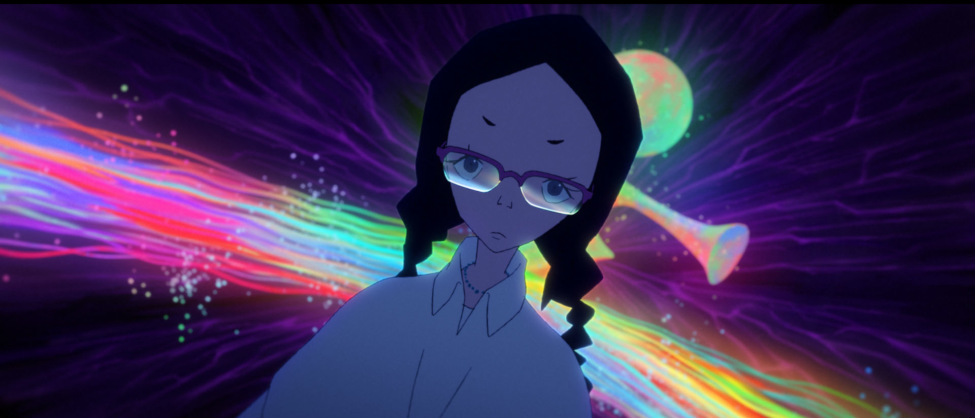
With CG animation, there’s a tendency for weaker CG to become very stiff, especially in facial expressions. We wanted to create CG animation that felt beautiful and free-flowing. One thing we focused on was the outline of the characters — emphasizing the thinness and thickness of the lines. CG director Takanori Nakashima handled many of those adjustments.
My goal with animation in general, and with this film specifically, wasn’t to think too much about the divide between 2D and 3D, but rather about what creates great texture in animation. We looked together at many old live-action films and photo books, pointing out things like lighting we liked, or certain types of noise or filters.

In the same spirit, the aliens in the film are inspired by plant life. What drove that thinking?
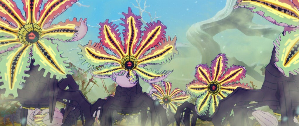
The inspiration for the monsters actually comes from the original novel. In the book, the aliens’ objective is terraforming — creating an environment similar to their home planet — which is why they were initially sent from outer space.
In the novel, they’re described as sea-creature-like, a bit like sea stars. In my film, the main alien is a flower. Darol is a flower, but I also wanted to incorporate petal-like shapes, the sea-star quality, and even something resembling an octopus. It needed to feel very raw and real, which is why it combines biological and mechanical elements. The legs are somewhat mechanical, while the upper portion is very biological — a merging of both. That was my inspiration.
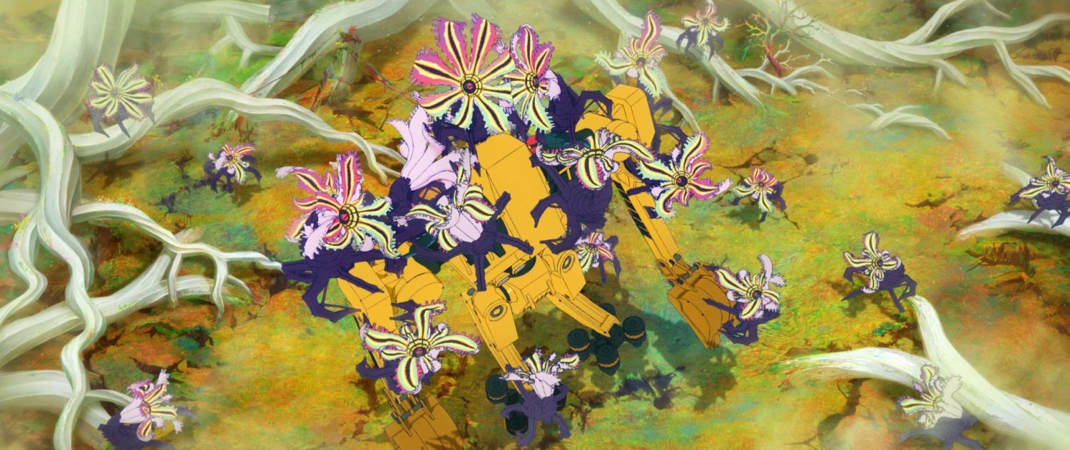

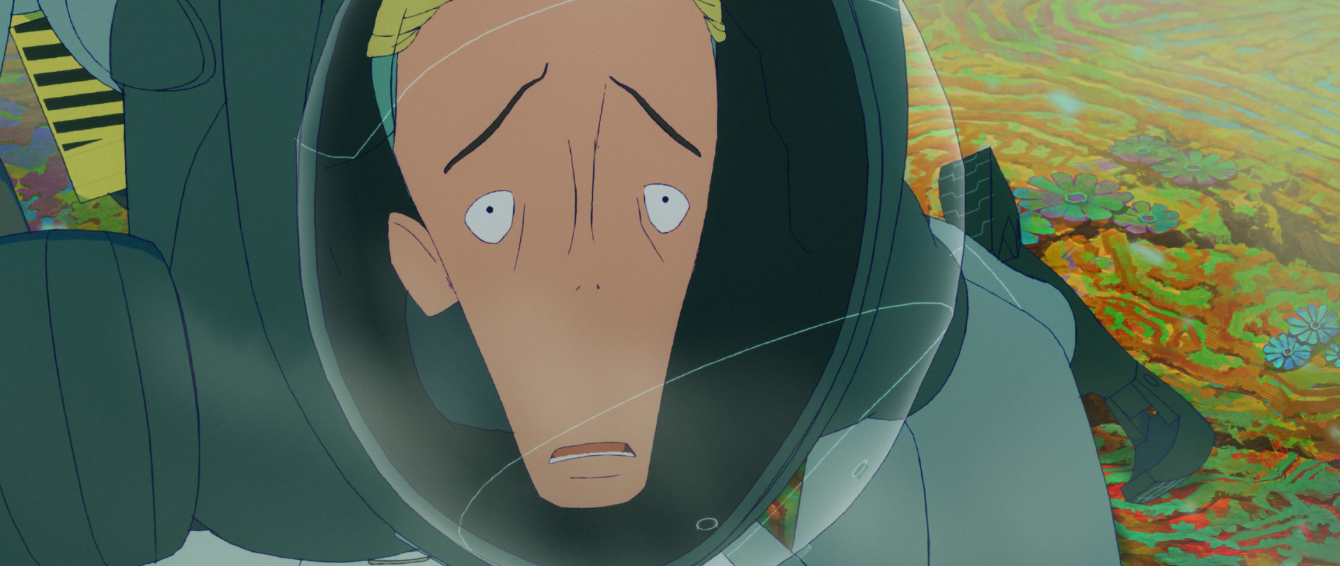
That merging of the mechanical and biological also applies to the power suits, which look very organic.
For the powered suits, it was a two-step process. They were originally designed by Izmojuki, who created the initial power suit designs. Then Murakami-san adjusted them to better fit the character designs and proportions. I wanted to make sure the characters could move freely and fluidly, and that the beauty of animation — especially in the silhouettes of the poses — came through. That was our main consideration in designing the power suits. It was more about elegance than ruggedness.
This interview was conducted through an interpreter and edited for clarity.