BAFTA Short Animation Nominees: How Each Film Was Developed Visually
The animation categories at the British Academy Film Awards (BAFTAs) are less predictable than their counterparts at the Oscars, and this year’s three nominated short films are a typically eclectic bunch.
Yet they have points in common. The list marks a victory for veterans – two of the directors have a BAFTA already. And all three films are tributes of a kind: one to an Expressionist painter, one to a far-flung Texan town, one to an old and damaged friendship.
Then there’s the fact that, for the first time this century, all the nominees are hand-drawn. Cartoon Brew spoke to each of the filmmakers behind these shorts about the visual development of each project.
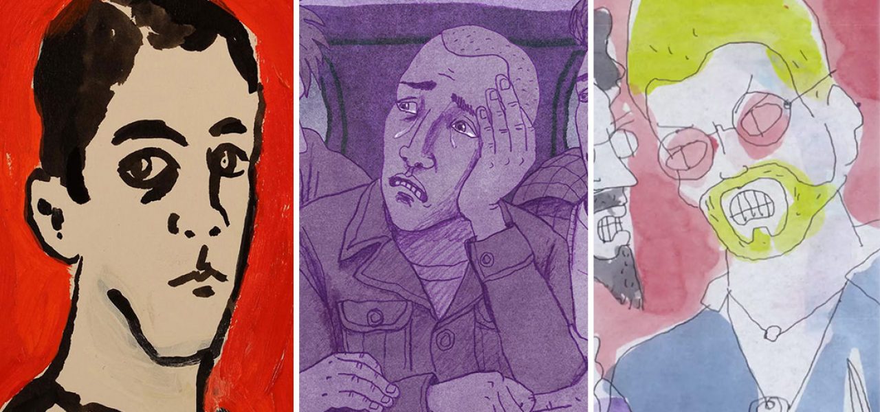
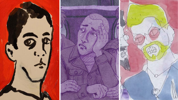
I’m OK
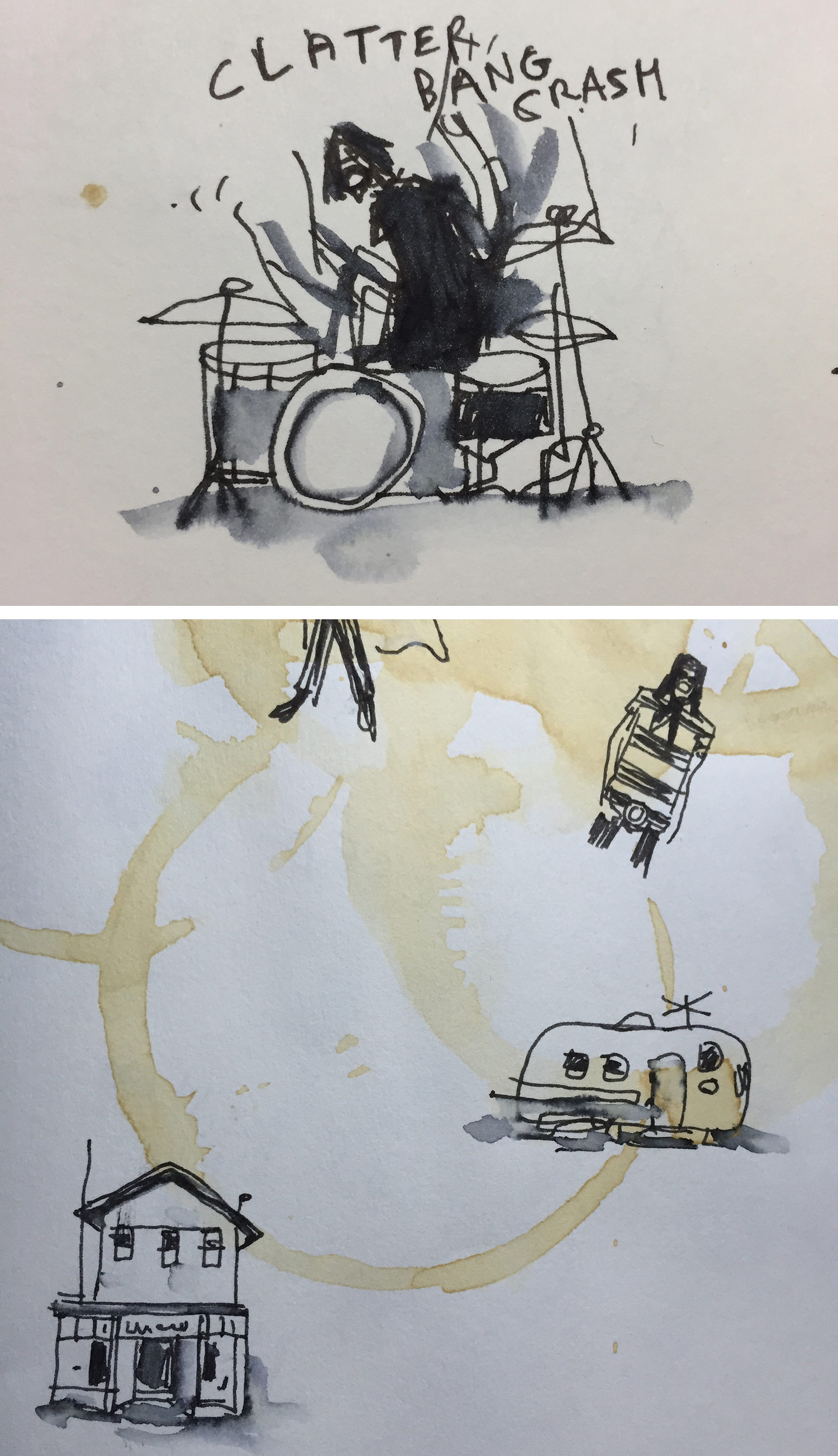
Elizabeth Hobbs’s latest film was prompted by a giant furry doll. The mannequin was of Alma Mahler, the one-time lover of Austrian painter Oskar Kokoschka; when they separated, Kokoschka had it made as a memento (and later beheaded it in public). After seeing a photo of the doll, Hobbs toyed with the idea of telling its story, but its sexist implications put her off. Instead, she turned for inspiration to Kokoschka’s remarkable expressionistic works from 1912–15, particularly his prints and paintings of Mahler.
“I wanted to make a film about that very dramatic period in Kokoschka’s life, in which he was injured as a soldier in the First World War, and his love for Mahler had ended in heartbreak,” Hobbs told Cartoon Brew. The painter’s delirious journey to the hospital forms the core of the film’s narrative. Hobbs didn’t use a script or storyboard: “I found the music that he associated with the period, read his plays, his writing, and studied all his prints and paintings. And then I animated on and around the work.”
I’m OK pays homage to Kokoschka’s compositions – some frames are even captioned with the names of specific works – yet its look is of a piece with her previous work. “I made the film on and off over four years, so the style came eventually of its own accord,” she said. “If the production period had been shorter, it would have been harder to get away from Kokoschka and establish a visual language of my own.”
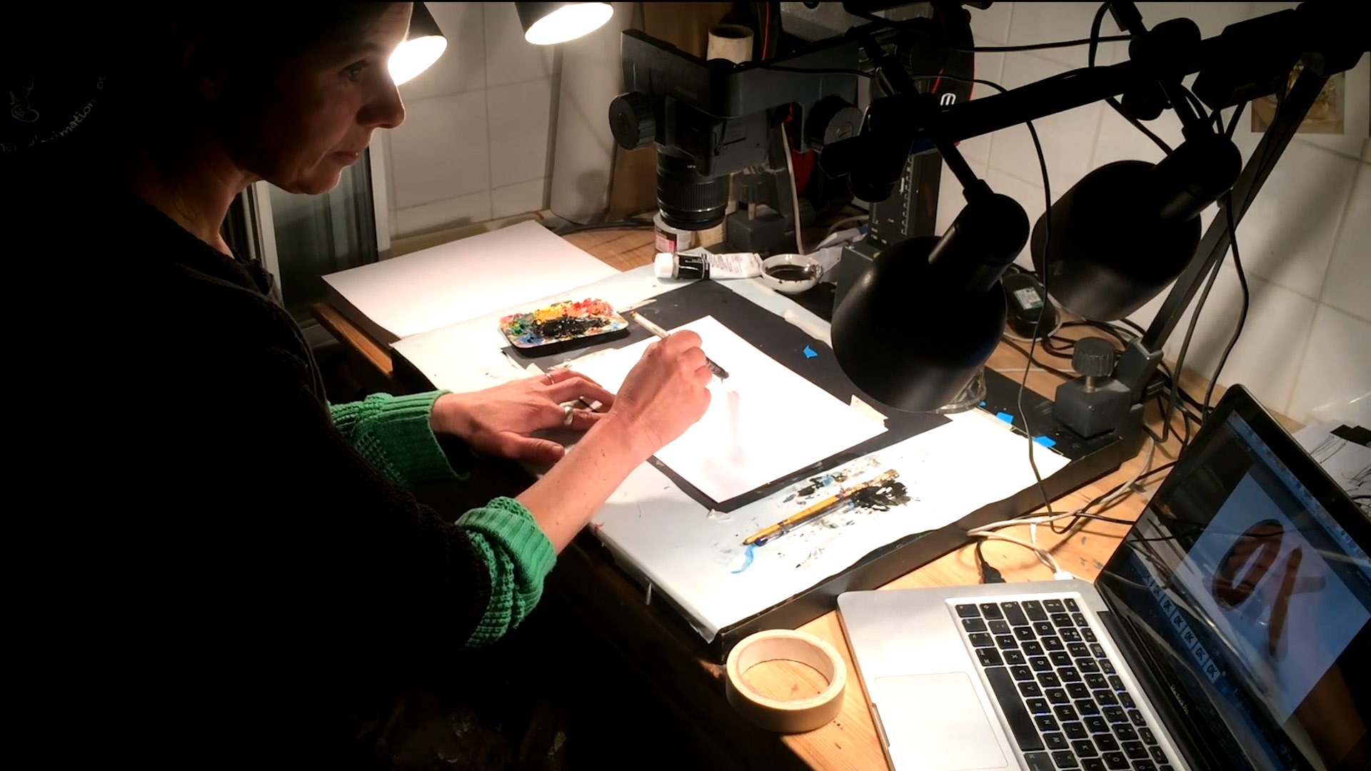
That visual language, a breathless charge of color and fleet brushstrokes, is a product of unusual working conditions. Hobbs made I’m OK alone in one of her bathrooms, which serves as an improvised studio (complete with a rostrum camera). She used acrylic paint and black ink on A5 paper, capturing each frame while the paint was still wet. She animated up to 15 seconds a day – that way, “I have a lot of nice moving sequences that I can try to cut together and make a rhythm and drama from. I do loads of reshoots.”
The film’s color scheme is particularly striking. Monochrome segments are punctured by spontaneous bursts of primary hues. “I had five colors that I stuck to,” she explained. “The work that I was looking at of Kokoschka’s was mostly the monochrome lithographs, but his work is all about expressionistic color, so I was trying to summon that up in the film.” Other than for editing and color grading, Hobbs did not use any digital software to alter the image. “The making of the film is an integral part of it. So I’m careful to show the film as it is, even if it’s not quite perfect.”
Marfa
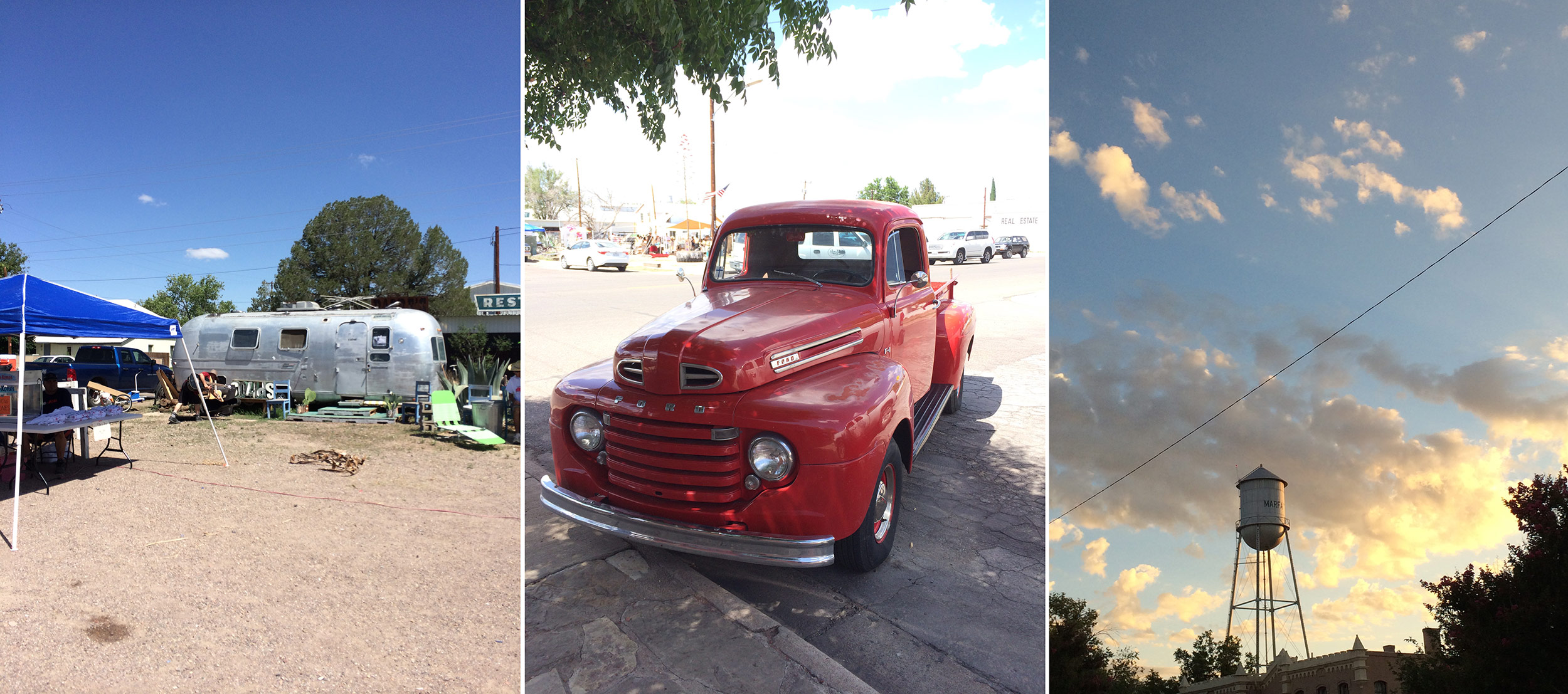
Greg McLeod grew up in England’s green Midlands, and when he saw pictures of Marfa, the Texan desert town instantly struck him as cinematic. “It’s a big-sky place,” he said. “It’s reminiscent in some senses of the spaghetti westerns I watched as a child.” The town is also home to an improbably lively film festival, and when it programmed 365 – a compilation of one-second vignettes that McLeod had animated daily throughout a year – he saw an opportunity. He would go to Texas and create another animated diary: Marfa, a travelogue of his journey into the desert.
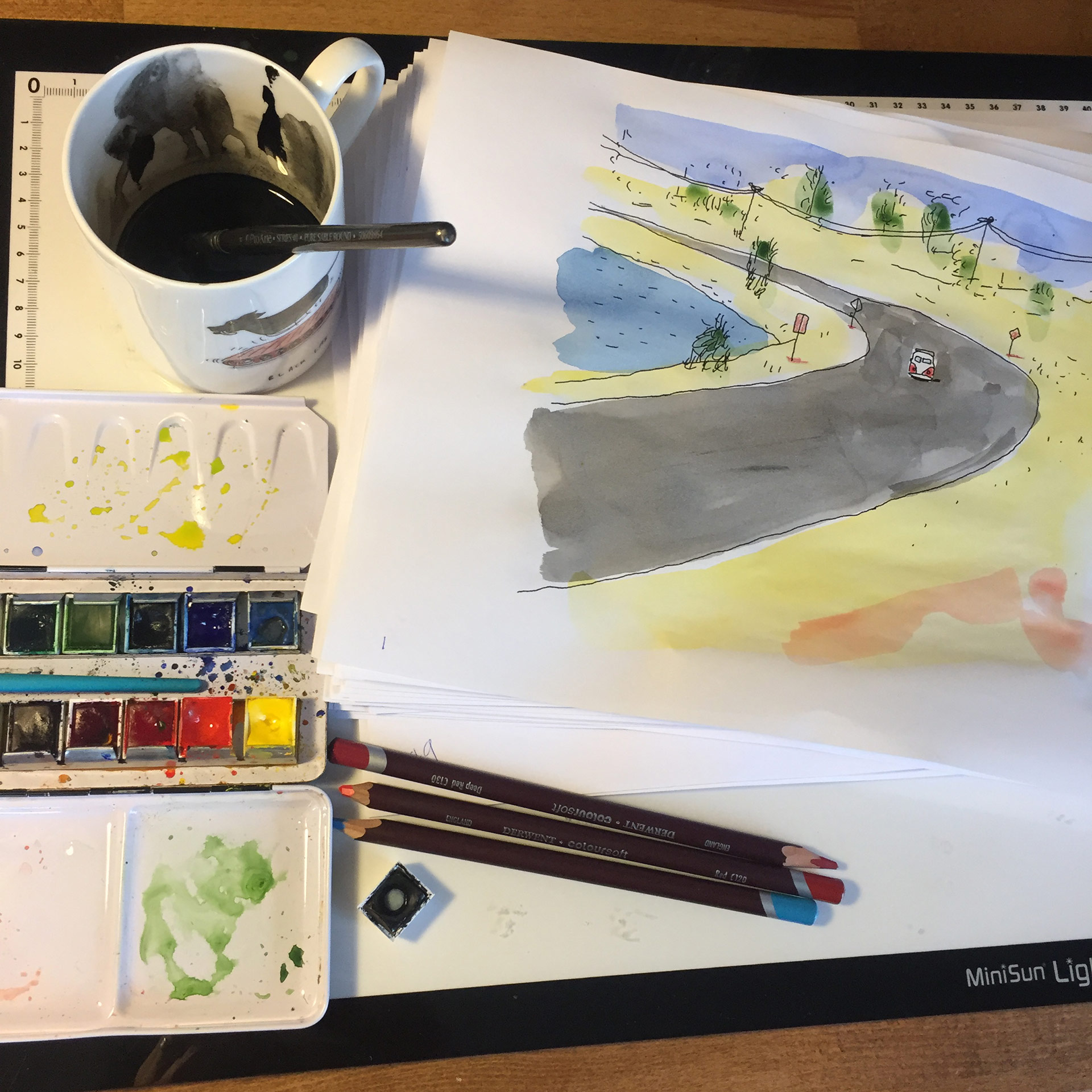
Having launched a Kickstarter campaign to fund the new film, McLeod embarked on the trip, sketchbook and camera in hand. He drove seven hours across the arid Texan wilds, listening to stadium country acts and Ry Cooder’s slide-guitar score to Paris, Texas, before arriving in Marfa. His drawings, photos, and videos of his time there served as visual references for Marfa’s scenes, each of which illustrates a quirky image or anecdote from his travels.
Upon returning to England, McLeod started by arranging the audio track. “I went through all the interviews and atmosphere and music I’d gathered, and made a collage using all the clips that seems to have their own internal narrative.” This determined the order of the scenes. The soundtrack also weaves in a poem by his brother Myles, who tends to script the films they make together. The poem, an impressionistic word collage riffing on Marfa’s sights, serves as the film’s tonal through line.
Like all the brothers’ works, Marfa is visually economical. McLeod used ink and watercolor wash on 60gsm economy-grade animation paper, which he loves for its crinkle. The image is square, big skies be damned. It’s also largely monochrome – color is reserved for a few salient details and a scene about two drugged-up hitchhikers. “My sketchbooks were square,” explained McLeod. “I intended to make the film in full color and in widescreen. However […] despite many tests I couldn’t make it work. I returned to the sketches I’d done while in Marfa and had a strong emotional connection with them. I did a few passes using a more sketched approach and it really connected.”
As the credits roll, the final minutes are given over to a static live-action shot of a freight train plowing down a stretch of Marfa’s tracks. McLeod added the footage on the advice of his friend Amy Nicholson, a documentary filmmaker. “It just sat so well,” he said. “It gives the viewer a visual sense of Marfa in terms of the natural colors, and also has that iconic American train sound. Hopefully it also helps the audience connect the impressionistic animation to the real world.”
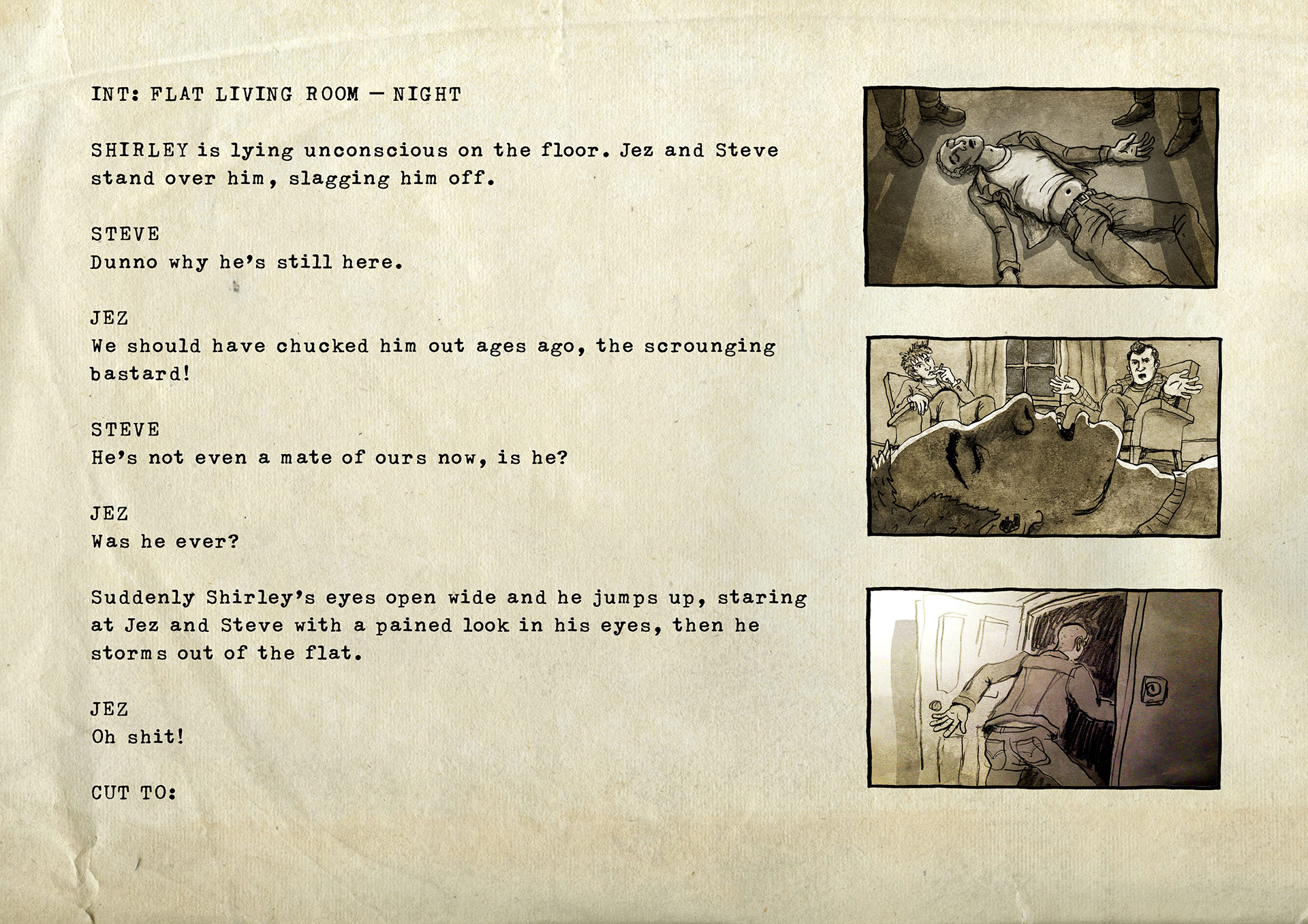
Roughhouse
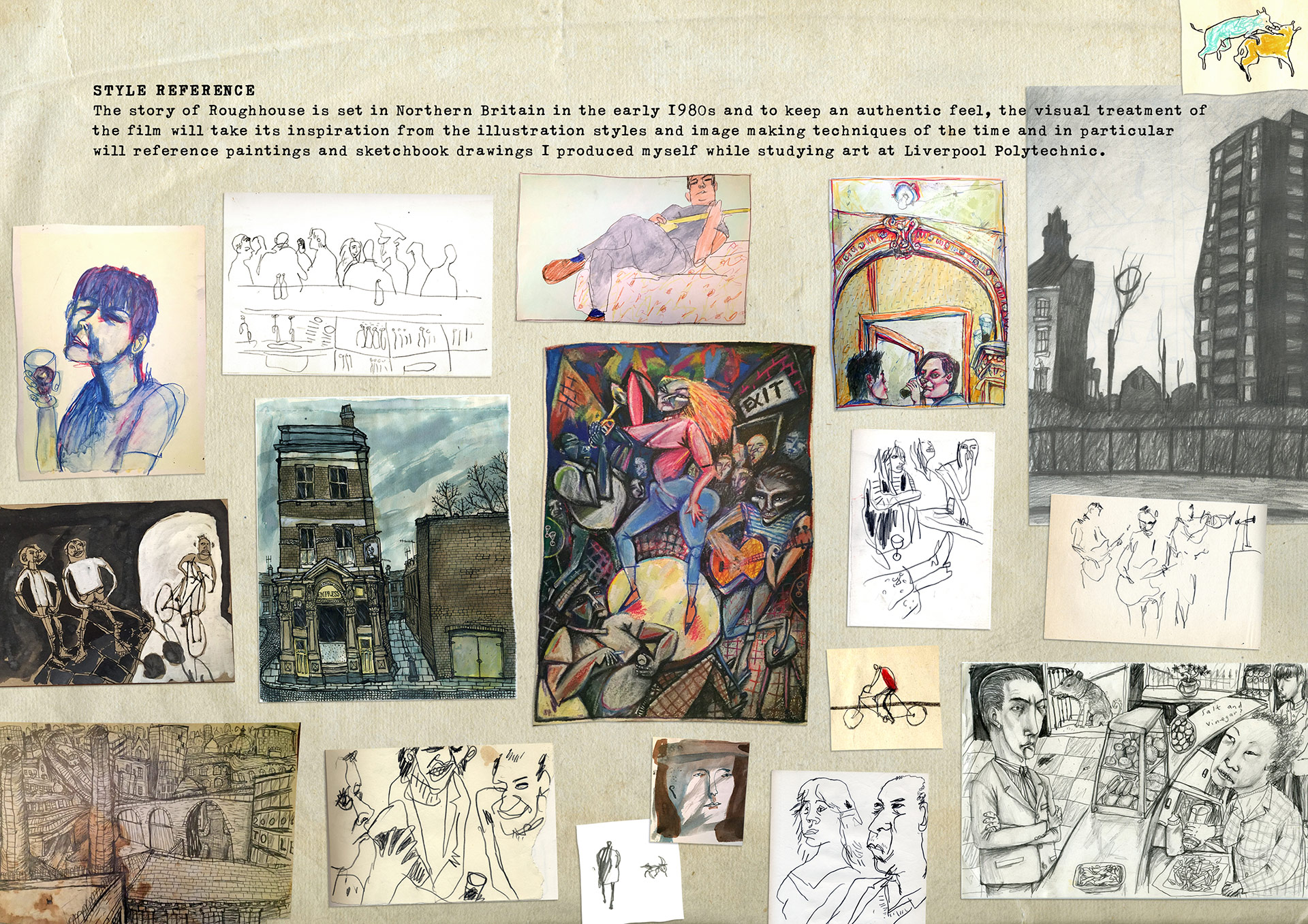
In the 1980s, Jonathan Hodgson burst onto Britain’s animation scene with a run of punky, sketch-like shorts. After directing several mixed-media documentaries, he returned to his original style for Roughhouse, his first hand-drawn work in two decades. To some extent, he was following his audience: he found that his early films went down better at screenings. “I’d always felt more at home with hand-drawn animation anyway,” he told Cartoon Brew. “I decided to forget trying to keep up with the times and go back to my roots.”
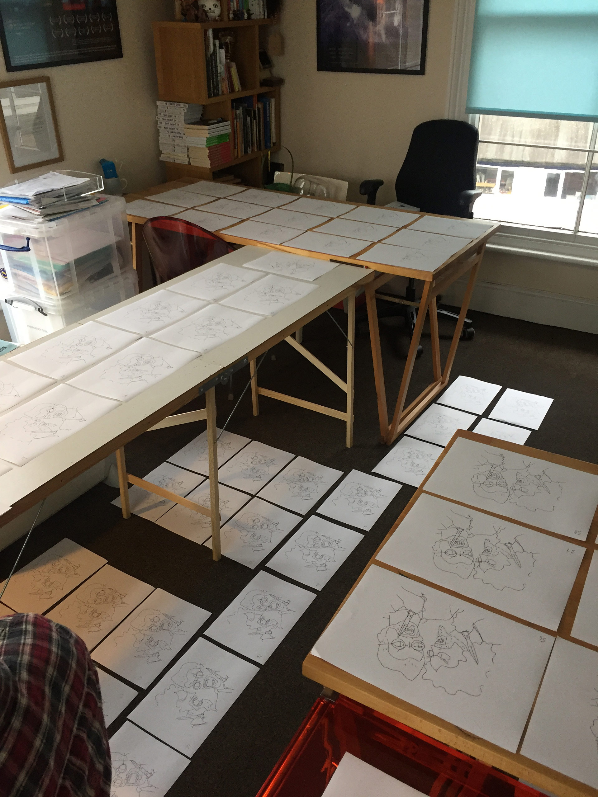
But this decision was also motivated by the story. Roughhouse is a largely autobiographical tale of bullying among freshmen in 1970s Liverpool, where Hodgson studied animation. “I wanted to create a look that was authentic to the times,” he noted. As well as writing the script, he designed the characters and backgrounds, and did all the storyboards and animatics. For reference, he drew on his own student films – notably Nightclub – alongside photos, drawings, and memories from his time in the city.
Unable to obtain the full funding in his homeland, Hodgson completed the funding in France and animated the film at Studio Train-Train in Lille. There, he realized that the character animation in France was “stylized in a different way” from British films. To convey the appropriate body language to his team, he showed them footage of his students in London acting out the film’s scenes. He also introduced them to the cult live-action feature Rita, Sue and Bob Too, “which has some brilliant portrayals of drunk northerners.”
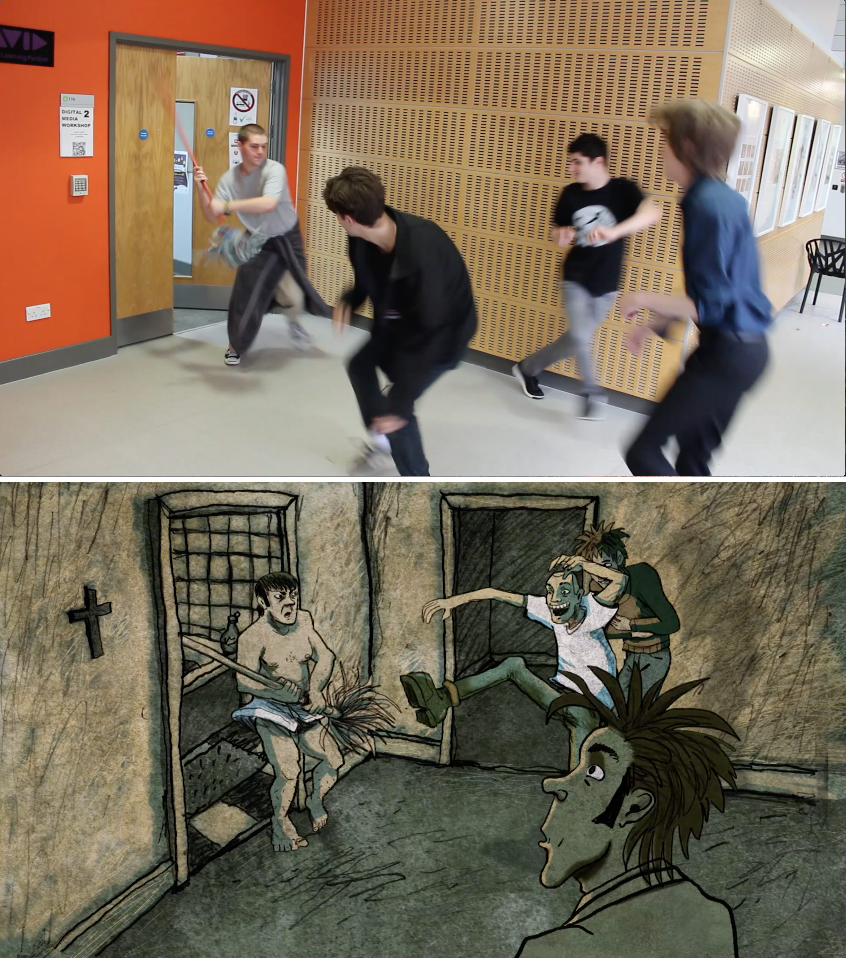
The film bears many hallmarks of Hodgson’s style: watercolor textures, dynamic camerawork, caricatured designs. One departure from his previous films is the bold color scheme. Hodgson was influenced by the woodcuts and lithographs of Edward Bawden, who “[layers] up two or three color separations to make additional blends. I adopted a similar approach in Photoshop, using a limited palette usually of two contrasting colors per scene.”
Although Hodgson had extensively used digital software for his mixed-media films, this was the first time he recreated a hand-drawn aesthetic on computers. Roughhouse was mostly animated in TVPaint – “the only 2D software that I really feel at home with” – and After Effects, which was also used for compositing and special effects. The team commissioned Rainbox Productions to develop a plug-in that imports TVPaint projects straight into After Effects, speeding up the compositing process.
Hodgson remains ambivalent about the move to digital. “I still feel that the animation I’ve produced digitally is missing something aesthetically,” he said. “There is a feeling of warmth and authenticity in analogue drawing that seems to be missing from digital animation. [That said,] economically speaking, it’s definitely a compromise worth making.”
