How ‘The Willoughbys’ Uses CGI To Create A Handmade Look (Exclusive Art)
Following last year’s Klaus, Netflix’s headlong charge into animated feature production continues with The Willoughbys, an adaptation of Lois Lowry’s eponymous children’s novel about a very dysfunctional family. The film premieres on Netflix tomorrow.
The book has the macabre tone of an Addams Family tale, but the film leavens the mood with lashings of color and slapstick energy — while retaining a grisly edge.
The family of the title live in a quaint old house lost amid the high-rises of a cosmopolitan city. Neglected by their self-absorbed parents, the four children strike on a plan: they will orphan themselves by dispatching mom and dad on a hazardous world tour. The kids’ efforts to find a better life take them on a journey into the big city, and thence to a candy factory run by the reclusive Commander Melanoff.
The old and the modern, the fantastical and the real, meet and clash throughout the story, and these dynamics are reflected in the film’s design. By and large, Netflix’s animated features avoid the conventional visual language of big-studio cgi, and The Willoughbys is no exception: it revels in bold palettes, heightened texturing, and an animation style that pays homage to stop motion. (It’s worth noting that this approach was already in place when we first reported on the film in 2017, before the streamer had come aboard. The film was developed and animated at Canada’s Bron Animation.)
The film’s look is in large part the work of director Kris Pearn (Cloudy with a Chance of Meatballs 2) and production designer Kyle McQueen (The Addams Family). Below, alongside exclusive behind-the-scenes artwork, they share their creative principles, and talk about their inspirations — from Citizen Kane to bats in toilets.
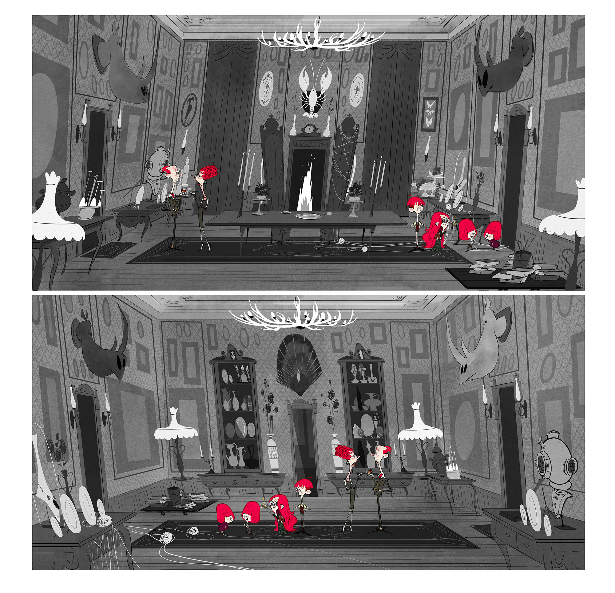
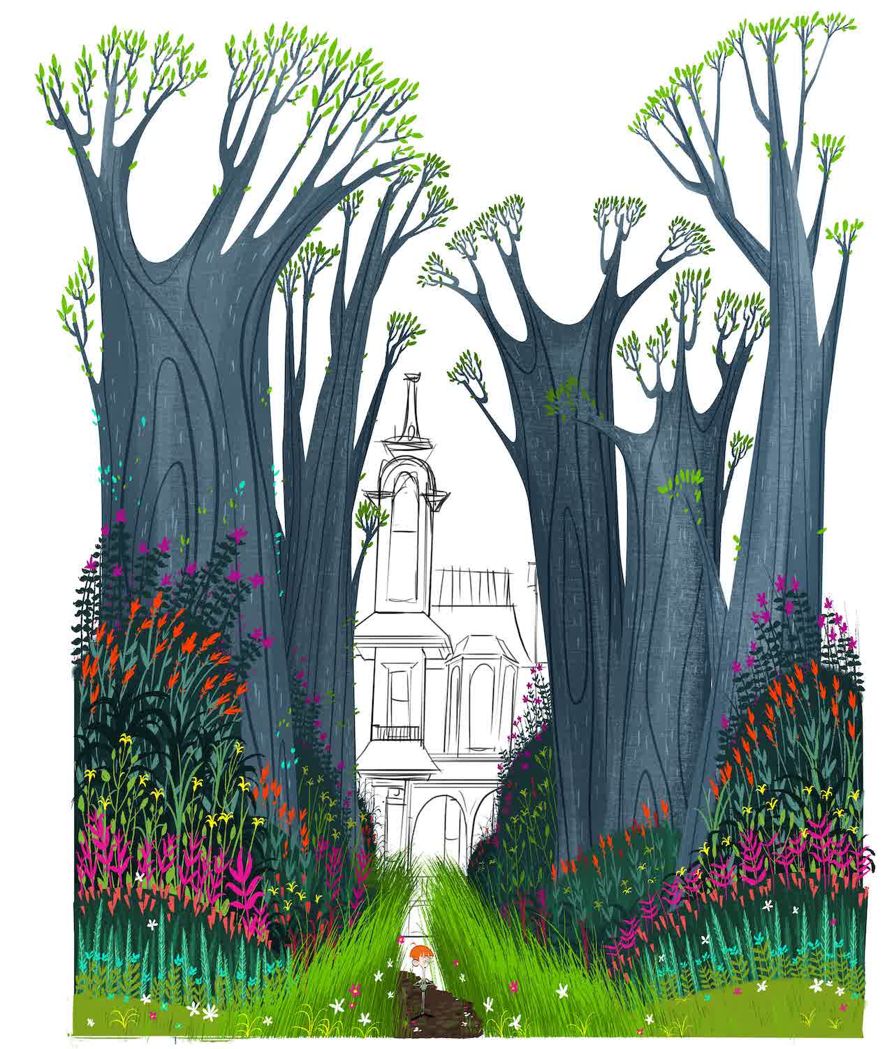
The Willoughby house: more of a tomb than a home

Kris Pearn: When I was a kid, my grandparents were caretakers at an old Victorian house in my hometown of London, Ontario. I always found the place full of fascinating nooks and crannies. And it was full of bats. We used to find them in the toilets. Years later, when that house was torn down, it was like part of my childhood went with it.
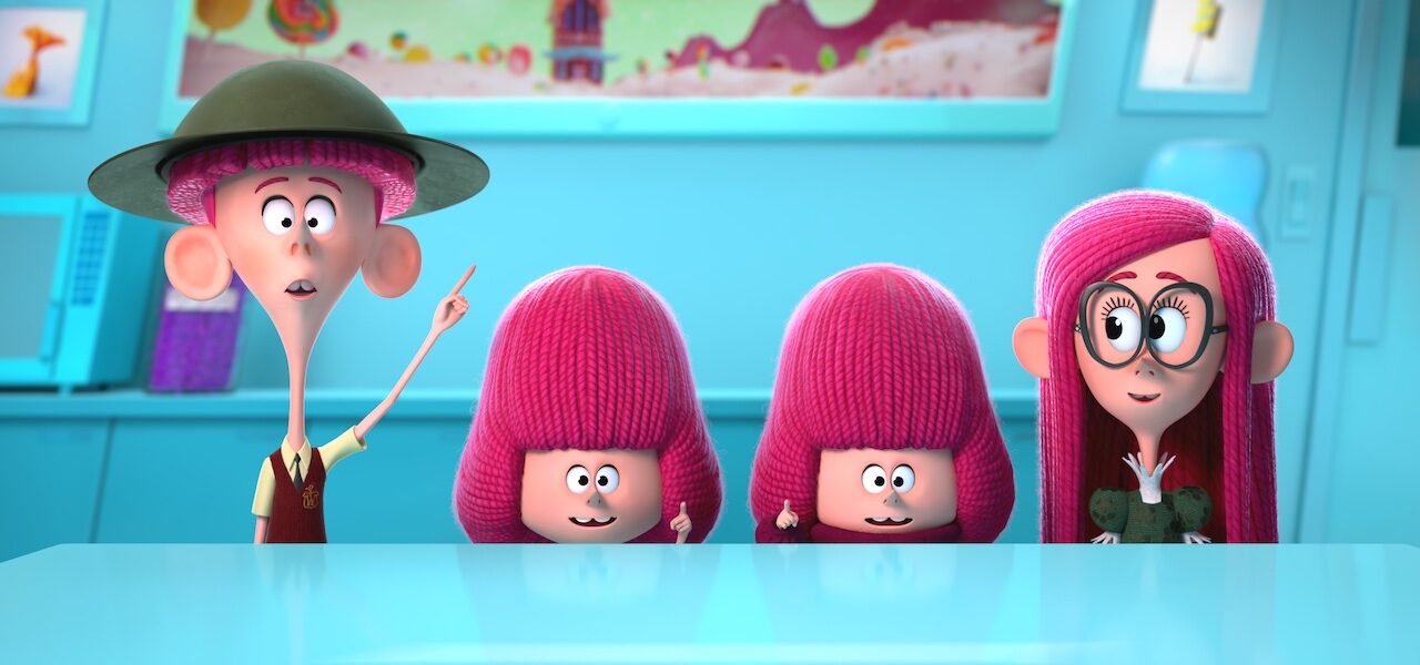
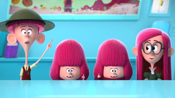
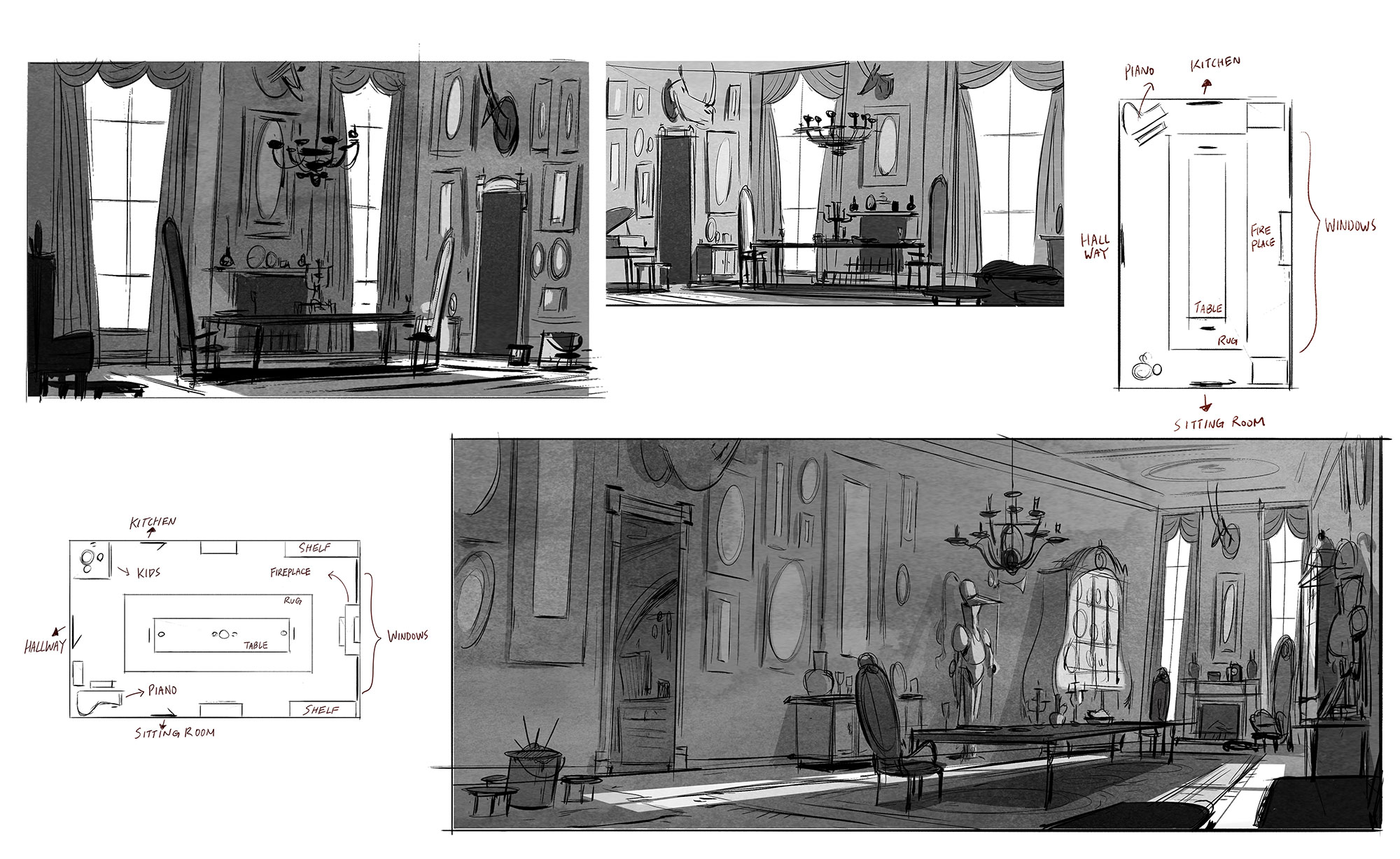
I wanted the Willoughby house to have that feeling: of a place that time forgot a bit, lost in a normal city. We talked about it feeling like a museum… a fun place for the audience to visit, but then also a faded place that had become more a tomb than a home. Kyle chose warm autumnal colors to cue the fact that the house was at the end of its cycle.
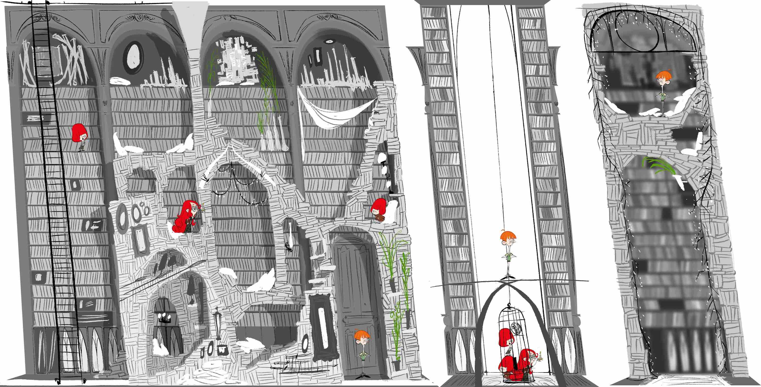
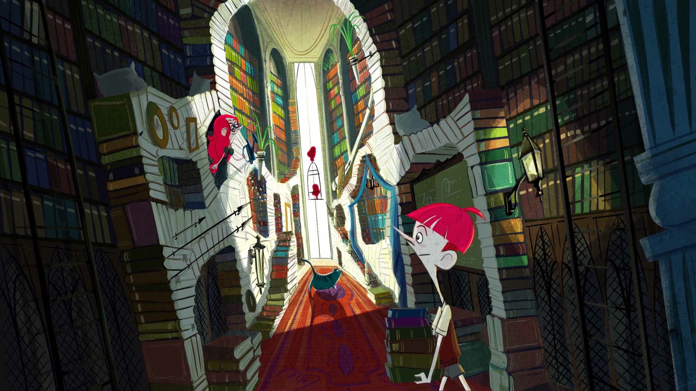
Kyle McQueen: The house is a time capsule crammed full of great Willoughby achievements. We wanted it to feel warm but with a controlled, autumnal color palette. It needed to feel whimsical, but also a place that the four kids ultimately need to get out of. It has long been forgotten by the outside world, so we buried it in this idyllic, unkempt front garden and squashed it in between two massive concrete skyscrapers.
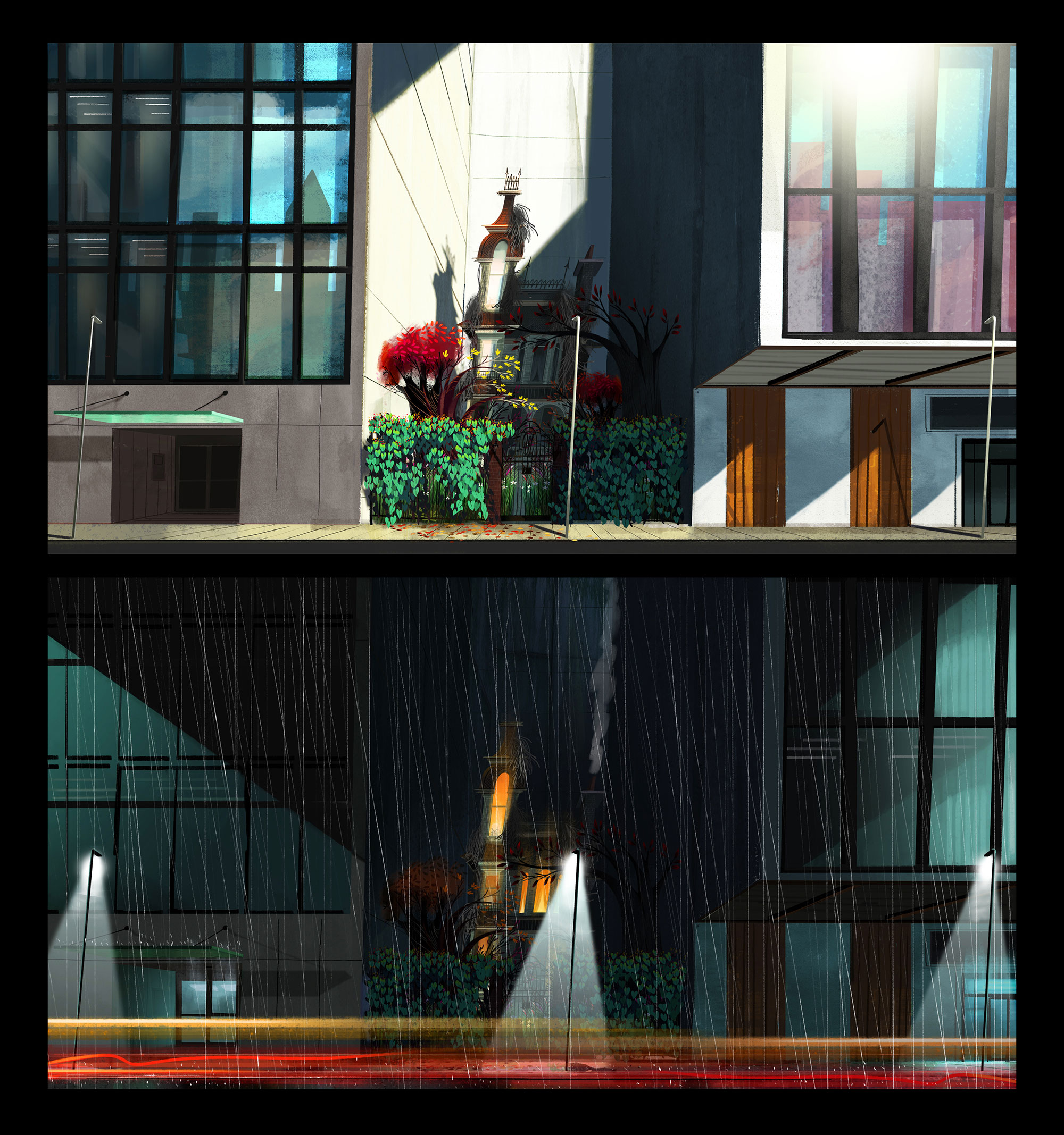
The city: an organized mosaic with a handmade feel
Pearn: I always imagined that it was a “back east” city — Chicago, Toronto, Pittsburgh — the sort of urban place built on an industrial past with a diverse population. We wanted it to have colors and shapes that felt foreign to the Willoughbys: a lot of straight lines and repetitive shapes. I love that it felt like a set with matte paintings that felt like paintings.
Even with the extras, such as the people and cars, we were looking for a harmony of shape to accent the diversity of colors, so the place felt like an organized mosaic… Maintaining that handmade feel was important to harmonize the worlds, so even when the traffic piled up, we wanted the cars to feel like toys (a little nod to Harold and Maude).
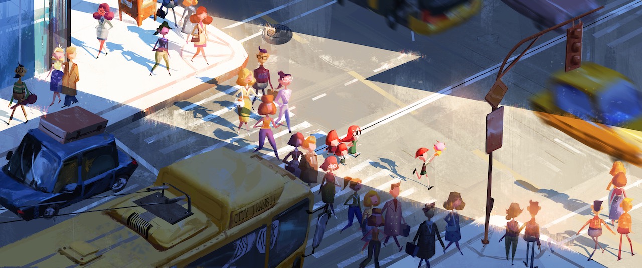
McQueen: It’s very simple and utilitarian. We played down the palette and kept it clean and cool to allow any active color to really pop against it. The crowds, vehicles, shops, and light needed to feel new to both the kids and the audience.
Drawing inspiration from mid-century illustrated kids’ books, we pushed back anything that wasn’t dynamic so the action could read clearly, like looking at colorful gouache illustrations on a white page. The lean was a very [Miroslav] Šašek-inspired way to add dynamics and character to the world and to push away from a rigid cg look towards a looser, handmade feel.
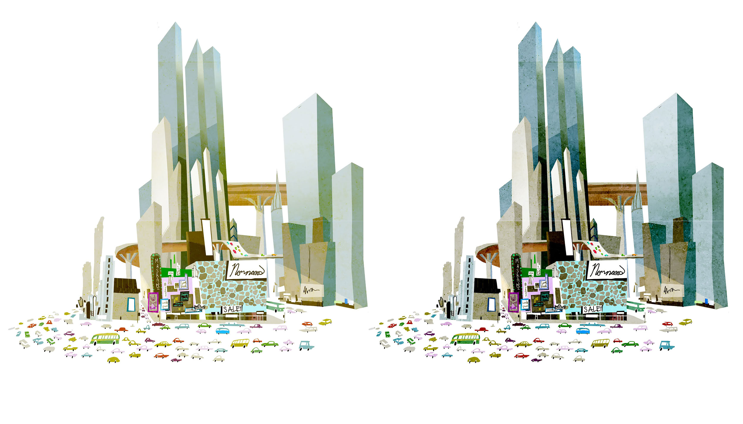
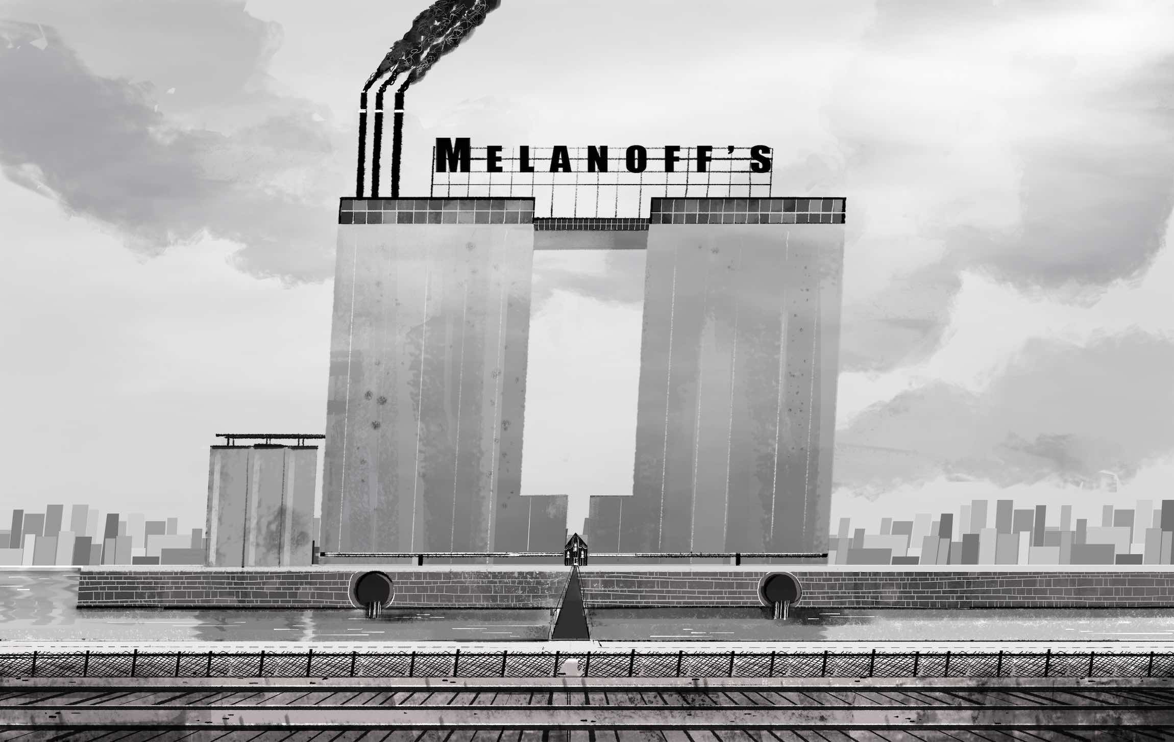
The Melanoff factory: Citizen Kane, but with candy
Pearn: The candy factory was a metaphor for its occupant: Commander Melanoff. We had decided to lean hard into the tropes of Daddy Warbucks, Willy Wonka, and Citizen Kane for the Commander, so we loved the idea that the factory was imposing and grim on the outside, but contained a hidden sweetness inside.
The negative space made by the two factory towers is in the shape of an upside-down Commander — a bit of metaphor: a missing piece. Much like the Willoughbys, he’s an outsider in need of a family, so thematically that set and the space it provided needed to support that story.
McQueen: The monochromatic blue echoes the feelings of the Commander while the vibrant candy colors reflect the happiness and warmth he is capable of, yet is missing in his own life.
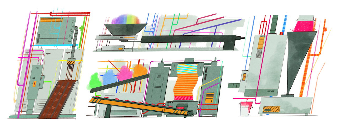
Pearn: We knew that we wanted to adjust the cinematography to support the collisions of worlds. The camera in the house is largely locked. We wanted to shoot the house like a sitcom (repetitive cuts, long takes, clear staging) but as soon as they enter the city, the camera would move. The colors traveled from oranges and browns in the house, to the bright rainbow set piece of the city, to the cool machine blues and greys of the factory. Even the music tracked these shifts in location.
Balancing monochrome sets and rainbow colors
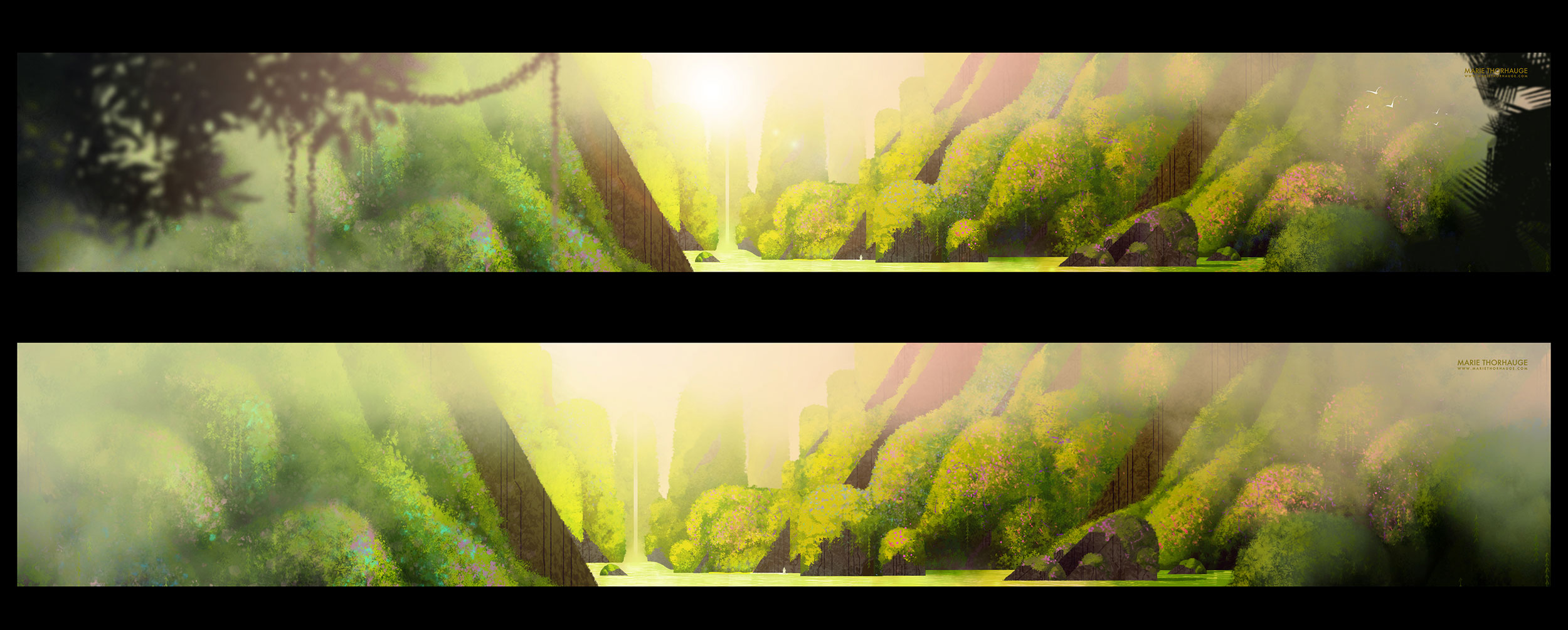
Pearn: Kyle always wanted the film to start in autumn and end in winter (on the Alpine mountain). It was important to me that the audience always had permission to laugh and enjoy the comedy of the farce, so Kyle’s color script always maintained the mood ring, tracking the emotions of the film. Whenever the kids take a risk and push toward their coming-of-age independence, they’re rewarded with color. All the characters move from their base worlds towards color.
McQueen: The Willoughbys is a story of growth and change, and from the very beginning I wanted color to reflect that emotional arc. We ended up making about three different color scripts over the evolution of the story, but always driving very specific color choices into every scene. There is very little use of black — we mainly stuck with analogous and complimentary color groups.
It’s very easy to overwhelm the audience with a million colors in an animated film, but I wanted to have a more deliberate use of color, more like live action or photography, and not be afraid to make bold choices, like a completely monochromatic candy factory. The rainbow was important, but needed to be introduced in little bits over the course of the journey, leading up to the moment the kids finally go out on their journey and escape their past, where we open the tap and let the color really explode onto the screen.
Channeling kids’ books and classic 2d animation
Pearn: From the beginning, I always wanted to undercut the darker themes of the novel. It was important that the film felt funny, so the movement we were chasing leaned heavily on classic 2d principles. Less is more. Strong pose-to-pose choices. Graphic compositions.
We wanted the film to carry that “once upon a time” tone, so the idea of heightened textures, simple camera, no motion blur, and a strong depth of field all builds to the style. Where possible we used twos instead of ones. Helén Ahlberg, our fx lead, would often put elements such as fire and smoke on threes and fours, which [added to the handmade feel].
McQueen: [One scene that switches into a side-scrolling 2d aesthetic] was our little nod to the mid-century illustrated kids’ books that influenced our style. We wanted it to feel like we were turning the pages of a book, watching the dirigible travel across the white of the page.
Pearn: [Lowry illustrated the novel herself, but] we didn’t really refer to her illustrations. The illustration of the house on the cover of the book was informative at the beginning to support the idea of the old-fashioned house. We experimented with the dot eyes early in the process, but as we developed the handmade aesthetic we moved away from the book’s illustrations. Once we hired Craig Kellman to design our cast, we trusted his genius to guide us. While I totally respect and love Lowry’s book, we needed the movie to stand up on its own visual principles. She’s been wonderfully supportive as we developed our world.
McQueen: We were influenced more from the tone of the story rather than the illustrations in the original book. I loved the idea that these kids were part of an old-fashioned family raised on books, and that really influenced the majority of our visual choices. It meant that nothing should feel digital or crisp. There is a slight off-set to everything, a looseness that echoes the handmade feeling of books and illustrations. We wanted it to have a very visceral feeling.