‘If It’s Not Broke, Break It’: Sony Imageworks’ Renegade Approach To ‘Spider-Man: Into the Spider-Verse’
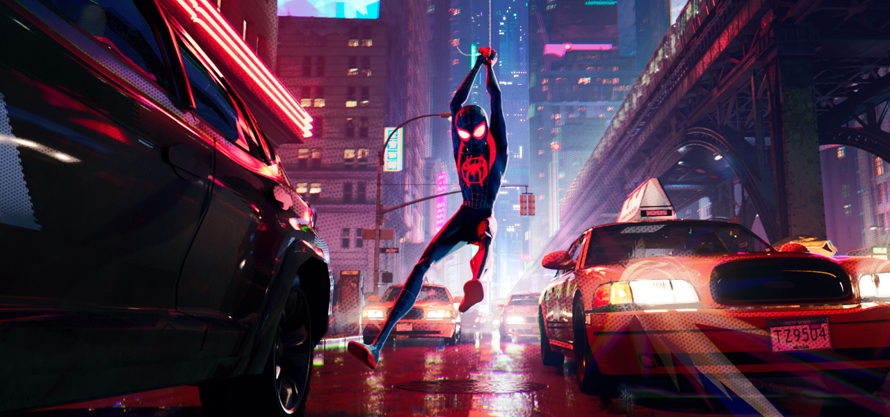
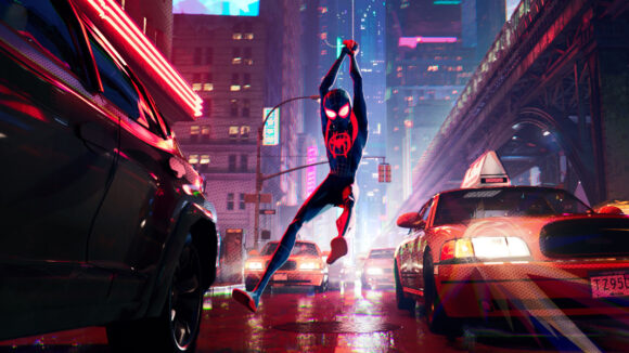
It’s safe to say that Sony Pictures Animation’s Spider-Man: Into the Spider-Verse is unlike almost any other mainstream cg-animated American film. The movie’s animation style directly references comic book panels, right down to the line work, the movement of the characters themselves, and via the infusion of actual off-set printing press processes into the final moving imagery.

But bringing that deliberately stylized – and non-photorealistic – aesthetic to life for a feature-length computer-animated film meant that Sony Pictures Imageworks, the production studio behind the work, would have to break many of their standardized processes built up over time on previous cg shows.
Cartoon Brew asked Into the Spider-Verse visual effects supervisor Danny Dimian what those new processes were and how they were implemented for the Bob Persichetti, Peter Ramsey, and Rodney Rothman-directed film.
If it’s not broke, break it
Leading the early charge on the development of Into the Spider-Verse and giving it a signature style were producers Christopher Miller and Phil Lord, who Dimian had worked with before on Cloudy With a Chance of Meatballs. “They’re very sophisticated when it comes to animation,” he said, “and from the beginning they both said they wanted something that they, when they looked at it, either did not understand how it was made, or they had not seen before, and hopefully both. So, the goal visually was to come up with something new and then have everyone look at everything we do [at Imageworks] in a new light.”
That meant, as far as Imageworks was concerned, a need to break the pipeline anywhere they could, or as Dimian describes, “trying to do something a different way, even if there was no real reason for it. We wanted to change the term, ‘If it’s not broke, don’t fix it’ to, ‘If it’s not broke, break it.’ The goal was to encourage people to experiment and to play in hopes of finding new ideas.”
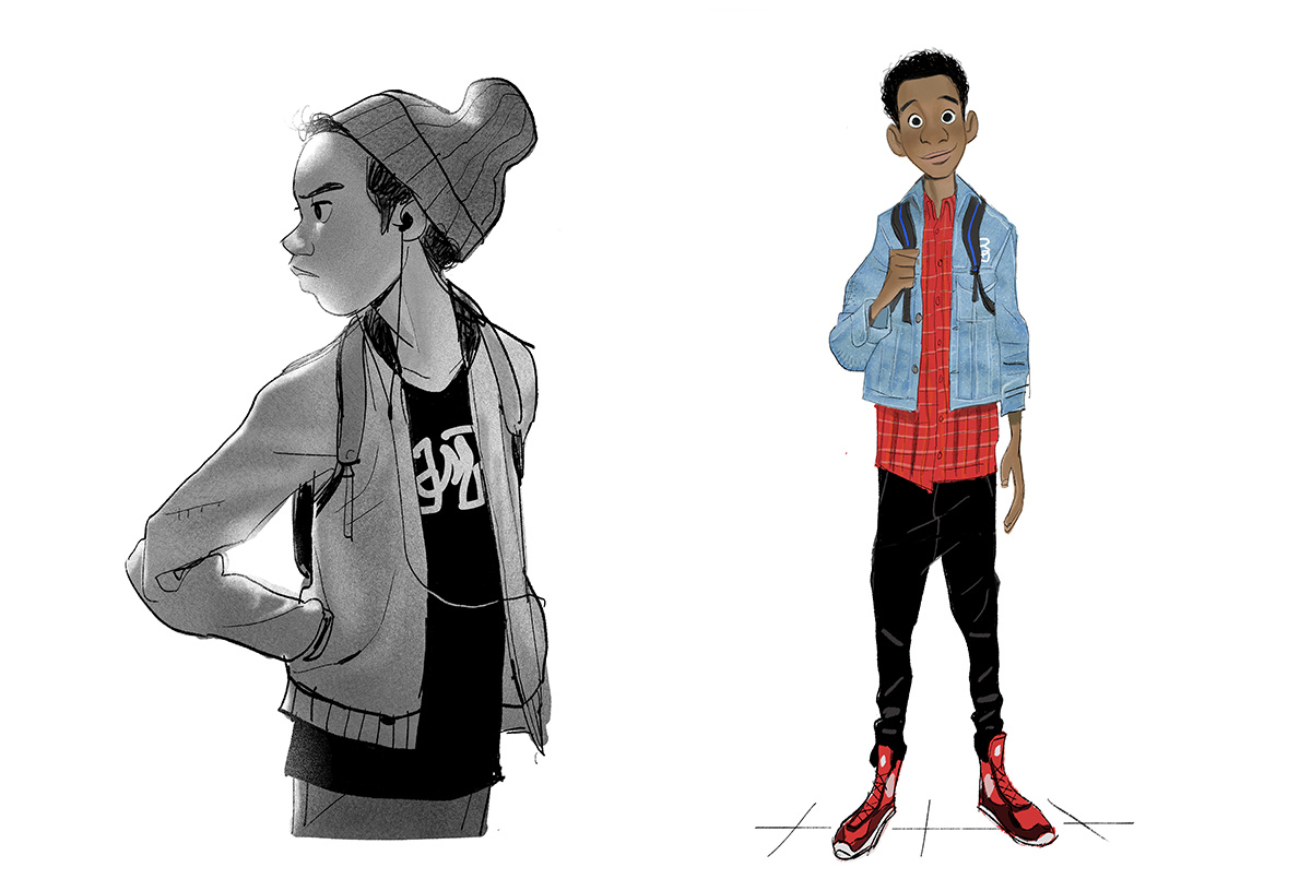
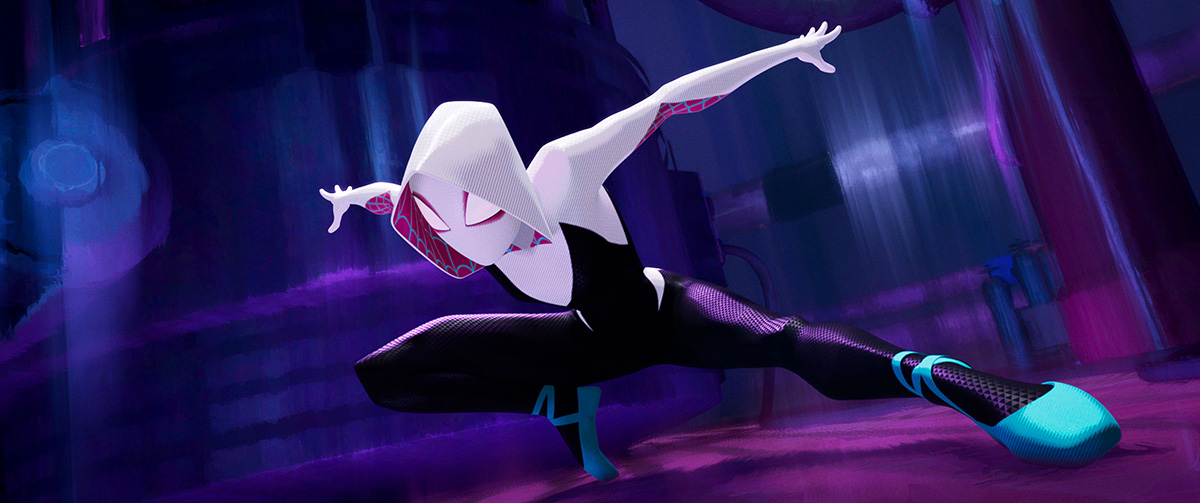
To get a handle on exactly what they would involve for the production, and particularly at Imageworks, a series of tests shots was embarked upon. One was a typical Spider-Man shot showing him leaping off a building. Another saw him swinging through the city, and the third was a close-up emotional performance of the character Gwen Stacy. The latter test shot was especially important for Dimian, especially in terms of how the final non-photorealistic rendering approach would work.
“I had worked on The Polar Express, so it reminded me of how hard it is to do stylized children and women characters who have very subtle features and don’t have a lot of detail and don’t have a lot of sculpture to actually work with.”
The tests revealed several things straight away that the animation and vfx teams felt they would need to take into account in making the film. “It was on 1s, and it showed us that we were not going to get the feeling we wanted if we animated traditionally, i.e. traditionally splined animation,” recalled Dimian. “What we didn’t like visually was the smoothness of being on 1s. The smoothness also happens from motion blur.”
From the tests, too, the filmmakers noted that the faces were not expressive enough if they relied on the cg model alone, which were intended to be simplified models.
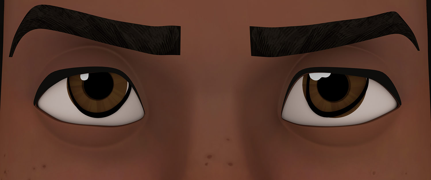
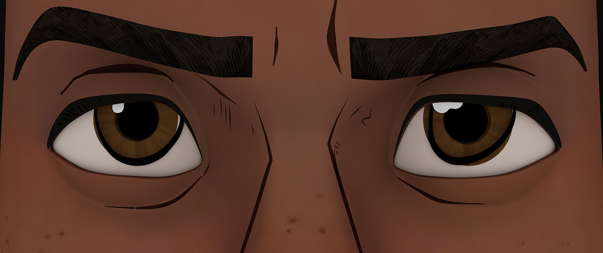
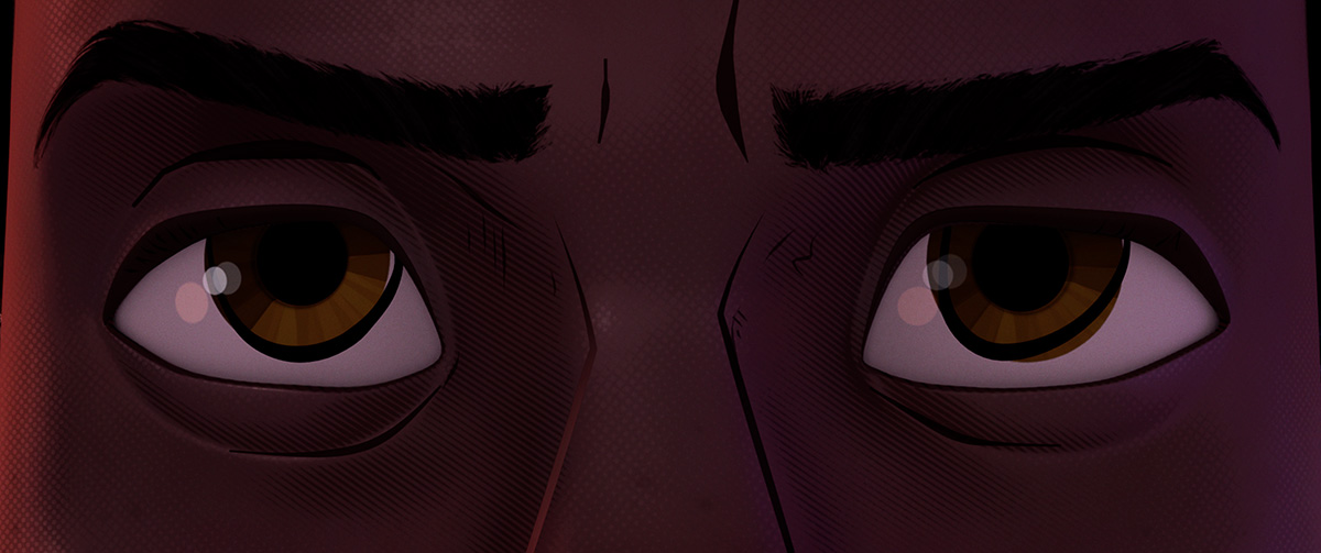
“When we kept looking at comic books,” said Dimian, “we noticed they got the emotion out of the lines that were drawn on the faces of the characters, and the fact that those lines were not consistent and they were not connected to the underlying structure. That led us to the whole idea of drawing lines on the face, as a part of animation, instead of them being a part of the texture or even connected very closely to the models.”
Drawing the line(s)
Thus, line work became a crucial part of the production, and also aided in linking the film to an illustration style that comes from actual comic books. “We wanted the feeling of [the film] being drawn in 2d,” said Dimian, “because one of the things that’s really beautiful and interesting about illustration is that there are a lot of cheats and a lot of ‘to the camera’ or ‘to the view’ drawing that is done. It’s not consistent and it doesn’t really make sense according to the form. Priority was given to design. We also wanted the 2d part where, if you’re drawing by hand, you get all the beautiful imperfections of it not lining up exactly right, but also the line weight, the line color, all of that.”
However, since the film was being released in stereo, Imageworks could not rely solely on a 2d solution for these lines (that would’ve mean they would have to draw every frame, which would not look correct in the stereo version). Therefore, the lines had to exist as 3d geometry that could be moved around.
The lines themselves were of three types, as Dimian explains. “The first ones were built into the model, those don’t really need to move. They’re just the more form-like lines such as the inside of the ear, for example. And they’re not expressive. Then there are those that are done from a drawing point of view, like when you would separate the underside of the chin against the neck because it’s the same color, or the nose against the cheek or the underside of the nose. Those are all about the form. They’re not really emotional, but they’re very important in terms of making it look like things are drawn and that deliberate choices are made about the way you would draw them. Then probably the most important lines are the ones that start as drawings, but are then provided to animation as a rig to control and those are the emotional ones, for example, the emotional face lines.”
Distinctive line work became part of props and buildings, too. This process actually began with the models of the buildings and props themselves, which were called ‘broken models.’ That’s because the lines were often floating lines, where buildings might have window panes that were not actually connected to the main structure of the building model. Dimian says the techniques settled on to achieve this look in Into the Spider-Verse are ones planned to be used “in general more, and also in newer ways” on other productions at the studio.
Going with no motion blur
With comic book panels serving as a clear inspiration, another feature introduced into the film that offered a stark contrast to the usual 3d animated movie fare was the absence of motion blur. That decision might normally have a direct impact on the amount of camera movement and the style of cinematography, since zero motion blur can also introduce strobing into the final shots. But Imageworks found other ways to deal with it.
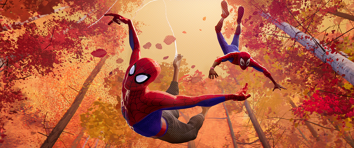
“We knew we would have to solve [having no motion blur],” said Dimian. “We just didn’t want to solve it with anything that looked too traditional. We looked to 2d animation and anime for solutions and ideas. We really looked for something that still looked like it could have been inspired by either anime or the way you would illustrate movement via smears or stretched geometry, for example, but not done that way.”
In the end, a number of solutions were employed. Imageworks’ line tool allowed artists to draw motion lines that also connected shapes. There were also camera shutter-inspired techniques. “For example,” said Dimian, “the background on a fast camera pan would, either in compositing or with help from effects, be very smeared and streaked, but in a really blocky kind of illustrated looking way. We basically tried to avoid anything that looked like it was a smooth gradation or that was blurry because of motion blur. Instead, it was a very graphic treatment.”
The impact of animating on 1s, 2s or 3s
Animation-wise, Into the Spider-Verse was mostly animated on 2s, but was also animated on 1s and 3s. This approach impacted Imageworks’ effects simulations, which usually need a constant rate of motion – “simulations don’t like the idea that in one frame you’re moving and then the next frame you’ve stopped,” said Dimian. The vfx studio, therefore, had to come up with ways where the simulation ‘targeted’ to the animation.
“We either had the data for what would’ve been the animation on 1s, and then the data that was for what’s on 2s,” said Dimian. “So, the effects artists could make decisions based on which portions to simulate, and which portions to bind to animation. And then a lot of really talented artists made creative choices for the in-betweens.”
Cloth simulations on characters’ wardrobe proved particularly challenging when animation was done on 2s. In order to achieve some kind of continuous motion of the clothing, Imageworks had to run a solve and run an in-between. That resulted in, detailed Dimian, “a ghost in-between frame that the audience never sees and animation never actually animated, but it allows the simulation to actually be continuous.” Software was written to allow those simulations to occur despite the non-continuous motion, and for the ghost frames to be removed.
Off-set color printing: a major influence
Continuing with comic books as a jumping-off point, the filmmakers looked to the effects caused by the off-set printing press and how they could be translated into the visual style in Into the Spider-Verse. Dimian says Imageworks was tasked with mimicking how that off-set printing process would result in different colors and different gradations out of only a few original colors.
“One thing we noticed was when the screen printing press was off and you had colors where color passes were not aligned properly, it was kind of hard to look at in a way that made you feel like it was blurry. And so, we did that as a cinematography technique. When we tried make something out of focus with the camera, it was almost as if there’s a color off-set process that is shifting the scenes out of focus and it still feels like it’s a racking camera.”
“One of the rules adopted was avoiding smooth gradations,” continued Dimian, again referencing the printing press process’ influence on the film. “So, if an area transitions, we’d use a dot pattern effect to create that transition. You don’t just allow it to be a smooth grad. Another thing we noticed was, in illustration, often the shadows were line hatched. So, most of our shadows have some sort of line hatching in them and those can go from thin to thick lines.”
Further comic book inspiration came in the form of prominent comic book artist Jack Kirby, including for the film’s climactic showdown that includes an array of floating ‘bubbles.’ “A lot of the illustrations had what we ended up calling, ‘Kirby dots,’” said Dimian. “Jack seemed to use a lot of those dots and splatters in his work. We started using them just because they looked cool, but then they kind of took on a life of their own. They’re inspired by the whole idea that, at the end of the day, the comic books were printed out of dots – the whole dot printing half-toning process, so it was an allusion to that. The bubbles were also an allusion to particles, as if they were things breaking down through the multi-verses.”
Glitching effects
In the film, characters and buildings glitch in our world because they are not supposed to be in this multi-verse. But one of the things the filmmakers were trying to do was represent all the other multi-verses when the glitching is happening. “What you’re actually seeing is animation being done through other cameras and other lookdev treatments,” said Dimian, “each one representing other worlds that the characters could have been from.”
To get that look, Imageworks rendered the same animation through multiple camera angles, and then assembled the camera views in three-dimensional space. “It gives you these three dimensional objects with different views representing a different angle from a different multi-verse and also a different rendering,” explained Dimian. “And then, altogether, hopefully, it just feels like it’s a glitching, but each glitch is from another multi-verse.”
More effects, but hand-drawn
Throughout the film, and particularly in the third act showdown, there are numerous explosions, blasts, fire, and spark effects. Imageworks shied away from directly simulating these with the usual effects-sim tools, and instead infused a two-dimensional look into them.
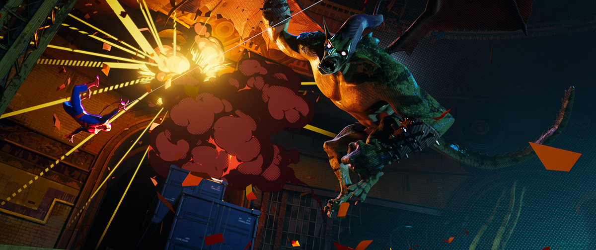
“We tried to do simulations and they just didn’t have a life or the right design sense,” noted Dimian. “A lot of the explosions and sparks came together so nicely by starting as animation entirely drawn by hand. Our 2d effects artists broke down what the action would be and sent a really rough blocking pass to a 2d effects animator. And then we got little libraries back of an explosion cycle hand-animated in 2d. It was all broken down so that they could be used as pieces that could be re-combined by us to actually create whole explosions.”
“One of the overriding things we wanted from the beginning was to feel like the hand of the artist is in there, including imperfections,” added Dimian. “We left stuff in there when – maybe it wasn’t what we intended – but it looked good, and we kept looking for those kinds of imperfections and things that look like somebody actually did it for real.”
In the picture
Dimian feels incredibly close to the work on Into the Spider-Verse, not only because of the significant time he and other Imageworks artists spent on production (with several of the technical innovations reportedly being put forward in patent application claims), but also because his likeness makes a brief cameo in the film – it’s as a anxious-looking guest at a lavish dinner held by the character, Kingpin.
“One of the animators took it upon themselves to make me into an interesting-looking nervous person,” joked Dimian. “It may have been done during the time where we were most concerned about, ‘How are we going to get it done?’ There’s always that part of the show where it gets really stressful and you’re not sure how it’s all going to come together. That may have been the time he decided I should be that character.”