A venerable 2d property’s shift into 3d is a vulnerable moment, with plenty of hazards. Scoob!, the first Scooby-Doo feature to be fully cg-animated, weathers the transition well, preserving the playful cartoonishness that has become a hallmark of the franchise across half a century.
Michael Kurinsky
A large chunk of the credit is due to Michael Kurinsky, the film’s production designer. Having worked as a background artist at Disney (The Hunchback of Notre Dame, Mulan, Tarzan) and a visual development artist and production designer at Sony Pictures Animation (Hotel Transylvania 2, Spider-Man: Into the Spider-Verse, The Emoji Movie), Kurinsky has honed his feel for light, color, and set design across both 2d and 3d — a skill set that prepared him well for Scoob!
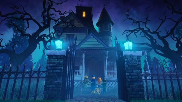
The film opens with an origin story for Scooby-Doo, Shaggy, and their mystery-solving buddies. The group meet as children one Halloween night, and swiftly end up the Rigby House, which is ostensibly inhabited by a ghost. The haunted house is the most iconic of Scooby-Doo locations, and so this prologue encapsulated Kurinsky’s core challenge throughout the production: to make things look at once fresh and familiar.
Below, Kurinsky talks Cartoon Brew through the process of designing the scene:
Kurinsky: The Rigby House was the set that payed homage to the original Scooby-Doo more than any in the movie. Director Tony Cervone and I agreed that this is our big throwback scene, and he asked me to play it that way. His direction was to play the Rigby ghost as “real” at first, and then, only at the right time, reveal that it was all a hoax. He also said not to forget to let it be a bit dark and spooky. The original had its dark and suspenseful moments, and so should our movie.
But I also wanted to make sure that the scene was unique for our movie. The idea that Shaggy had what the kids in his neighborhood thought was a real haunted house really appealed to me, so I asked the art team to play up that aspect of it.
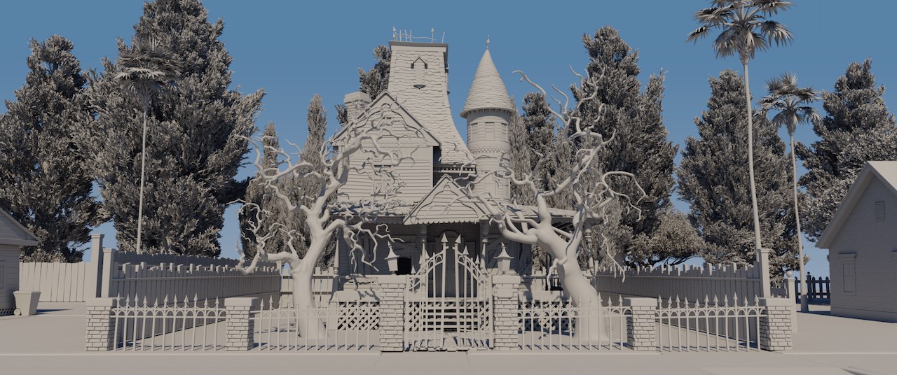
At our largest, there were 11 of us, including myself, art director Emil Mitev, and character designer Sandro Cleuzo. It was a lean and mean team, which was great because each individual artist’s contributions to the film can be seen in a big way. To play up the “spooky old house” aspect, I asked them to push its proportions so it felt different from the other houses, which use 90-degree angles. Also, it’s the only house to have extreme wear and tear on it. There are boards over broken windows, weeds for a front yard, and it even came with its own fog bank!
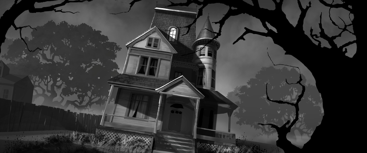
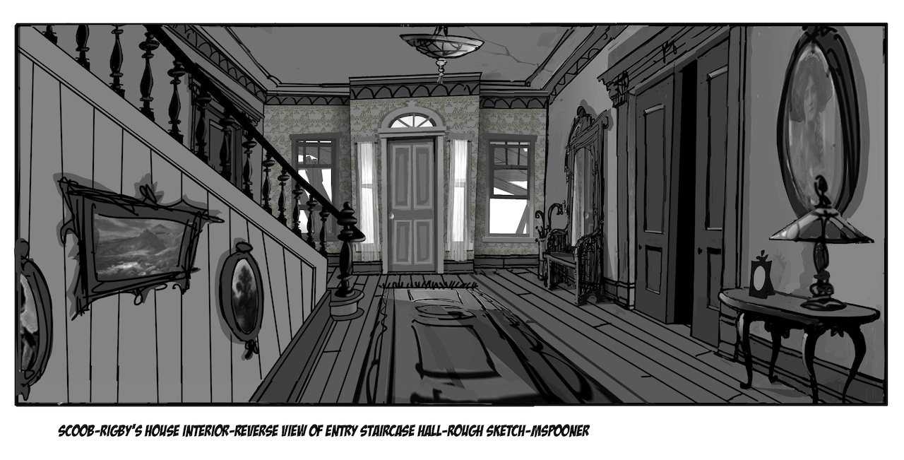
Original sketch of the Rigby House’s exterior (above) and interior (below, by Michael Spooner).
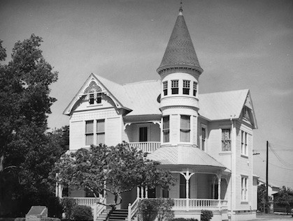
“We studied the Stoffel House, which had a history of being haunted by its caretaker”
We looked at the haunted houses from old Scooby-Doo episodes, but Tony always spoke of our movie having a big California presence to it, so we did research on houses in Southern California that had a haunted history.
The Red Cross House
We came across the Stoffel House, also known as the Anaheim Red Cross House, which had a history of being haunted by its caretaker. There was something about it that grabbed Tony’s eye, so I started designing the Rigby House using elements from it. The problem was that it felt too “normal” and didn’t provide enough contrast to the other houses in the neighborhood, so I added an unusually tall gable in the center that was reminiscent of a few houses in the original Scooby-Doo.
That first sketch was then given to designer Michael Spooner to flesh out. He did turnarounds of the exterior as well as the designs for the interior. He’s a very precise designer — his designs of the interior feel like they would actually work with the designs of the exterior, which was great, until we saw what kind of action was supposed to happen inside the house.
Painting of the interior by Michael Spooner and A. Hall.
“The story and ideas change, which forces changes in the environment”
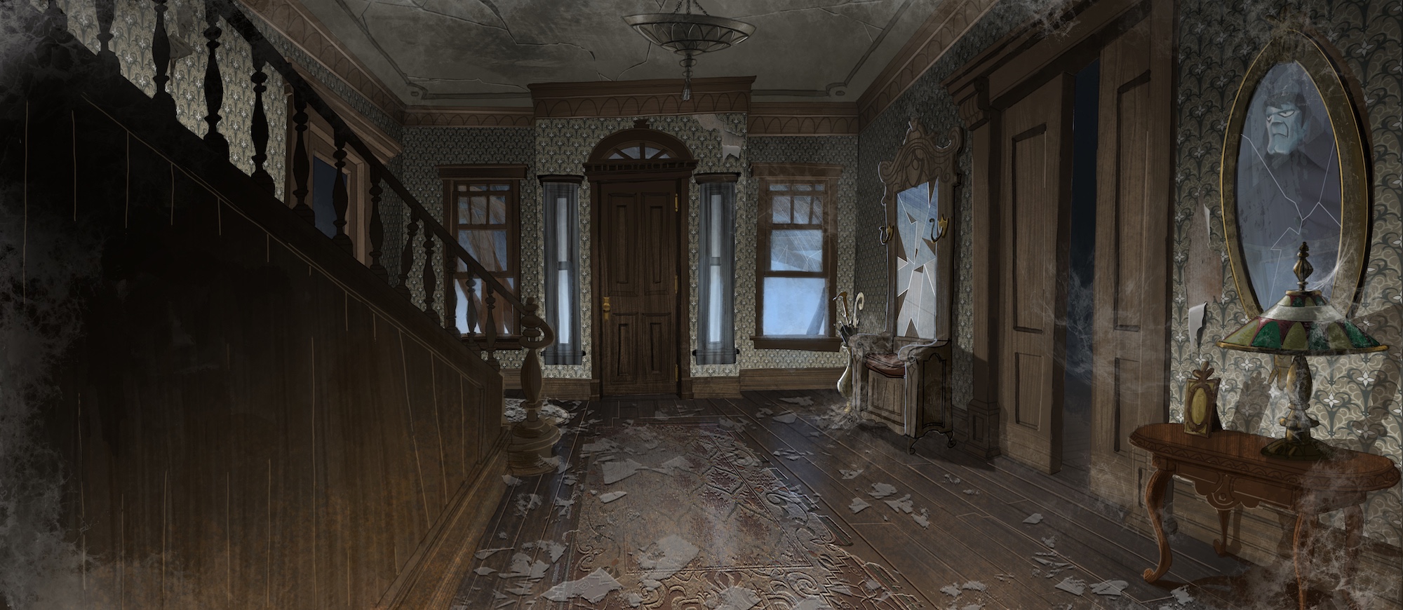
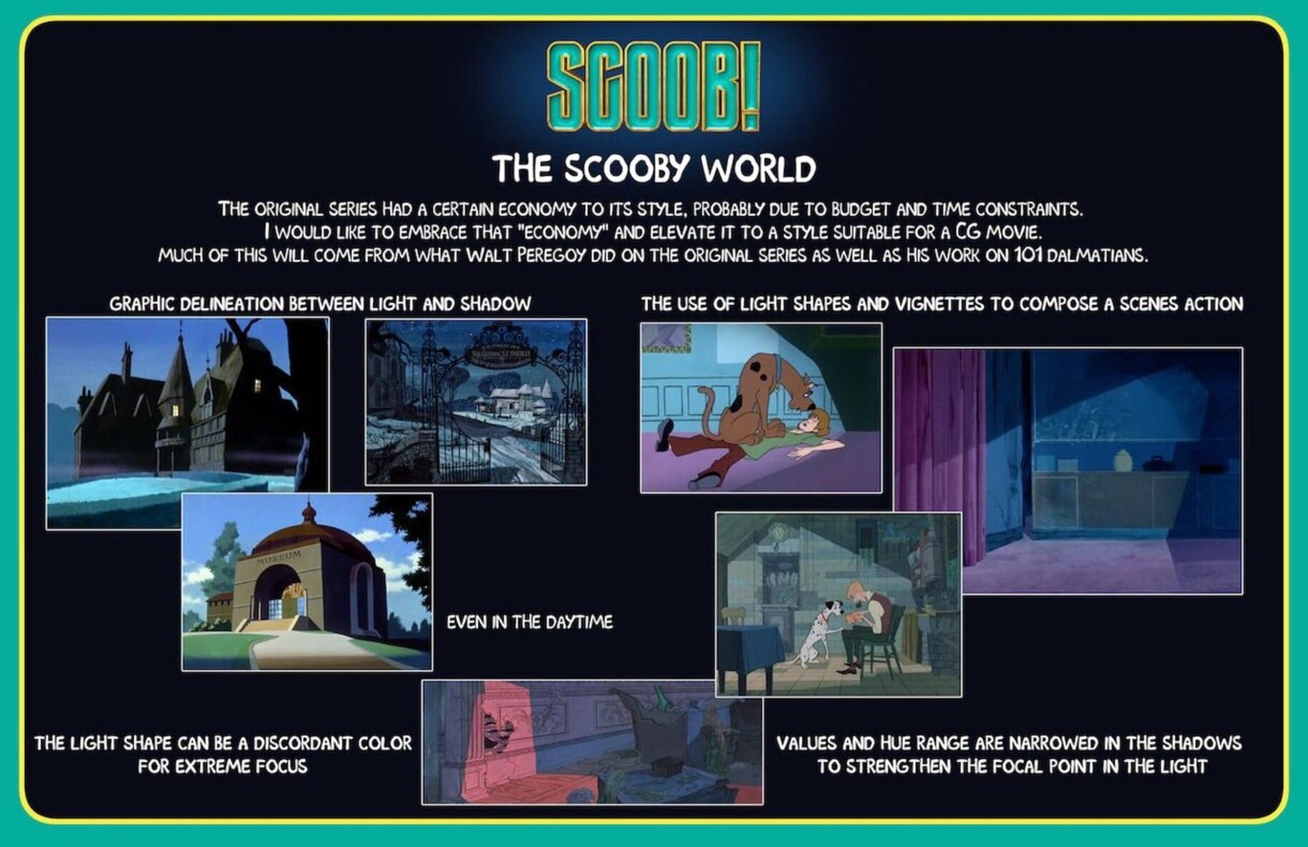
I loved the idea of the interior feeling a bit more narrow and taller than it might in real life. I wanted it to look like one of the old Victorian interiors in One Hundred and One Dalmatians. That film is actually very Scooby-Doo, because its look was strongly influenced by Walt Peregoy, who was also the original designer of the layouts and backgrounds for the 1969 Scooby-Doo series.
The problem was that, if the front room was narrow with high ceilings, it could never work as a setting for the action of the young gang battling the Rigby ghost. We ended up widening the room and bringing the front of the ceiling down low, so that you could see that Rigby was appearing to “fly” from a cable suspended from it.
In the end, I think the room still has the claustrophobic feel that was originally intended, while also working for the animators. Sometimes that’s just how designs go. When you first start designing something, it may have very limited animation happening in it, and then story and ideas change, which forces changes in the environment.
Model of the Rigby House.
“Scooby-Doo was never afraid to push color”
With color, I like to start planning things out pretty early, then roll with changes as they come. I do this by starting with mood boards, which consist of photographs that I do some heavy Photoshopping on. It’s much easier to change or update these than starting a new painting or color key each time.
I was lucky that the Rigby House scene stayed pretty consistent through all the story changes, so that when it came time to do the actual lighting keys, that original mood board was still relevant. I just started doing the final keys from there.
A big part of the show’s original style comes from color and lighting — Scooby-Doo was never afraid to push color. About 90% of the time, the gang was solving mysteries at night, so the artists needed to come up with a way to light things up without always resorting to artificial light sources. That’s what kept it feeling spooky. The lighting had a “day for night” kind of feel to it, like there was always a bright full moon in the sky. They also then would stylize the light by making light shapes or frames for the characters to act in. This was also something that came from Walt Peregoy.
A style guide referencing Walt Peregoy’s influence.
“I asked the lighters to disregard what light would really do”
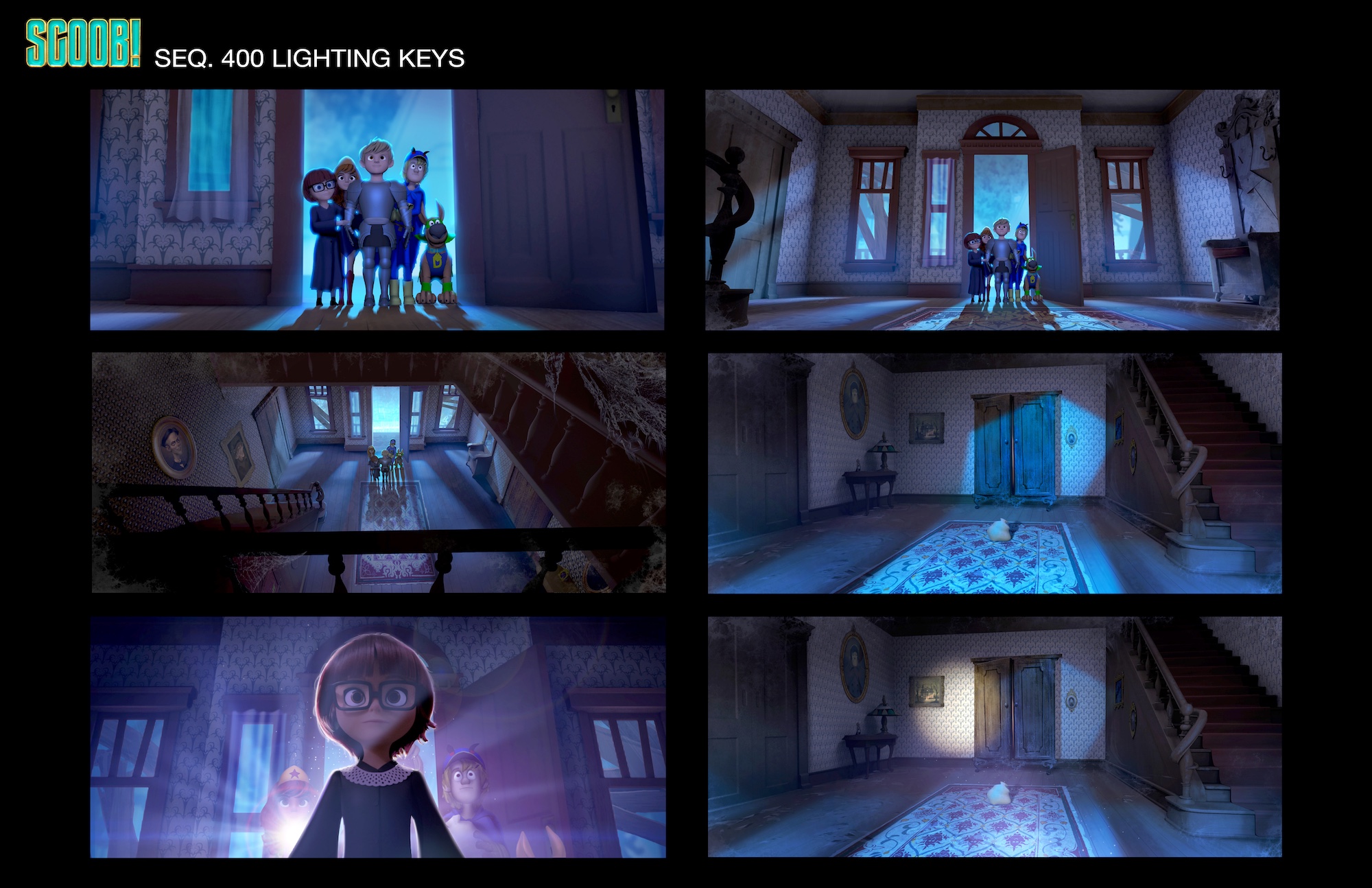
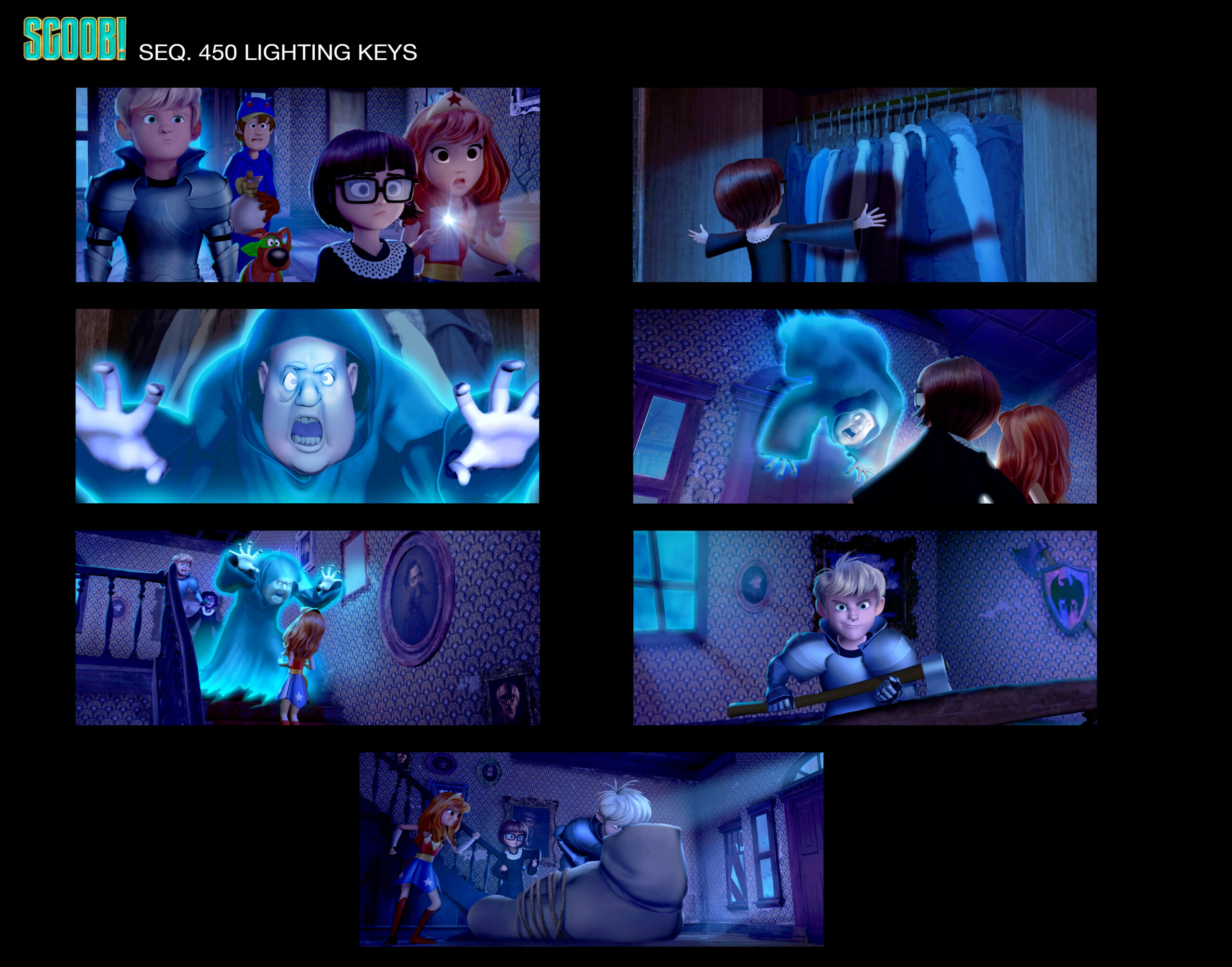
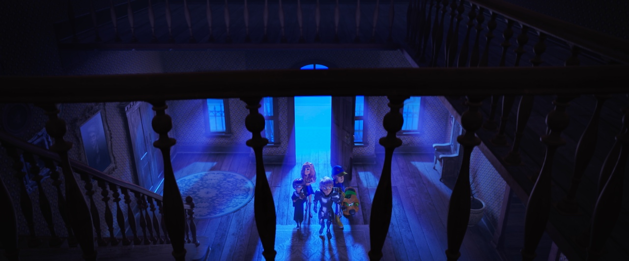
I knew that the Rigby House was the perfect place to use all these lighting devices. When the sequence opens, it’s an iconic Halloween night with a brightly lit night sky suggesting a full moon just off screen. As Shaggy and Scooby get closer to the Rigby House, the lighting changes because of the low ground fog layer, which adds a spooky glowing effect to exterior shots in the scene.
When the gang enters the house, I wanted that glow to come in through the front door and cast a shape on the opposite wall, like in the old series. The cool blue light shape, combined with the contrasting warm shadow shape, made it feel like classic Scooby-Doo.
I asked the lighters to disregard what light would really do in this set, and to follow what was established in the keys. Realistically, the same amount of light would be pouring through the side windows as the front door. That would have been distracting and would have taken away from the stylized light shape running down the center of the room. The light does come in those windows but it’s much more subdued.
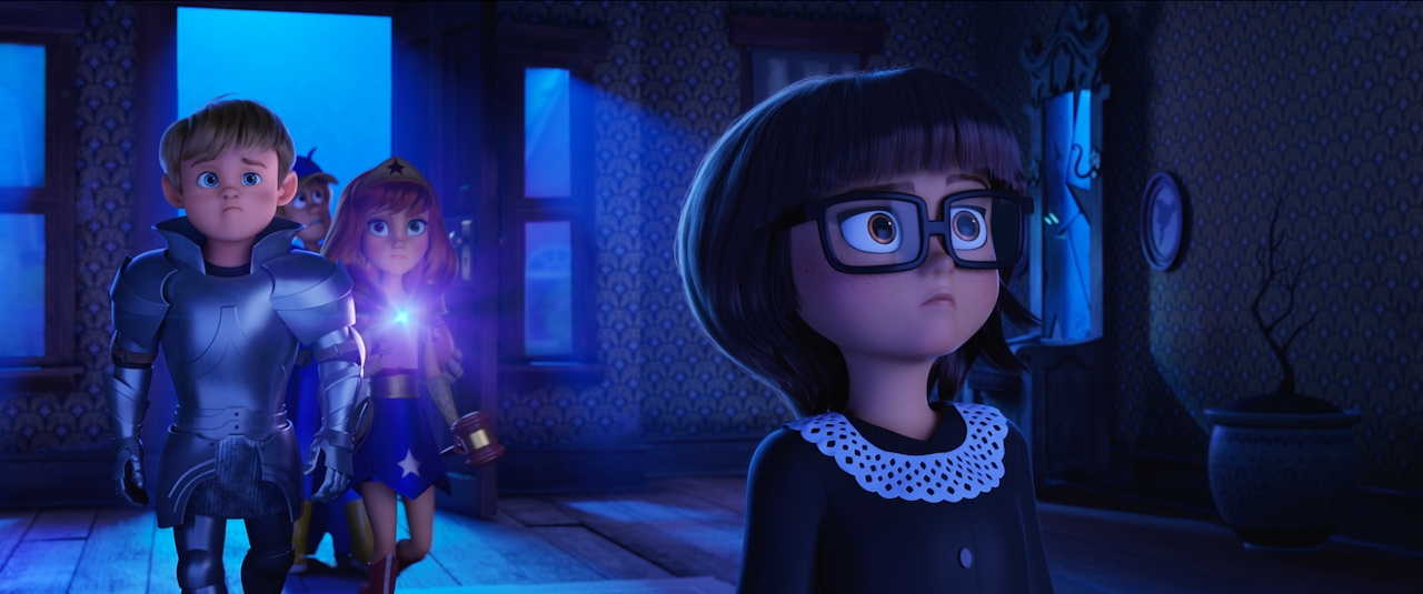
Shadow play makes for great design, especially when we are talking about Scooby-Doo. Keeping the light very focused in the center of the room, and letting everything around it fall off into shadow, allowed the characters to stand out; the viewer’s eye wasn’t distracted by props like a lamp or painting hanging on the wall. I’m always thinking about staging with light, which definitely comes from my background painting days at Disney.
Lighting keys (above and below).
“Don’t let the background upstage the characters”
I don’t think there is a difference between how you think about lighting a 2d and a 3d film. At Disney we were doing a stylized approach to our lighting, and it’s no different in 3d. Computers can do realistic lighting very easily, but I’m not going for realism. I try to bring what I learned as a background painter to push the lighting beyond just realistic. The colors should be exaggerated and the quality of the light should be more like stage lighting, to always feature the characters first.
The characters should be the last pop of color or value to separate them from the background. I wanted to push this concept even further in Scoob! than I have in other films. In the original Scooby-Doo series, the characters were never color-designed: Fred’s sweater was always white whether it was day or night, never tinted cool or blue. That made the characters really stand out from the backgrounds.
I didn’t want to go so far as that, but I did ask the lighting team to keep the local colors of the characters as clean as they could, and not to put light color on them that would neutralize or kill their iconic color palettes. I feel like this stemmed from what I learned as a background painter. Don’t let the background upstage the characters.