Lindsey Olivares On Her Bold Production Design Debut ‘The Mitchells vs. The Machines’ (Interview)
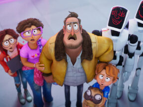
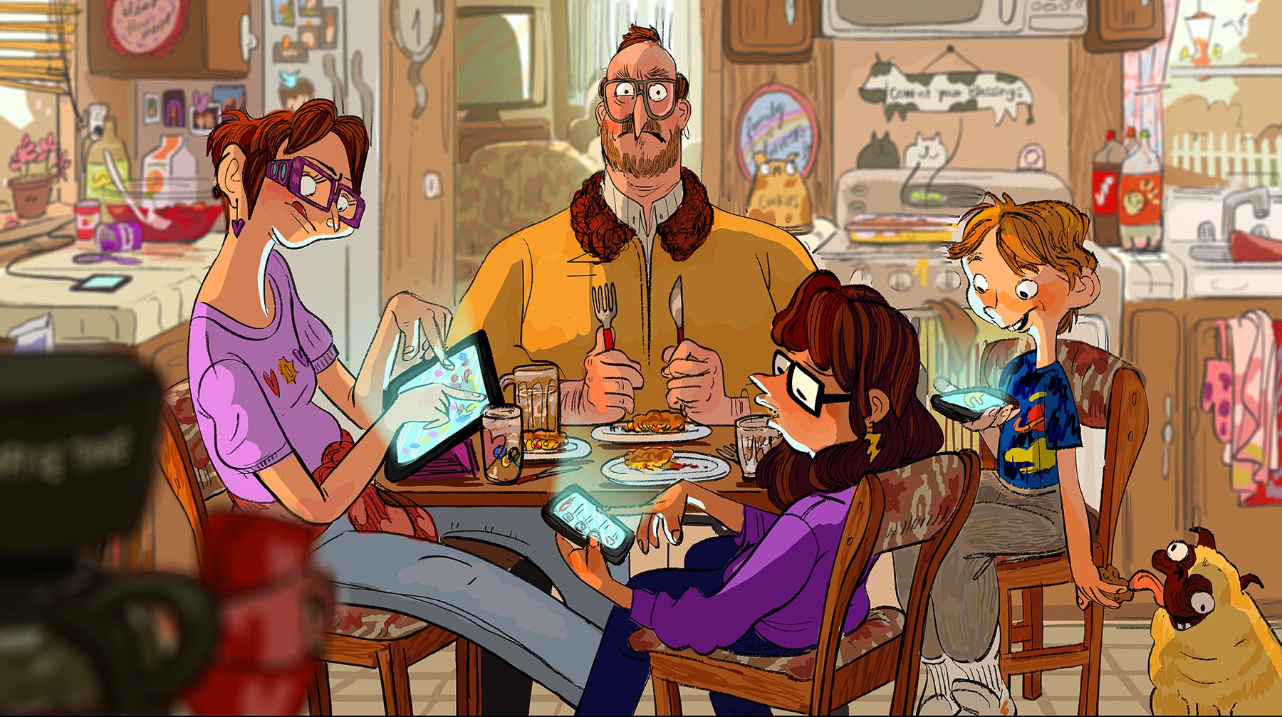
The title says it: The Mitchells vs. The Machines tells a tale of two worlds. When a robot uprising interrupts the Mitchell family’s road trip, the scene is set for a clash between humans, in all our messiness, and the clinical world of technology.
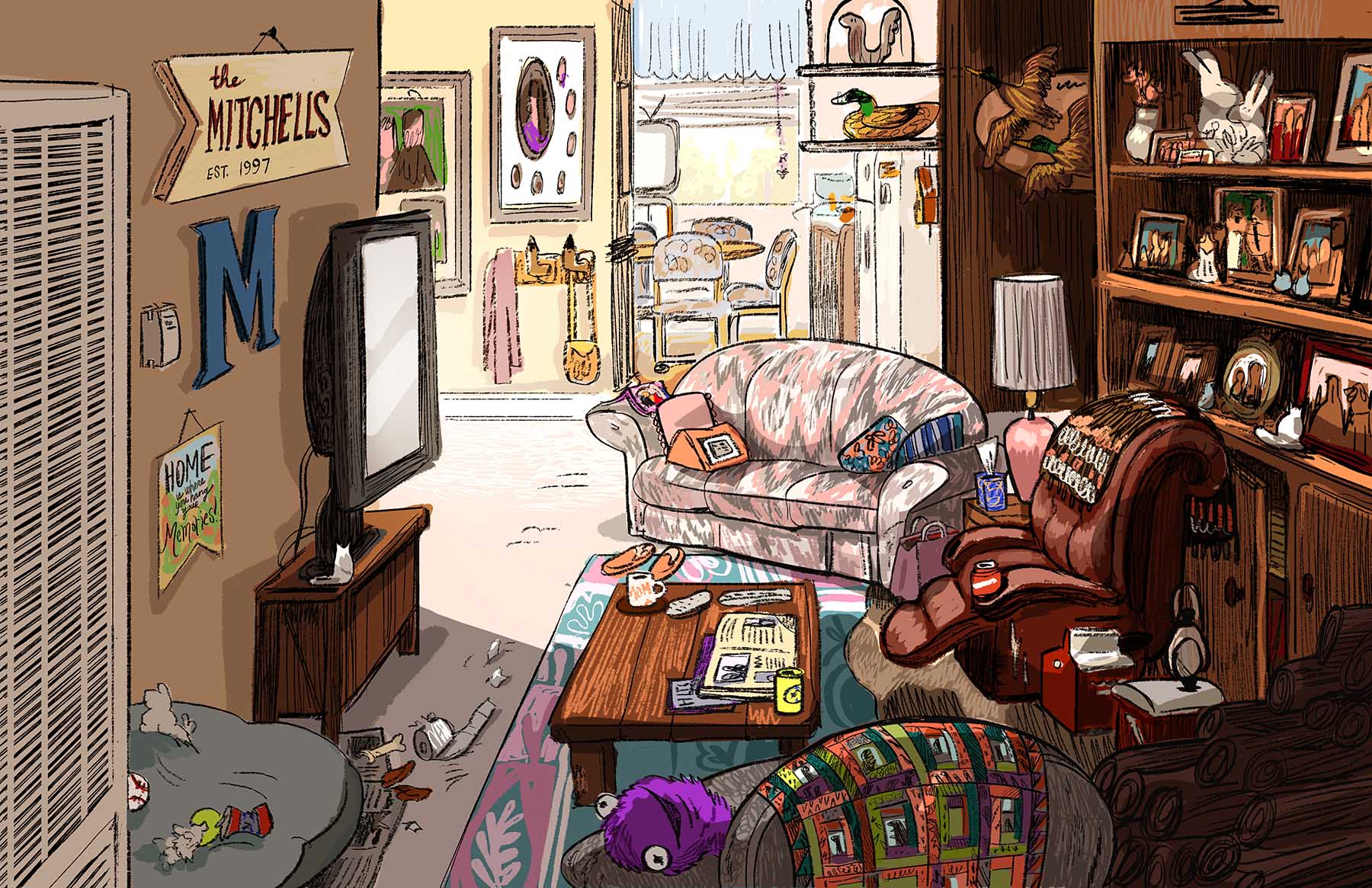
The premise is a designer’s dream, and the film’s look is indeed one of its most striking aspects: it revels in the contrast between the Mitchells, who are gangling or lumpy in their forms, and the sleek realm of Pal Labs, the Apple-like corporation behind the uprising.
More than that, The Mitchells vs. The Machines continues Sony Pictures Animation’s broader experiment with the art of cg animation, following the triumph of Spider-Man: Into the Spider-Verse. Even as it uses studied, nuanced character animation, the film incorporates non-naturalistic elements like watercolor textures and painted outlines, live-action inserts, and pop-up 2d animation.
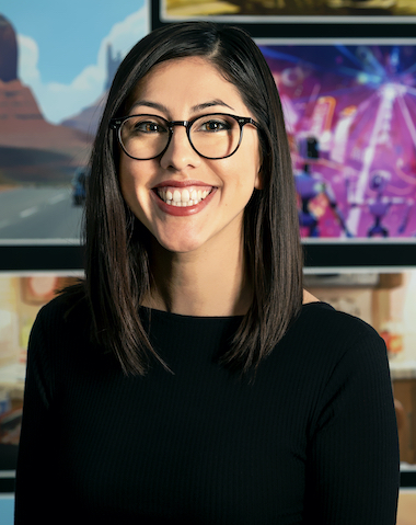
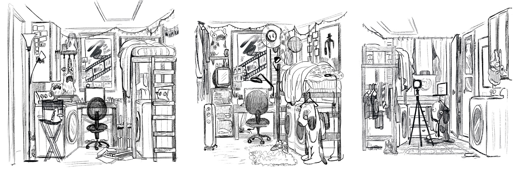
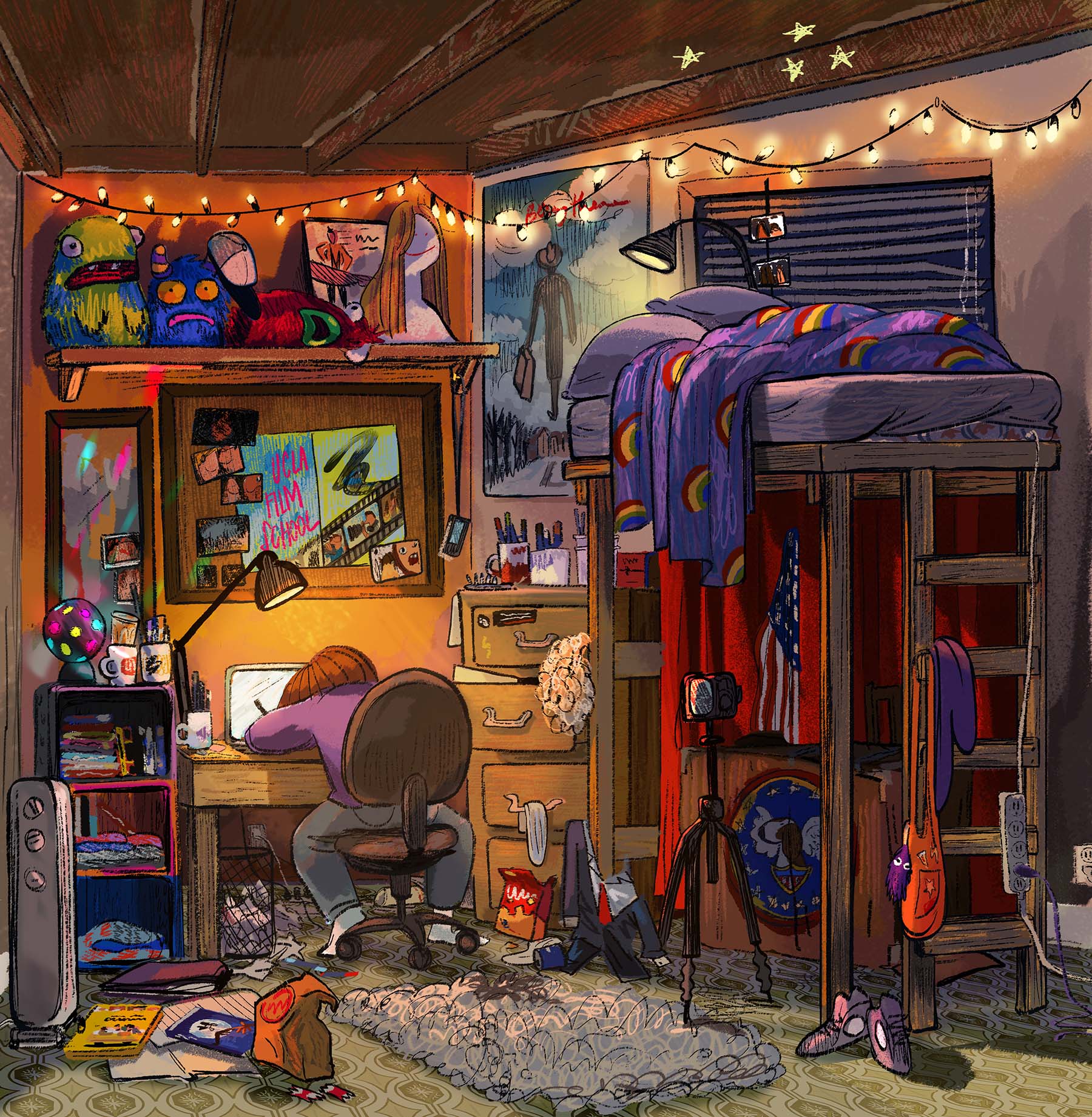
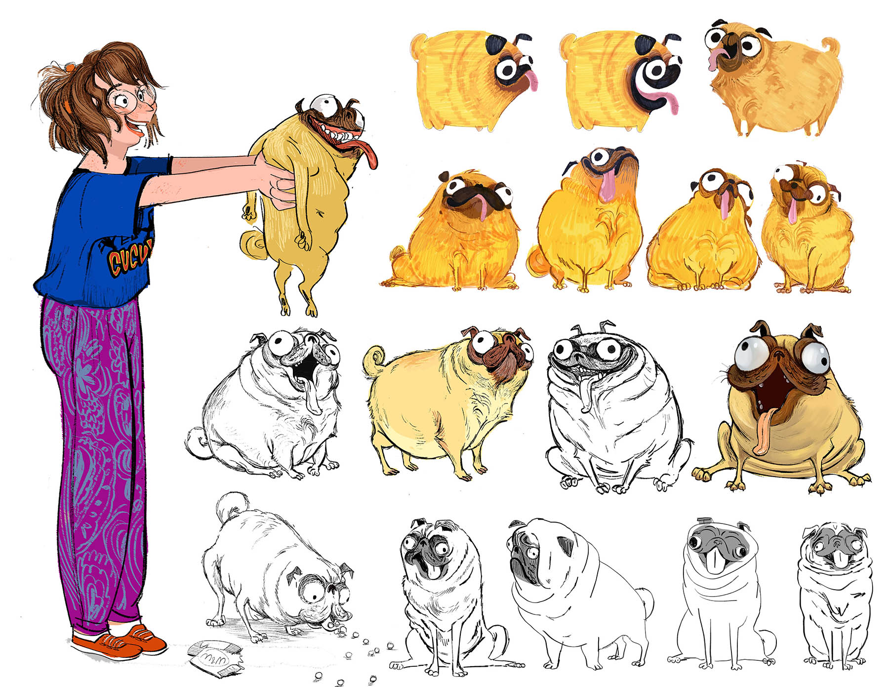
Much credit is due to Lindsey Olivares, who served as both character and production designer on the film. The first person to join director Mike Rianda on the project, Olivares assembled much of their art team and shaped the film’s style with her bold, caricaturistic sensibility. Remarkably, this is her first production design credit: she previously worked as a visual development artist for a number of studios, including Dreamworks (Trolls, Penguins of Madagascar) and SPA (The Emoji Movie).
Ahead of the film’s release on Netflix, we spoke to Olivares about her experience of the production. She tells us how the team came together, how they brought their characters to life, and how production design is, in her view, an extension of caricature. The interview is presented below, alongside Olivares’s character designs and development artwork …
Cartoon Brew: You have this dual title on the film. What was the extent of your oversight? Were you focused on characters or any other areas, or were you overseeing the design of the whole film equally?
Lindsey Olivares: Overseeing the entire set of the film equally. But the character design component, I did a lot of that before I was the production designer — before we were greenlit — and then I became the production designer. We had some other artists that supported us in character design. At our vis-dev models stage, before the production models stage, we were a really small team. We weren’t greenlit and I had the time to really work with our 3d modeler, very one-on-one.
And so I got backup once I moved into the production design role, but still did a lot of it. By the time we’re hiring most people, we’re really moving quickly. Each artist has their own hand in the way of doing it, so there were a lot of things that, to keep it in that same style, I was pretty hands on with — which was a lot, you know, to do both [roles]. But it was also, I think, a nice, cohesive thing to do.
The film has a strikingly different look from a lot of a big-studio productions. At Annecy last year, Mike Rianda said that you started out with this manifesto: to do something new with animation. I’m wondering at what point that crystallized into the look of the film.
It’s a good question. It felt like it happened gradually. There was a version of that in my early drawings, but they were more kind of line drawings, not so much like a final render. But they had a certain quality to them … a kind of scribbly, slightly inky, watercolory texture.
[After the early design phase] I feel like we really hugged to where we were. You do have to let it be a little bit more, in the way that their eyes are basically black dots, but when you look close up, there’s a little bit of iris that doesn’t go all the way around — it’s just a little hit of it. But it’s that level: you have to gain a little bit so that it doesn’t feel … I don’t want to say cheap, but so that it just feels more, because you do need to use the tools you have. I don’t think I wanted it to look just like a sketch.
But we hugged really closely to the things where it was like, do we have to get rid of linework? Or does the collar have to become real fur? I’ve always liked [to think]: how do we use the computer as a tool to make it look like anything? Because you start to get types of 3d looks, so it feels fun to do something different.
Our movie is about humans versus machines. Obviously, humans are always making these [films]. But how can we make it feel more like a human hand made it, and you’re seeing strokes of brush texture from the look-dev surfacing team, and you can feel like it’s almost more traditionally made, in ways? That felt appropriate for this human-versus-machine story.
Coming after Spider-Verse, it felt like there’s a lot that was learned too. Our style is a bit different, but there are some elements of pushing and trying new things that [are similar]. It was, I think, really lucky for us that we were able to come after that production, because there are some things that we learned and some confidence that I think the studio had, too.
While you were developing the look of the film, how conscious were you of what the Spider-Verse team was doing, in terms of experiments with rendering and so on?
Well, it’s interesting, because I started the project remotely. I was in Northern California, living with my grandmother, which is how Mike found me: I had these little animated GIFs of me and my grandmother hanging out. So I was actually kind of in a vacuum from that. I started down at Sony in 2018, so I wasn’t able to see any of [Spider-Verse’s production].
Had I been exposed to it when we were in production, it might have been like, you know, being too aware of it. I don’t remember if I first saw it from the trailer eventually, when I was down at the studio. It mostly worked in all positive ways, like, “Oh yeah, we can do something new, too.” While we were working on it, we had this feeling of big shoes to fill for the project coming after [Spider-Verse]. But earlier on, I was a little bit more in my own freelancer, outside-the-studio space. So I didn’t have to compare.
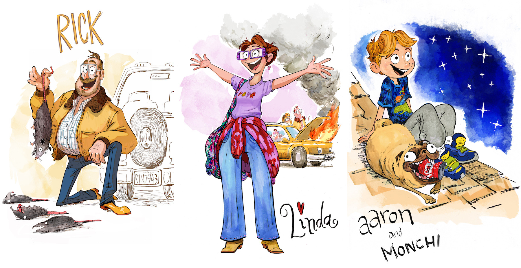
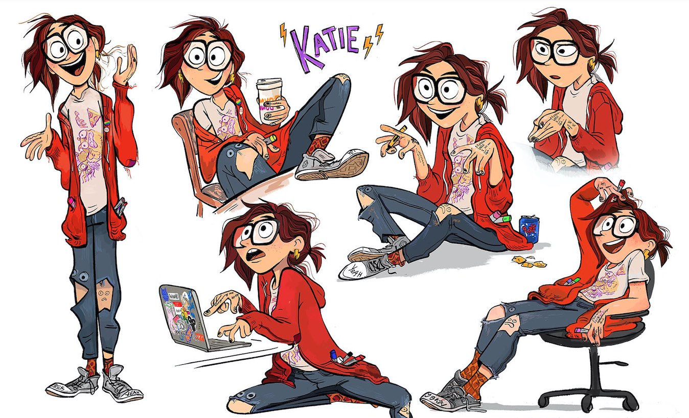
Mike’s family served as inspiration for the characters. Did they serve as visual reference for the designs of the characters as well?
I don’t know that they look like them in any kind of specific likeness. But I definitely had reference. The closest one is: there’s a photo of Mike’s dad that … is exactly the costume the dad, Rick, wears. And then the other ones, it was a mix of getting photo reference from them and their energy is really big. Linda, the mom, is a mix of Mike’s mom and aunt. And I’d have all these photos of them kind of jumping around and there’s this big energy. In a character way, they were very much a part of it.
And then a lot of the detail came from a lot of different places. I really like observation. My character design process is usually me really digging on things like Facebook, or, what’s the closest thing I can do to people watching — looking at someone’s purse, or details of clothes, or how they fit, or something?
So it’s a mix of general observation based on the character clues that I got from his family. Katie’s kind of a version of Mike, but also kind of her own thing. And Aaron’s a bit of Mike, so there were some childhood pictures of Mike that he’d send. And then on top of that, it’s nice because you get that knowledge of who the character is, because it’s so clear in [Mike’s] mind. So there’s a nice kind of foundation to design from.

When you were designing the characters, had the voices been cast?
Mostly I’d say no, but for some of the characters they had been. There was a version where I designed them in the beginning, and some parts of that stayed really the same. But the Katie character took a little bit longer to find. We did tons of versions of her. By the point that we were solidifying her, Abbi [Jacobson] had just been cast.
I actually found a video that was really crucial. There’s a point where we started to get a design that we kind of liked, but it wasn’t quite enough. She was a little more like mild, or a little bit less like the main character of the movie. But Abbi had just been cast, and she had just done this really awesome voice recording session. She knew the character by that point and it was all very specific, but I think she was just improvising and it was so good. It brought a lot of, “Oh, I really get who the character is.”
Abbi did all these great line reads and I did several drawings where I just put her in these poses, because I wanted to use that as inspiration and see how it felt. And my main drawing, where I really found her and pushed her clothing to be a little more iconic, was while working with Abbi’s acting. I’m not saying that [Katie] looks like her, but her personality really helped in that stage.
With Mark Bowman, the tech CEO, we had a design for him and we were changing it. At that point, I had Eric [André, who voiced the character], and I kind of drew him. We weren’t trying to be caricatured — I do like caricature, but we weren’t trying to do [the actors] literally — but I love to draw to video, so being able to put a video of Eric André up and draw that character definitely help find him and give him some life.
You have an amazingly strong caricaturistic style in your art. Did you have many discussions with Mike and the team about how far to push the caricature in this film? Because there are moments in which they break into the very cartoonish, stylized expressions, and so on.
When I first started with Mike, he asked me to do a range, because I think he was unsure how realistic to go. I think there was a part that he wanted it to feel like this is a real world with real stakes and real people, but [also] wanted a certain type of playfulness of animation. We talked about that and landed in a kind of in-between spot.
I think the movie has a lot of mixed elements, in a way. Some things are really naturalistic: the animation, the acting, the little moments that are very human but, like you said, can be also very broad. [The characters] have a certain cartooniness. I think that tonally, that works for what [Mike] wanted to do.
The animation kind of took it to the next level, too. And they were really good at matching the boards — they’ve got really incredible rigs at [Sony Pictures] Imageworks.
When you’re designing the characters, are you already thinking from the start in terms of how they will adapt to 3d models, the limitations of 3d?
At the beginning, not really. For me, the main thing is trying to find the character, and I usually won’t weigh myself down too much [by wondering], “How do we translate it?” I think that might inhibit the process a little bit. But yeah, you do need to translate it ultimately. [At that stage], you make more discoveries, and go to another level of specificity and form in a technical sense.

I wanted to ask about the tech world. It’s threatening, but not too much, because this is still a family comedy, and also because the film has positive things to say about tech as well. I found that balance interesting, and I was wondering how difficult it was to strike it.
I don’t know if I initially approached it with, like, “How menacing?”, but it would come up a lot. But the first thing I got excited about with the tech stuff, or started to understand it, was — I guess I said this before, but I like caricature. But to me, [caricature] is not just a big nose or goofy face or something: you’re really distilling the clearest thing to really exaggerate it, so that it’s really clear. I feel like production design is an extension of that, because you’re caricaturing a world or feeling.
I was like, “I’m going to caricature tech, these companies that we’re familiar with.” I looked at different apps — I won’t single anybody out — and there’s lots of simple gradients, bright colors. It’s like Apple, it’s the apple. Their design is so minimalist and clean — it’s kind of the opposite of what we’re doing in the human world. So that contrast is appropriate and made sense.
My specialty is more the kind of human lived-in stuff. I think I had a point of view with that. But we had a lot of really great artists that were also taking us to the next level. Arthur Fong did a lot of cool work like Pal’s office; we had Ryan Lang doing the robots, and Alex Konstad did a lot of really cool robot development. Our art director Toby Wilson did a lot of really cool robot tech effects and stuff. And we had a really cool motion graphics designer.
This was your first leadership role. What were the challenges of working with a large team and maintaining a consistency of style across the project?
It was an interesting position because I’d been onboard in the early days, and by the point when we got a team, we were a little bit later than I was used to in my experience at those studios. I think it’s nice when you have artists that get to have some room to explore and try new things. And we kind of had [that] point of view. So it was like, “How do we keep that evolving?” And I think there was a lot of really great stuff people brought to the table that was in line with that.
But, you know, there’s things too where you’re like, “Oh, this thing is not right,” whether it’s paintovers, or getting everybody onboard with the brushes or [reference material]. How do you share [the things in your head] with the team so that we all start thinking similarly? That’s the challenge of it, because you have all of these people that all have their own unique styles. There’s things that kind of come into it.
Part of it’s in the hiring: I can see everybody’s different, but [with some people] I can see there’s this component that’s going to really adapt really well, or it’s going to bring something really specific. Part of it’s in the community culture. I think we had a nice dynamic; it was obviously mostly pre-pandemic, so it was nice to be all together.
All that stuff kind of happens naturally: I mean to trust your team, give feedback, hear feedback. It was interesting doing leadership for the first time. It felt really rewarding.
“The Mitchells vs. The Machines” will be released on Netflix on April 30.
(Olivares’s answers were edited for clarity and brevity.)