Commercial Analysis: ‘Toucan Sam’s Froot Loops World’
Kelloggs’s Froot Loops cereal has launched a new campaign with a re-imagined Toucan Sam that has generated a lot of online feedback — almost entirely negative. Getting so much derision for a 15-second spot is an impressive accomplishment.
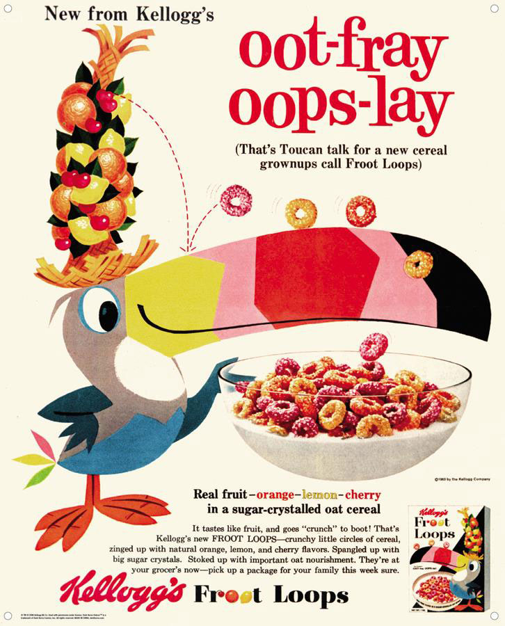
Most people seem to be put off by the odd design choices on Toucan Sam. It’s important to acknowledge here that Toucan Sam is a commercial mascot whose look has constantly evolved since its debut in 1963. So an updated version of the character is hardly shocking; it’s the specific design choices made here that seem to have made this so off-putting to viewer.
First things first: Creative directors at ad agencies are not known for creating new graphic styles; in fact, one could argue that that’s not even part of their job description. A creative director’s job is to absorb popular design trends and apply it to their client’s products to keep the brand relevant. Often, when ad agencies send out for bids from different studios, they’ll simply show the studios an existing piece of animation and ask for something done in a similar style.
Knowing this basic fact about how agencies functions, it’s painfully obvious that in this case the agency was going for a Cartoon Network vibe circa mid-2010s. Why? You’ll have to ask them.
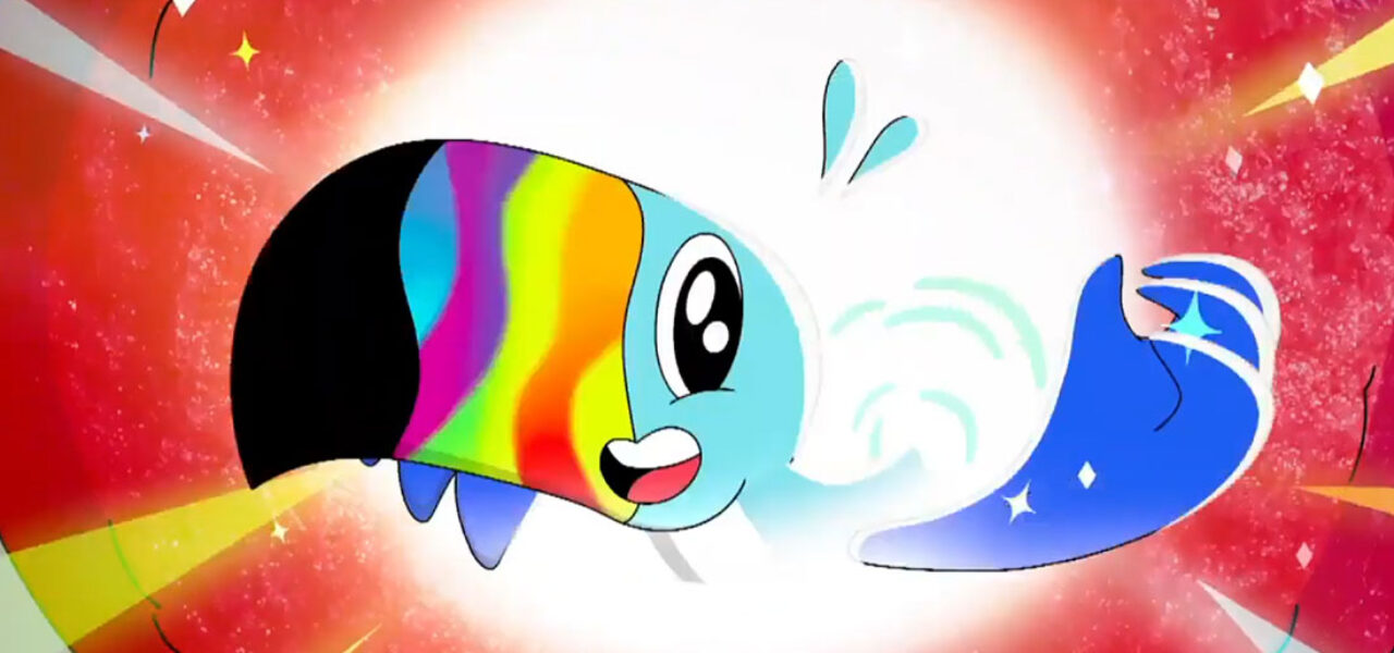
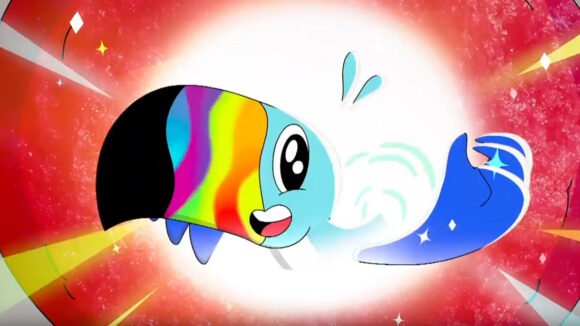
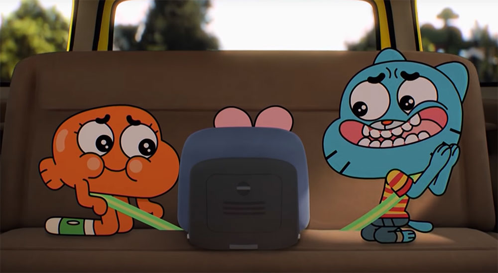
The key design reference for Toucan Sam on this spot is clearly Gumball. It’s evident in the way that flat drawn characters are combined with a photorealistic environment. The Froot Loops themselves are macro-photography with drawn outlines.
Other Gumball touches are the double white eyes and bean mouth on Toucan Sam. These design elements however have been added haphazardly onto Toucan Sam, without proper consideration given to the existing design of the character. The bean mouth rests on both his body and beak, which doesn’t make sense anatomically. Breaking the rules for design effect is perfectly normal for such a highly stylized character, but it’s visually disturbing in this instance.
The double-white eyes in Gumball are used sporadically for emotional performance. It is not the normal state of the characters. For Toucan Sam, they made the double whites the stationary look of the character, which is another unfortunate choice that makes the character appear manic and reduces appeal.
The spot also uses a bunch of other recent but tired animation design trends: The kids have a Euro-anime styling and the Froot Loops world uses a touch of Adventure Time randomness.
As in all animation, everything you see on screen is a creative choice made by someone, and it’s remarkable how ineffectual every creative choice is in this commercial. Let’s talk about Toucan Sam’s beak. The character has always been a highly graphic design and the stripes of color on his beak have never perfectly wrapped around in an organic manner. That’s fine because it was a specific design choice and the character’s original designers made it work. In this new spot, however, they’ve turned the hard-edged stripes into wavy gradient lines that run all over the place. Not only is it ugly, but it eliminates one of the character’s most distinctly iconic elements.
Another misfire is Toucan Sam’s voice. Sam’s colonialist British accent in recent decades gave him a certain authority that was integral to his personality. If you’re a child who’s about to go on a journey with a stranger into an alternate universe, you’d probably want to go with someone who sounds like they know what they’re talking about, not another child.
The animation could have tied everything together and made this spot work, but though competent it’s quite boring. It doesn’t make the world seem as fun as the agency people seem to think it is. Compare it to this General Mills campaign animated by New York-based Exit 73. The designs have similarly been simplified in the style of our time, but they move effortlessly and organically. In other words, even though the designs aren’t ambitious, the animation makes the viewing experience pleasurable:
Leo Burnett was the creative agency on the Froot Loops spot; it’s unclear which studio animated it. We’ll update with the details when we find out.
What are your thoughts on the spot?