Interview: Creating An Atypical Animated Ad For A Spanish Brewery
Animated commercials are more common than ever, yet rarely do they harness the medium’s full expressive potential. Generally, the artists’ creativity is subordinated to the advertiser’s branding and message, and the result is conservative in style, however well it might be made.
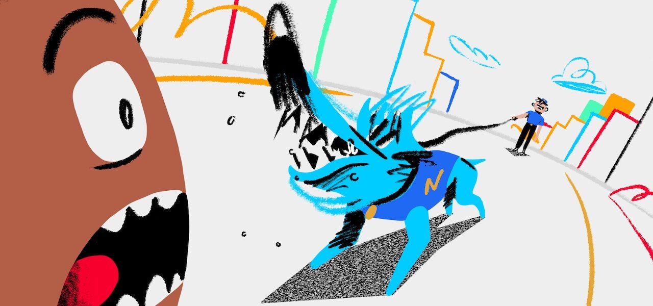
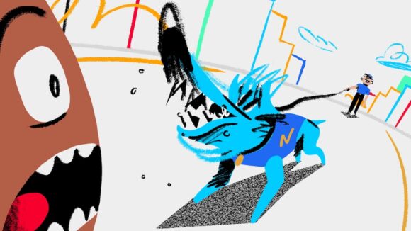
So this new spot from Leo Campasso and Barcelona’s Niceshit studio hits like a breath of fresh air — or, more to the point, a can of fresh beer. “Blue Dog” is an ad for Basque brewery Gross, which is run by a friend of Campasso’s. Watch it below:
The directors were given freedom to apply their own style to the spot, which is only playing online. The result: a flamboyant, kinetic, very entertaining 80 seconds of 2d animation, which revels in sheer motion through drawing. No worrying about rigs or models here.
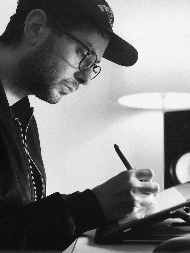
“I think that interesting things can be done in advertising,” Campasso tells us below, discussing “Blue Dog” alongside fellow animation director Guido Lambertini. Read on to learn more about their process and see some pencil tests and concept artwork.
Cartoon Brew: When we initially discussed this project, you told us, “One of my directives was that each drawing be different.” Of course, each drawing is different in any animation — what exactly do you mean by this?
Leo Campasso: Exactly, but in this era it is very easy to fall into interpolation or repetition of drawings. Guido and I have tried [to ensure] that, although the movement is subtle, each drawing is different.
On the other hand, we also tried to focus more on the fluidity of the movement rather than the consistency of the model. I’m a big “Spümcø style” fan, and of animating with few layouts, letting the animation propose, and flow better. I always remember a phrase from one of the Animatrix directors (I think), who said that he loved when it’s not clear where the layout keys are in an animation.
Why did you choose this bold, free style of animation for this project?
Campasso: The animation style of this short is purely what I love to do the most in traditional free 2d animation projects.
I remember two things that marked me a lot as a child: seeing a chapter of the Warner Bros. series Merrie Melodies called The Dover Boys (Chuck Jones is one of my heroes), and a complete video of the old 1990s festival Spike and Mike’s Festival of Animation. These discoveries were key to the development of my style, along with Spümcø as well.
How did you work with Niceshit and Guido Lambertini to develop this style? Was it clear from the start that you would use it for this project, or was it the result of a lot of exploration?
Campasso: Together with Niceshit we carried out a search that was initially complex and frustrating. My main idea was that our style should be freehand, that the human stroke should be noticeable, no vectors.
For advertising generally, the recurring search is a vectorized and clean style, and in this project, we wanted to break with that. Nowadays the vectors aesthetic is everywhere, and it’s difficult to see more organic and authentic aesthetics.
So I think the work done by Niceshit art directors Rodier Kidmann and Bianca Sangalli Moretti was key to finding the balance between something refreshing but traditional and organic at the same time. I think that balance is very fine, difficult to achieve.
What are the challenges of directing animators with this style (as opposed to more restrained animation)?
Campasso: This question is very interesting, and it was one of the keys to the project. I think the key to keeping everything coherent is the animatic stage, and for me, this process needs to be done by whoever directs a project.
Apart from this, for me it’s also very important to have a very fluid back and forth with the animators, speak in the same language, and be one of them — all this is energy that feeds itself.


This kind of free, playful animation seems rare in commercials. In your experience, would bigger, more traditional clients allow this style? If not, why not, do you think?
Campasso: I think we all already know that aesthetic decisions of the big brands are always governed by fashions or trends. Many times the artistic value of what is shown in an advertisement is not so important, but the important thing ends up being that it’s cool or modern. As if it were a disposable work of art.
Anyway, I think that interesting things can be done in advertising. I always remember the commercials directed by Oscar Grillo and I think today they would also work.
Guido Lambertini: I’d like to think that yes, something within this style could be commissioned by a (very cool) client. We’ve been incredibly lucky at Niceshit over the past years, where we got to animate in very fun and not-so-traditional styles. You’ll see it in the worldwide campaign we developed for Ketel Vodka (we worked with Leo here as well), where our basic idea was to have these animations and drawings as if there were a quick doodle on a bar napkin.
Also, as we all know, it’s easier to get the projects or briefs you want to do if you already have made something in that style. It’s easier to get clients on board when you have examples. So hopefully we can be working on something like “Blue Dog” sooner rather than later!


The shot below was initially laid out in cgi. How did this help you in the creation of the shot? Do you do this often for your traditionally animated projects?
Campasso: Generally in my studio stuff I use 3d in 2d projects when I think it’s really necessary. I mean, we could have solved this shot in 2d as well, but with Guido we imagined something that we couldn’t explain in 2d, like some random and crazy cameras. So we put together the scene in 3d to test different points of view.
I think we spent a whole week testing shapes and fighting with 3d, hahaha. But we were able to get what we really wanted later, rethinking the timing of the 3d playblast in 2d.