Mascot Makeovers: Good or Bad?
I was at my local Target the other day, and as I was passing down the cereal aisle, I came across this. General Mills is doing a “retro” promotion for its more popular cereals, like Lucky Charms and Cocoa Puffs, complete with the old designs of their mascots on the boxes.

There’s something undeniably charming about some of these old designs. Although seemingly crude on the surface, the simplicity of it all, from the geometric-like bodies down to the poses the characters are standing in make them more iconic than their current Disney-like proportioned, iris-eyed incarnations. And seeing them literally side by side on store shelves made it all the more jarring to me.
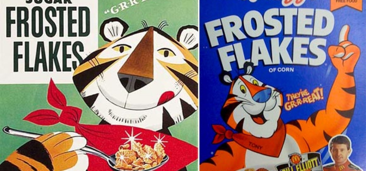
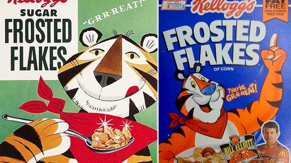
Nearly all advertising mascots have changed over the years: Tony the Tiger, the Vlasic Pickle stork, Scrubbing Bubbles, even a design so deceivingly simple as the Kool-Aid Man has had an overhaul:

Of course, most of these character’s designs evolved over the course of a few decades. Watch a Trix Rabbit commercial from the early 1960s and compare it to one from the 1970s, 80s, 90s and today, and you’ll notice how gradual the changes have been over the course of half a century. Larger commercial budgets, different ad agencies and animation studios, as well as graphic trends and the advent of digital animation have been contributing factors to these alterations.
A lot of characters, like the Keebler Elves and Toucan Sam, have even made the big leap from 2D to 3D. While many people have collectively poo-pooed the CG makeovers of some of these classic characters, I personally find that most of them still retain their traditional charm. Take this new Froot Loops commercial for example:
Some makeovers are a bit harder to digest:
But in this day and age, we seem to be embracing the past more than ever. Childhood nostalgia has become a new marketing strategy for advertising companies, and consumers are eating it up (no pun intended). Why else would General Mills revert to utilizing these vintage designs on their boxes? Some companies are even “re-aging” their mascots, making them look like their former selves, while still refurbishing them for the 21st century.
Who’s your favorite advertising mascot and what do you think of their modern makeovers? Share your thoughts!
