Blue Pigs And Mutant Mandrills: Designing The Post-Apocalypse In ‘Kipo And The Age Of Wonderbeasts’
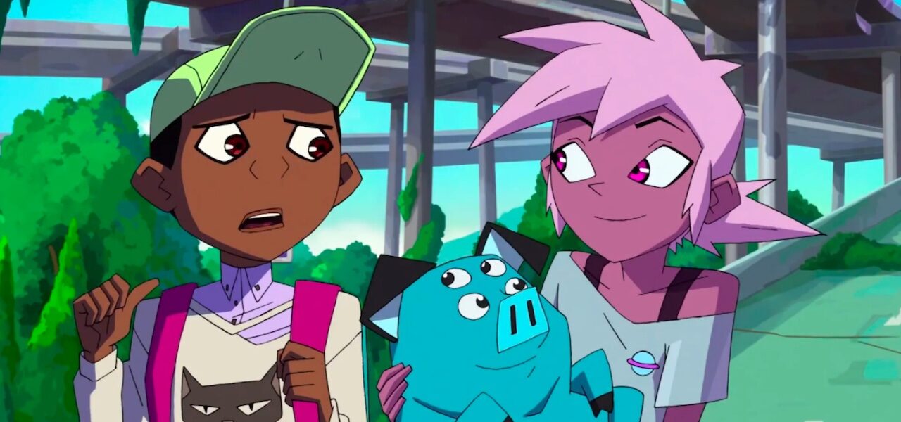
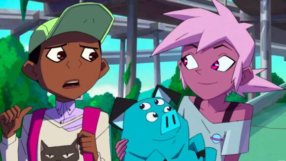
Kipo and the Age of Wonderbeasts was originally meant to be like The Walking Dead, with all the grittiness that implies. But as Radford “Rad” Sechrist developed it, he found himself embroidering his bleak survival story with sweet gags and whimsical drawings of freak animals. The final show strikes a curious balance: the world is post-apocalyptic, but the creatures that inhabit it are cute and often benign.
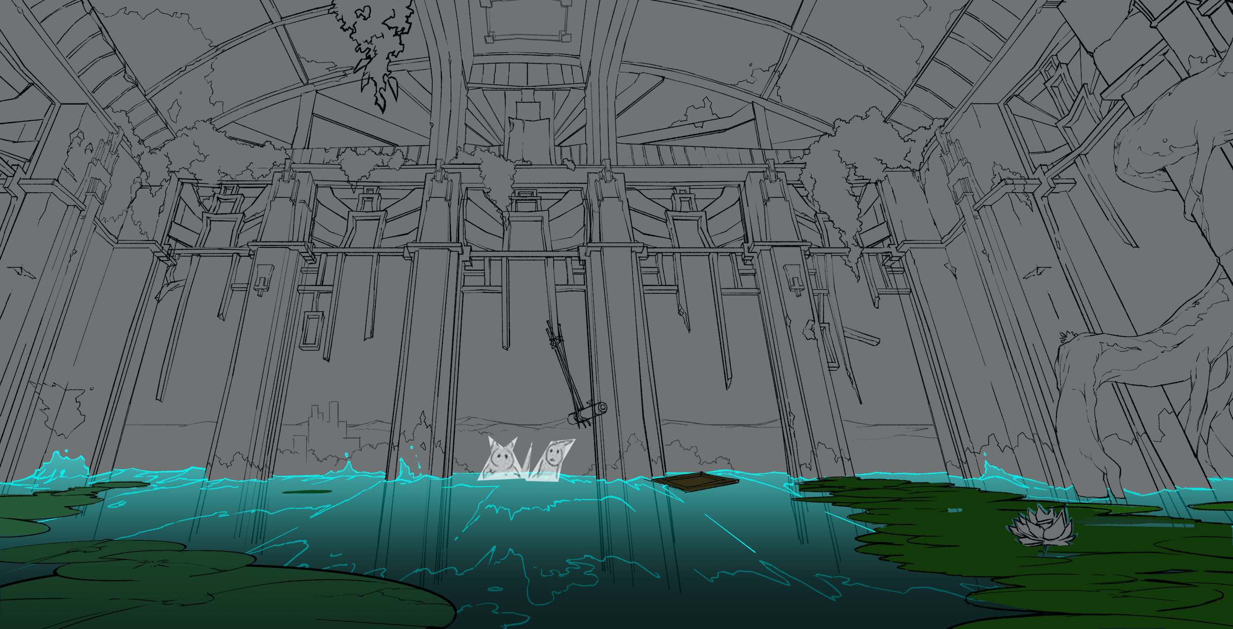
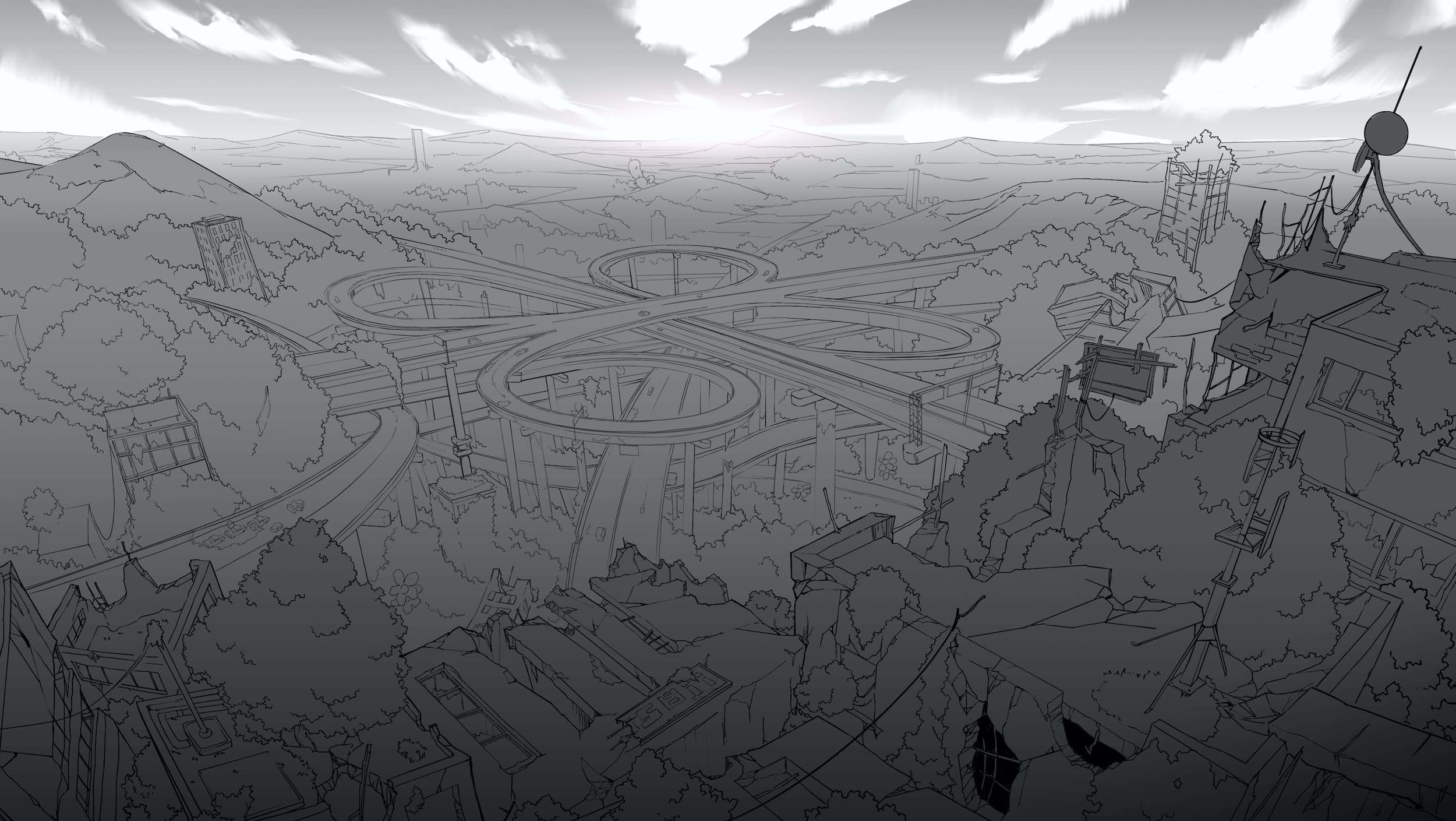
In this futuristic dystopia, the flora and fauna have taken evolutionary leaps forward. Giant mutated animals, or “mutes,” are now in power, threatening the existence of what few humans remain on the planet. Kipo is a parade of anarchic design. With its angular anime-tinged characters, painterly backgrounds, and psychedelic colors, the show — whose second season debuted on Netflix this month — looks like nothing else.
Except perhaps Sechrist’s original web comic, on which the show is based. He successfully pitched a screen adaptation to Dreamworks Animation, where he had worked on numerous projects (including Kung Fu Panda 2 and How to Train Your Dragon 2) as a storyboard artist. Sechrist developed the show with Bill Wolkoff, his co-writer, co-showrunner, and co-executive producer. The Seoul-based Studio Mir (The Legend of Korra) animated it — entirely on paper.
As the show’s art director, Angela Sung (The Legend of Korra, Niko and the Sword of Light) played a pivotal role in translating the world sketched in Sechrist’s comic to the screen. The comic’s aesthetic is broadly preserved, but there are crucial changes: the colors are different, the backgrounds lusher and more detailed. The characters have undergone a redesign, too. Here, of course, everything must lend itself to animation. How did Sung go about adapting a style she loved? She explains below…
Cartoon Brew: From what I’ve seen of Rad Sechrist’s original comic, it differs from the show in terms of the character designs and palettes — and also in the backgrounds, which are far more detailed and painterly in the show. How much did you refer back to the comic during production?
Angela Sung: I really liked Rad’s original style for Kipo, and it was one of the reasons why I jumped on board (I was also a fan of his since forever ago)! I think that style worked very well for a comic book, but to adapt the story from comic to animation is a bit of a process. For me, the most exciting thing about animation is that you have full creative control over what type of experience you want the audience to have.
I prefer to use detailed designs to tell stories — to convince the audience that if this imaginary world would exist, this is how it will look like. We had to do a lot of “rework” based on the comic book to fully adapt it into an animated show.
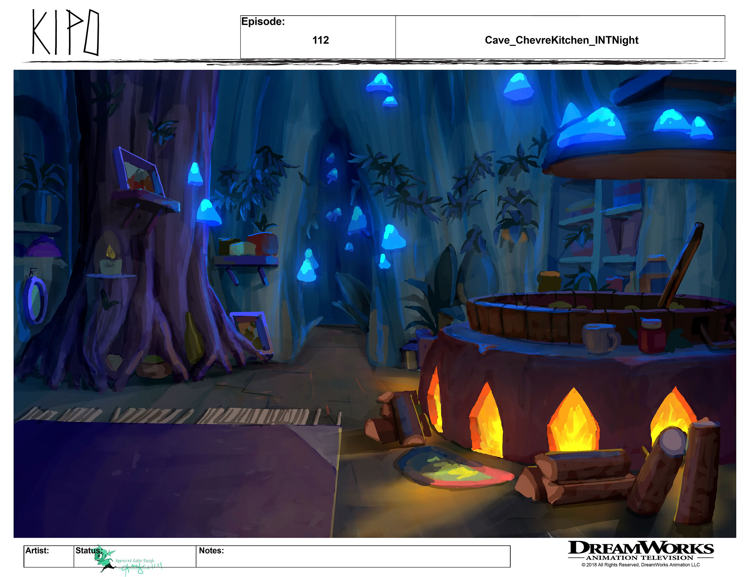
We modified the characters so that they became more sophisticated (showing form while focusing on the graphic read) and animatable. We designed complex environments to make the post-apocalyptic world more believable. And we chose a set of color palettes that matched the mood of the story, and which tied the characters with the backgrounds better.
Aside from a couple of key locations that needed to be based on the original comic, the background team did not need to follow the comic at all. I’m very happy and satisfied with what we’ve created, and I’m thankful that Rad and Bill let the art team have almost complete freedom over the background design and paint.
What were the main inspirations and references for the backgrounds?
When I first got on the show, Rad and Bill showed me a few concept pieces done by Ryan Lang (which were amazing!) and explained that they wanted the show to have “an Alice in Wonderland (the cartoon version) vibe mixed with The Walking Dead.” They wanted it to have a fantastical yet post-apocalyptic look. This got me very excited, because I felt like what they envisioned instantly clicked with what I had in mind.
In addition to those two inspirations, I also asked the art team to look into films with amazing layouts, such as Ghost in the Shell and Akira. I believe that strong fundamentals lead to strong layouts, and strong layouts make the final paintings awesome and more believable. This learning was generated from my experience working at [Shanghai’s] Wolf Smoke Studio on the Kung Fu Cooking Girls feature film, where I understood how space works in backgrounds.
I believe a lot of my color decisions were inspired by traditional painting. I’m a big fan of playing with color relationships to make an image interesting, and luckily Rad and Bill also like the way I approach colors. The painters on the team are all very good at traditional painting, which made it easy for them to apply the color knowledge to the background paintings. They also quickly grasped the color style and began to play around with pushing colors, making bold decisions — I was constantly amazed by their work.
What’s striking about the series’ world is that it is post-apocalyptic and often threatening, yet also often benign. Was it hard to strike this balance?
It wasn’t too hard, actually. Rad’s brilliant character designs helped nail a lot of that feeling already. What was left for the art team was just to find smart ways to showcase these characters’ unique personalities. Also, Rad and Bill really liked the idea of having overgrowing vegetation in the show, which inspired the artists to have fun with both the shapes and colors.

The colors are obviously not naturalistic: purple skin, blue pigs, etc. Is it harder or easier to design a world whose colors don’t have to obey those of reality?
When the artists have solid understanding of color theory and a good taste for art, it won’t be hard for them to choose colors that look good together. Luckily for me, the three painters (David Merritt, Sona Sargsyan, and Wayne Tsay) and one color designer (Katherine Tsai) on the team are all super talented.
Also, the style guide I established at the beginning of the show included detailed color rules, which helped a lot when we were hiring new artists. So even though we did not have an exact reference, it was fun and exciting to push the colors and break what reality is.
I read that the team at Mir, when first presented with the visual materials, said the show would be hard to animate. Why did they think this, and how did you ensure that it wasn’t too hard?
I’m not so sure why they said that, because they did such a great job! If anything, I would guess that it was probably the unique character designs that caused them to feel that way. Unlike other shows with mostly humans or regular animals as characters, Kipo has a lot of unique creatures (like a mega bunny with ten-plus ears and a lot of legs).
You might find it hard to imagine how they would move and interact with one another. But being a super skilled figure drawing artist and character designer, Rad drew a breakdown of how he envisioned the characters to be in terms of form and volume, which really helped the Mir team!

Can you describe your working relationship with Mir? What kinds of directions did you give them? Were there any surprising challenges in the animation process along the way?
The very first time we flew out to Korea to meet team members in person, we were able to communicate what we wanted to accomplish together. Once the production kicked off, our line producer, Michael Moragne, coordinated everything with Mir, including organizing biweekly meetings. Every time they sent us the final animation for an episode, our storyboard supervising director Young Ki Yoon would be the main person on our side to give notes. Rad, Bill, and I would also look at it and provide feedback. I don’t recall any surprising challenges during this process.
They did surprise me with their determination and dedication to make the show look good, though. Mir’s art director, Kyung-hwa Lim, was simply amazing. She asked good questions about color and how we approached the style, then she was able to really take that information and run with it. After having biweekly meetings for the first ten episodes, it was mutually decided that they did not need further guidance from us anymore, so all that we ended up doing was continue to look at the final animation they sent us.