‘King Of The Hill’ Showrunner Says Recreating Original Look Is ‘Impossible,’ But Revival Aims To Stay Familiar
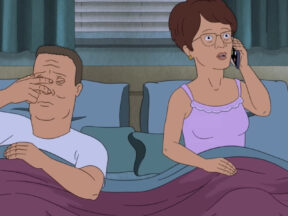
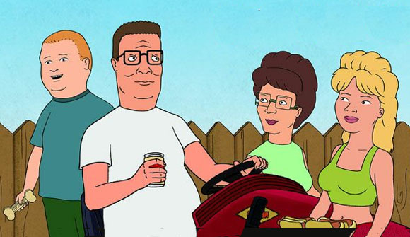
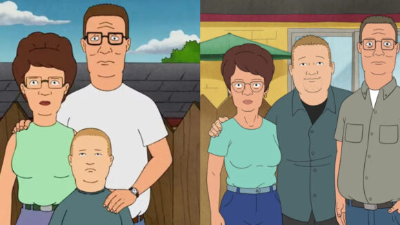
When Hulu dropped the first previews of its upcoming King of the Hill revival, fans were quick to notice the show’s aesthetic had changed quite drastically in the 15 years it was off the air. The characters are sharper, the colors brighter, and the landscapes cleaner. For some longtime viewers, the animation shift was jarring. (No news on if the crew still follows the original run’s do’s and don’ts)
Saladin K. Patterson, the new season’s showrunner, understood the reaction and says it’s one the show’s creative team anticipated.
“I do want to address the art because that’s probably been the most universal thing that has shook the new audience when they saw the previews and things like that — that the animation looks so different,” Patterson told The Hollywood Reporter in a recent interview. “I get it, and I get why people who want to revisit the show may be taken aback a little bit.”
The change, Patterson explains, comes down to the evolution of TV animation itself. The original series, which debuted in 1997, relied heavily on hand-drawn work and watercolor backgrounds, techniques that are now largely impractical for episodic television.
“The new animation style is all digital now, but the truth of the matter is, it is impossible to do the show now the way it was done then,” Patterson said. “The hand-drawn animation, the watercolors, those don’t exist anymore. If they exist, they certainly don’t exist at a cost where you can do a TV show. So it has to be updated.”
That update meant embracing the tools and styles of modern animation, but Patterson insists the team worked hard to ensure the revival still feels like King of the Hill.
“I admit it does look different and maybe jarring to some people,” he said. “I just want to put out there that even though it’s updated, we still went and tried to give it an age-old look, to make it feel more like the color palette and the landscape of the original, more so than other shows.”
Patterson explained that the team spent a lot of time collaborating with background designers to ensure the color choices and tones captured the feel of the original series as closely as possible.
Patterson hopes the result is a visual bridge between past and present, an updated Arlen that still feels like home to fans who’ve waited nearly 15 years to reunite with the Hills. If the strong debut viewership is any indication, audiences don’t seem too bothered by the change.