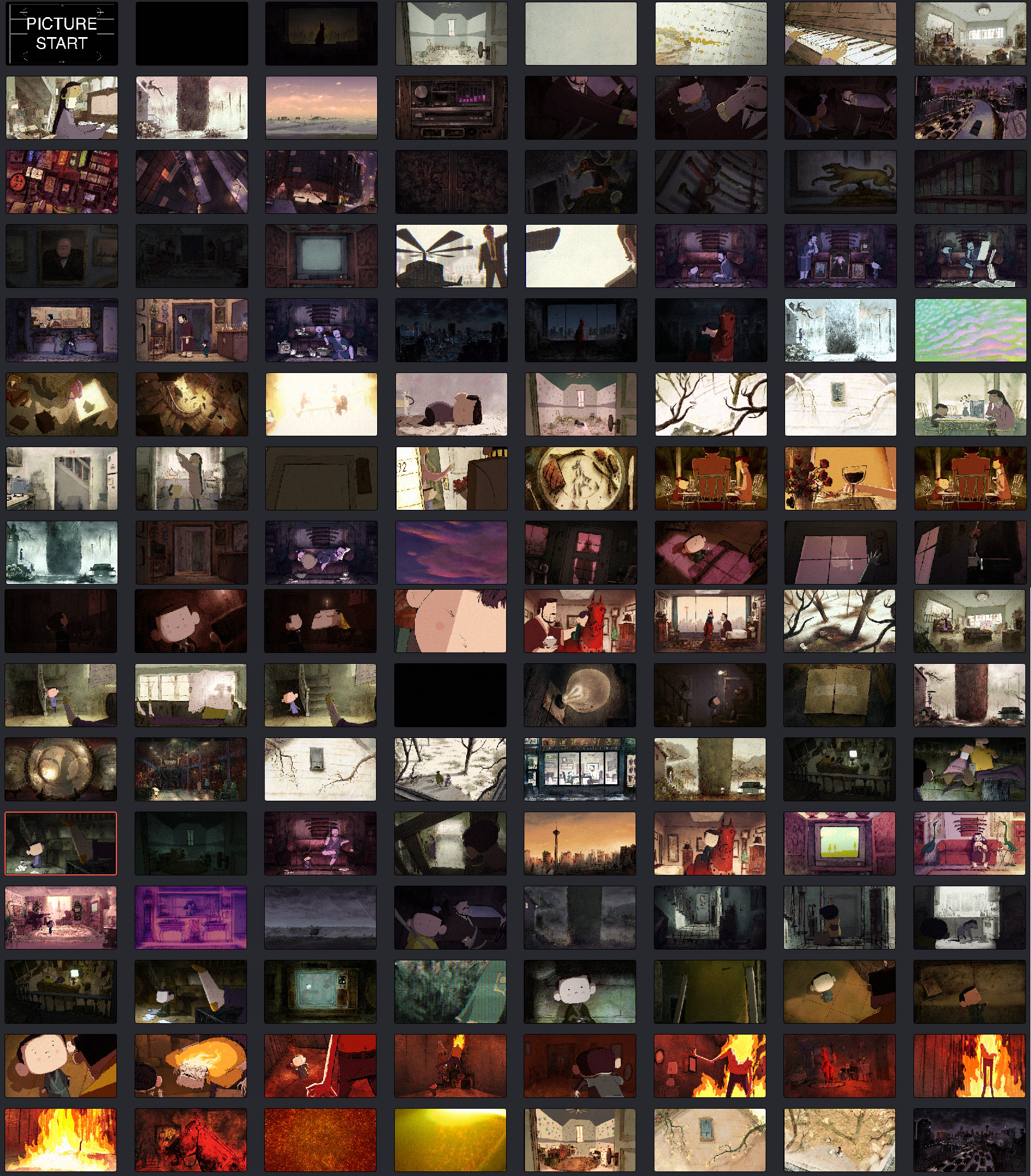
Oscar-Shortlisted Shorts: See The Visual Development And Production Design – Part II
Amongst the 10 shortlisted animated shorts for the 91st Academy Awards, five are hand-drawn animation films – Animal Behaviour, Bird Karma, Grandpa Walrus, Late Afternoon, and Weekends (all of which you can watch HERE for a limited period of time).
This thematically eclectic bunch of shorts are from the U.S., Canada, France, and Ireland. Characters include deceased grandparents, anthropomorphic animals, an elderly woman reminiscing, and an antique-obsessed divorced father. Cartoon Brew spoke to the artists behind these acclaimed short films about the visual development and production design of each project, and their approaches to color, design, texture, and light.
This is the second part of a series. To read about the other five animated shorts currently shortlisted for an Academy Award, check out this piece.
Animal Behaviour
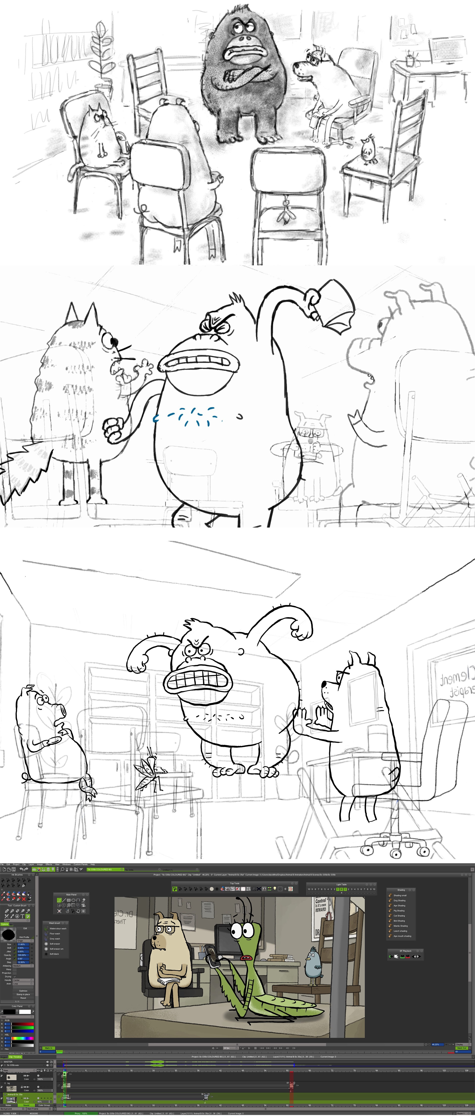
It took co-directors Alison Snowden and David Fine 25 years to make a new short film together following their Oscar-winning 1993 effort Bob’s Birthday. Their latest collaboration — produced for the National Film Board of Canada — is Animal Behaviour, which depicts a group therapy session in an office attended by distressed anthropomorphic animals struggling to accept their instinctual urges. “It’s about whether or not animals (and hence, humans) should suppress what comes naturally or not,” the filmmakers told Cartoon Brew.
Though they could have chosen to have the meeting in nature, the idea of placing naked animals in a civilized and contemporary space helped create conflict. “We wanted the animals to feel incongruous with the setting, and even uncomfortable,” they said. The room where the insightful humor unfolds is inside a building that offers other medical services, hence the hallway opening of the film that introduces us to the world. The filmmakers wanted it to feel like a working therapist’s office, with busy shelves, and copies of the lead character’s books on display.
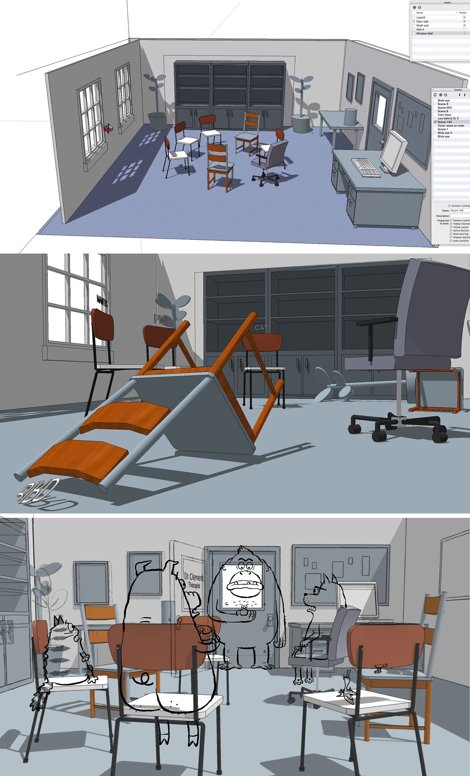
In addition, they designed the furniture to suit the story. For example, the chairs don’t match, so that viewers would get the sense that this group was maybe a little larger than normal and required sourcing different chairs. “Clearly, this is a very subtle point, but it has an impact on the tone,” they said. A friend of the director, who is a psychologist, served as a consultant on the script and inspired hidden jokes in the backgrounds, like the posters with puns on animal behavioral issue. Even though Animal Behaviour has a humorous tone, Snowden and Fine consciously chose to use a more subdued color palette. “We could have taken it further, but we felt these tones worked nicely with animals,” they said.
Bird Karma
Earning his first credit as a director with the short film Bird Karma, veteran Dreamworks animator William Salazar returned to hand-drawn animation for a story about a winged predator stubbornly trying to eat a colorful fish. At first, the film begins with a limited palette for both backgrounds and characters, but as the protagonist interacts with its prey, the blue and grey hues transform into rainbows and luminous yellows.
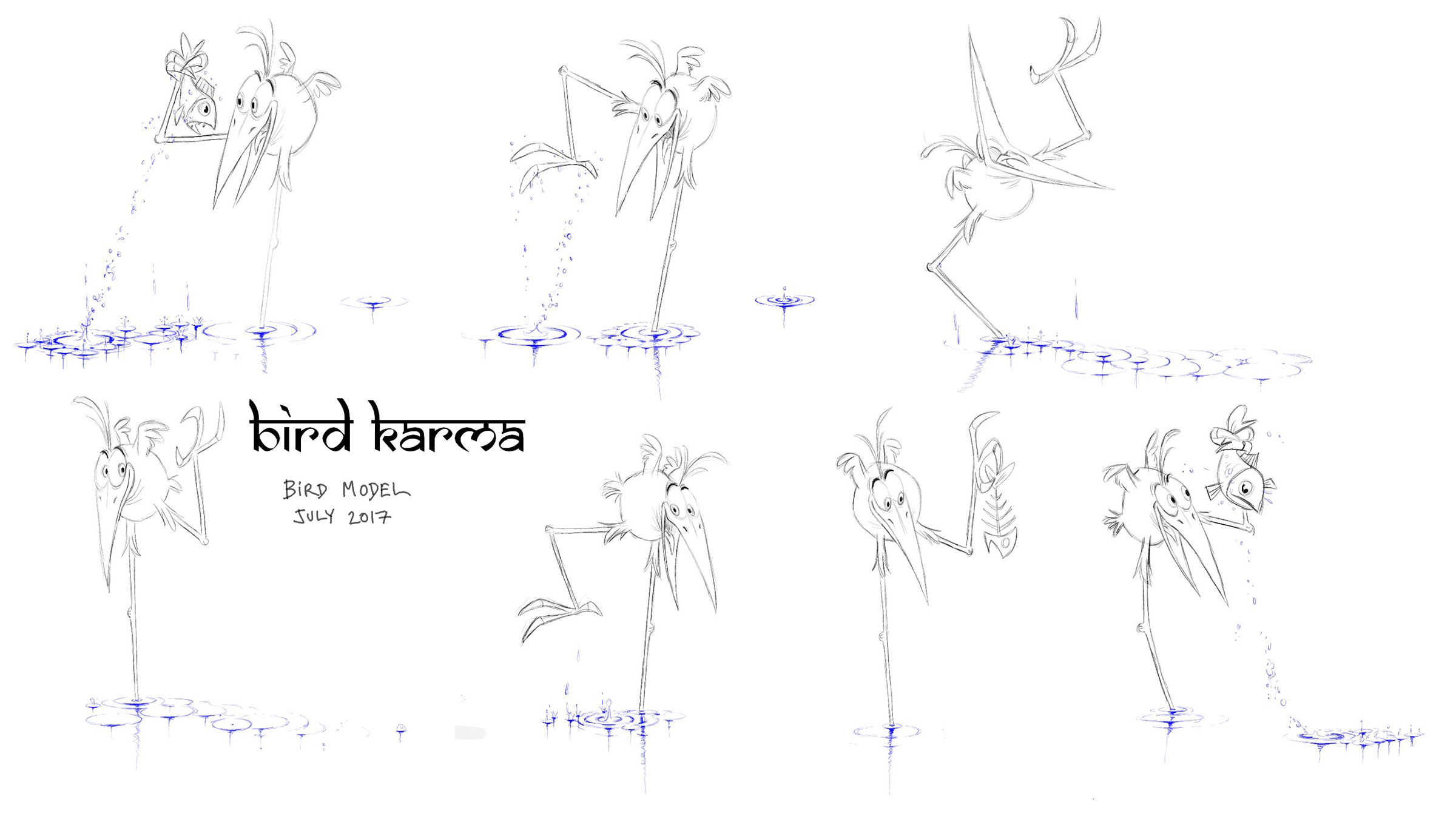
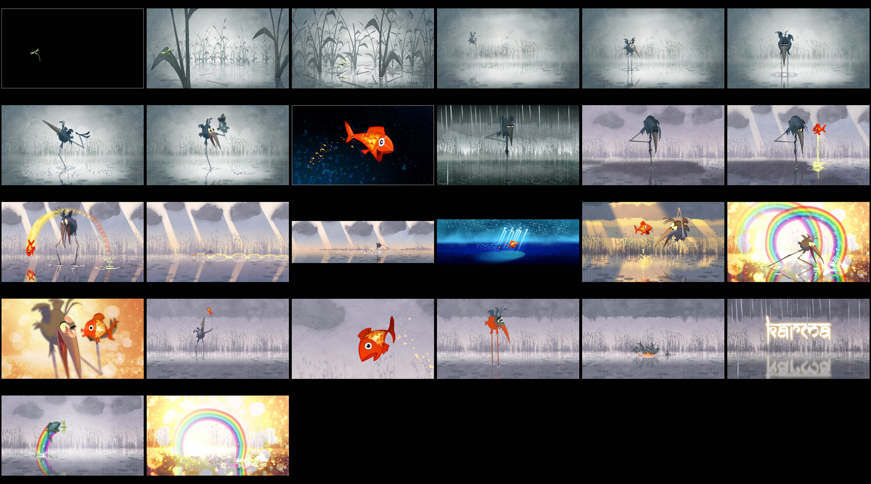
Production designer Raymond Zibach, who created every single background, used the watercolor paintings of English painter William Turner as a reference. Going after a watercolor look seemed appropriate since the tale deals with water and sky. To make it more atmospheric, Zibach and Salazar included several layers of semi-transparent colors. For example, in the foggy sequence at the beginning of the short, they used different layers of clouds and fog, and added watercolor and paper textures to create a unique effect.
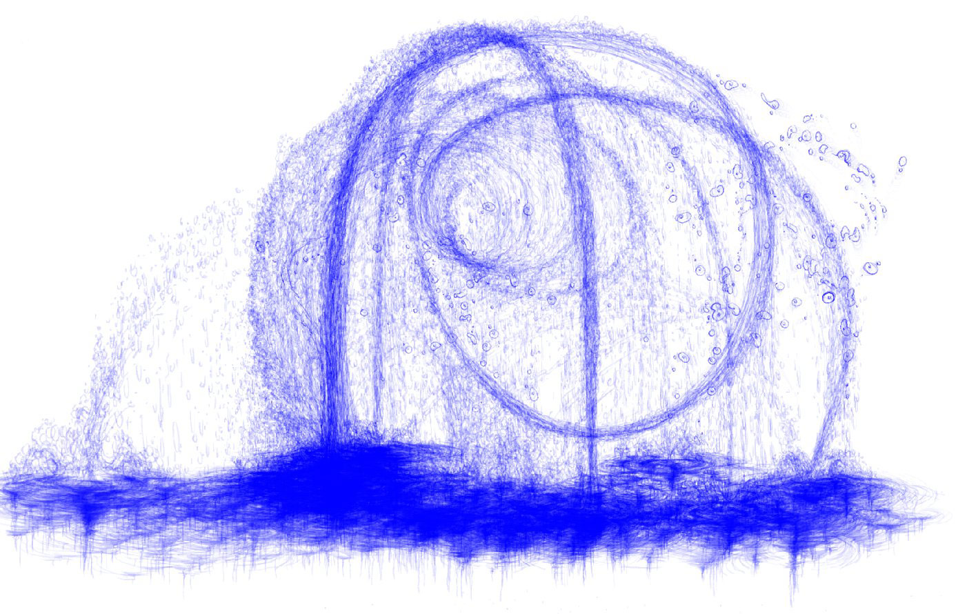
Ripples and splashes in the water were among the trickiest effects to achieve, but they added an extra design element that completed the film’s look. “We used the straight-ahead technique for the water [animation], so we would have to wait until the character animation was completely done, and then we could do the water straight-ahead,” Salazar told Cartoon Brew. According to the director, straight-ahead is to animation what improv is to music, “You animate frame by frame, and you don’t know what’s going to happen next,” he explained. “When I animated a splash, there can be 10 drops that go up in the sky, and each drop falls, and each drop does a little circle of water, and each circle interacts with the next circle of water, and then it creates a new design pattern on the surface. It’s very time consuming, but it’s very pleasing. You just animate straight ahead, without knowing where you are ending.”
Grandpa Walrus
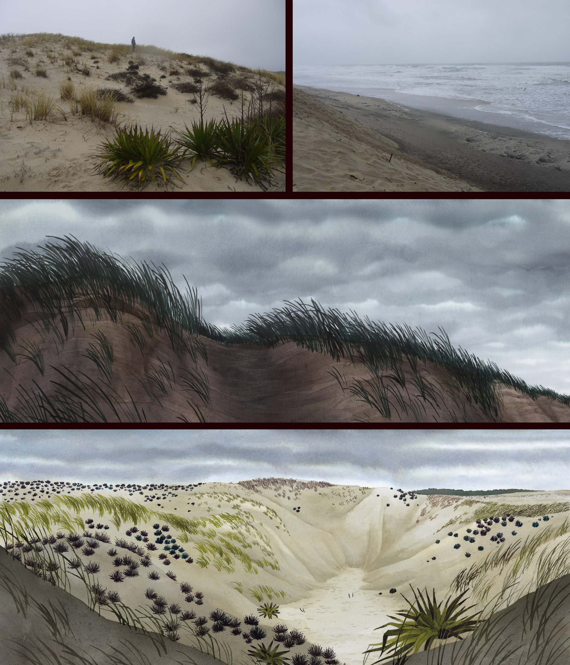
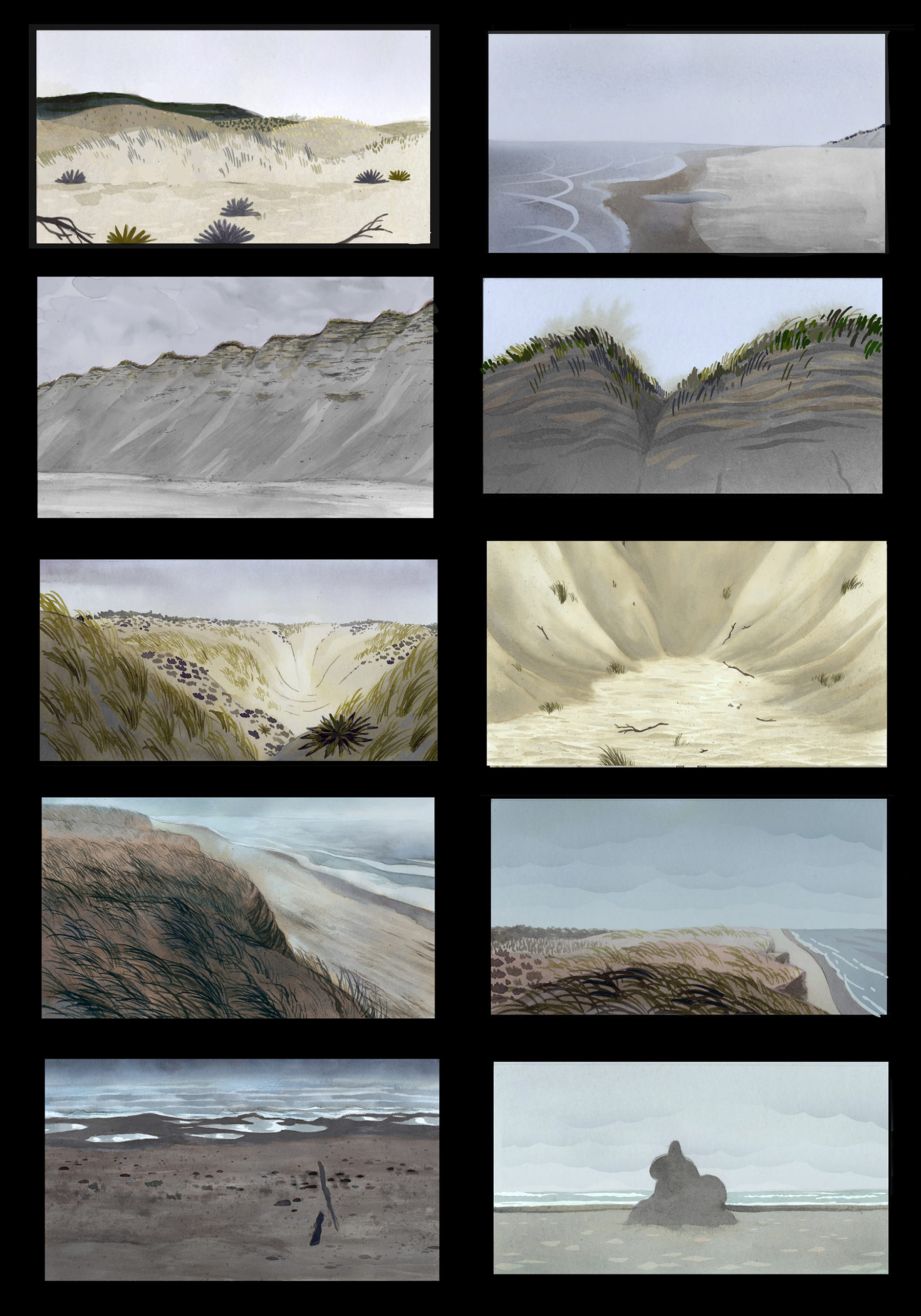
For her fascinating and truly idiosyncratic short tackling grief, French director Lucrèce Andreae channeled her childhood recollections about mourning, vacations with her parents, and her relationship with nature. Setting the eerie narrative about a family dealing with their grandfather’s passing at the beach was a reflection of place that’s rooted in her subconscious. “I naturally chose this location to describe the emotional confusion of my characters confronted with death,” she told Cartoon Brew. “I tried to inject a lot of my sensorial memories in the film: the soft sand flowing between the fingers, the wet and heavy one next to the sea, the violent wind in the hair.”
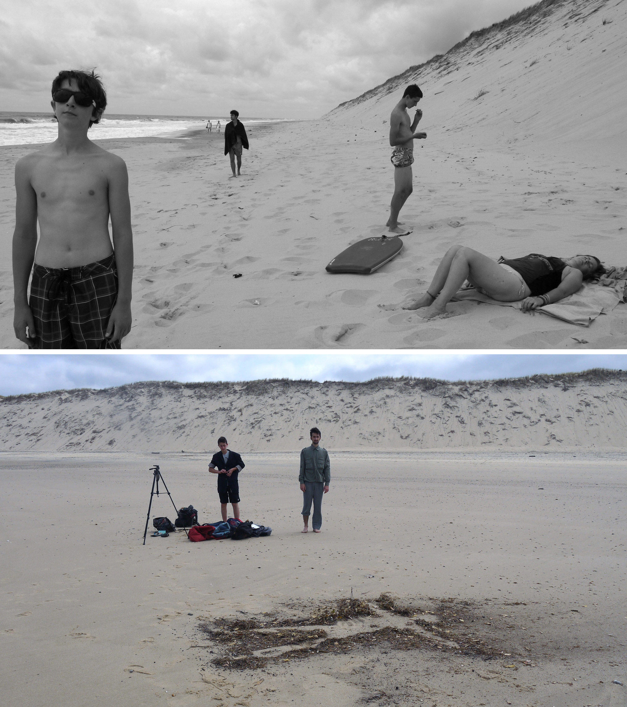
Translating those physical experiences for audiences through 2d drawings was a challenge, both technical and narrative. Andreae recalls that when she first presented her early designs in order to obtain funding, people were terrified of the gloomy color palette paired with the themes it portrayed. One crucial production design decision was to turn as much of the watercolor backgrounds grey, or darker versions of the colors in each frame. This worked in tandem with overcast light that envelops the film. “The most challenging part about the light work was to paint the impressive heavy clouds that are dark and dazzling at the same time,” Andreae explained. To achieve this striking finish, the paper sheet had to be just wet enough for the watercolor to spread when applied, but not flow. “We threw away tens of failures!” The lighting choice was made for creative reasons and allowed Andreae to emphasize strong silhouettes through backlight effects, but it also served an economic advantage by removing the need for extra shadow layers in the animation.
For Andreae, every element is a deeply personal decision, not only are all the characters directly based on her family members, but all stylistic choices carry powerful intentions. “The agitated ocean in the gloomy weather allowed me to illustrate the inner chaos of my characters. They are trying to hide their feelings, even to deny it, but the world around them reflects their pain. They are cut off from their comfortable world, even the cell phones can’t reach the cell phone signal, and thanks to that they’ll be able to face their real feelings. In front of the immensity of nature, they are confronted with their extreme fragility, their loneliness, and to the idea of death. I especially tried to express the hard feelings of children who are naturally submerged by their imagination to explain what they can’t understand. The walrus and the other ghosts appear to make explode what is devouring them from the inside.”
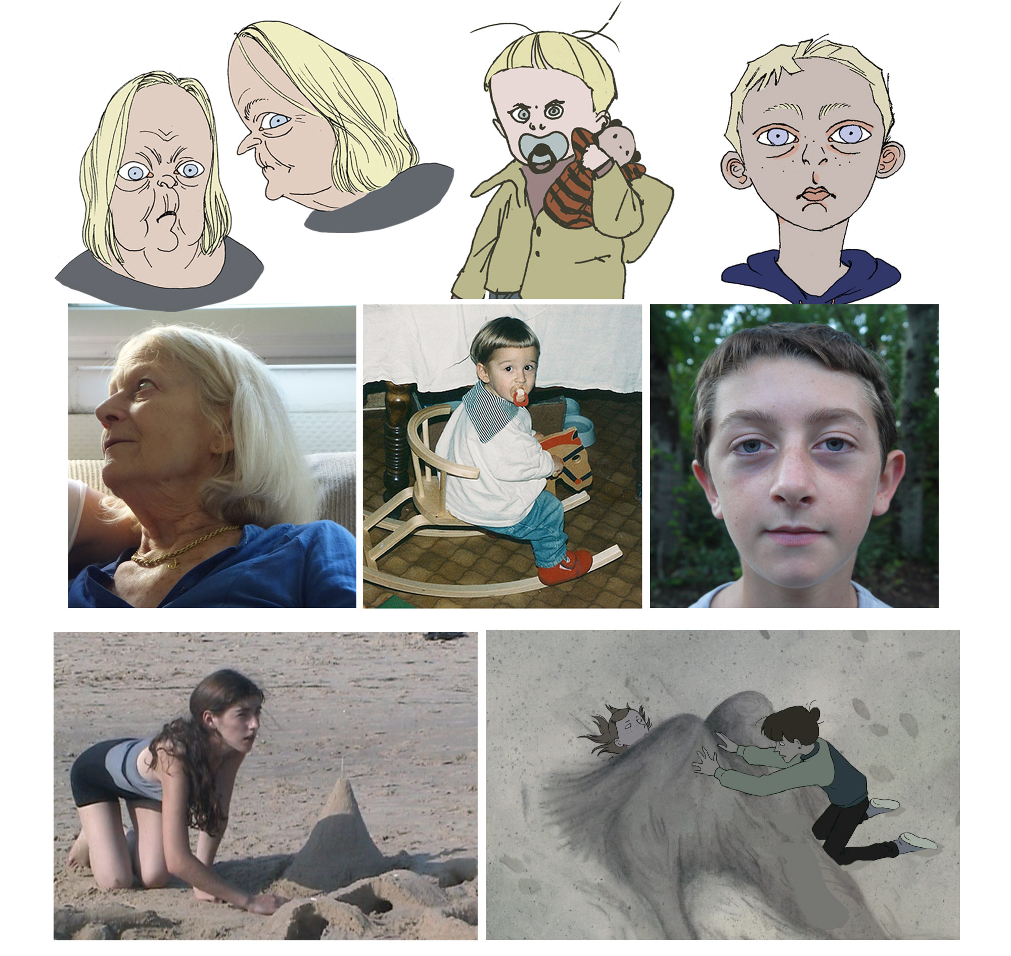
Andreae also speaks about her obsession with avoiding design cliches in her characters. She looks for specificity in character design rather than using formulaic design conventions. “When I developed my characters (dramatically and graphically), in an effort to make them true and credible, I naturally took inspiration from the people I know best. I caricatured, modified, distorted them, but there are still many of them in the final figures: the obtuse character of my grandmother, the explosive fragility of my mother, the boastfulness of my little brother…”
When she showed the design of the grandmother to her mother, her mother screamed, ‘Oh my God! Don’t you ever show that to your granny!'” Her mother thought the design was grotesque, but Andreae says, “I love strong features: wrinkles, dark circles under the eyes, protruding ears, long noises, that’s what make each of us unique.” During the production of Grandpa Walrus, Andreae’s grandmother passed away. “It was very painful and strange,” she says. “I felt like entering in my own movie. But drawing her again and again everyday softened my mourning: I was happy that there would remain a part of her forever in the movie.”
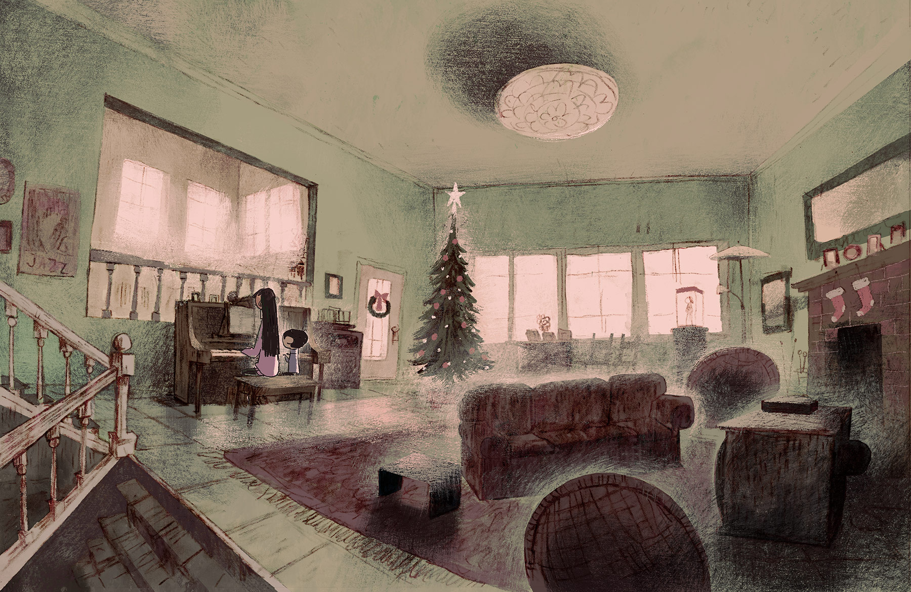
Late Afternoon
Production designer Áine McGuinness came on board Louise Bagnall’s Cartoon Saloon-produced short film Late Afternoon early on and helped develop the visual style and the color script for this delightful trip into an older woman’s precious memories.
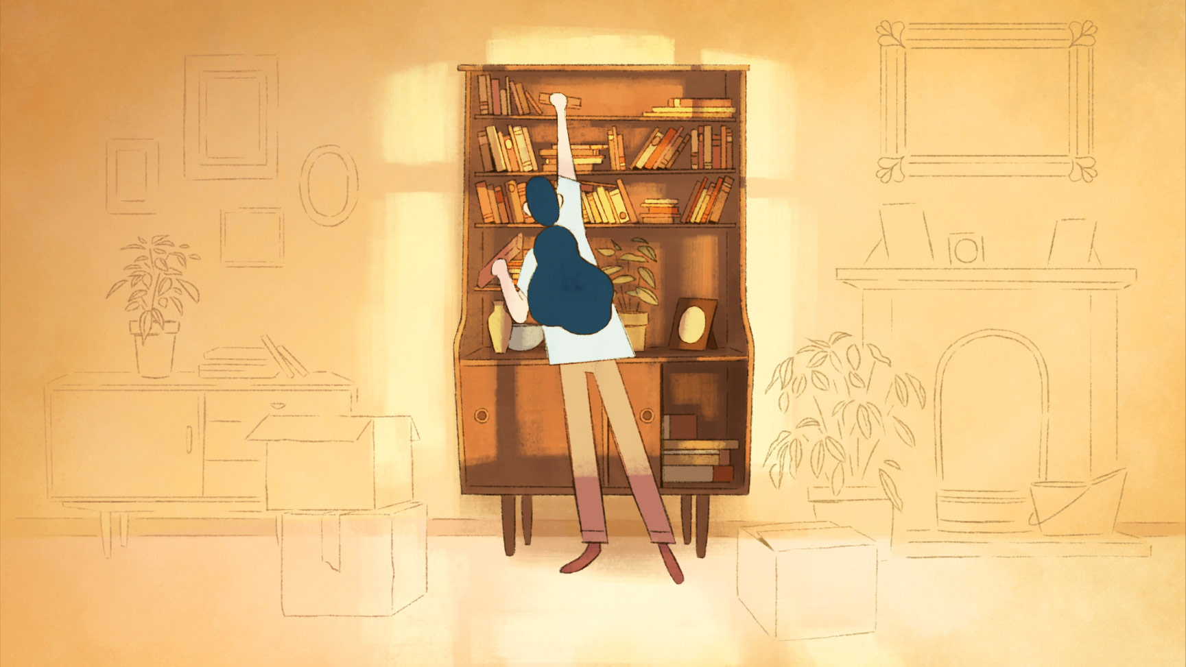
As production progressed, McGuinness focused on creating the abstract visuals that appear in the subconscious of the lead character, Emily. “The production design in this film helps to put the audience in the mind of the character, because it’s tricky to visualize what someone’s subconscious or memory looks like,” McGuinness told Cartoon Brew. The challenge, therefore, was to create imagery that immediately reads for the viewers as the place where a person’s mind goes when they are lost in thought. “In order to feel those emotions along with Emily we needed to be immersed in her inner world.”
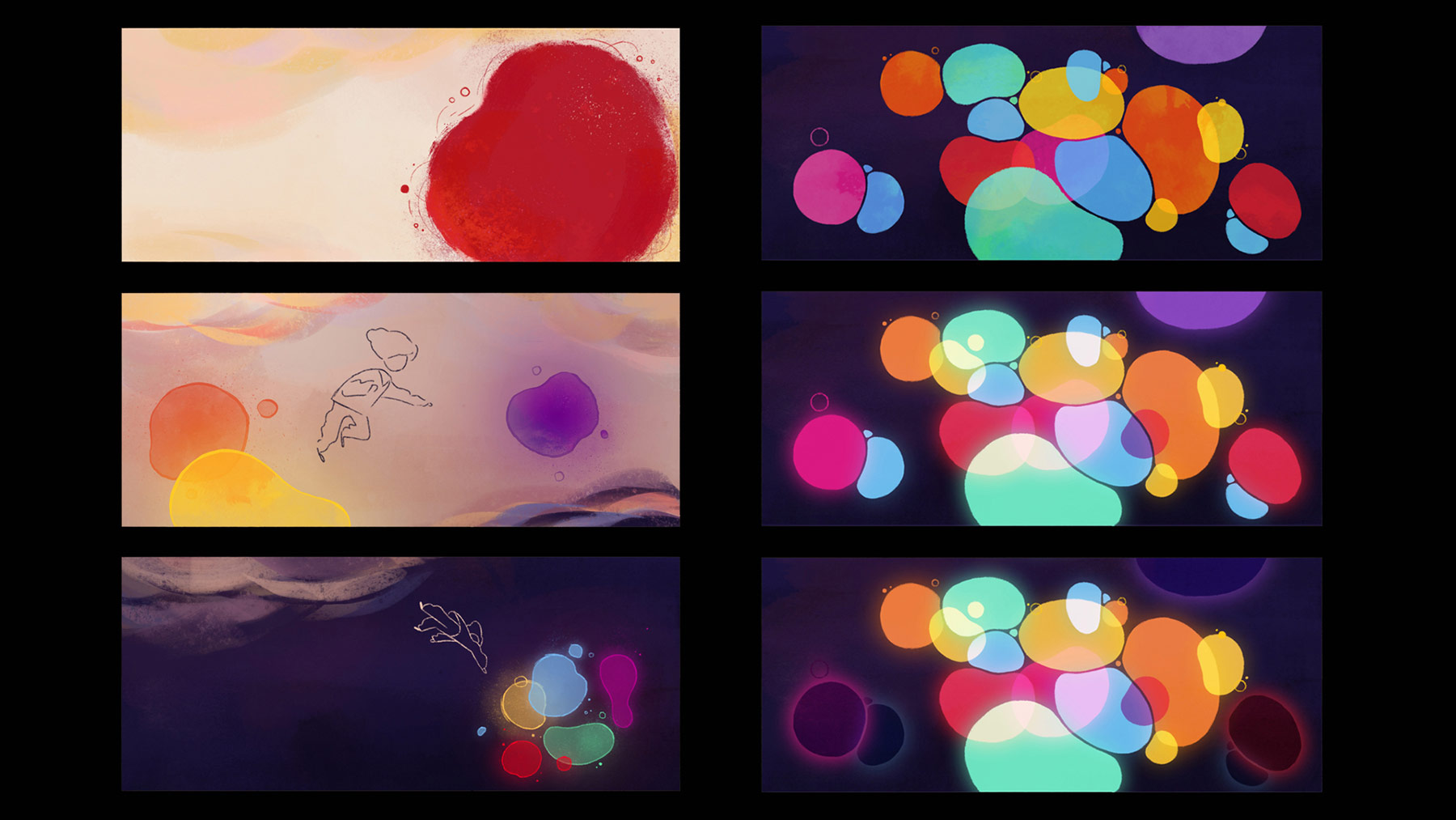
There are three distinct settings portrayed throughout the film: present day, Emily’s memories, and her subconscious. They needed to be distinct, but also flow smoothly from one to the next with Emily as the connection. “The main way we achieved this was through the looseness of the line and through the use of the color palette,” explained McGuinness. In the present day the living room has very limited colors, and the backgrounds showcase more structured compositions with defined lines and flat staging. On the other hand, the approach for the memories was to have looser, broken lines, and a palette dominated by single vivid colors.
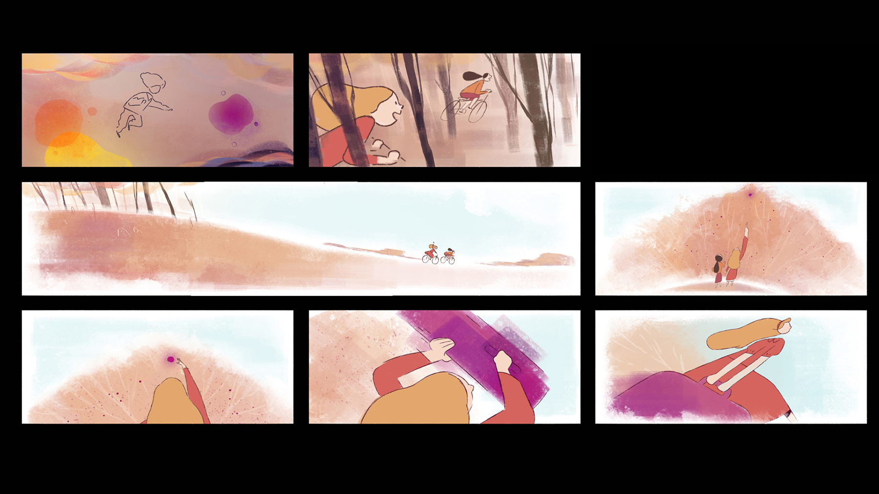
For the subconscious, there are no lines or details, and a feeling of weightlessness overtakes the screen. The production designer also explained that some of the most complex shots were the ones with dynamic camera movements, such as the scene where Emily runs across the beach. Given that the animation was so organic and fluid, they didn’t want it to be restricted by the layouts and created a previs pass that allowed them to test the camera move with the rough animation. “We then adapted the layout as needed and completed the final background based on that,” McGuinness said.
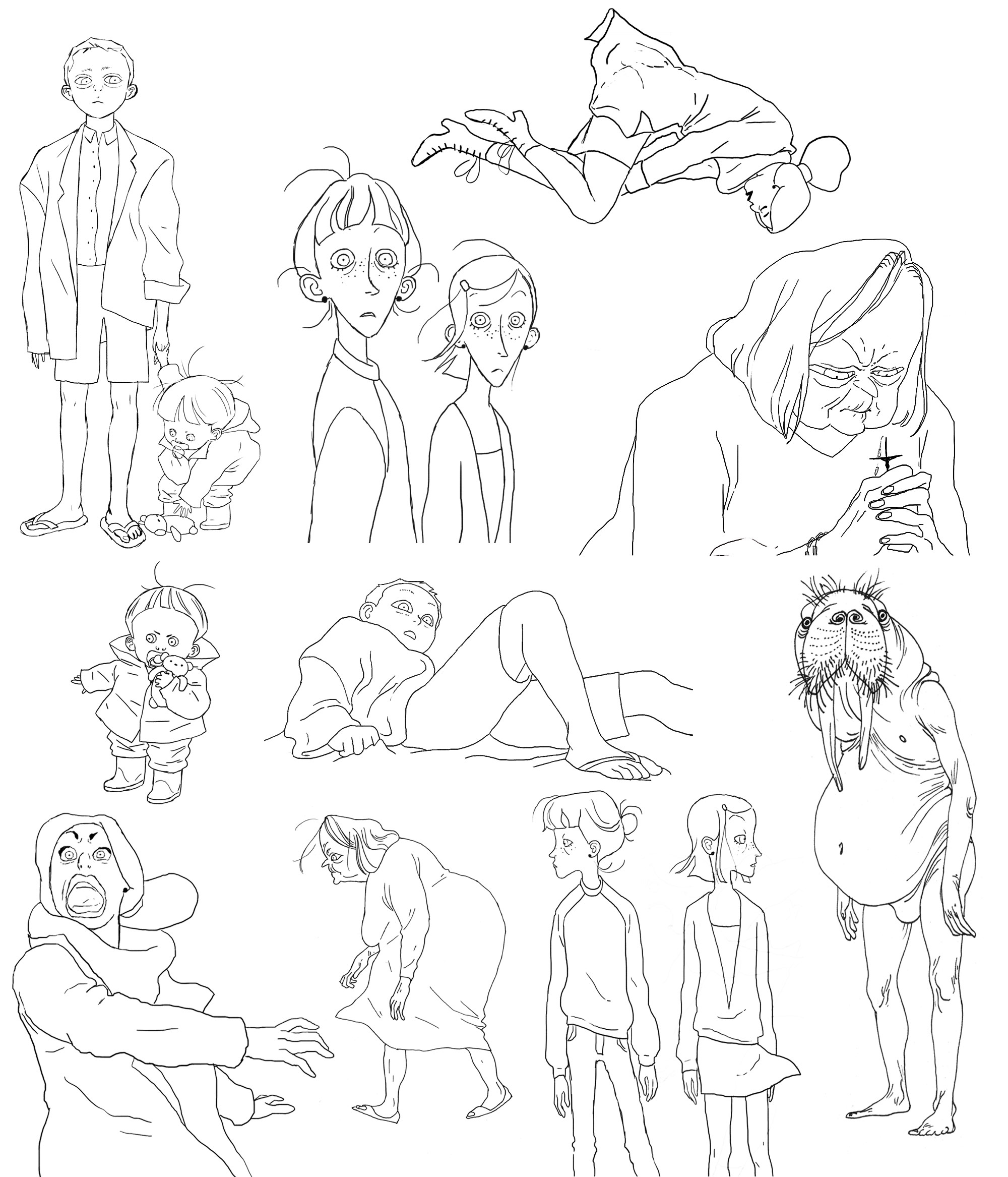
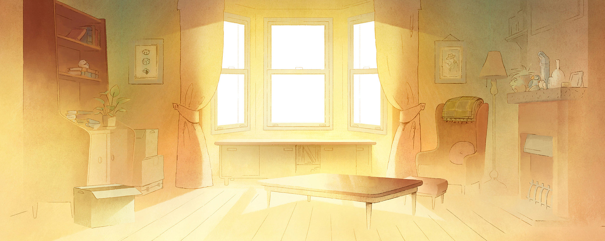
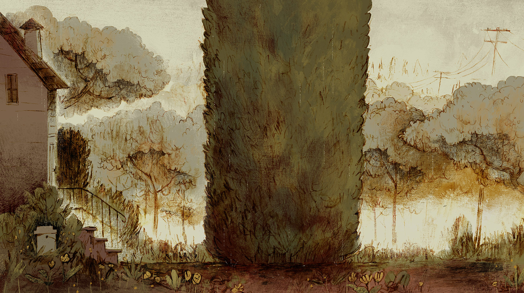
Weekends
Despite being occupied with his day job at Pixar, artist Chris Sasaki offered to help director Trevor Jimenez with key pieces from a production design standpoint to get his short film Weekends off the ground. Sasaki was enticed by the textured approach Jimenez wanted to use and the intimate nature of the project about a young boy in 1980s Toronto splitting his time between divorced parents.
While initially Sasaki only wanted to create guidelines for others to complete the short, he quickly realized each background would need individual care and time. Once he took on the role of production designer, Sasaki suggested that since this was an independent film it should look like an independent comic. To achieve this handcrafted look, he blended tactile techniques and digital paint. “All the line work was completed traditionally using charcoal,” he told Cartoon Brew. “After scanning the line work, we applied a watercolor texture overlay to weather the line and make it feel more gritty. We then used Photoshop to paint in our flats and mimic pencil shading for shadows and light.”
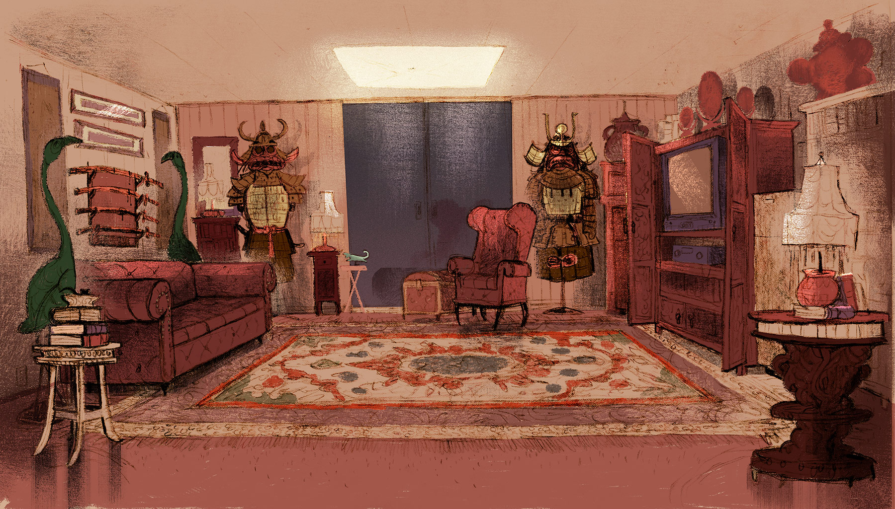
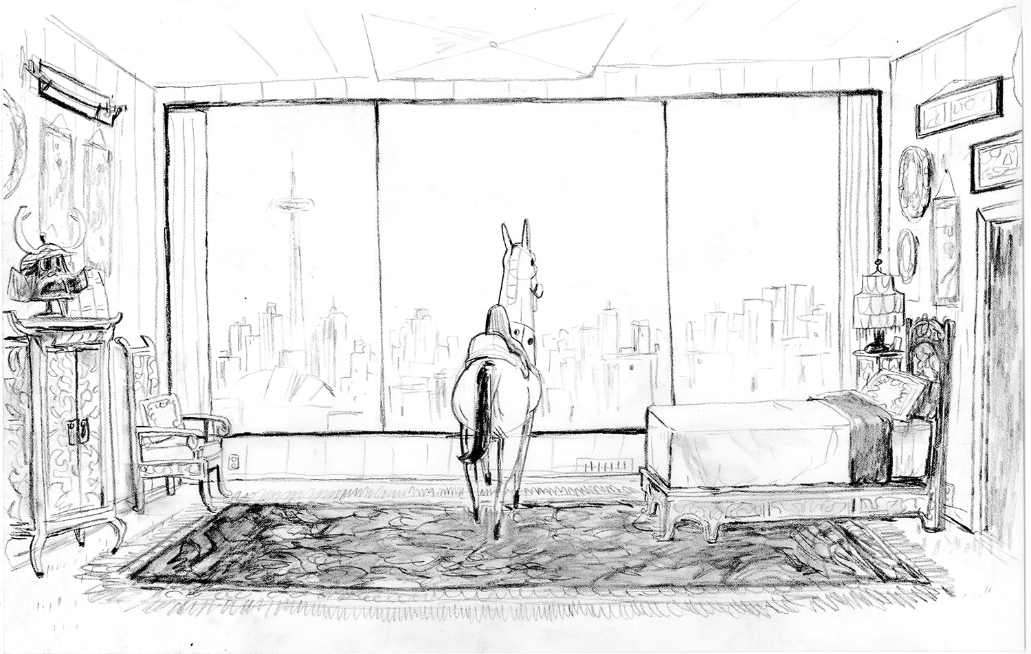
One of the most striking spaces in Weekends is the father’s apartment, as he is an eccentric collector of Japanese furniture, samurai swords, armor, and 80s electronics. “We used a lot of pattern, texture, and dense set decoration in his apartment to contrast with the mother’s home, which is more sparse and transitional with moving boxes still-to-be unpacked,” said Sasaki.
Desaturated colors were also a tool to delineate the two worlds the boy inhabits. “For clarity of story, we contrasted the color in the parents’ homes; when we’re in mother’s home the color green is more present, and in the father’s apartment the color red is more present,” Sasaki explained. They reserved the use of surprising or unsettling colors for the dream-like, surreal moments of the story.
As a production designer, Sasaki felt his mission was to make the short film feel authentic, and that mean incorporating the director’s own experience at this particular time and place in his life. Capturing the subtleties of what he remembered sometimes could only be done by Jimenez’s own hand. “The most direct and efficient way to achieve that,” Sasaki said, “was to literally channel everything through Trevor and get his thumbprint on screen. It was one of those rare scenarios where I told the director he needed to draw the line work himself.”