
Oscar-Shortlisted Shorts: See The Visual Development And Production Design – Part I
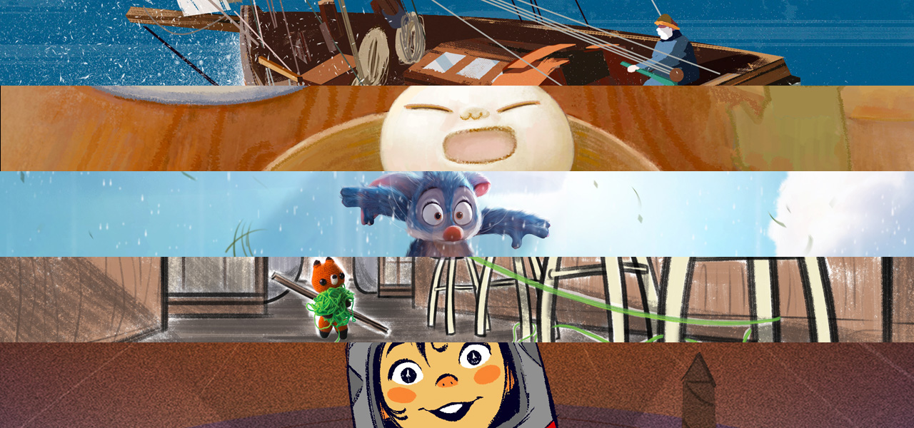
Amongst the 10 shortlisted animated shorts for the 91st Academy Awards are four cg films – Age of Sail, Bao, Bilby and One Small Step – and one stop-motion contender, Lost & Found (all of which you can watch HERE for a limited period of time).
Each short, of course, had to be designed from the ground up. Characters, sets and locations were imagined, matching the story and often taking formation from the designer’s own background and experiences.
In this round-up — the first part of a two-part series — Cartoon Brew explores the production design of these five shorts, and learn what talks to the filmmakers, production designers and artists behind these five short films and presents behind the scenes concepts and artwork from each.
To read the second part of the series, where we focus on the other five animated shorts currently shortlisted for an Academy Award, check out this piece.
Age of Sail
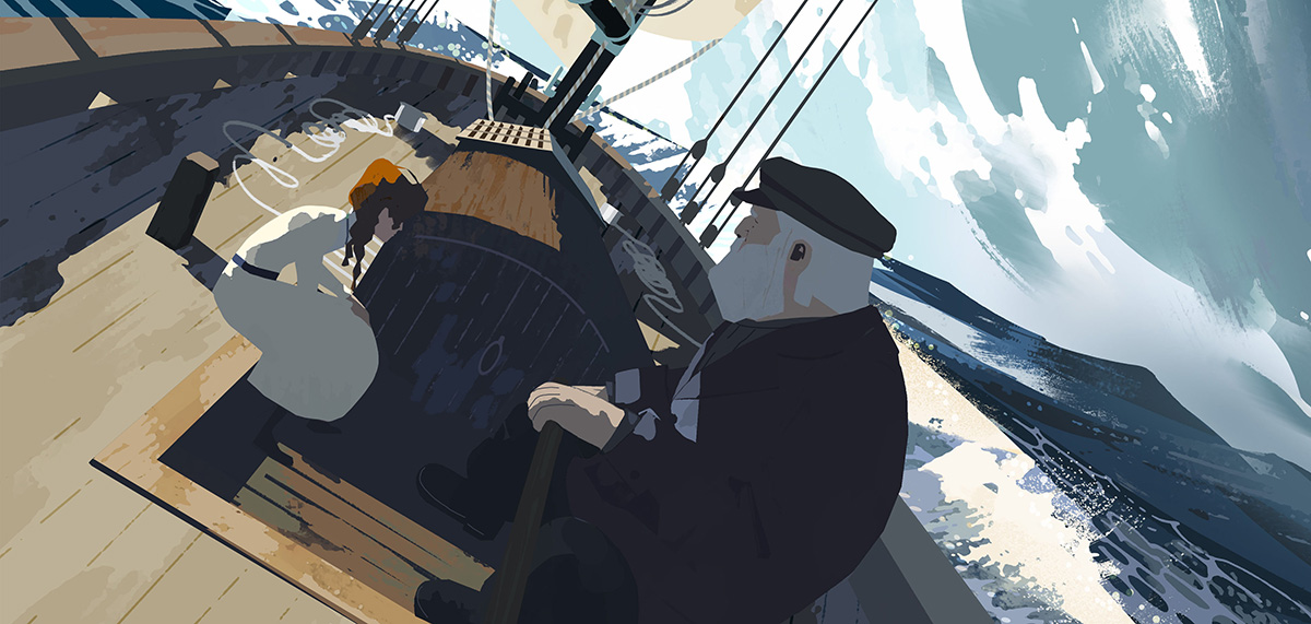
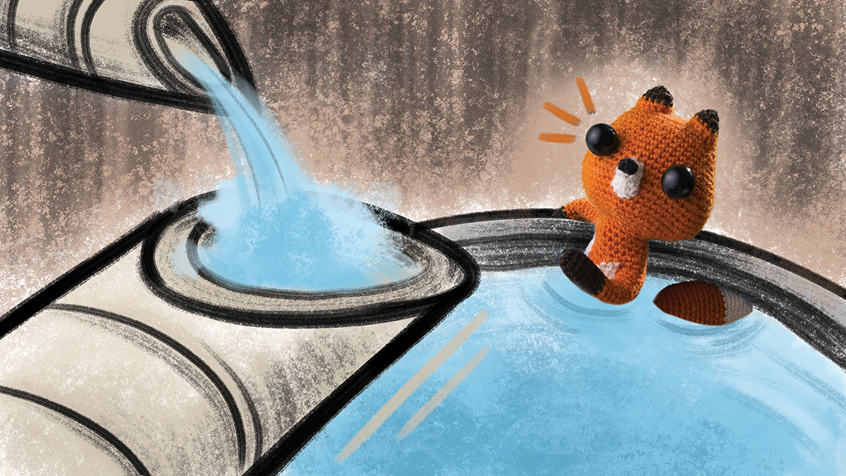
In Age of Sail, to immerse the viewer with the feeling of being on a boat (the film was made also as a vr/360 degree short by Google Spotlight Stories), production designer Celine Desrumaux was charged by director John Kahrs with delivering a look that was creative and colorful. “John brought up the paintings from Thomas Hoyne – which was our reference for waves and water until the end of production – and [creative director] Kevin Dart brought up the illustrative references of Bernie Fuchs to show how he had used textures in shadow,” said Desrumaux. “When you look closely at both, there are some similarities in how the light is very bright without any detail, but also how the textures give definition to the dark and shadows.”
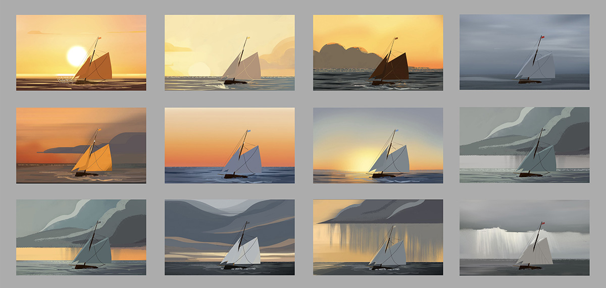
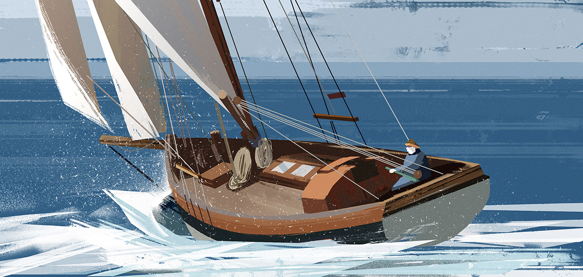
“We always wanted a stylized ocean,” added Desrumaux, “avoiding something too realistic, which is very difficult to achieve in cg, and especially in real-time, but we also needed something with complexity. We were aiming for the right balance between realism and illustration — the realism mostly coming from the lighting approach and the colors, even with the limited palette. We had also been inspired by Robert Fawcett and Ludwig Hohlwein and how he had used light to define the faces of his characters without drawing any eyes. We wanted to avoid the expected white eye with black iris. It was a really exciting challenge as an artist.”
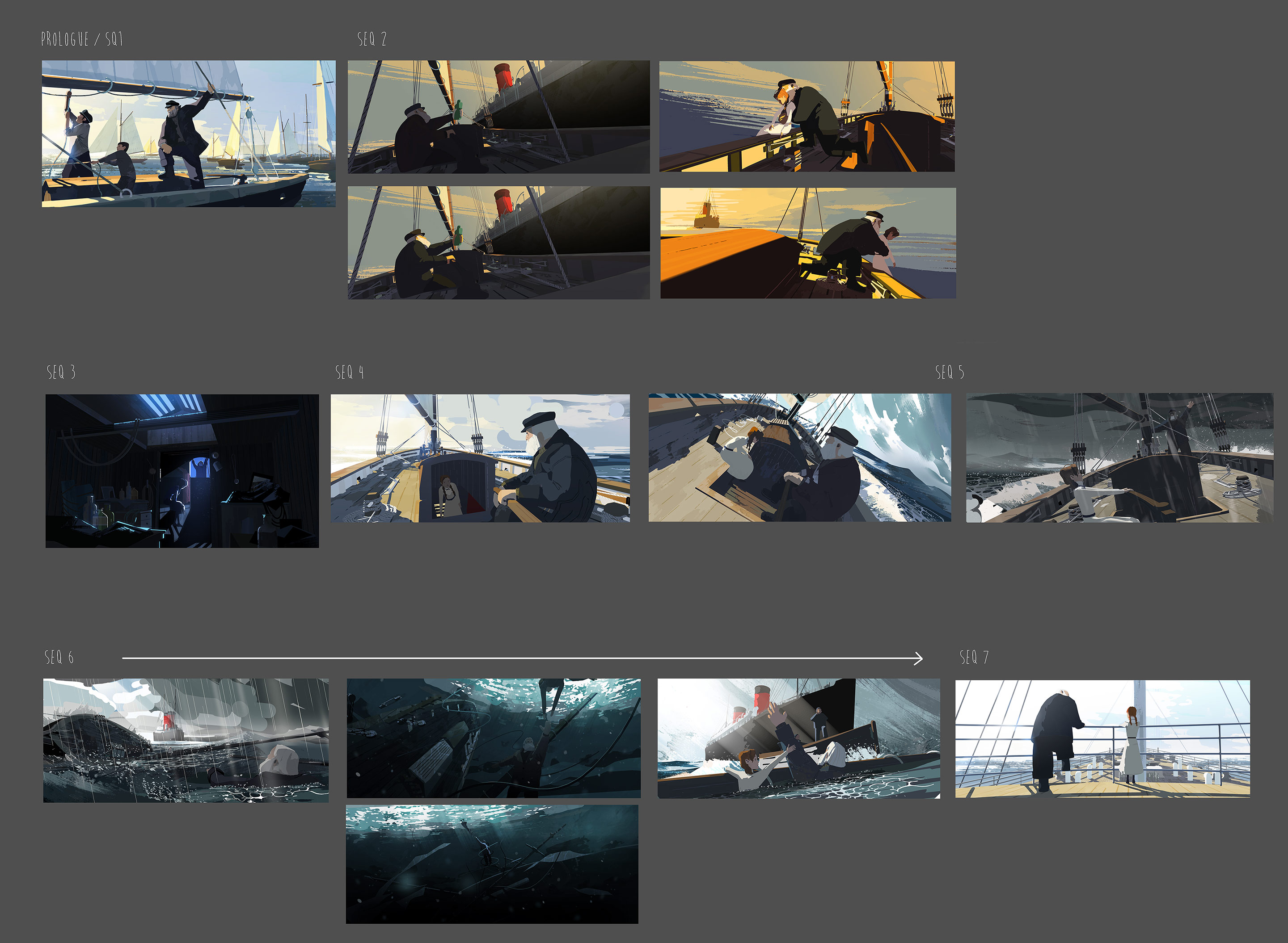
The film features a significantly reduced color palette, with clean, clear lines. Desrumaux says that lighting and colors are at the center of all her work and that it was important that the light supported the story and drama as much as possible. For technical reasons, too, there was the constraint of using only one light to cast shadows. “It’s one of the constraints of working in vr and in real-time for phone: you need to have your scene super-lit,” she said. “It pushed us to be even more efficient in our choice of lighting. It made us ask ourselves, ‘What is the most important thing that is happening in the scene? How can we guide the audience to look in the right direction, for the vr version, but also support the dialogue and action?’ I did a light-board with one to two images per sequence – the light needing to work for the entire sequence, then tested them in 3d. We needed to be extra precise with the position of our light.”
Bao
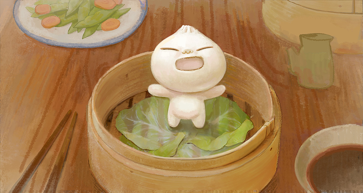
Bao production designer Rona Liu channeled her own personal experiences and background for director Domee Shi’s Pixar short, after she and her mother immigrated to the U.S. from China when she was 10 years old, and were mostly inseparable. “We were everything to each other, just like little Dumpling and Mom in Bao,” said Liu. “Then the pains of growing into an adult crept in and it was extra hard because I was often times caught between two very different cultures. So when I had to imagine Mom and Dumpling going grocery shopping in Chinatown or Mom and Son reconciling on the bed, I knew exactly how the scenes should feel based on my own memories with my mom. I could see in my head what the colors and light would be because it’s almost as if I’ve already been there.”
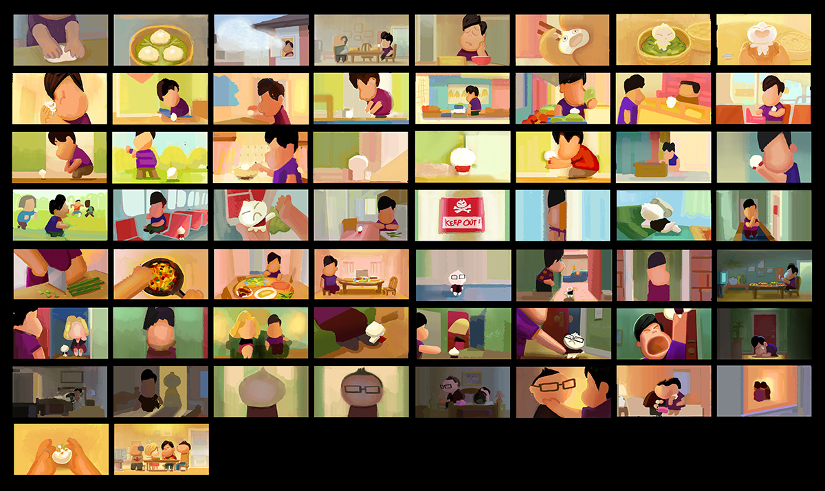
For specific designs in the film, Liu said she and the other filmmakers were drawn to “chunky proportions, simple designs, and vibrant colors,” adding that, “Domee also has a very unique and humorous way of drawing all of her characters, so all of that together was our jumping off point for our characters and environments. For Dumpling, our team sought out the best looking steamed buns to study so he would look like the cutest and squishiest little bao there is. And for Mom, we wanted to honor all of the Chinatown grannies so we took a lot of research trips to Oakland and San Francisco Chinatown to shop with the locals.”

Bao’s sets were designed to stylistically live in the same world as the characters. Liu says Chinese folk art formed reference, and inspiration also came from miniature models, with everything having a touch of imperfection. Also, Mom in the film is an immigrant living in Toronto, so the home is a balance of East meets West. “The built-ins and the larger furnitures would be Western, and the decorations, cooking utensils, and food would be Chinese inspired,” said Liu. We often used photos of the homes that we grew up in as references. In the kitchen, all of the counter tiles, oak cabinetry, and the tinfoil covered burners were a straight lift from my mom’s actual kitchen here in the Bay Area. We pulled as much as we could from our own lives so that the film might be as relatable as possible to our audiences.”
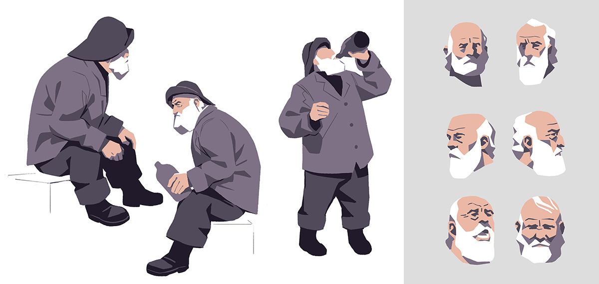
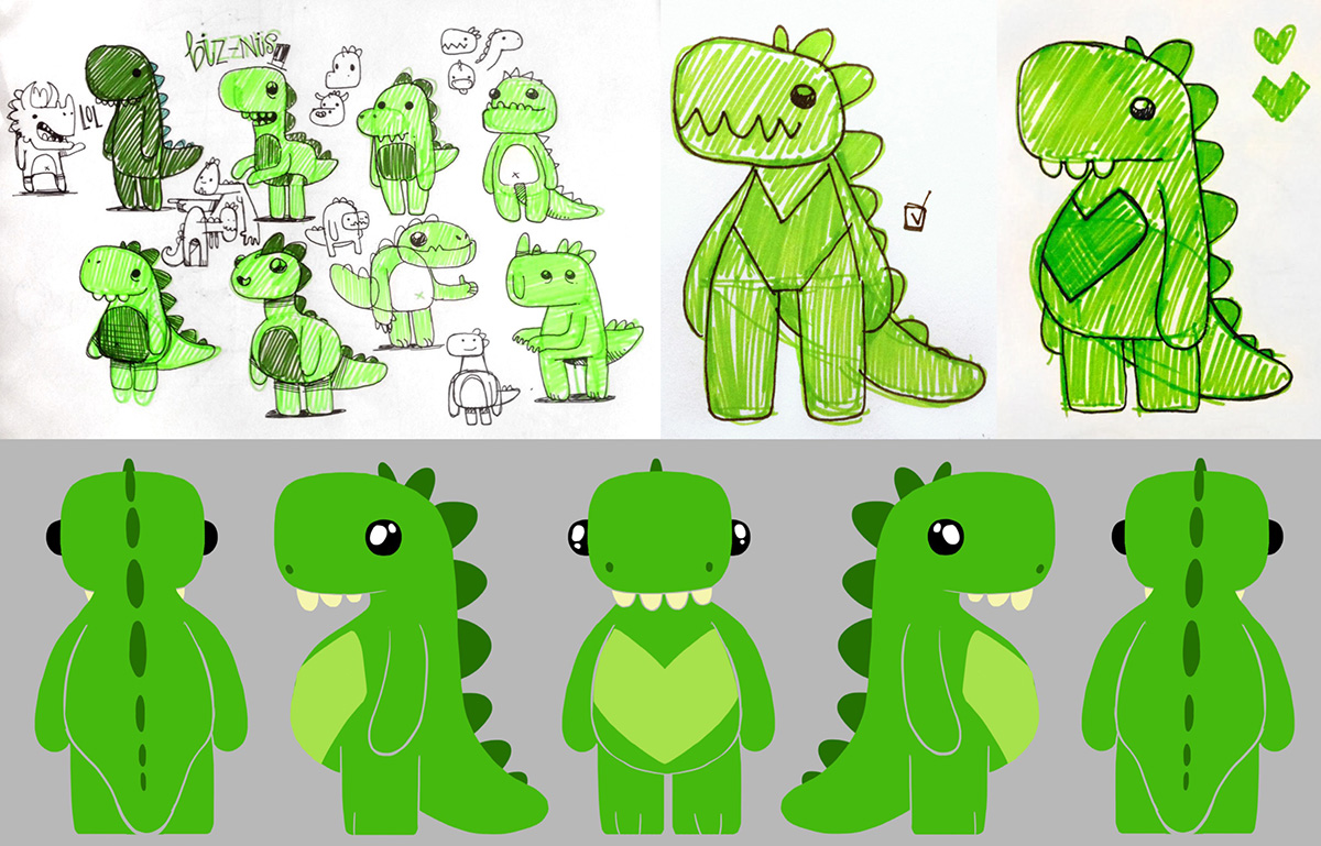
Bilby
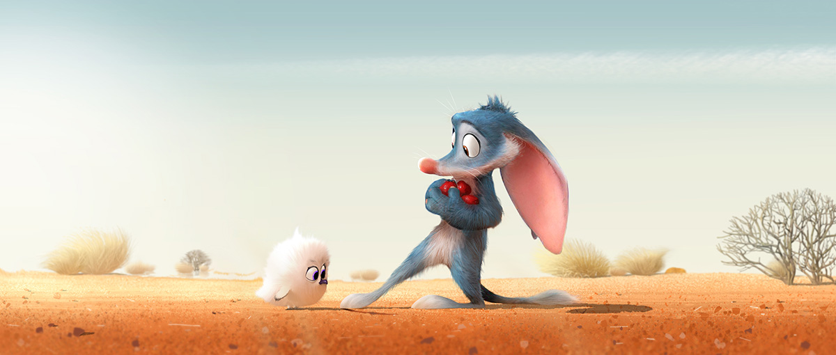
Bilby, directed by Pierre Perifel, J.P. Sans and Liron Topaz, emerged out of the cancelled Tim Minchin film Larrikins at Dreamworks. Production designer Richard Daskas says its characters needed to be appealing, noting they had “cartoony shapes but surfacing that helps them really fit into the environment. We wanted to have real stakes, that the characters could be harmed in the harsh world of the Outback that they live in. Surfacing on both the characters and environments are a bit more realistic because we wanted a real sense of danger. But we didn’t want a photoreal look. I worked closely with our vfx supervisor Matt Baer to help achieve this.”
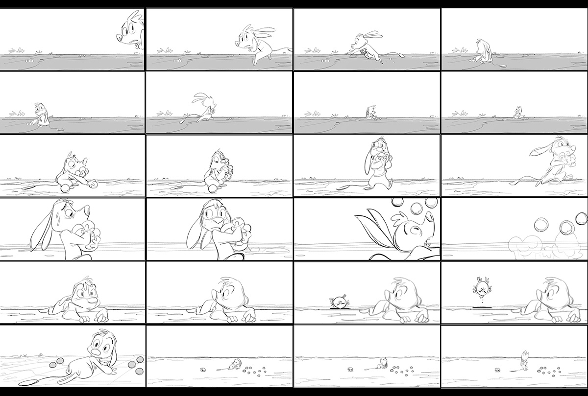
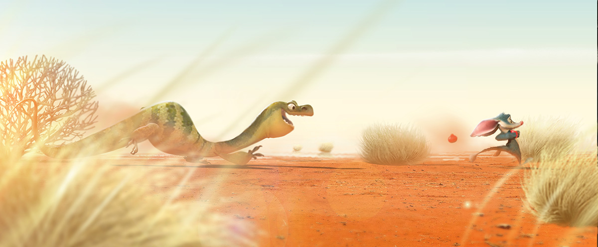
Color and color changes were an important attribute of the film, notes Daskas. “We wanted the viewers to feel the heat and harshness of the outback so everything in the first act is warm and bright. The Bilby is blue, like an actual Bilby, just a bit more pushed so he really sticks out, which makes it hard for him to hide from the predators. We made him dirty, however, so he looks like he’s been surviving there for a while. The second act montage sequence is super chaotic so we really wanted variety by using color, time of day, weather, and lots of locations. The third act, in contrast to the heat of the first act, is all cool tones. I wanted it to feel like a cool drink of water. And the Bilby looks like he belongs there.”
“I ended up doing a lot of color/lighting keys,” continued Daskas, “most of them pretty tight in order to really get the look we were going for, not photoreal and not super stylized, either. I think illustrative is a good way to describe it. The lighting team did an amazing job matching the color keys. Our head of lightning Betsy Nofsinger as well as Greg Lev, Max Bruce, and Scott McKee and their lighting teams, did an amazing job.”
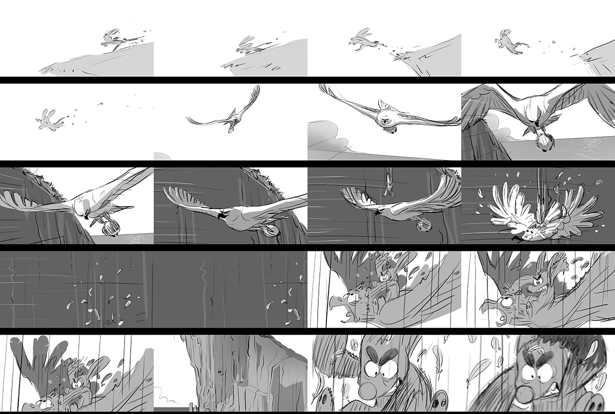
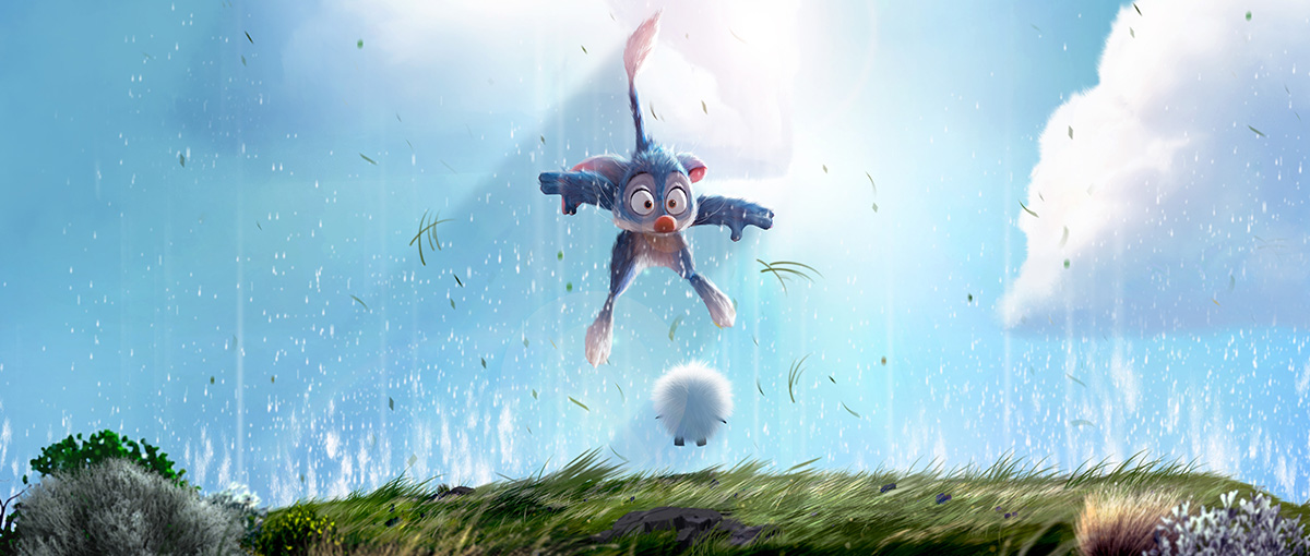
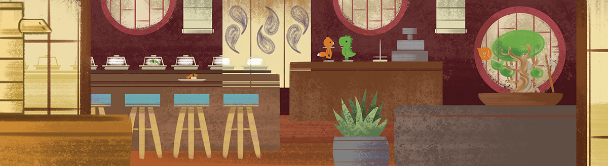
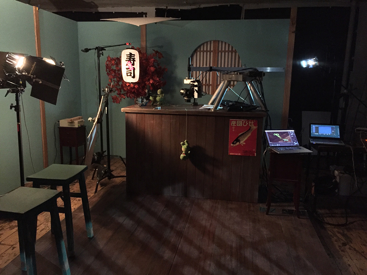
Lost & Found
Stop-motion short Lost & Found, directed by Andrew Goldsmith and Bradley Slabe, looked to Japanese philosophy Wabi-Sabi as a major influence. “We wanted to honor the beauty of things that are imperfect, impermanent, and incomplete because these were important themes in our film,” said Goldsmith and Slabe. “So we envisioned the set to be weathered and connected to the natural world with wood, water, etc. From early script stage, our characters were green and orange creatures to reflect the seasons. Another principle we followed was to infuse the restaurant with history so that it looked well loved. We extended this to the lost property box too. Inside, the dolls have organized the human items into a home. Books are beds, hankies are blankets, and the iPhone’s a TV.”
For the puppets themselves, character designer and animator Samuel Lewis was tasked with striking a balance between making the amigurumi dolls cute but also ensuring they could express a wide range of emotions. “We didn’t want our audience to sympathize with the dolls,” the directors noted. “We wanted the audience to empathize with them and feel their love and pain.”
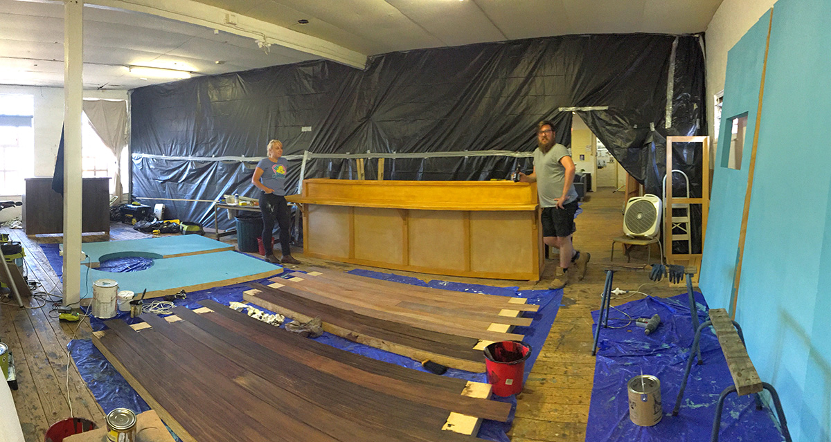
The restaurant set was built modularly and then deliberately aged and textured with ‘swinging hammers and heavy chains.’ “Our production designer, Rennie Watson, really embraced the Wabi-Sabi aesthetic,” said Goldsmith and Slabe. “He had a very holistic approach to his work and would justify any wear and tear with logic and considered backstory. We just didn’t want anything on set that was new and yet to be loved. This also applied to the amigurumi dolls. They were worn and frayed to look as though they were handcrafted, which they were.”
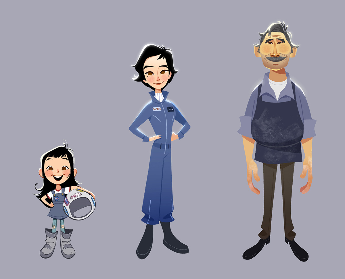
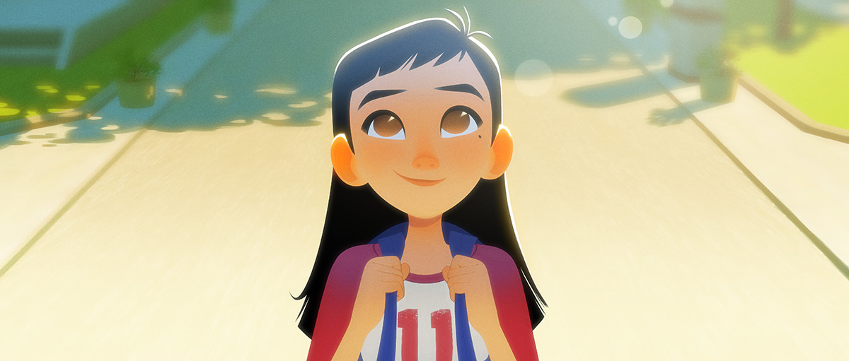
One Small Step
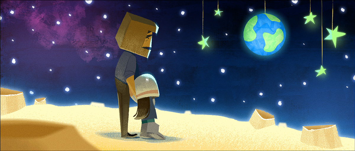
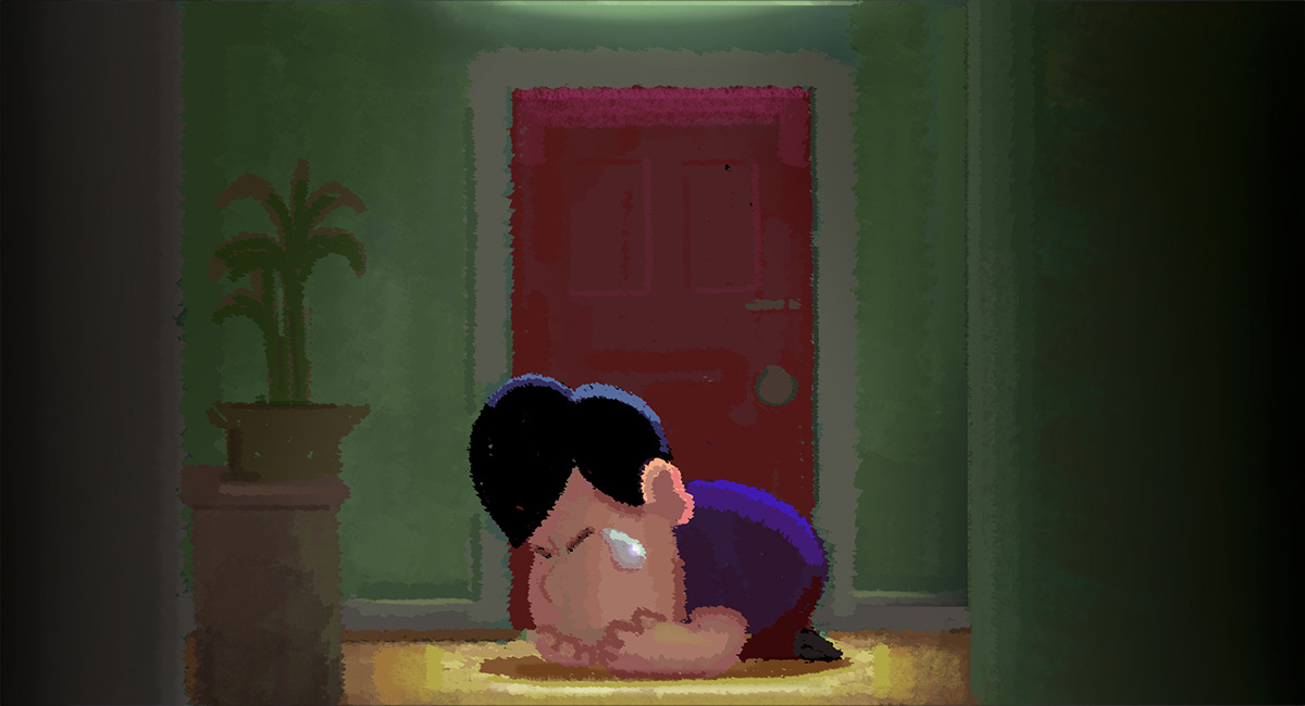
Directors Andrew Chesworth and Bobby Pontillas and producer Shaofu Zhang followed several underlying design principles in making One Small Step, from Taiko Studios. “We wanted the film to have the timeless quality of a moving illustration, to reflect the dream Luna had since childhood,” they told Cartoon Brew. “That meant rendering the final images with the same simplicity of shape and color in the concept art. The goal was to see the same imagery from an art-of book moving on the screen.”
Inspiration for that look also came from, the directors and producer say, the graphic simplicity of mid-20th century artists like animator Milt Kahl and illustrator Earl Oliver Hurst, as well as poster art from the era that captured the sense of wonder and optimism the world had for being on the frontier of space travel.
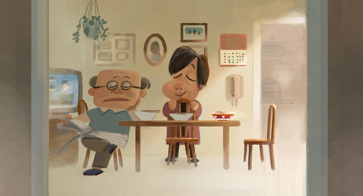
Luna’s home was based on Chinatown, San Francisco. Shaofu was inspired by his own childhood as a Chinese-American immigrant, supported by his parents who ran a small tailor shop. “It was important to us to be as authentic as possible depicting a relatable and believable Chinese-American household,” he said. “Many details were informed by working with our Wuhan, China team.”
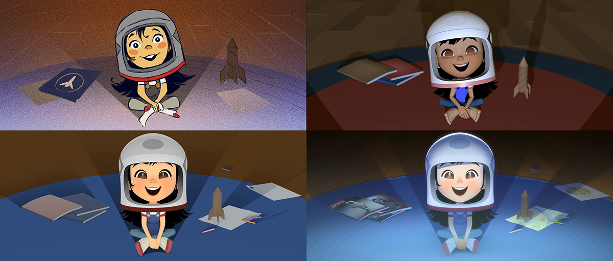
One Small Step was heavily storyboarded, with the aim that later conversations would focus on iterations on the final design of an image. Ultimately, the translation to cg animation preserved much of the illustrative beginnings. “We were inspired by Kent Melton’s sculptures when translating the characters into three dimensions,” the filmmakers said. “As much as possible, the shapes had to hold up at important angles by default. On top of that, the textures contained carefully chosen details and tone changes to separate elements under flat lighting conditions. The hair, cloth, and elemental effects are all articulated by hand like stop-motion and 2d animation. Guiding the layout and animation closely set us up for success in lighting and compositing. Bobby’s color keys in Photoshop were often projected back onto surfaces in Maya. Sometimes those Photoshop layers were used directly in compositing, with character lighting layers recreated using motion tracking and manual rotoscoping.”