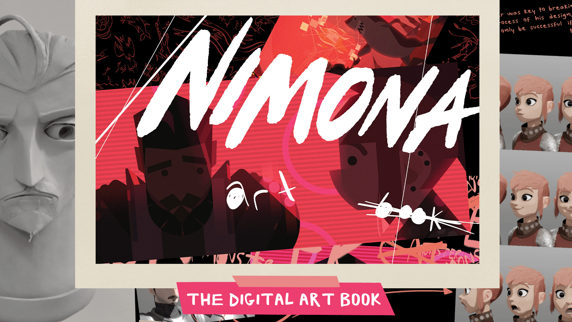
Netflix Has Released A 358-Page Multimedia Art Of Book For ‘Nimona’ – Exclusive
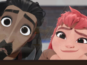
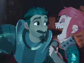
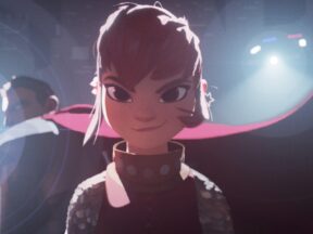
Earlier this summer, Netflix released the animated feature Nimona, one of the most ambitious and visually daring productions the streamer has been involved with to date. Critical reactions were overwhelmingly positive after Nimona’s Annecy premiere, and the film pulled in strong viewer numbers upon its Netflix debut.
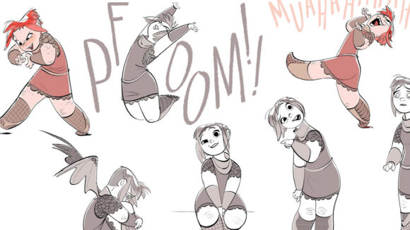
Today, the streamer has released a multimedia art of book for the film. which was put together by the film’s production designer Aidan Sugano, and Cartoon Brew has been given exclusive access to the document. Clocking in at over 350 pages, the book is a treasure trove of concept art, character designs, backgrounds, vfx breakdowns, music, and commentary from artists who worked on the film, including directors Nick Bruno and Troy Quane and the original Nimona webcomic creator ND Stevenson. To access the art book, go to ArtofNimona.com or click the image below.
Nimona’s production story is as dramatic as any of the plot points in the film itself. We’ve documented it over the years and recently spoke with the film’s directors about the twisty road to completion. Summed up briefly, Nimona was well into production at Blue Sky Studios when Disney bought the studio’s parent company, Fox Entertainment, and shut Blue Sky down, canceling production. Eventually, several members of the Nimona team got in touch with Annapurna Pictures, who picked up the film’s pieces and teamed with Netflix to revive the project. DNEG Animation, which produced the animation for the final film, had to rebuild all the existing cg assets; thankfully, they didn’t have to re-animate the film as the vast majority of the film had yet to be animated at Blue Sky.
Sugano was with Nimona from its Blue Sky beginnings, and recently sat down with us to discuss the film’s challenging development and production, how his role evolved over the years, and putting together the digital art book.
Cartoon Brew: When and how did you first get involved with Nimona?

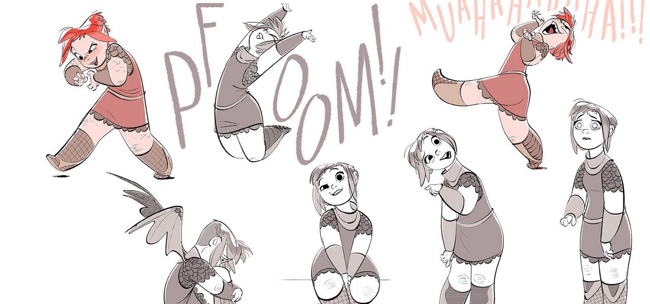
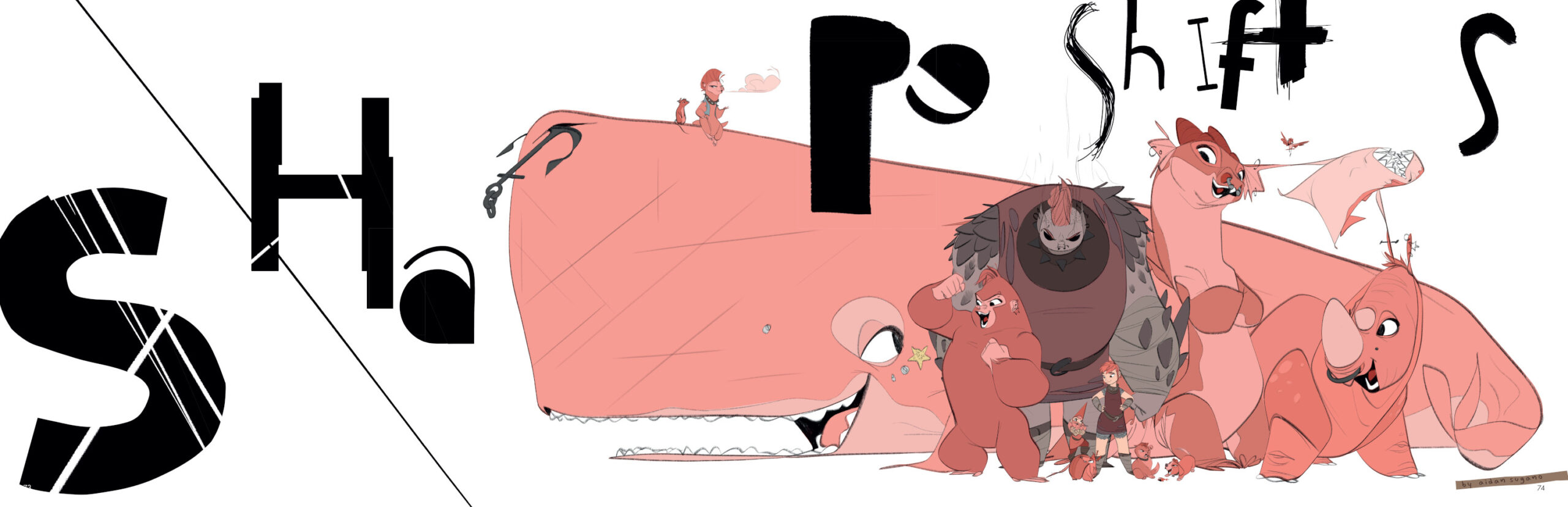
Aidan Sugano: I came onto this project in 2016, so it’s been a long time. Patrick [Osborne] was shopping it around to different places, and when he showed it to us, I was like, “Holy —-, I will chop off all my limbs to work on this project.” Patrick had just come off [the Disney short] Feast, and there was a definite desire to take that specific aesthetic, move it forward, and apply it to this medieval future story. But we were also heavily influenced by the iconic 2d fantasy animation genre that we all grew up with, which defined many of our childhoods.
How did you find the right style to do that, to take Osborne’s original look and elevate it?
That was the big ask at the beginning. How do you blend Syd Mead with Eyvind Earle? We added Charley Harper in the mix, and by doing so, it gave us the breadth to kind of still live in that golden era of animation but with the range that we could, with our shapes and language, push a lot of that stuff so we could cover all the bases and not limit the story.
I noticed that Feast’s production designer Jeff Turley contributed to the art book as well. You were both production designers on the film for a time, although he moved on before production finished. How did that partnership work?
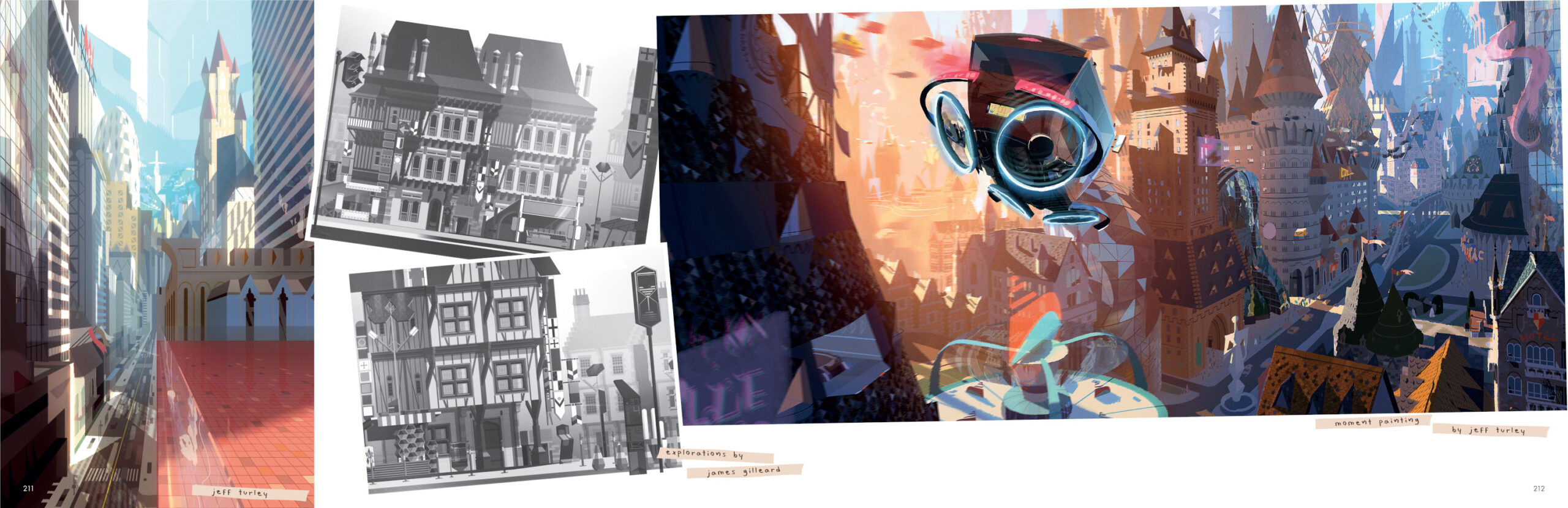
When Jeff came on, he and I partnered to make a style guide. The early days were very focused on establishing that style. He focused more on the color and the sets while I was working on the character side. And a lot of that style guide is in the film. It was our training manual and bible during production because we had to figure out a lot of the 2d tenants that didn’t work in 3d. We had a plan for this universe that was moving, deforming, and reforming, and when the rules say everything has to be aligned on a grid, that hurts. That’s difficult to do without extremely limiting the performance. So, we had to come up with clever ways to apply our thinking in 3d and in motion.
Can you talk a bit about the development process at Blue Sky?
This was probably the most collaborative project I’ve ever worked on. We knew it was a big ask to make this very specific thing, especially with technical limitations. We brought in the production crew really early, which created this beautiful cycle of feedback where we could talk about what we wanted to do and figure out ways around the limitations preventing that.
And what happened when the studio was shut down?
We had a lot in place and had our look nailed down when the studio closure happened. That was absolutely heartbreaking. Fortunately, we were able to find a partner in Annapurna and Megan Ellison, and Netflix joined after that. We were able to bring almost everything over with us data-wise, which was good because we’d put a lot of work in and figured out solutions to a lot of problems.
How did that work practically? How was the pipeline affected?
Everything had to be put into a new pipeline, and DNEG was awesome at piecing things together. I had stepped in as sole production designer at that point. Even though we had a lot of data from the original development, we still had to get the new team up to speed on the style and get everyone thinking along the lines we’d established over five years of development.
After production started at DNEG, how did your role change?
When production kicked off, I was working on the standard design pieces and making sure that every artist in every department was sharing the same brain. My job was to oversee that and ensure that everything stayed consistent because our look demanded consistency. Our effects couldn’t feel pasted on. They couldn’t live in a different style, and all the characters had to feel like part of this world, so everything melded into the background and never distracted from the story.
Did anything change aesthetically after DNEG took over?
From 2016 until the film was finished, the spirit of the thing never changed. There have been a few details and tweaks, but if you look back at the original artwork from 2017 in the book and the final work done by DNEG, not much has changed. That’s a great credit to DNEG, which had a monumental task that they crushed. Being able to maintain consistency through all that change is still just mind-blowing to me.
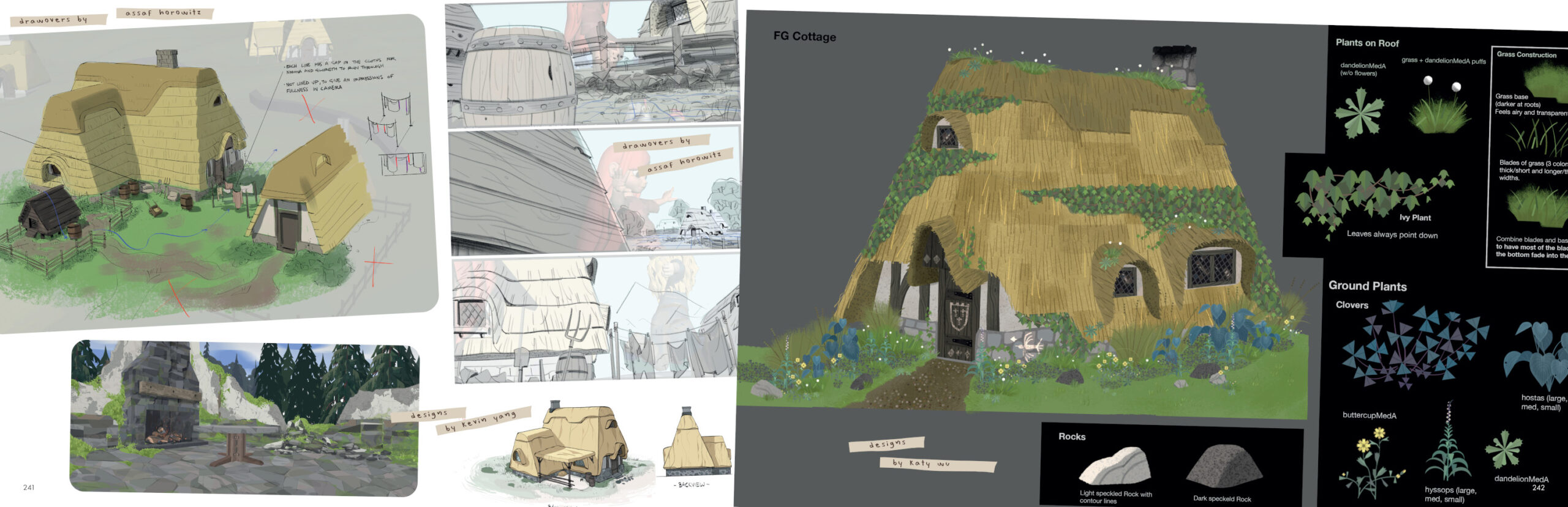
Near the end of the book, you dedicate a lot of space to the paintovers. Can you talk about that process and why you felt it was important to include those in the art book?
Paintovers happen in every film, whether or not they are included in the art book. Most of the time, they aren’t. I wanted to include the paintovers because the whole production floor had to learn to “paint” this entire thing. So, by the time we knew exactly what we wanted our film to be, those paintovers were super valuable because they were doing those final polishes. It kept us honest and consistent. Because of the nature of this film, there were so many details we had to make sure stayed consistent. Those paintovers are some of my favorite things in the book because you can literally side-by-side a painting and a final image from the film and have it match almost one-for-one where you couldn’t tell the difference.
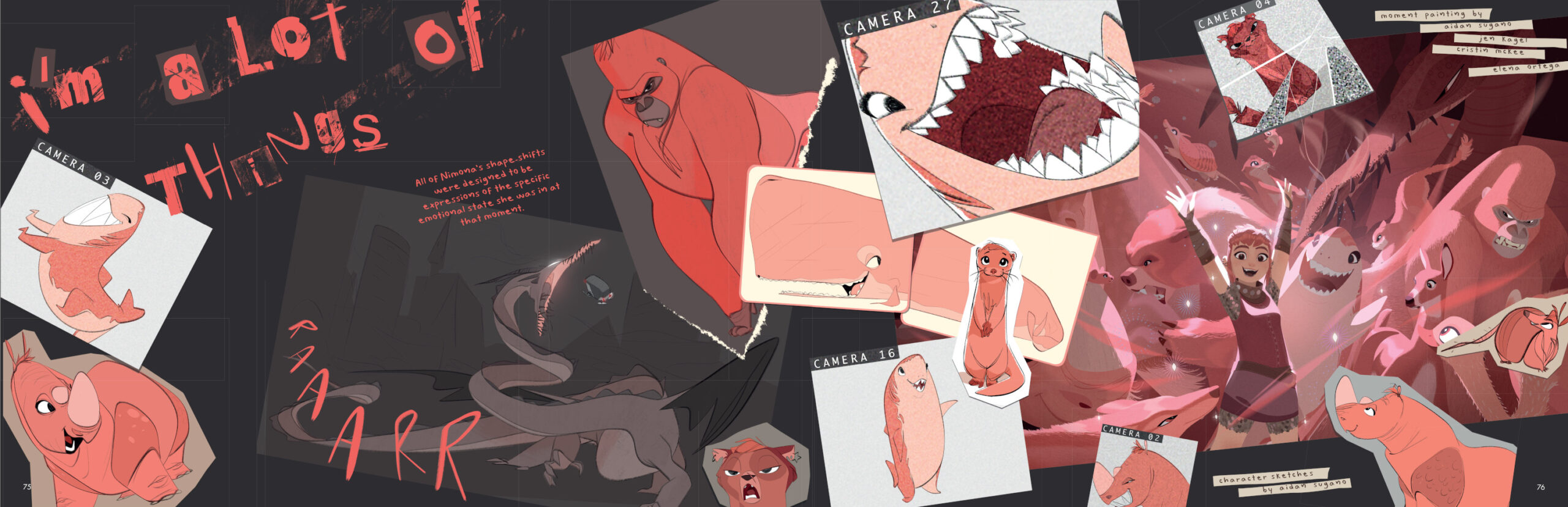
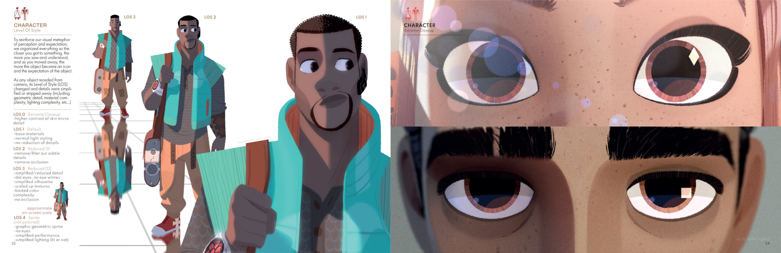
There is also an interesting passage dedicated to how you removed character details as they moved further back in the frame. Why was that necessary?
We quickly saw that if you just scale something down, the amount of detail in the space would make the frame feel more 3d and cause the viewer’s eye to go to the background, and it would break the whole frame. So, we had to figure out technically how to strip out detail and simplify the geometry as figures moved further into the background. That was the only way to make it feel like the whole thing had been painted with the same set of brushes.
Does that mean you had to do multiple designs for each character based on their position in a given frame?
We started off thinking we’d have to do exactly that: make assets for every single step of the way into the background. But the brilliant team at Blue Sky figured out a solution where they kind of stripped and reduced and merged assets. I don’t even totally understand it, but their solution meant we could work with only two, maybe three different assets. For our crowds, we had the little things called sprites, which are basically a circle on top of a Playmobil-style body with very simple geometry. But, because of the motion and atmospheric effects, it still feels like a crowd and doesn’t break the viewer’s attention.
How did you put the art book together? And who helped?
I made the book with one of our team members from the design team, Emily Chekmeyan. I have to give her so much credit for this thing. She took all my messiness and cleaned it up, and I asked her to do a million other things. The whole process was sort of DIY. Jeff and I had talked about it a long time ago and established what we’d want from an art book, which was basically all art. There is a very strong editorial aspect to all of the imagery in the film expressed through Nimona’s voice. So, I wanted to design a book and make it like Nimona would if she was doing it. I thought of it like a DIY zine, a David Carson-inspired chaos manual. Some of the writing was done by me, some by Jeff, and some by Assaf Horowitz, who was the film’s environment art director. But a lot of the pages in the book are just straight from the style guide, what we had in our bible internally, and what we handed over to DNEG.
The digital artbook is fantastic and really fun with the music, gifs, and clips. But is there any chance of a physical art book in the future?
If I had any limbs left, I’d cut them off to get a physical version of the book made. I want this thing out there as much as possible if only to selfishly have eight copies of it stacked on my desk.