
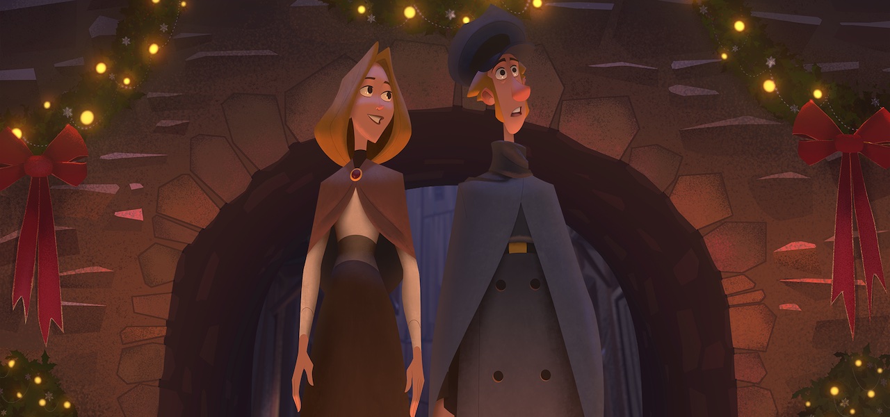
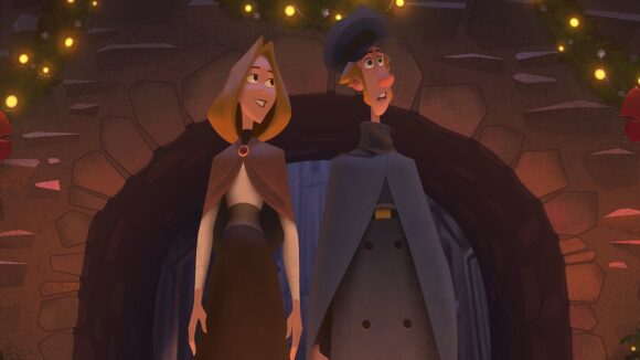
How ‘Klaus’ Draws On Centuries-Old Artistic Principles To Push 2D Animation Forward
When Cartoon Brew premiered the first teaser for Klaus back in 2015, we had to clarify that it was hand-drawn. Confusion was forgivable: the characters had the volume, the polished sheen, normally associated with cgi.
Almost five years later, the film’s visual style is still striking, for two contrasting reasons. Firstly, the very fact that it’s a work of 2d animation — backed by a major U.S. company (Netflix) — sets it apart in an age of 3d dominance. Yet this is no ordinary hand-drawn animation: Klaus deploys cutting-edge lighting and texturing tools to redefine the look of the medium.
This approach is in keeping with director Sergio Pablos’s stated ambition: “I’m not trying to bring traditional animation back, I’m trying to bring it forward.” Well known as the co-creator of the Despicable Me franchise, Pablos cut his teeth as a Disney animator in the studio’s 1990s heyday. As the U.S.’s 2d animation industry collapsed, he returned to his native Spain, where he founded SPA Studios and set about trying to update the medium for a new generation. The result is Klaus.

Now that the film is out theatrically (and launching on Netflix tomorrow), much is being made of its visuals — but little has been said about how they were actually achieved. So Cartoon Brew decided to put some questions to Szymon Biernacki and Marcin Jakubowski, the film’s production designers, as well as Anaël Seghezzi, who helped develop the lighting and texturing tools at his company Les Films Du Poisson Rouge, in Angoulême, France.
Below, the trio walk us through key stages in the making of the film. They speak about the challenges of producing a major 2d feature today, and shed light on their approach to lighting — which, when you strip away the snazzy technology, is essentially what artists have been doing for centuries. Their comments are taken from longer answers sent by email.
Developing the tools
Marcin Jakubowski: From the very beginning it was clear to me that if something was supposed to look hand-painted, it had to be made by hand. That’s why I discarded all the automatic solutions that used a computer-generated light on 3d geometry. I wanted to paint directly with light, without any extra layer between the artist and the final result.
I’m not a programmer, so I wanted to build a prototype using existing software. I knew exactly what kind of features I was looking for. After a couple of weeks, we had created the prototype using Nuke. We managed to make the whole teaser in 2015 using that system. It was good enough as a proof of concept, but we wanted to improve the accessibility and efficiency.
Anaël Seghezzi: Around 2014, we were contacted by SPA Studios to do some tests for a new project they were developing. They sent us a few 2d animated shots, lit by Marcin Jakubowski with a new method he’d created. We showcased our animation and rendering technology to Sergio Pablos, and demonstrated how we were able to add brushstrokes and textures to 2d characters in a semi-automatic way.
A couple of years later, during pre-production, we heard from SPA that it was very challenging to apply light and shadow in production. I’d been working on a 2d animation software called Houdoo for about ten years, and I had a very effective inbetweening and tracking system. So I modified it a bit to show them how it could speed up light and shadow animation.
I then exchanged [information] with Marcin about his technique and I started writing a prototype software for a lighting tool based on Houdoo’s technologies and his method. This tool, KLaS (Klaus Light and Shadow), featured automatic tracking, inbetweening, and real-time rendering. It was used by Florian Aupetit’s light and shadow team at SPA.
At the same time, we worked on the pipeline for texturing using MOE, another custom software developed at Les Films Du Poisson Rouge. MOE is a type of expressive renderer: it can analyze a sequence of images to detect contours, lighting, and motion, and reproduce traditional styles like oil painting or crayon. Once set up, this software was very effective in production.
Finding the artists
Jakubowski: That was a serious concern from the moment we started working on the proof of concept in 2015. I was afraid that the tediousness of the process would overcome the excitement after just a few weeks and at the end the artists would hate doing it. Quite soon it became very obvious that it’s not the animation skill that is required for the process. Understanding how the light works and how to translate it onto a stylized character was essential.
Usually it’s the concept artists and illustrators who have this knowledge. But there were some issues, for example: how to advertise the job without giving away the process that we wanted to keep secret? How to identify seniors or leaders for a job that didn’t exist, and nobody had any experience? How to convince competent artists to stray away from a well-known career path and invest their time in such unknown?
First we approached Florian Aupetit as the head of the lighting department. [He had] the perfect mixture of artistic sensibility, technical knowledge, natural curiosity, and personal features. All the other lighting candidates had to make a simple test for evaluation. They had to put a solid shadow on two poses of the character and some hand gestures with a given light direction in Photoshop. We were judging the volume understanding, shadow shape stylization, and overall quality and consistency.
The majority of the team was very young and inexperienced. For most of them it was a first job. Nonetheless we were all surprised how easily and fast they were learning.
Applying the tools
Jakubowski: We didn’t try to simulate the realistic light with all its nuances. We narrowed it down to several passes/layers — like “key light,” “bounced light,” “ambient,” “occlusion,” and “rim light” — and gave this choice to the artists who could use them however they wanted. That’s what made this process understandable for 2d painters.
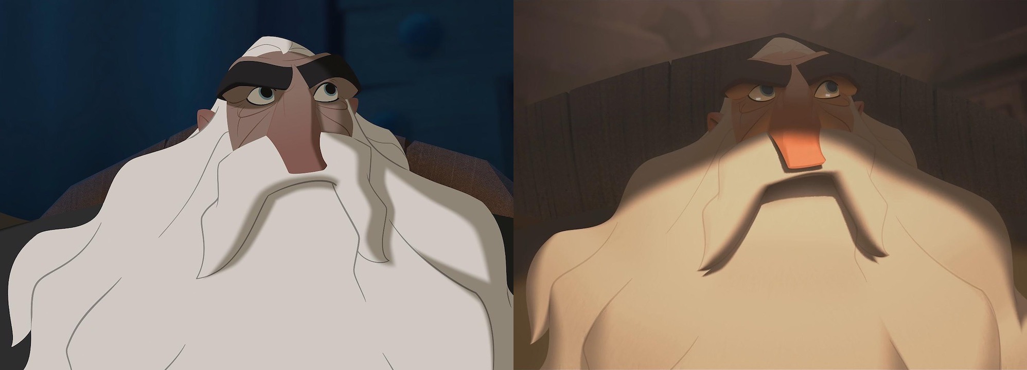
When the lighting artists started a shot, they had to interpret the animation frame beneath, and create the shape of light for each of the light passes they choose. Some of the layers were generated automatically — like the warm transition between the light and shadow on the characters’ skin, which makes it feel like flesh.
The artists worked only on the key frames, and all the in-between frames were interpolated automatically using the data from the tracking system. If the tracking system failed, the frames had to be worked out by hand. That’s pretty easy in the static shots, but if the character walks away from the light source, it’s the artist who has to figure out how it would affect the character.
The main challenge in the lighting process was finding colors and the shapes that are nicely stylized, fit the lighting condition, are embedded in the background, and make the character looking appealing.
Creating the world
Szymon Biernacki: It was extremely hard to find traditional layout artists that could do feature film-quality work. We realized that the most common profile these days is that of a concept artist, which means that the artist can usually both draw and paint. Very few people specialize in drawing or painting, like back in the day. Now everything is done inside the same program, like Photoshop, by one person.
So we decided to merge the background and layout teams. We hired a group of concept artists, trained them in the craft of traditional layout, and had them work under an experienced layout supervisor. Then they painted the final backgrounds on top of their own layouts.

We didn’t really have the time to create a proper production design package for all the locations in the movie. So the fact that our layout artists were also doing concept art allowed them to design a lot of things as they were drawing their layouts. And since they were painting on top of their own drawings, the layouts themselves didn’t have to be super tightly drawn, because they were not handed over to another department.
[Merging these teams posed] a huge organizational challenge. The work of the layout and background departments overlaps in time during production, but in this case we had only one team doing both, so it was very difficult to schedule the work of individual artists.
Using (and avoiding) CGI
Biernacki: We used cgi mainly for complex rigid objects that would reappear in the movie numerous times, like Jesper’s wagon or the ferry. It is very hard to animate those in 2d and keep the consistency of volumes and the correct perspective.
It was never our intention to fool anyone into thinking that [the 2d animation] was done using cgi. Marcin and I are concept artists, and we just wanted to find a way to use light and color in traditional animation the same way it is used in, say, illustration or concept art created using Photoshop. Actually, we were often asking our lighting artists to simplify the shading, because making it look “too 3d” was taking away from the simple graphic statement that we were looking for.
I believe that the confusion comes from the fact that this kind of volumetric character design was previously reserved only for 3d animation. At the same time, we don’t have these doubts when it comes to 2d paintings or illustrations, because we are used to seeing this treatment of light — it has been there for hundreds of years.
“Klaus” launches Friday, November 15, worldwide on Netflix.