Cartoon Saloon And Dog Ears’ My Brother the Minotaur: The Color Script Behind The Story (EXCLUSIVE BTS)
Since 2012, Irish animation studios Cartoon Saloon (WolfWalkers) and Dog Ears Studios have been collaborating on the preschool animated series Puffin Rock. Hoping to develop animated stories for an older audience, an opportunity arose in 2016 when animator Donal Mangan pitched Dog Ears, an original mystery about two brothers, one of whom is a minotaur.
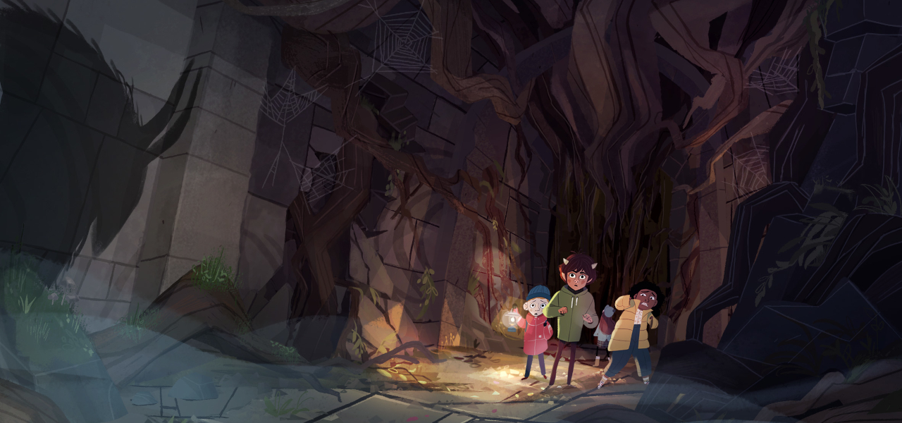
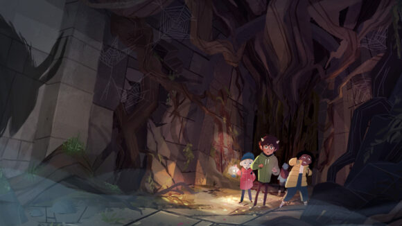
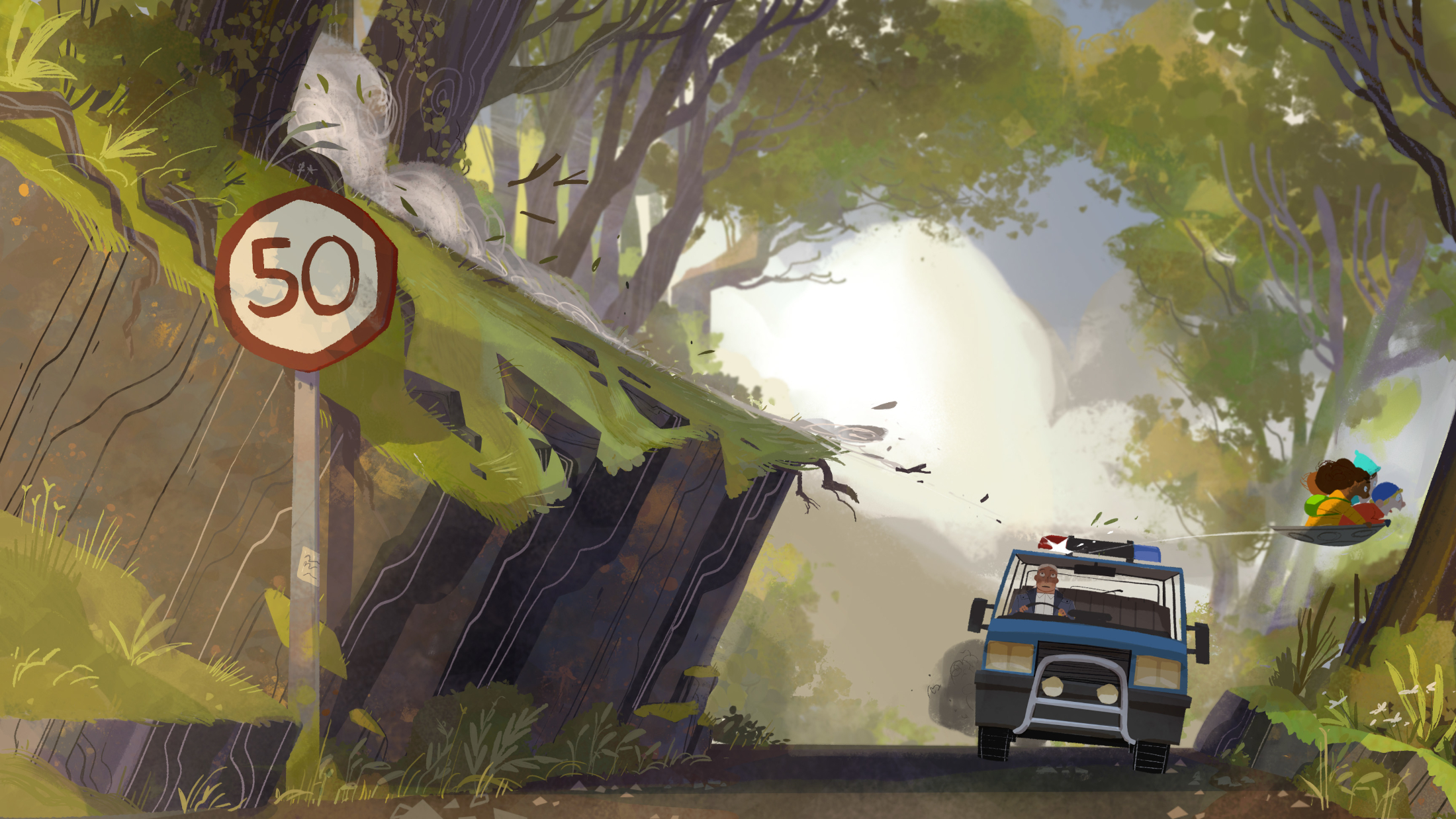
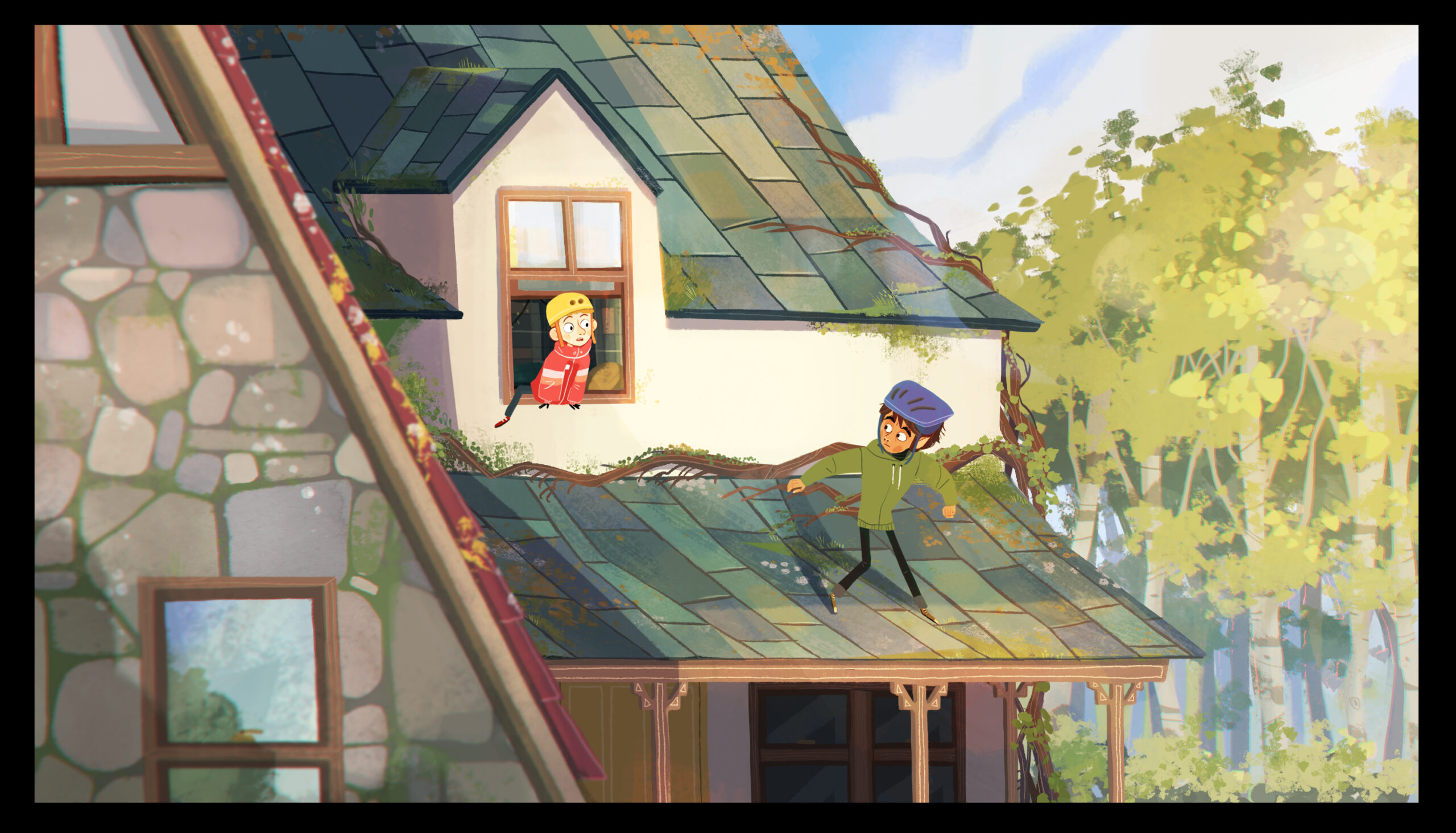
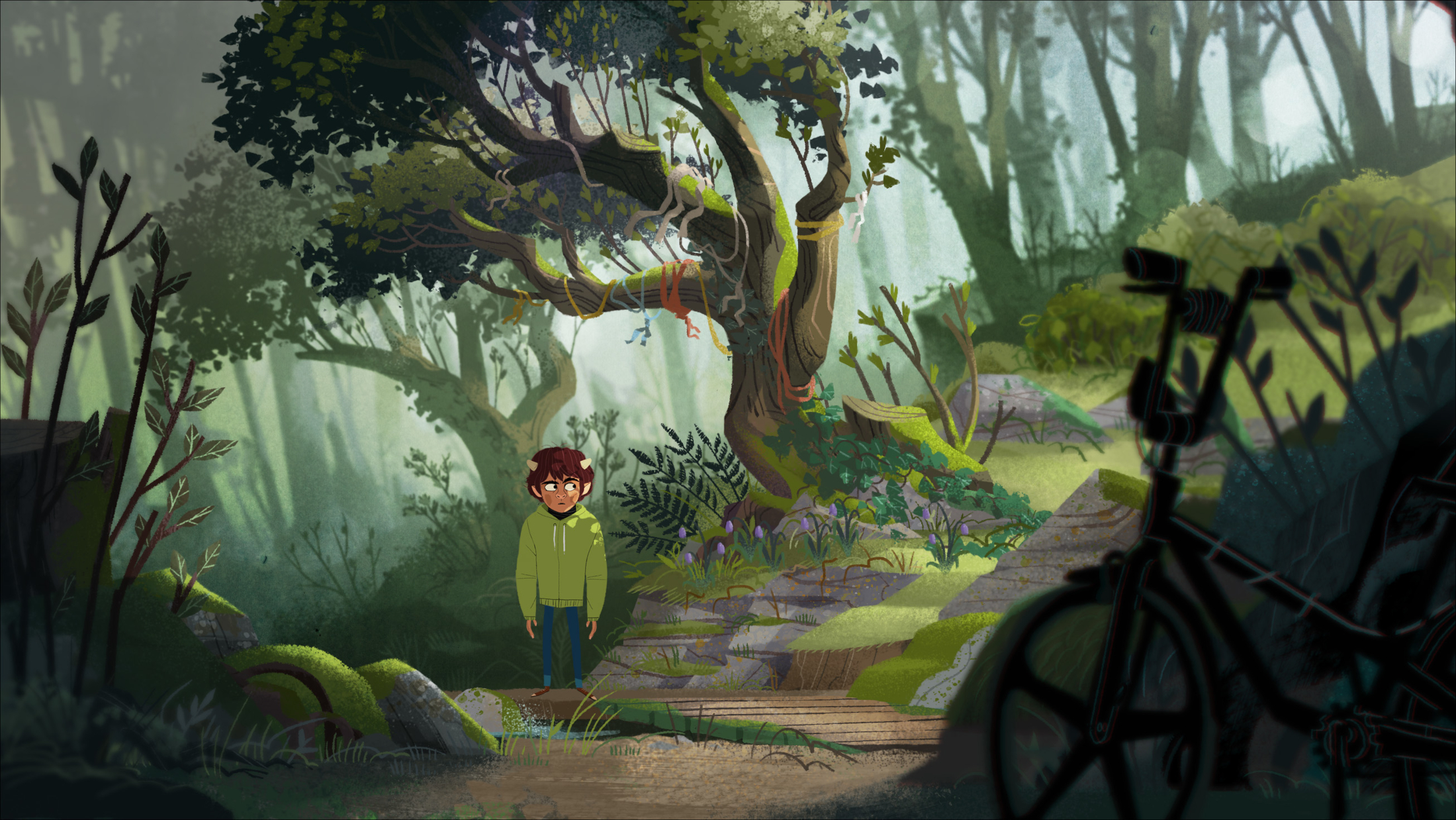
After animating a successful pitch reel, Cartoon Saloon became a producing and animation partner on what is now the Apple TV+ series My Brother the Minotaur, which debuts globally today on the platform. A family adventure steeped in Celtic folklore, the tale unfolds on the fictional Bryony Island, where 12-year-old Lorcan (Ely Solan) is the only minotaur in the world. He has been protected by the island’s residents, his adopted parents, and his precocious and protective younger brother Charlie (Billy Jenkins). But Lorcan is having nightmares about monsters, and strange things are happening in town, making them wonder if his nature is taking over or if something more supernatural is at hand.
Veteran Cartoon Saloon background designer Stefano Scapolan, now the art director on Minotaur, walks Cartoon Brew through the show’s unique dynamic symmetry shot compositions and its carefully crafted color script.
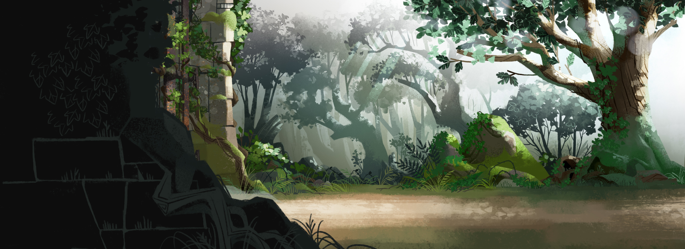
Despite the Greek mythological creature in its title, Scapolan says the series is still very much “rooted inside the traditions of Ireland” and set among the island’s landscapes. “We didn’t want to steer too far away from the concept. We had to try to fit this fairytale by taking elements from another culture, the Greek, and planting them in a very historic language with its own identity and folklore… trying to let the landscape of Ireland dictate the story.”
A series unlike anything Cartoon Saloon and Dog Ears have done before, Scapolan says, they began by trying to visually distinguish it from other middle-grade animated series. “When we started working on the design of the show, me and the other artists tried to take inspiration from the studio identity and from legends like Scott Wills, Eyvind Earle, and Mary Blair. But we wanted to keep it fresh, giving more emotional depth to the concept and to the look of the show.”
“Before starting work on My Brother the Minotaur, I had this idea of looking for an alternative composition grid, and I came across dynamic symmetry,” Scapolan says of his early development explorations.
“I started studying how it’s applied, and it’s mostly used in photography rather than cinema. I didn’t know at the time that Maurice was thinking the same,” he says of series director Maurice Joyce. “I remember doing a test for the art director role, and naturally, the images were already being composed following dynamic symmetry. It was a challenge because we didn’t know where to start. We didn’t have references because, in animation at the time, there were no formats like what we were doing. So we tried to work in parallel with the design while focusing on how to compose the image to give it a cinematic approach. We were taking a lot of inspiration from live action rather than animation.”
Scapolan says that once they agreed on using this dynamic compositional approach, it extended across the entire production, including location design, storyboarding, layout, coloring, backgrounds, and animation. Even character movement followed dynamic symmetry.
He says they also worked closely with the compositing supervisor to simulate camera movement. “We were creating this type of depth of field, applying foreground and background blur in a way that really feels like there is a camera, but still staying in the realm of 2D because we didn’t want to go hyperrealistic. We wanted to stay graphic because the characters are very graphic.”
Using Toon Boom software, the team worked within the program’s constraints to adapt the backgrounds and establish lighting so the compositing supervisor could replicate it on the characters. “The more we worked, the more everything literally fell into place,” he explains. “Everybody got on board, and it created a synergy around how dynamic symmetry works. Maurice and I worked very closely on all these aspects, influencing each other. It was about the color, and we knew how we wanted to move the camera. When I saw the camera movement, I pushed the color in a certain direction.”
When it came to color, Scapolan says he developed a custom color theory throughout, not just for environments but also for the characters, particularly the friend group of Charlie, Lorcan, and their two female friends. “The two girls, like their characters, complement each other, the same way we wanted to handle the color,” he says. “They all have a certain saturation in the palette, which is constructed to match the saturation in the environment. Wherever you place them, even in the darkest part of a room, you can still see them.”
Scapolan continues, “Each environment has its own color theory. You have the calming greens of the forest, the harsh yellow and gray of the cliffside, the colorful, well-balanced town, and the storm, which is this gray mass coming in.
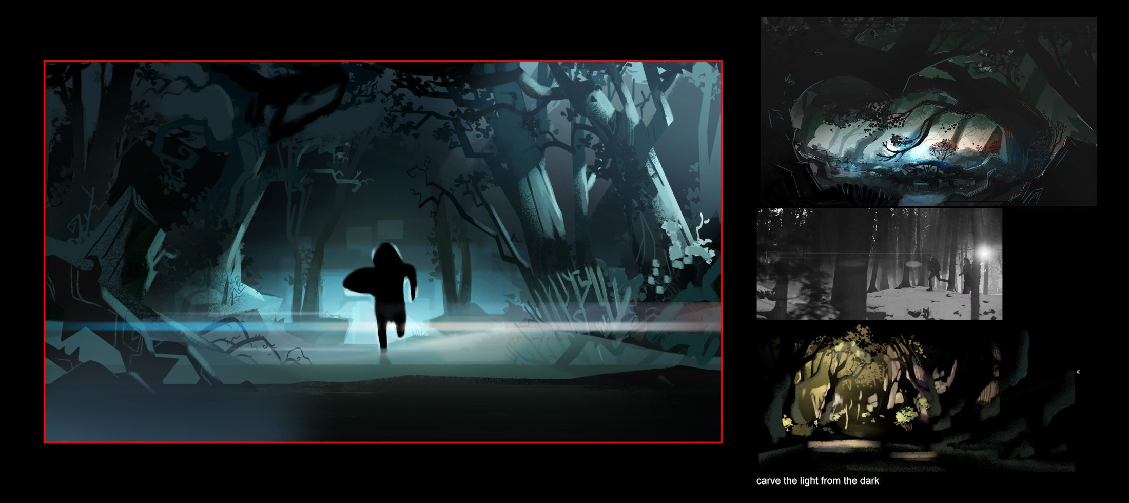
“But the main theory we have across the entire series is orange and blue,” he adds. “Orange and blue are present in the first frame, and there is a reason why. They both have their own meaning.”
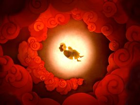
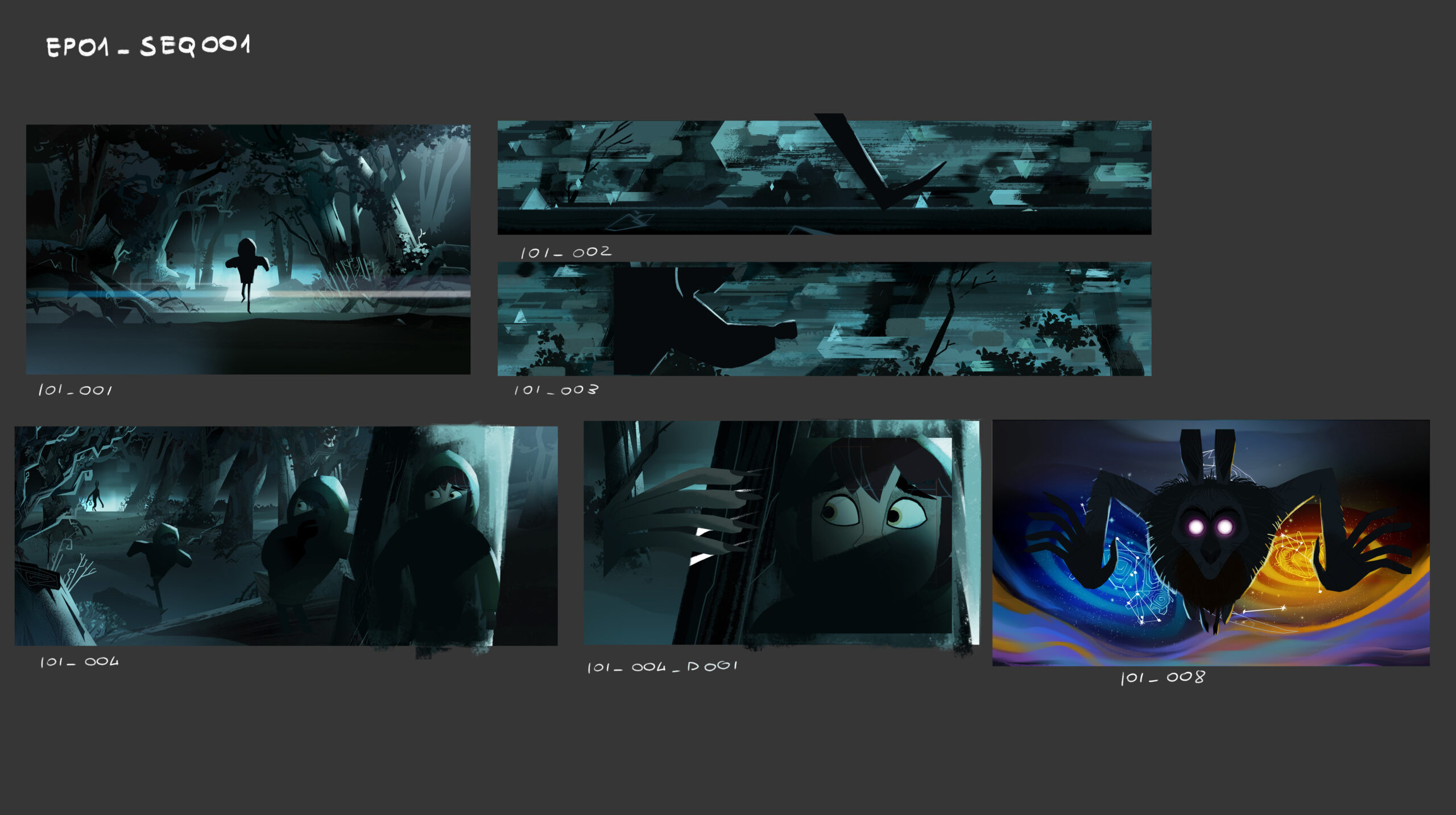
He points to the opening episode’s dream sequence, where a monster chases Lorcan through the forest, as the first presentation of this palette. “We are in the dream, and it is blue, and then you add a hint of orange at the end. There are five dreams across the season, and in each, the color palette is consistent. Progressively, the balance between the two main colors shifts, so you get less blue and more orange as it takes us on a journey.”
There are also flashbacks in the season with their own intentionally unreliable color language. “The flashbacks help bring the story inward or sometimes throw you off because some of them are incomplete or partially fabricated. Even there, we include hints of blue and orange,” he says. “Between the dreams and the flashbacks, there are clues scattered throughout the episodes. When you finally understand their meaning, you’ll see why those colors were used.”