‘I Never Want To Just Repeat’: Lisa Hanawalt On Crafting A New Look For ‘Long Story Short’ – Exclusive Artwork
As production designer on Bojack Horseman and creator of Tuca & Bertie, Lisa Hanawalt has shaped some of the most beloved adult animated series of the past decade. With Netflix’s upcoming series Long Story Short, Hanawalt joins BoJack creator Raphael Bob-Waksberg once again, this time as supervising producer, helping create the show’s look and feel.
We spoke with Hanawalt about Long Story Short’s comic-strip-inspired aesthetic, the challenges of telling a deeply personal story through animation, and how she and Bob-Waksberg’s years of collaboration shaped this latest project.
Cartoon Brew: The visual style of Long Story Short feels very different from BoJack Horseman. What was your guiding principle in developing this look?
Lisa Hanawalt: I never want to just repeat what I’ve done before. I’m an artist, and I get bored easily. I constantly want to reinvent and try something new. With animation, you have to think about whether the form fits the function. With BoJack, we had a tightly drawn, rigid puppeting style. That made sense because the show’s surreal world needed to feel grounded.
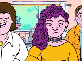
With Long Story Short, the writing is very realistic, there are some flights of fantasy, but overall it’s grounded, so I wanted the animation to be looser and more childlike to balance that out. When Raphael first described the show, I immediately pictured what it should look like: characters that are very cute, almost like Sunday funnies or old Peanuts cartoons.
The characters have a warm, scribbly feel. How did that emerge?
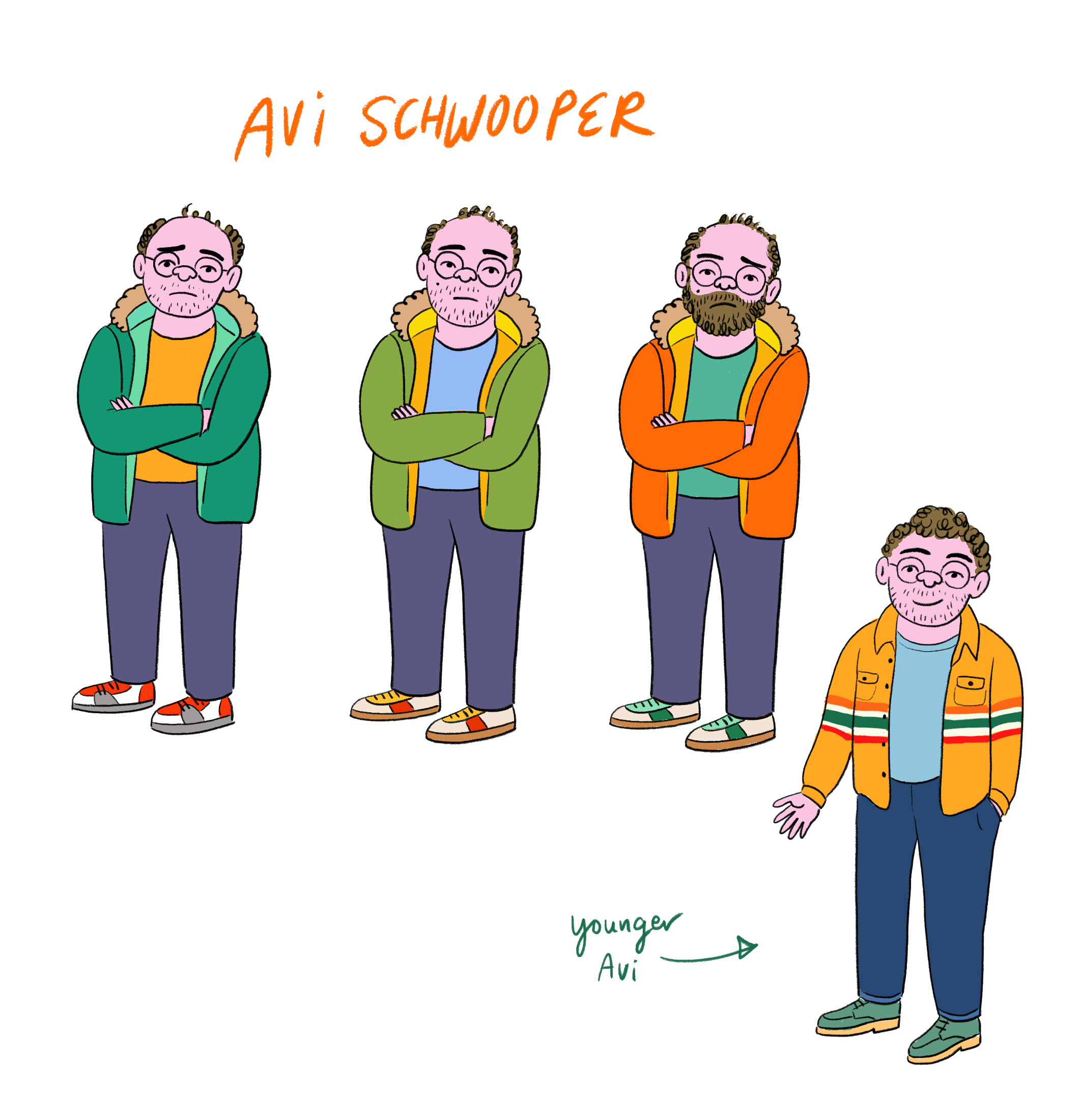
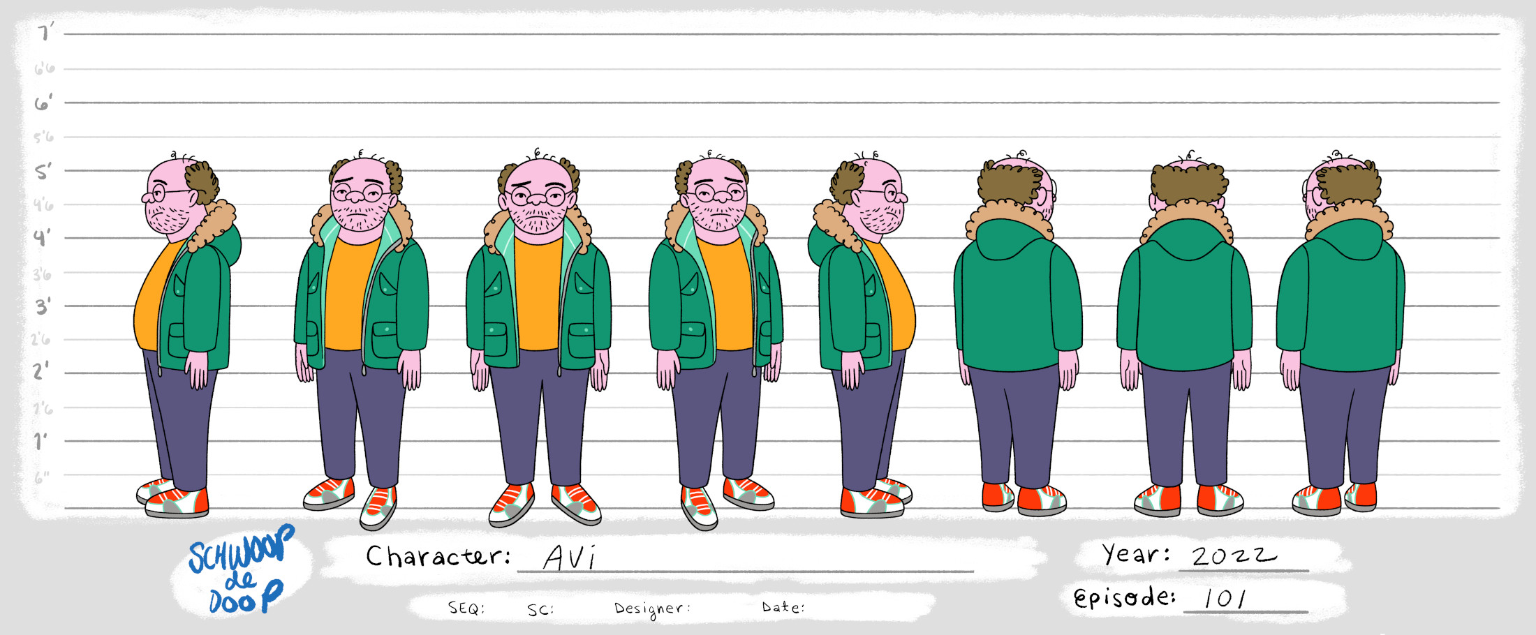
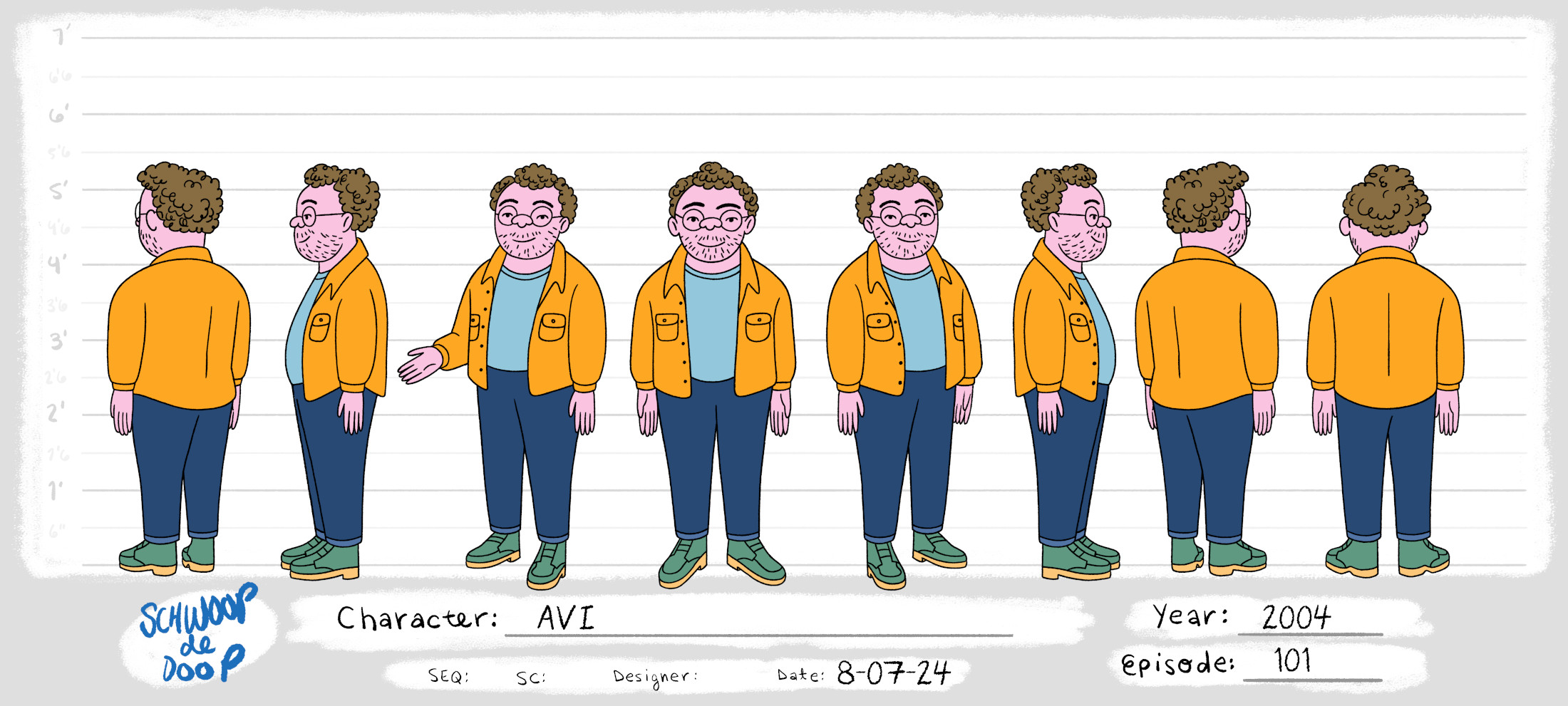
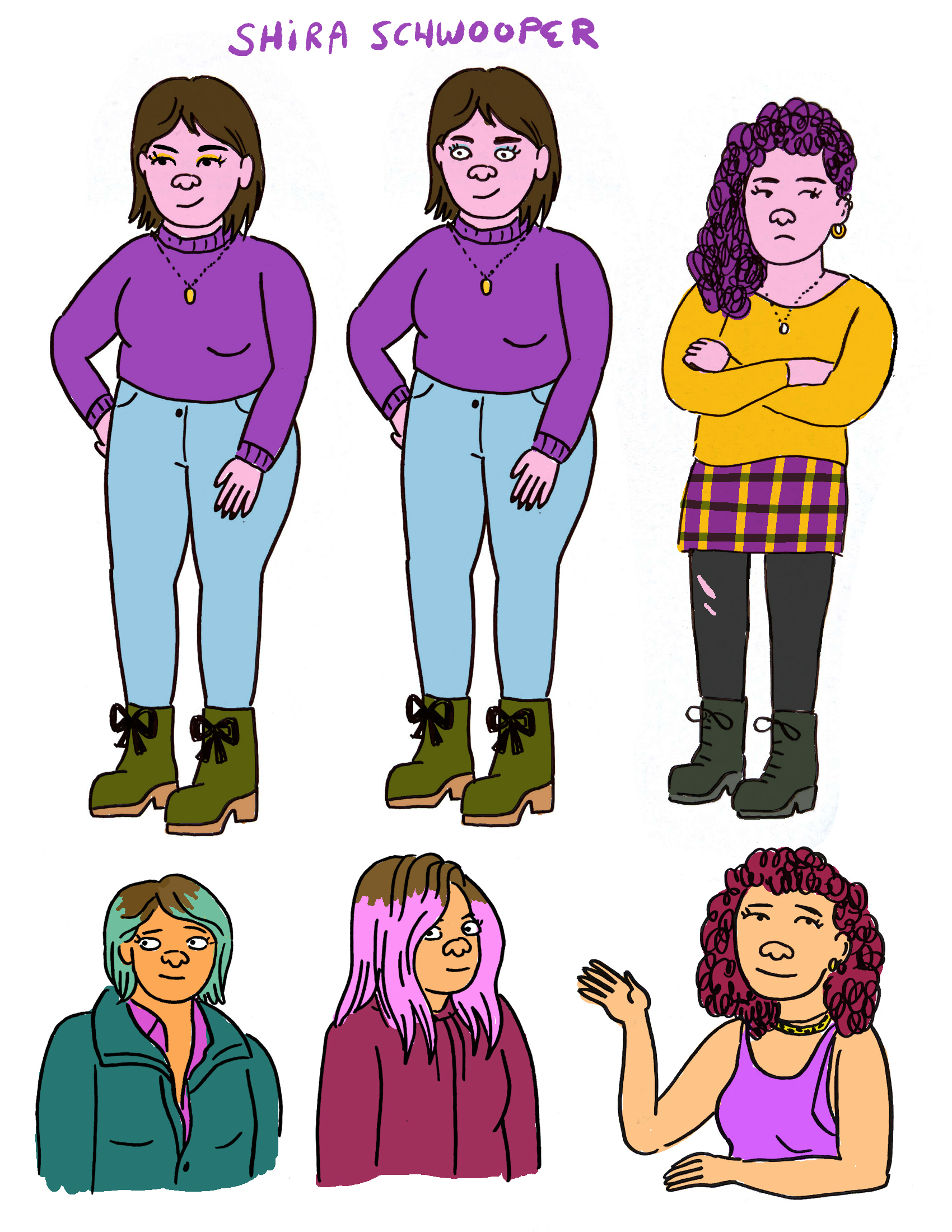
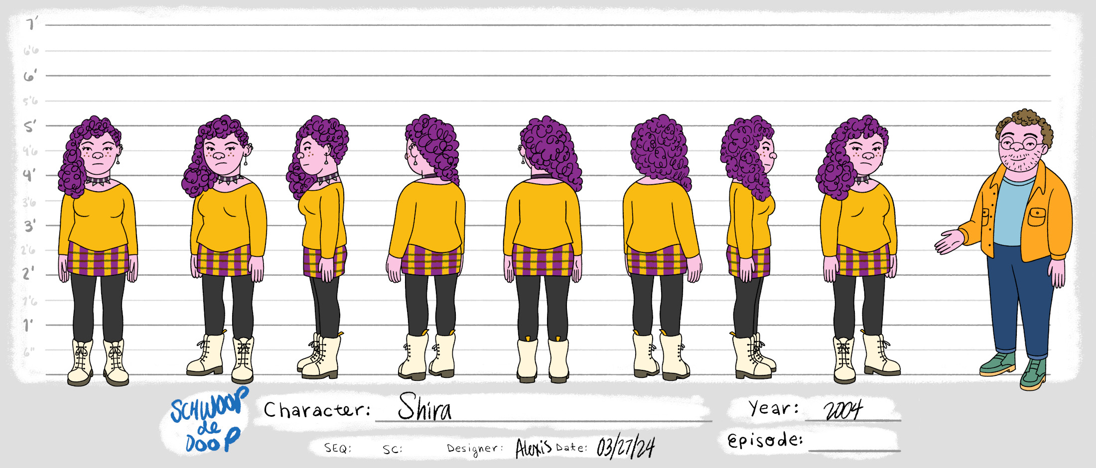
I’d never really done that style fully before, but it just popped into my head. I sketched Avi and Shira and nailed them right away. Naomi took longer. At first, I drew her to look too much like Raphael’s mom, and he wanted something different. Our art director, Alison Dubois, helped refine her.
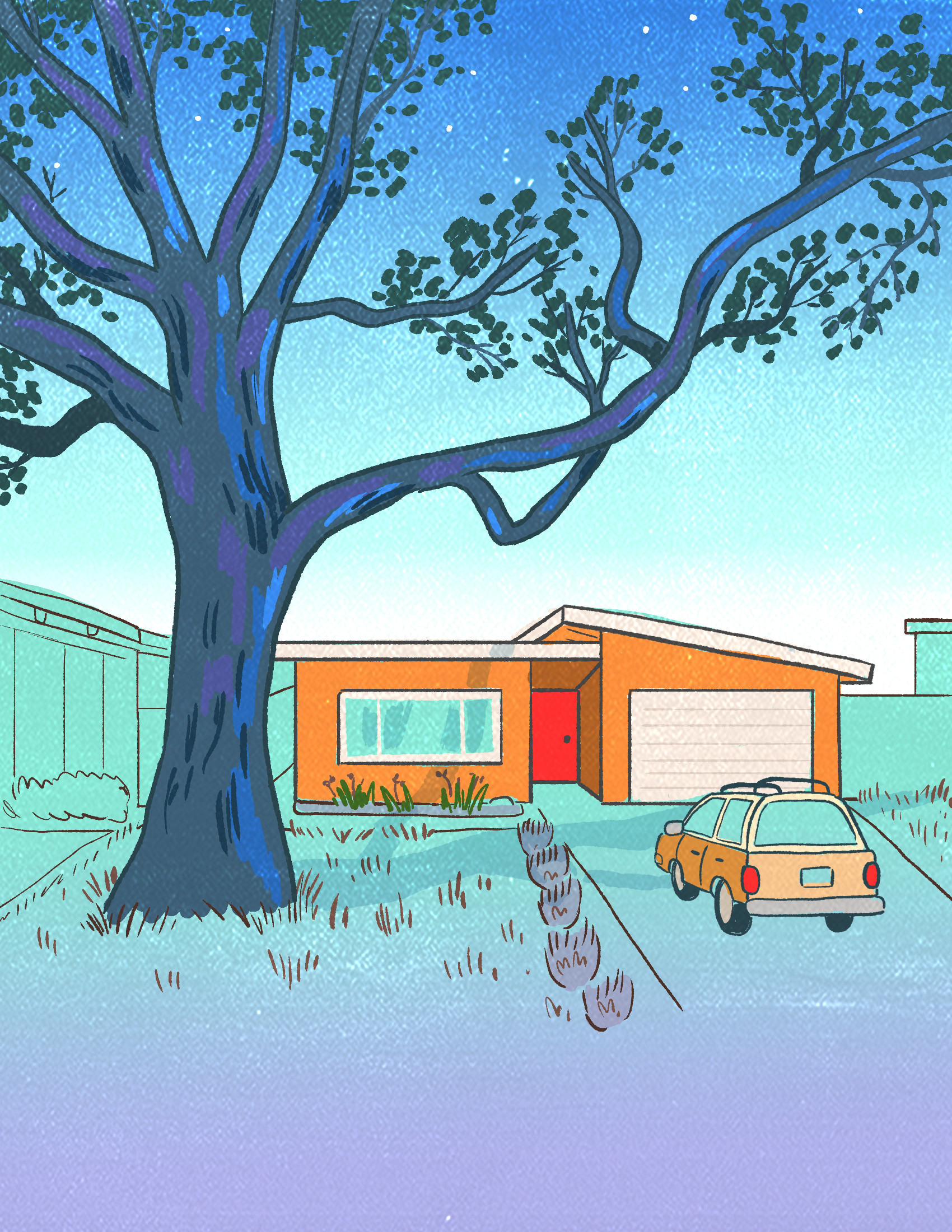
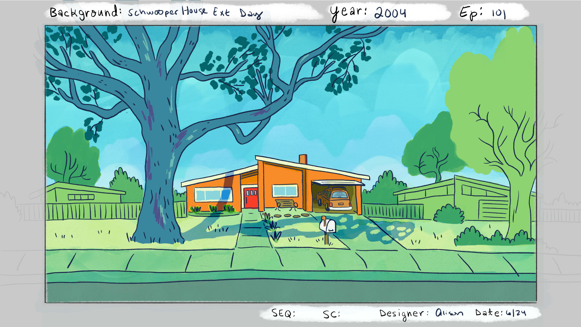
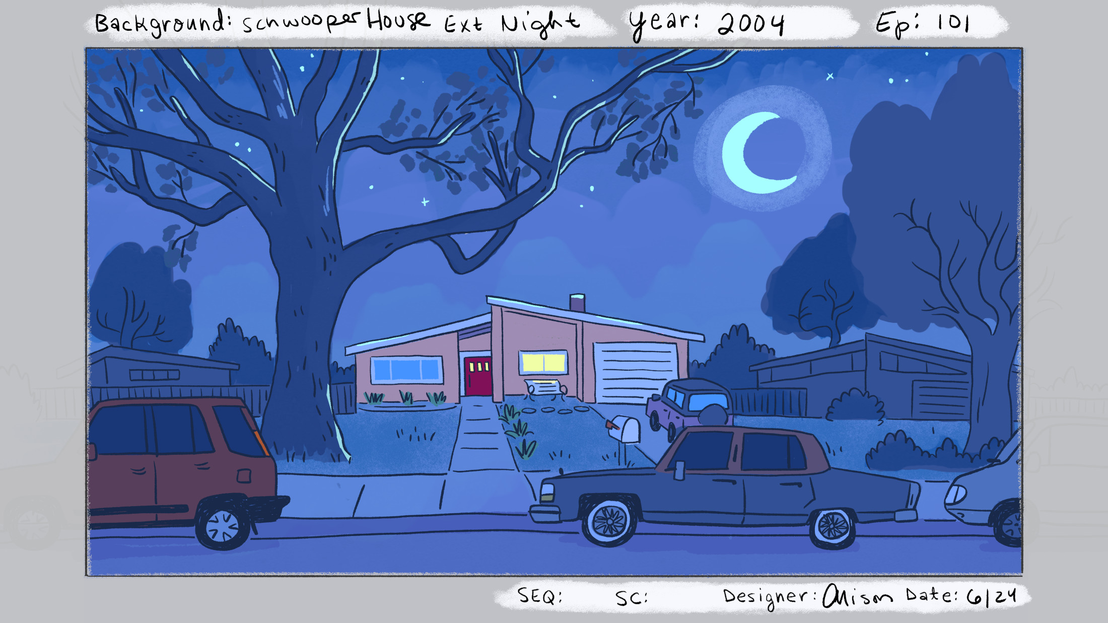
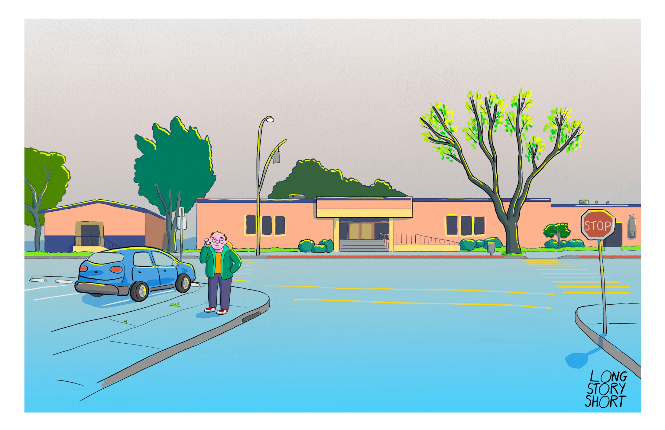
When I started concept art, I used a yellow rim light to capture the Bay Area weather and kept the backgrounds loose and washy, details suggested with scribbles instead of tight outlines. Alison took that and really ran with it. She’s brilliant at simplifying environments while keeping them artful, and she figured out efficient ways to handle difficult scenes, like crowds, without losing beauty.
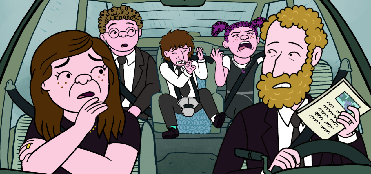
There are moments where characters will come into focus while speaking, then fall back and become part of the minimalist, static background. How do you think about those playful touches?
I think it suits how we actually see the world. When someone’s talking, we focus on them; we’re not noticing every detail around them. If there’s no visual hierarchy, things look cluttered.
That was a big change from BoJack. Here we asked: What’s the bare minimum of outlining we need? What can we colorize instead? It actually takes extra effort to make something look simpler, but I think it makes the show look better.
The show moves through different eras. How did that affect your design choices?
Specificity was really important. The house didn’t need to look exactly like Raphael’s childhood home, but it needed the right feeling. I grew up in an Eichler house in Palo Alto, and we drew from that. Avi’s family in the show is the kind to display objects from their travels, and his dad’s a teacher, so we pulled in details from both of our family homes.
Fashion is also key. I thought about what I wore in high school, sometimes embarrassingly, and applied that to Shira. Each episode takes place in a different year, so it’s fun to think about their style journeys. What stays consistent? What changes? Did Avi buck trends? Did Shira experiment with hemp necklaces, like I did? Those choices make it feel specific and real.
The color palette is striking, limited, bold, and almost printlike. Why go that route?
We wanted it to feel like Sunday comics, where there’s literally a limited palette. Alison has a printmaking background, so she knows how colors combine to create richness. Limiting the palette gives each scene mood and tone, which fits the show’s themes of memory and nostalgia.
We also worked with artist Danielle Chenette, who created color maps for each episode, like: “This scene is very green, this one goes purple.” They make choices I’d never think of, which keeps the colors surprising and exciting.
You’ve been working with Raphael Bob-Waksberg for more than a decade. How has that collaboration evolved?
There’s a lot of trust. I sent Raphael my early drawings, and he immediately said, “Yeah, you got it.” We refined details along the way, but he gives Alison and me a long leash to experiment.
We’ve always had a shorthand. I love reading the scripts and then talking to him, he gives me a rough sketch of a character in words, and I can translate that visually. We refine together from there. It’s a really fun process, making up these people who are loosely based on people we’ve known.
The show is personal to him, but also very relatable. How do you see that balance?
The characters can be “the worst” sometimes, but then they’re redeeming in ways that feel true and loving. That’s what makes them real. I love Naomi—she can be so annoying, but also so caring. You see her love her kids deeply, even when it comes across as overbearing. That kind of contradiction feels very real to me.
All photos courtesy of Netflix.