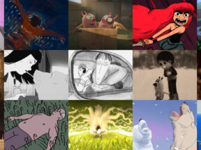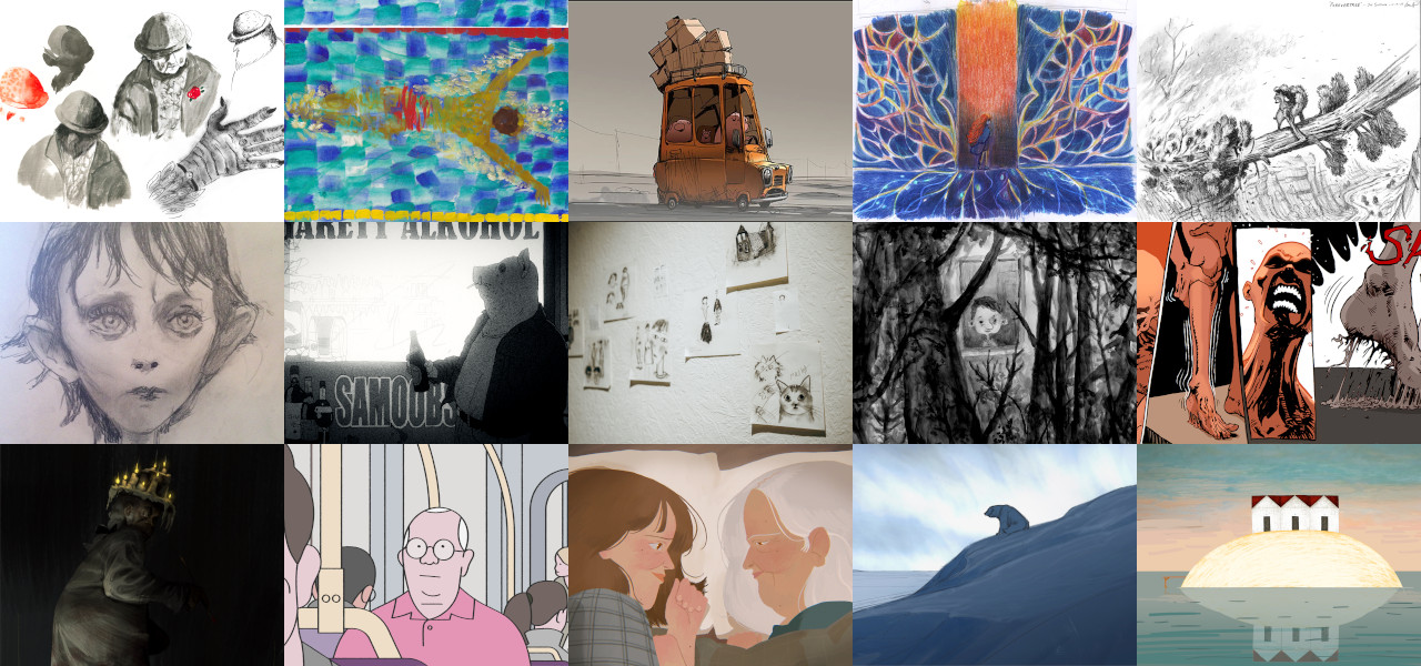
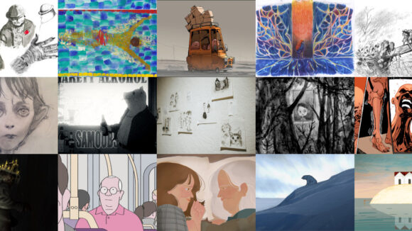
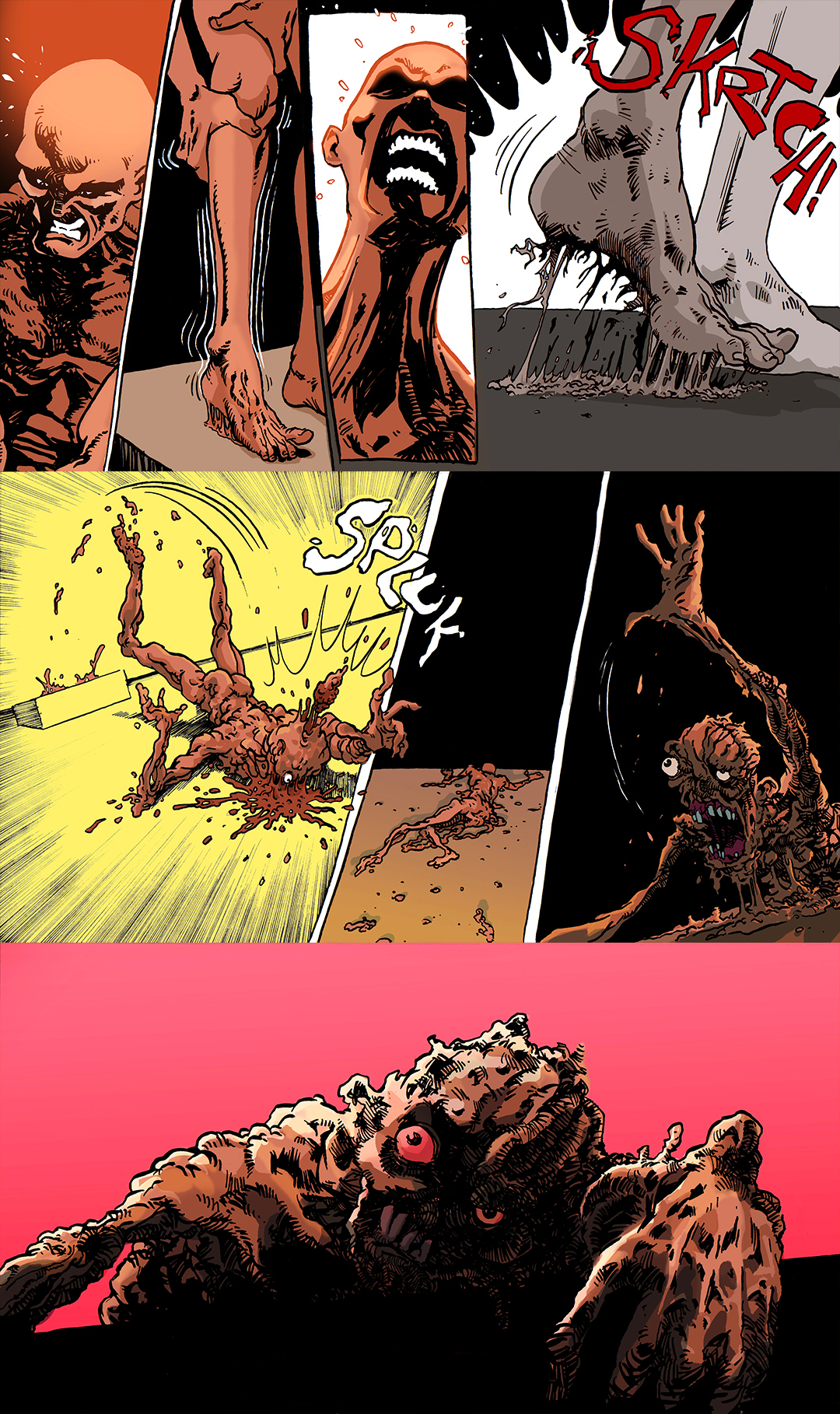
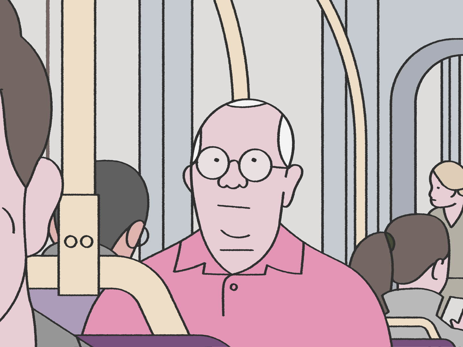
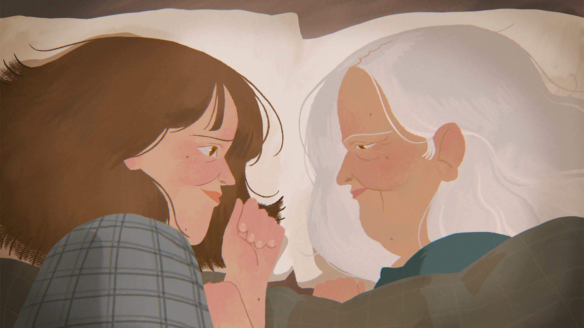
See The First Piece Of Concept Artwork From Each Of This Year’s 15 Oscar Shortlisted Animated Shorts (Exclusive)
Stay informed with free updates
Sign up to get our news digest — delivered directly to your inbox twice a week.
Oscars nomination voting begins today, January 12, and with Academy members set to cast their ballots, we wanted to spotlight the highly unpredictable animated short race.
We asked the filmmakers of all 15 shortlisted shorts to send us the first piece of artwork they created for their films and to explain what inspired the look.
Here are their replies in alphabetical order. Click any film title for more information about the shorts.
Autokar
Director: Sylwia Szkiłądź
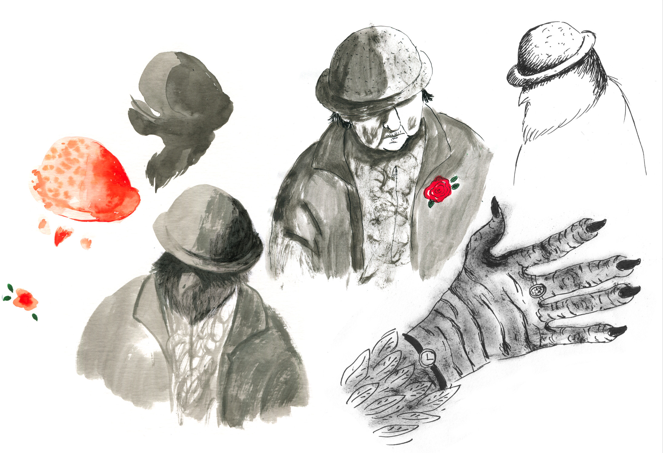
First explorations for the Sparrow Lady. I knew I had almost found her when I managed to feel the sadness hidden beneath her hat.
One of the first sketches where Agata is sitting next to the Sparrow Lady. Agata has changed since then, but she has remained small, just like in this first sketch.
Butterfly
Director: Florence Miailhe
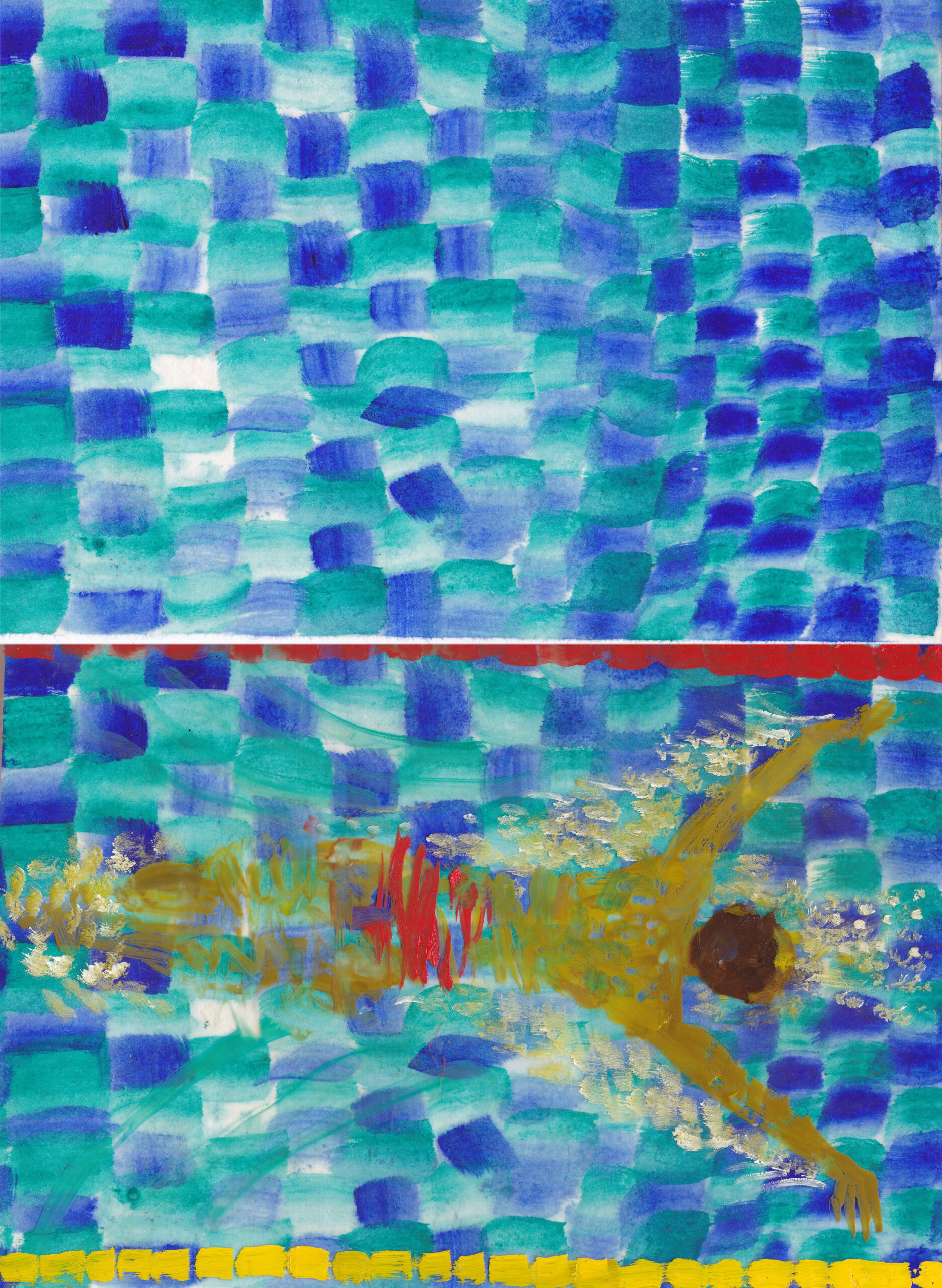
When I started researching Butterfly, I tried to figure out how to represent water and its transparency. I first made fairly abstract experiments with swimming pool tiles distorted by the water, and then added a sheet of rhodoid* to paint the swimmers.
I tried to stay as close as the technique I was going to use for the film: canvases for the backgrounds and a pane of glass for the bodies and everything that was above the water.
* Rhodoid refers to thin, flexible, transparent sheets of cellulose acetate similar to plastic film and can be painted on as it’s clear and lightweight.
Cardboard
Director: J.P. Vine
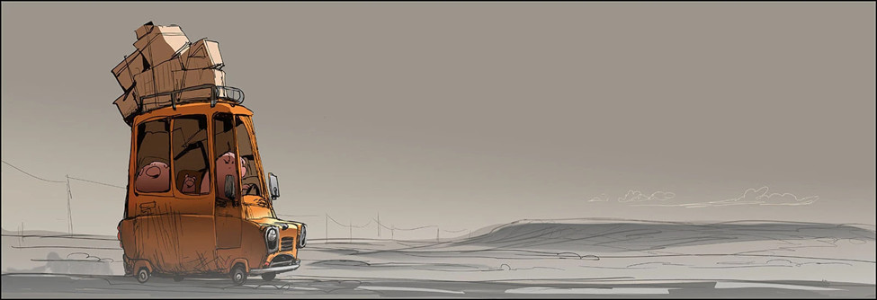
I drew this after a desert drive across Nevada with my family. I wanted to capture the strange emptiness and dust-filled atmosphere and that struck me that day. As I drove past isolated trailer parks, I started to develop an idea of a family arriving to a new life there. This simple image set the atmosphere for the opening scenes of Cardboard, as well as the hand-made, wobbly line look that we took care to celebrate in the whole short.
Éiru
Director: Giovanna Ferrari
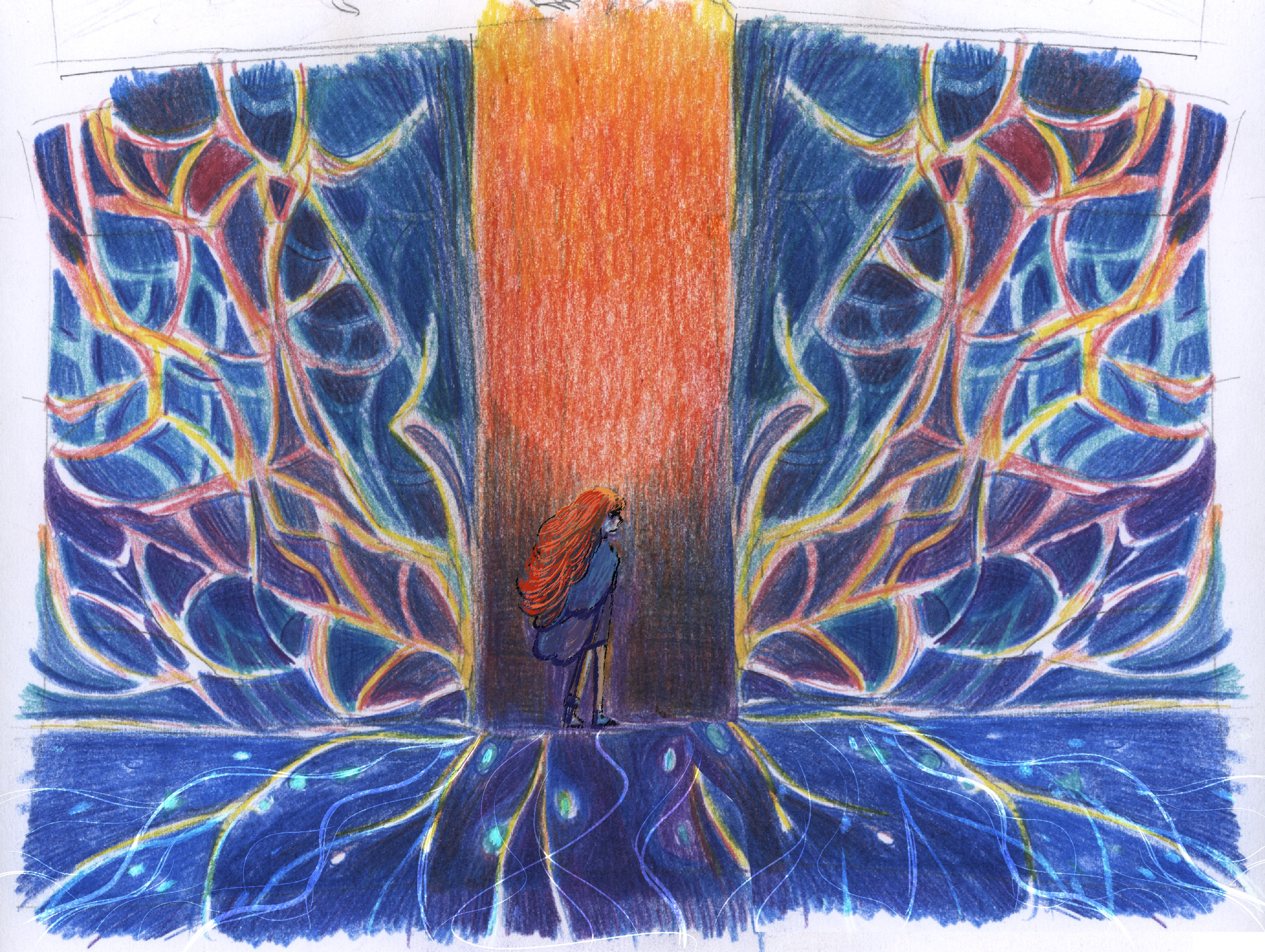
I drew this initial exploration on a small piece of paper, with my favorite colored crayons.
This image was in my head very early on, it felt safe to start here. The color red, very prominent in the first part of the short, meets the blues for the first time here, and so finally the palette can be richer and softer. It took me and Áine Mc Guinness a while to understand how to paint the mycelium in the film, how to layer it in a way that could be consistent and not problematic for compositing, and this drawing kept informing and helping us in that search.
Forevergreen
Director: Nathan Engelhardt, Jeremy Spears
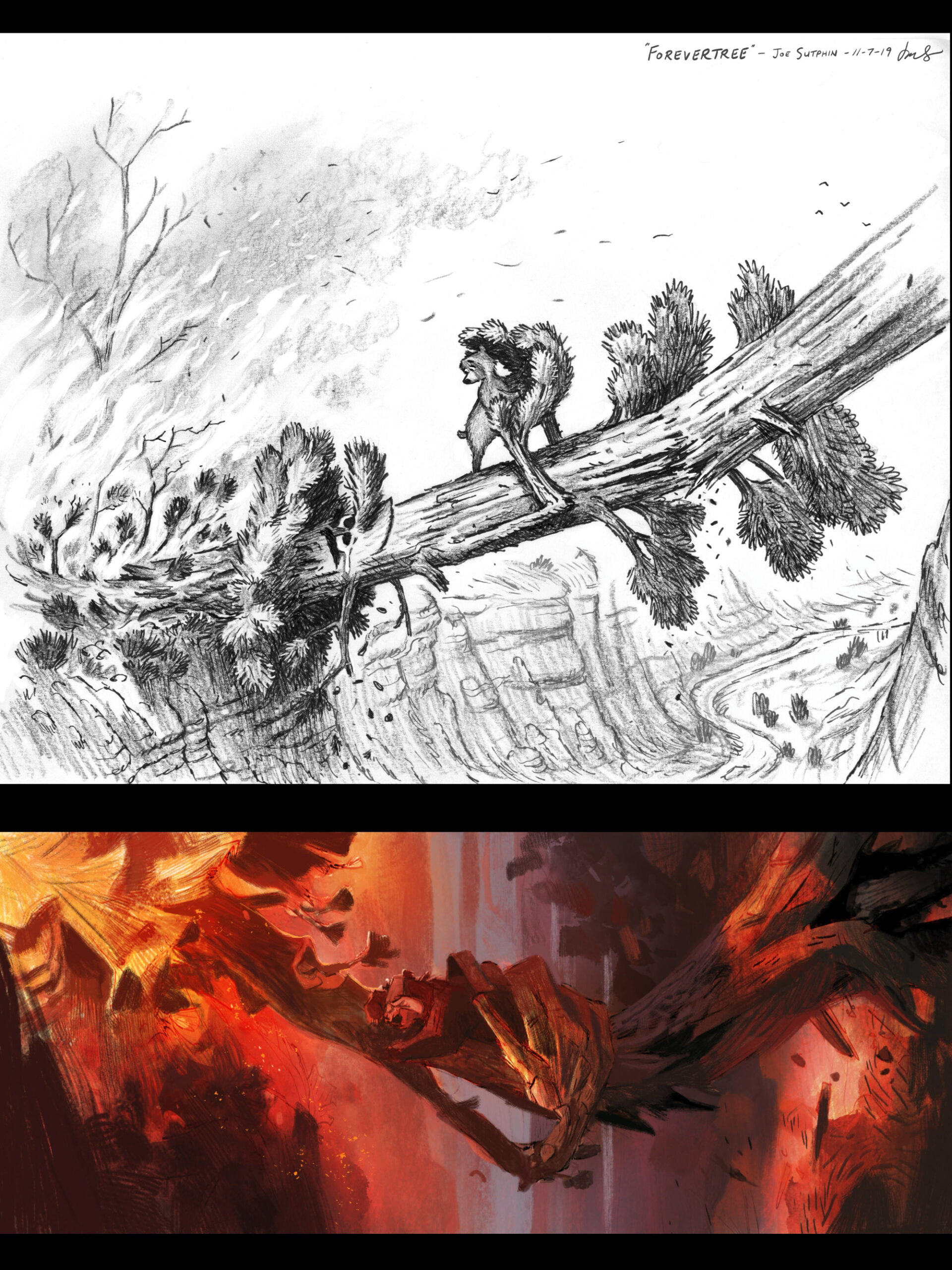
The top image was our first piece of concept art for Forevergreen, depicting the most important moment in the film, drawn by the incredibly talented illustrator Joe Sutphin. It’s rare to find a single image that so deeply influences an entire production. From the very beginning, the idea of handcrafted visuals and director / production designer Jeremy Spears wood-carved design aesthetic was central to the film, so launching the project with a hand-drawn piece of art felt especially meaningful.
This influenced the bottom image of early concept art by Paul Felix that also depicts the film’s pivotal moment and helped establish the texture, lighting, and emotional core of Forevergreen. Paul provided a wealth of imagery using a digital approach that still felt painterly, with brushwork that carried a strong sense of texture and tactility. That quality became a key reference for how our CG wooden world could feel fully rendered and handcrafted.
Inspired in part by WPA-style national parks posters from the late 1930s and early 1940s, Paul employed a limited color palette to express a specific color story, one that complemented and reinforced the characters’ emotional arcs.
The Girl Who Cried Pearls
Directors: Chris Lavis, Maciek Szczerbowski
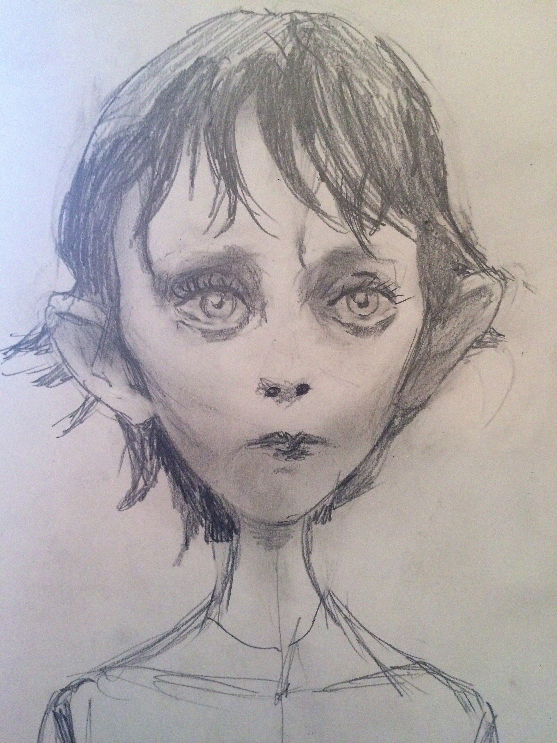
This early pencil sketch of the titular “Girl Who Cried Pearls” was inspired by a young actress named Erika Bók, from Bella Tarr’s film Sátántangó. We needed a face that was sensitive and fragile, a face that would make you believe in a sorrow so profound that tears could transform into pearls.
Hurikán
Director: Jan Saska
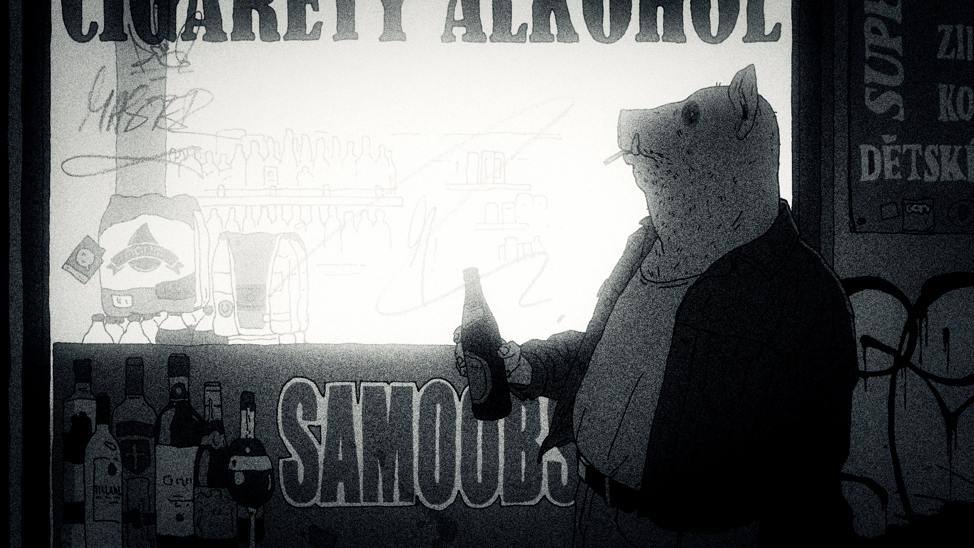
This image was made before I was sure Hurikán was even achievable in animation. Putting those doubts aside, I was aiming for a look similar to Detective Story (part of The Animatrix anthology, directed by Shinichiro Watanabe) — specifically a film-noir atmosphere and a realistic visual approach.
I Died in Irpin
Director: Anastasiia Falileieva
I was confident in my character and my ex’s character, but I was unsure about the appearance of his parents. Something felt off when I drew them as humans. At some point, I suddenly decided to draw them as their values instead.
The father became a tape recorder, because before evacuating, he hid his tape recorders, risking everyone’s lives. The mother became an apple. During an evacuation convoy, in the middle of shelling, she came to our car (we were driving in two cars) and gave us apples. I started screaming that she must go back to her car, but she kept insisting. These symbols stayed with them forever in my mind.
The Night Boots
Director: Pierre-Luc Granjon
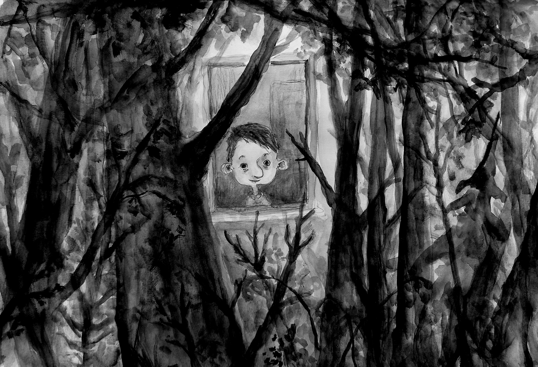
With this first image, I sought to represent what I would call “the call of the forest.” It is clearly a childhood memory: my bedroom faced a wooded area, and from my window I could hear all the sounds of the forest, and I felt the urge to join it. In The Night Boots, Eliot is about to take the step, and although it is dark, he will slip into the undergrowth. I wasn’t very satisfied with this first image, but I knew that the Alexeïeff/Parker pin screen would allow me to do better.
Playing God
Director: Matteo Burani
The look of Playing God was inspired by the old workshops of Italian sculptors and painters, whose works have deeply shaped my background and imagination. Among the closest references is a rare complex of terracotta sculptures, still intact since the 1400s, which conveys an intense artistic presence. “The Lamentation over the Dead Christ” by Nicolò dell’Arca, in particular captures the soul of the short film, with its ability to blend drama, delicacy, and emotional depth. Elements central to the visual design of the story.
The Quinta’s Ghost
Director: James A. Castillo

This was the first time I saw Francisco de Goya looking back at me. I had done some previous sketches and ideas for shots; larger compositions to find the tone of the film, but it took a long time to land on the perfect look for Goya. We needed to walk a very tight rope; it needed to be sophisticated enough to allow for subtlety as well as stylized enough to be appealing, but we knew that if we were too pushed, too cartoony, we would betray the tone of the film. It also helped us understand how we wanted to light him in certain scenes.
Retirement Plan
Director: John Kelly
The early stages of visual development on this were painful, I was full of self-doubt. I took a whole day tentatively drawing up this scene, completely unsure of myself but trying to listen to myself, to trust my instincts.
And once I was finished with it, I felt such a surge of excitement. Something clicked. I even sent it to my phone so I could sneak repeated delighted glances at it over the weekend. The final look advanced further, but looking back at this initial exploration encourages me to step into the unknown and trust that I’ll find my footing.
The Shyness of Trees
Directors: Sofiia Chuikovska, Loïck Du Plessis D’Argentré, Lina Han, Simin He, Jiaxin Huang, Maud Le Bras, Bingqing Shu
This concept art by Maud Le Bras was amongst the first one created in early preproduction. It felt like a meaningful breakthrough to us because it was the first drawing that did not center around trees and vegetation, but rather on a close up of the characters. It revealed to us that one of the core element of the movie, besides its fantastical aspects, was the bond between Hélène and her mother. How they mirrored each other, how alike they looked, and how we could visually convey a deep intimacy without relying on dialogue. It definitely oriented the rest of the preproduction, and we tried to keep some visual elements of it such as the lineless artstyle.
Snow Bear
Director: Aaron Blaise
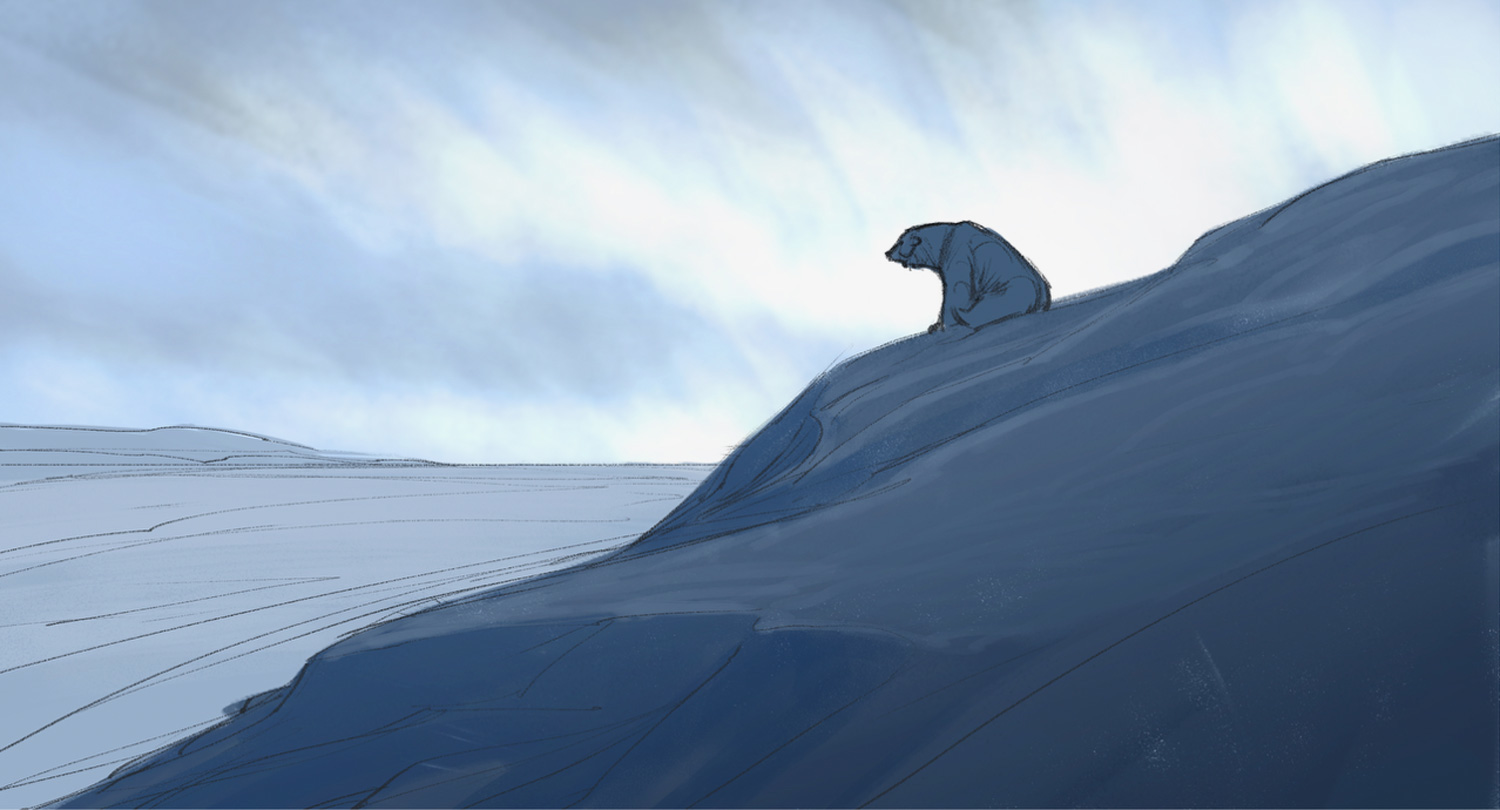
Right from the beginning of Snow Bear, I knew that it was a sense of loneliness in a vast landscape that I wanted to capture. This is the very first image I created. I pitched the idea to my business partner Nick Burch, and from that notion eventually grew the film.
At the time, I thought it would be a 6-minute short and take about 9 months… That turned into 11,000 drawings, 3 years, and 10 minutes of run time. It ended up being not just a story of our bear but a story about me.
The Three Sisters
Director: Konstantin Bronzit
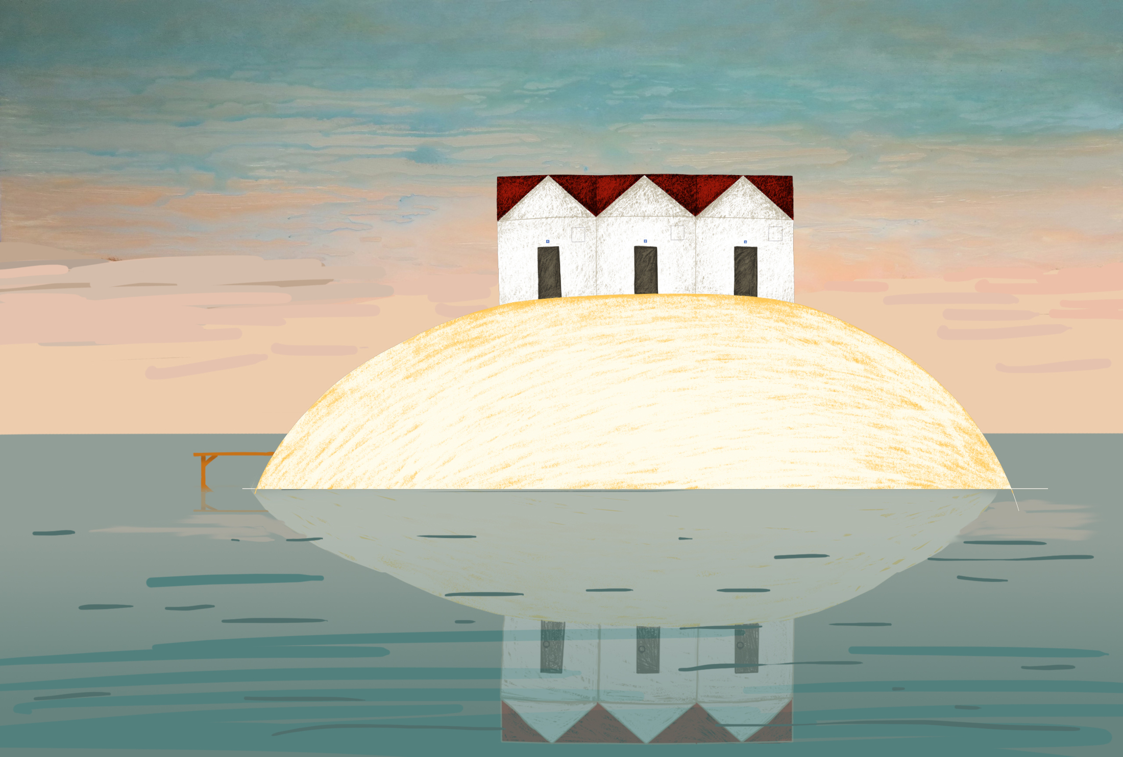
From the very beginning, I knew it had to be a lonely house on an island – it highlights the loneliness of the characters and the monotony of their lives. I was also secretly very attracted to the image of a lonely house on a hill (or on the tip of a mountain), which clearly haunts me all my life, and this is my third film in which you can see it.